2019 Winner
Typeface Design
Ribaasu
Ribaasu
Category—Typeface Design
2019 Winner
Typeface Design
Ribaasu
Designer(s)
Tien-Min Liao, New York
Additional Credits
URL: typeji.com
TWITTER: @typeji
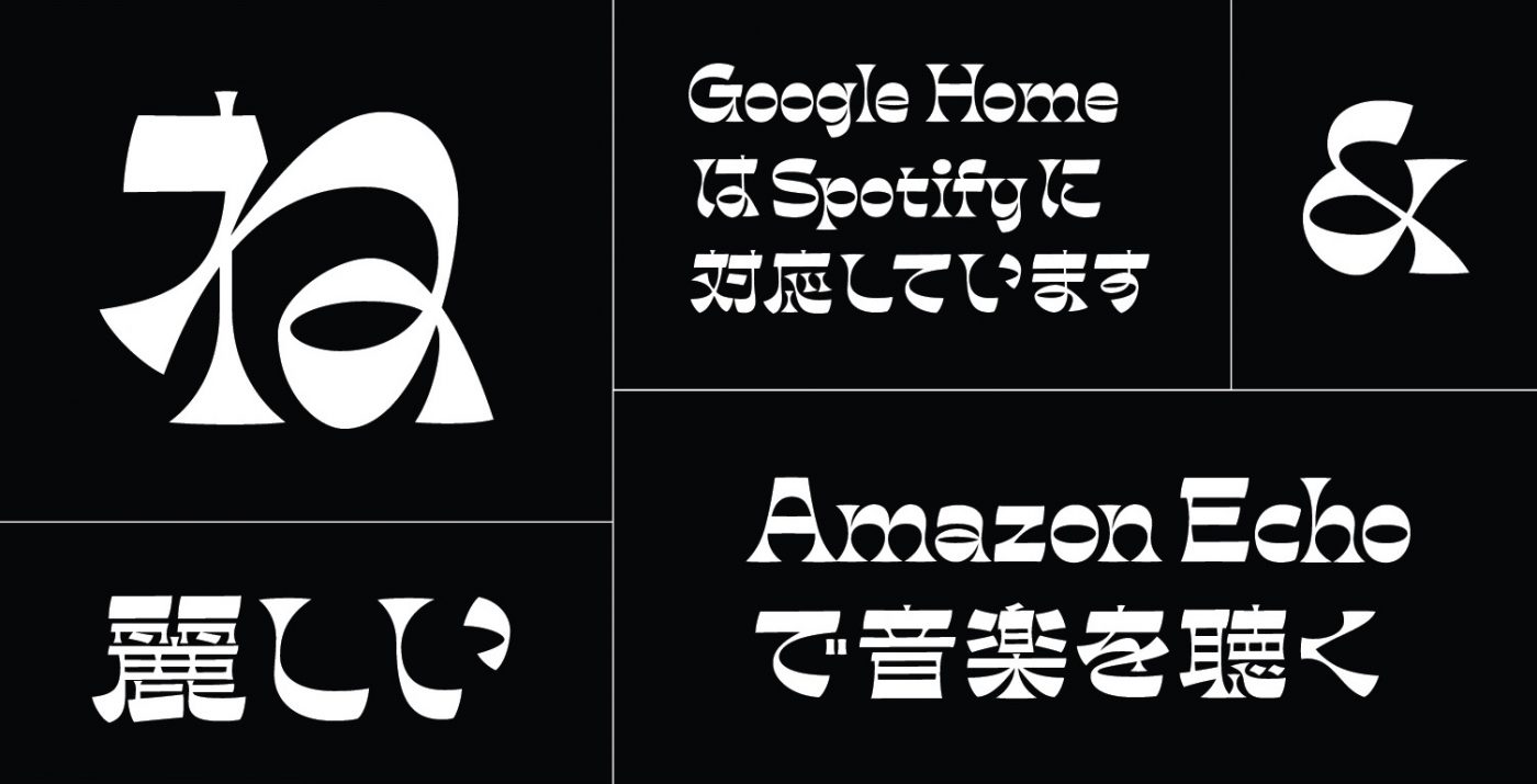
CONCEPT:
In standard typefaces, verticals are usually heavier than horizontals. However, in a reverse-contrast typeface, the normal weight distribution is reversed. The result is that the weight becomes concentrated along the cap-height, x-height, and baseline, which creates a strong horizontal visual connection.
Unlike the Latin alphabet, the weight distribution in Kanji and Kana are much more complex, and not just on the verticals. Many strokes are diagonal or curved, therefore the weight distribution varies on different strokes. Simply reversing the weight distribution may not create the same visual result as the Latin one. Instead of reversing the weight literally, my approach is to create a non-Latin reverse-contrast in order to capture the visual essence of the Latin reverse-contrast. That essence is the quirky personality and strong horizontal connection; thus, both can work together in a visually compatible way.
JUDGE'S CHOICE: Erin McLaughlin