Ribaasu is currently on display in The World’s Best Typography exhibition (TDC65) at the Polish-Japanese Academy of Information Technology in Warsaw through September 30, and will also be shown in Minneapolis at TypeCon 2019 (August 29 – September 1) and at Tokyo’s Miraikan Museum at ATypI (September 5-7).
About Ribaasu
- Typeface Design: Tien-Min Liao
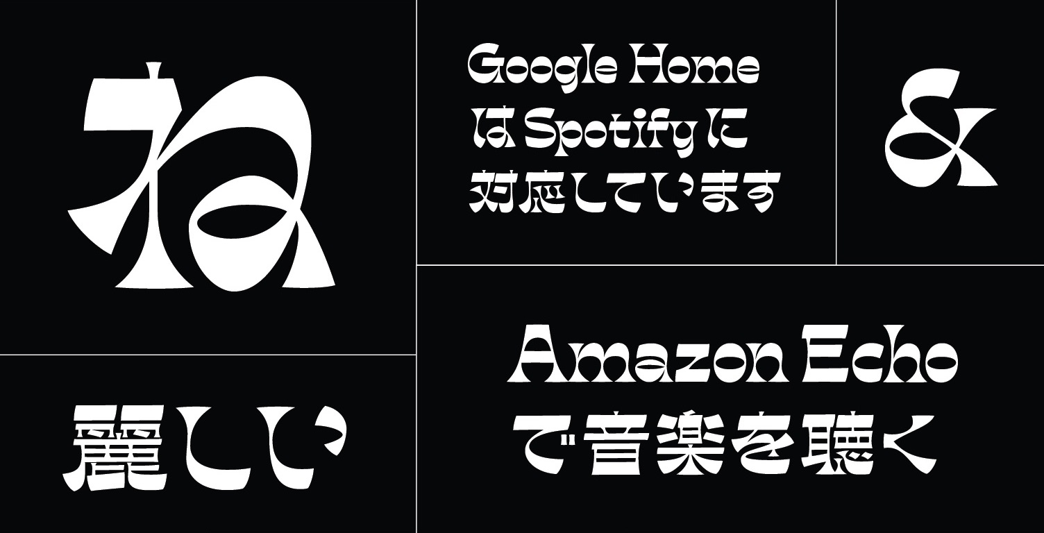
"In standard typefaces, verticals are usually heavier than horizontals. However, in a reverse-contrast typeface, the normal weight distribution is reversed. The result is that the weight becomes concentrated along the cap-height, x-height, and baseline, which creates a strong horizontal visual connection.
Unlike the Latin alphabet, the weight distribution in Kanji and Kana are much more complex, and not just on the verticals. Many strokes are diagonal or curved, therefore the weight distribution varies on different strokes. Simply reversing the weight distribution may not create the same visual result as the Latin one. Instead of reversing the weight literally, my approach is to create a non-Latin reverse-contrast in order to capture the visual essence of the Latin reverse-contrast. That essence is the quirky personality and strong horizontal connection; thus, both can work together in a visually compatible way."
![]()
Comments by Typeface Design Judge Erin McLaughlin
"This project drew me in like a magnet. It's not often that you get to see a boisterous, reverse-contrast display typeface elegantly executed in four writing systems.
Harmonizing scripts with differing calligraphic traditions is no easy feat, and a majority of the industry's recent attempts have succeeded only by reducing these differences as much as possible, via a low-contrast approach. This project, instead, turned the challenge on its head, by tackling a high-contrast, detail-rich style that must fully consider and respect the differing structures and densities of each writing system. The Latin-based, horizontally-stressed design formula had to be adapted to suit the fluid, organic forms of Hiragana; the stark, angular shapes of Katakana; and the structured, often extremely complex Kanji.
Its careful balancing of weight, the smart handling of negative space, the designer's deep understanding and respect of the structure of the letterforms, and the infusion of just the right recipe of detail and quirkiness have resulted in a masterfully executed work that type designers can look up to. It's also a project whose exciting, exuberant forms can be noticed and appreciated by anyone – no matter what their level of typographic knowledge. For these reasons, I feel that this project firmly stands as one of the world's best examples of typeface design. "
About Erin McLaughlin
Erin McLaughlin is a typeface designer and consultant specializing in South Asian writing systems. She has developed custom Indic script fonts for Adobe, Google, IBM, and StarTV India, as well as independent type foundries like Bold Monday, Lineto, and Type Together. Previously, she worked as a typeface designer at Hoefler & Frere-Jones after graduating from the MATD program at the University of Reading, UK. Erin has spoken at TypoDay India, TypeCon, and now serves as a SOTA board member. Through Fontwala, her new venture, she aims to mentor and partner with other designers to build a library of high-quality fonts for Indian languages.
Read more about Erin and see her work here.