2018 Winner
Typeface Design
Harrison Serif Pro

Harrison Serif Pro
Category—Typeface Design
2018 Winner
Typeface Design
Harrison Serif Pro
Designer(s)
Lisa Fischbach, Hamburg
Additional Credits
TYPEFACE DESIGN DIRECTION: Jakob Runge, Munich
FONT PRODUCTION: Christophe Koeberlin, Berlin
FOUNDRY: TypeMates
WEBSITE: typemates.com
TWITTER: @TypeMatesFonts
MEMBERS OF THE TYPE FAMILY: Harrison Serif Pro, Hair Italic, Thin, Think Italic, ExtraLight, Extra Light Italic, Light, Light Italic, Regular, Regular Italic, Medium, Medium Italic Bold, Bold Italic, Black, Black Italic, Ultra, Ultra Italic
CONCEPT:
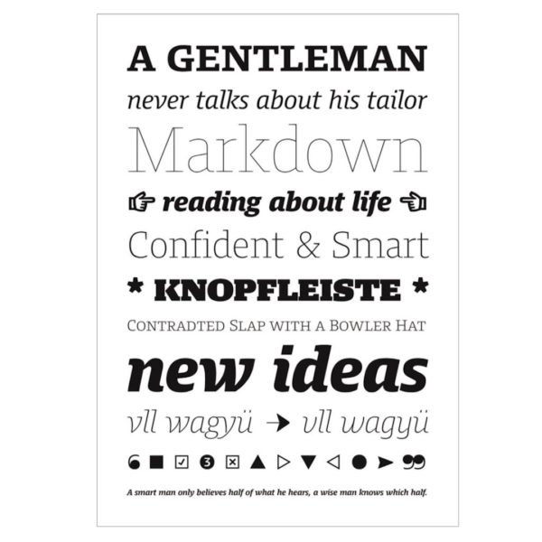
Harrison Serif Pro is a sturdy yet contrasted slab serif that combines a rational and efficient approach with a warm voice. A typeface of nuances, the slightly carved and occasionally extended serifs evoke the friendly side of Harrison Serif and contrast with the straightforward nature of the typeface’s squarish curves, open counters, and horizontal emphasis. The almost mechanical vertical terminals, open counters, and modest capitals combine with Harrison’s generous x-height to ensure the typeface holds up on screen. Given this serif typeface’s improved ClearType hinting and sturdy physique, no medium is a worry for it.