To celebrate our talented and diverse membership, the TDC is profiling one member each month who is selected at random. We’re asking members the same five questions that will hopefully let us – and you – get to know them better. Last month launched with a feature on Bruno Maag and this month falls on Ray Masaki.
Tell us a little bit about yourself – what you do and where you work
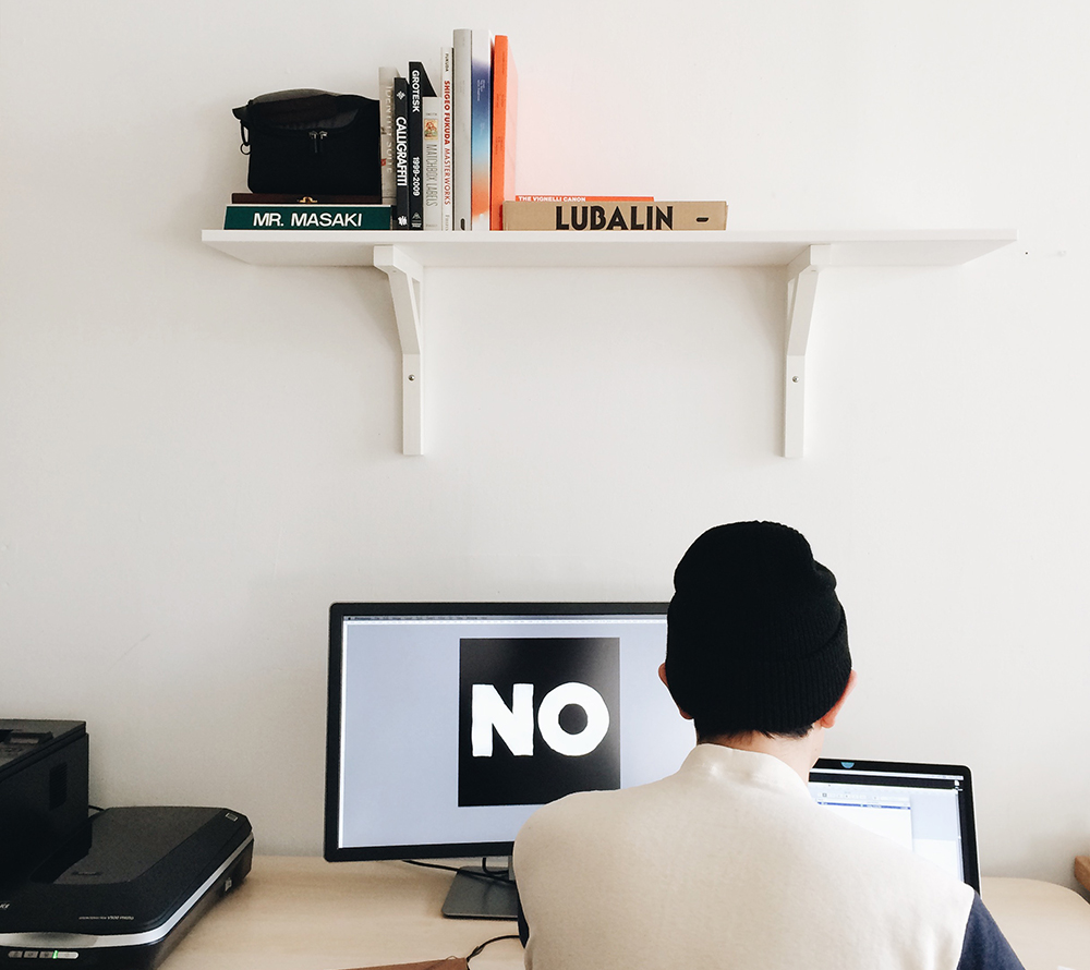
My name’s Ray Masaki. I’m a designer living in Harlem and I recently started working out of a shared studio in Brooklyn. I work primarily on lettering, brand identity, and web design projects. After completing the Type@Cooper Extended program last year, I have also started to work on some typefaces on the side.
 Ray Masaki
What is your favorite typeface? And why?
I don’t really have one favorite typeface because I think it’s usually a matter of the context, but there are a couple recent typefaces that I find very beautiful. I like Grilli Type’s GT Sectra because I think it’s drawn with a lot of conviction and I like how the styles were conceived. I generally enjoy the work of Berton Hasebe, and I think that Druk was was one of the coolest typefaces from last year. I physically gasped when I saw Lucas Sharp’s Ogg for the first time, especially the italics, which I think are incredibly expressive and capture the beauty of Ogg’s work.
Matthew Carter’s Georgia is also pretty significant to me. I remember in middle school when we were all customizing our Xangas, my friend had chosen Georgia as his template font. I don’t think I had cared what letters looked like up until that point, so in hindsight I feel like I owe quite a bit to that typeface.
Where do you take your typographic/design inspiration from?
City signage and vernacular typography have been pretty consistent sources of inspiration for me. I like how they give you a feeling of the city’s culture and history. Aside from design, I listen to a lot of hip-hop music, which has been a big inspiration. I enjoy the exploration of flows, expression, and nuance, which I think relates to drawing letters in a lot of ways.
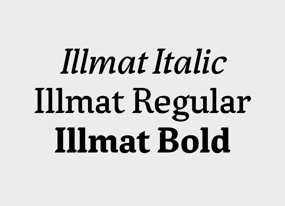 Ray’s ‘Illmat’ typeface family designed while attending the Type@Cooper Extended program taught by Jesse Ragan
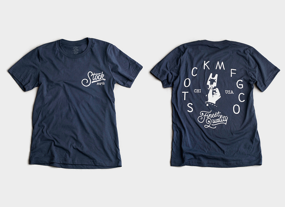 Artist’s series t-shirt collection curated by illustrator, Jon Contino, for Stock MFG Co.
What is your all time favorite piece of design?
Damn, that’s a pretty heavy question. Maybe the Madvillain album cover? I think it’s super classic and iconic, and the photo’s dope. He released a limited edition version of Operation: Doomsday where it’s just the DOOM mask blind embossed on a silver cover, and that’s definitely one of my favorite pieces of design. I also like the Calpis branding designed by Taku Satoh, because it’s one of my favorite drinks, and my aunt worked in the lab that helped develop the flavor, and whenever I would visit Japan she would always give us a couple bottles. I enjoyed the experience of unwrapping the polka-dotted paper and revealing the bottle underneath. Completely unrelated to design, I think when they brought the drink over to the US, they changed the name to Calpico, because they probably thought the name sounded too much like “cow piss.”
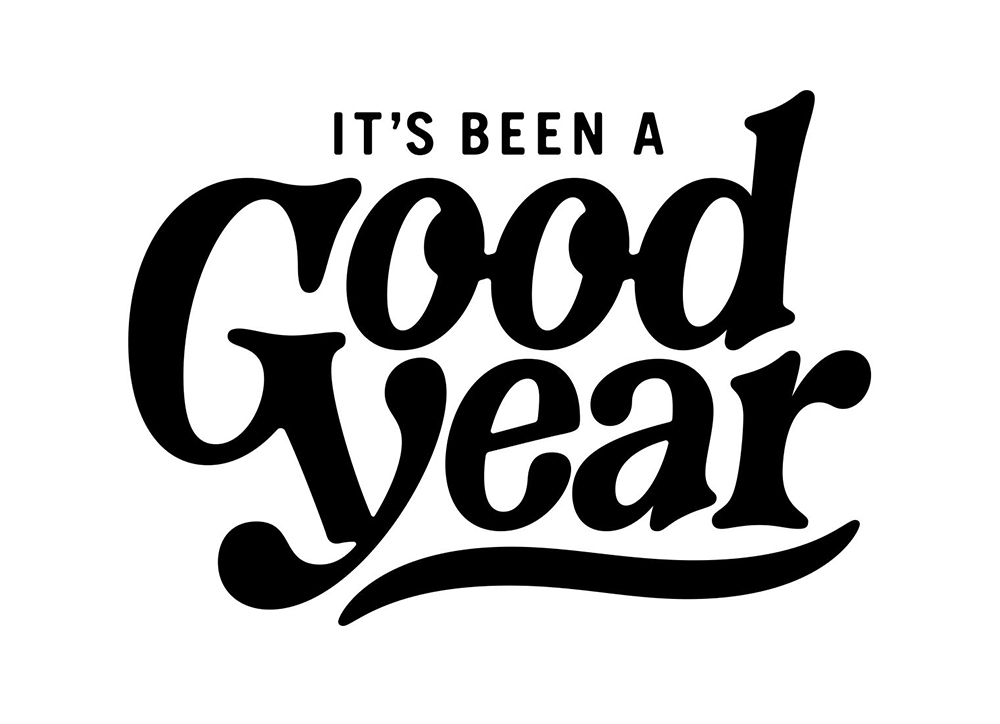 Personal project and type exploration which began as a hand-drawn sketch, and then digitized in Robofont
Where do you see the future in typographic design and typeface design?
I think it’s an interesting time for type. It’s more accessible than before and there is a growing public interest in typography in general. One challenge with this is that I think a lot of people tend to rush into the field by blindly trying to create new things or copying others without fully appreciating and exploring the history. With that said, I’m excited to see the output from the next generation of type designers and lettering artists. In the future, I think that even more people will care about typography, and I imagine that foundries will place a heavier emphasis on web/epub fonts and perhaps new licensing models will be developed to help the more independent foundries.
What is your favorite aspect of being a TDC member? / What drew you to become a member of the TDC?
I’m pretty new to type design and the field in general, but I find that since type design is a pretty niche industry, the community feels more supportive than competitive. I love the TDC events and workshops, and I’ve taken complete advantage of them. I think last Fall, between TDC and the Type@Cooper events, I was attending a talk or workshop sometimes 3 or 4 times a week, and they were all fantastic and inspiring.
Links:
Website: raymasaki.com
Instagram: @ray_masaki
Twitter: @Ray_Masaki