To celebrate our talented and diverse membership, the TDC is profiling one member each month. We’re asking members the same five questions that will hopefully let us – and you – get to know them better. This month Barcelona based graphic designer, illustrator and custom letterer, Marta Cerdà tells all!
Tell us a little bit about yourself – what you do and where you work
I am Marta Cerdà, a Barcelona Graphic Designer whose main body of work is focused on the boundaries between letters and illustration. At the end of 2008, after working in agencies and design studios between Barcelona, Düsseldorf and Munich, like toormix or Vasava, I won the ADC Young Guns and decided to found my own studio. Since then I’ve worked on global projects which call for Design, Illustration and Custom Typography for Arts, Culture and Advertising Clients.
Where do I work is a bit complicated to answer. I am moving all the time, I am mainly based in Barcelona now, just moved from LA a couple of weeks ago, where I’ve lived and worked for the past year and a half. I am moving to Amsterdam this winter. I love to travel and get to know new cultures and ways of seeing things. I usually rent a space in a studio, with friends, here in Barcelona I share with Toormix or for example when I was in New York with Hugo and Marie. In LA it was more difficult to move so I mainly worked from home.
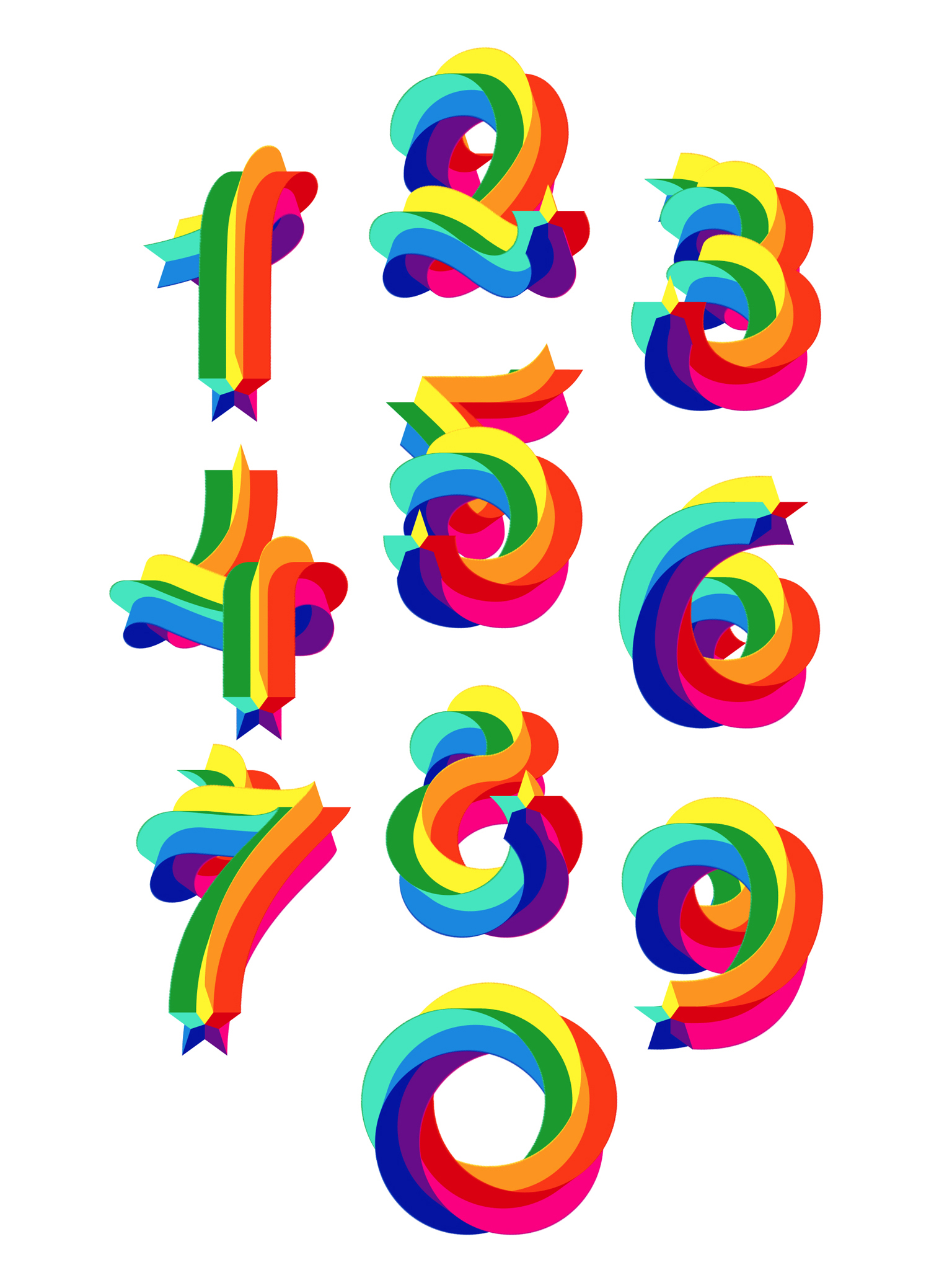
 Marta’s 36 Days of Type collaboration for the special edition ampersands.
What is your favorite typeface? And why?
Mistral is my favorite. It is extremely expressive, intricate, virtuous, yet works perfectly, it solves the technique simulating the handwriting at its perfection while respecting the limitations of the type itself. Those values working together without nulling each other, it is masterful.
Where do you take your typographic/design inspiration from?
From everywhere, from the old neon signs of the streets of LA to the modernist architecture of Barcelona. I like to collect old books too, I have a lot of TDC annuals too which are like little treasures to me. I love to see what was done in the 60’s and 70’s in terms of typography and illustration working together.
What is your all time favorite piece of design?
I can’t tell, there are many favorite pieces in my mind, depending on the field. But on what I do, to say just one piece, I’d say the cover for Kama Sutra from the Classics Deluxe Edition from Penguin Books. Those Illustrations/letters of the bodies are just so perfect, playing with the negative space and the geometric yet expressive shapes. It also makes me think of the timeless alphabet designs of Erté, it is just brilliant.

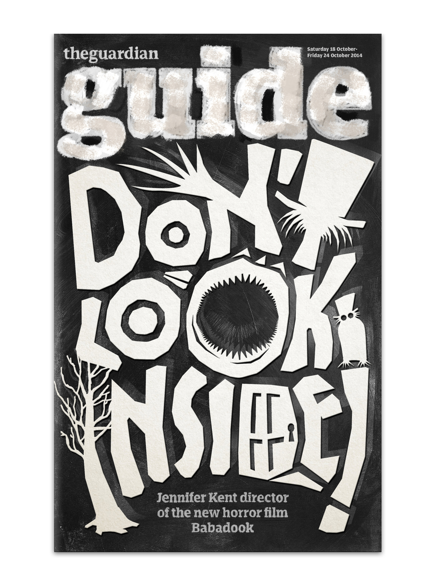
Marta worked with Art Director, Pierre Stravinski, for an Esquire magazine headline.
Where do you see the future in typographic design and typeface design?
I’d say we’ll keep seeing more and more how calligraphy and typography keep hybridizating.
What is your favorite aspect of being a TDC member? / What drew you to become a member of the TDC?
Oh, I thought I was going to move to NY after LA, and the first thing I thought was that I wanted to become a member of the TDC, I felt excited to move there so that I could come to all your events. In the end we moved to Barcelona so I won’t be able to attend much, but I am able to stream, which is great!
Links:
Website: martacerda.com
Behance: MartaCerda
Facebook: MartaCerdaAlimbau
Instagram: @MartaCerda
Twitter: @martacerdaalimb