
You were an art director for Minnesota Public Radio (MPR) for many years. Tell us more about other things you design and how much of your “letterform thinking” directs other design projects?
My interest in letterforms goes way back. By the time I was in high school, I was incorporating lettering into the projects I was doing, like the school paper and yearbook. This continued on through my career as a graphic designer and art director.
At MPR, I naturally looked for opportunities to incorporate lettering. Part of my job was to design promotional materials for A Prairie Home Companion, including audiocassette packages and album covers, so there were lots of opportunities to do lettering. When I was on a deadline, sometimes I would hire it out, but it always just made me frustrated and jealous. The Prairie Home Companion projects lent themselves to using vintage or vernacular letterforms. I’ve always enjoyed working in those design genres. It’s a lot like a magic trick, making something appear old when it’s not. I enjoy illusions of all kinds, and understanding the secrets behind them.
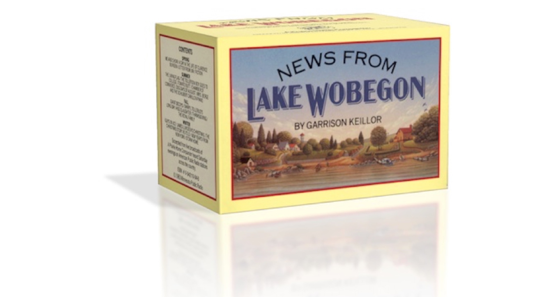 Package that I designed and art directed in 1982, featuring Lake Wobegon lettering. I’m working on a font based on it that I hope to release soon.
I bought Coquette for BUST magazine in 2004. I remember being struck by a feeling of “must have” when I saw it. Did you feel you were on to something when you released that?
That was you? Cool! One of my colleagues alerted me to that and I think I bought a copy. It is special in my mind. It’s a design that seems to have bubbled up from my subconscious almost fully formed, more so than my other typefaces. It’s kind of spooky. I kept thinking it must be something I’d seen before, and it kind of was, but more like an amalgam of things. It grew out of a logo I was working on. The logo went another direction, but I continued to doodle this alphabet obsessively for months after that. I knew I had to turn it into a typeface, and eventually did a few years later. It’s one of my favorites, and I decided recently that I should try to do more like it.
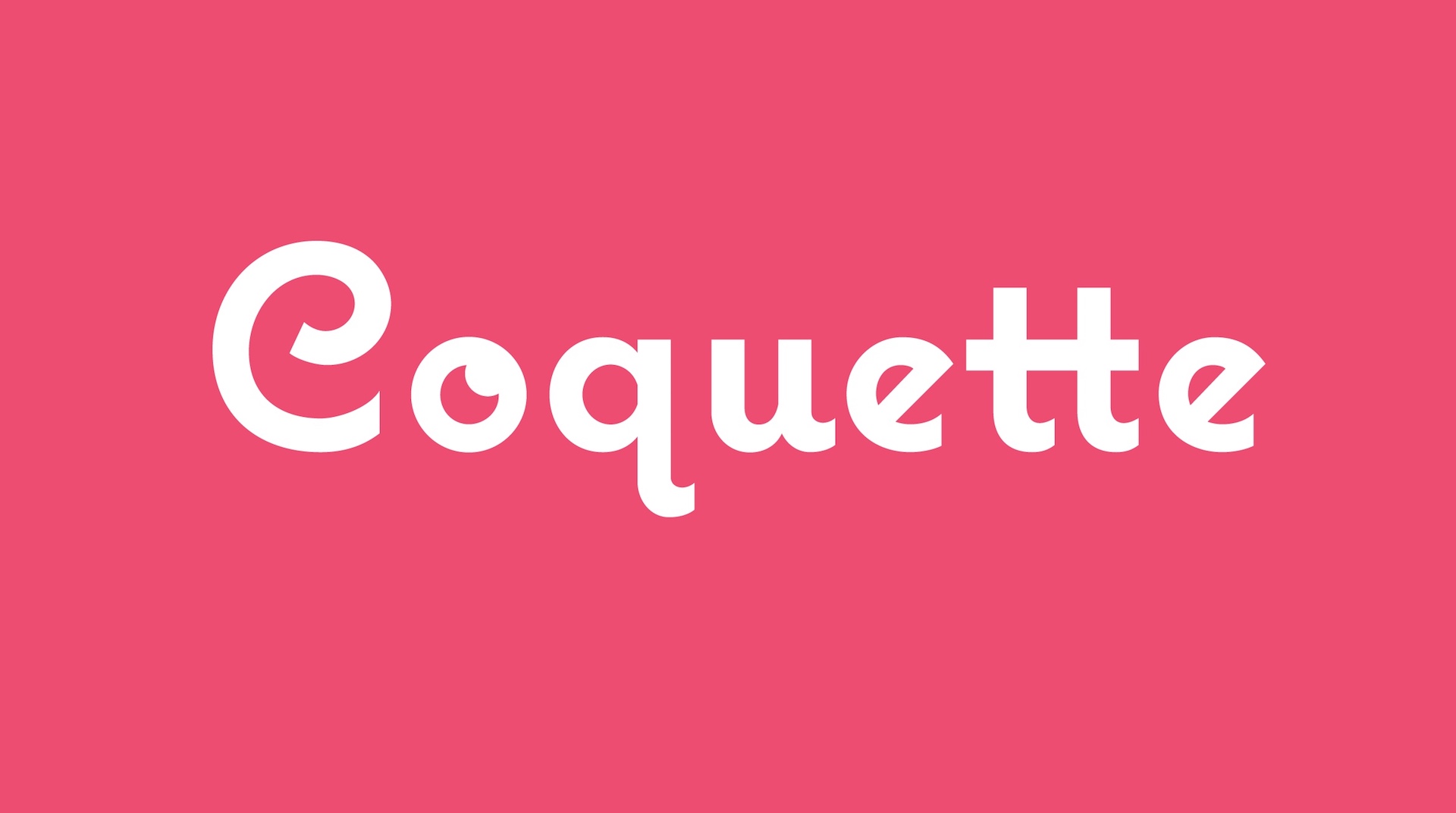 Coquette, designed in 2001.
I read that in the early aughts your partner won substantially on the quiz show, Who Wants to Be a Millionaire? That is crazy! Did you get called as a Lifeline??
I was one of her lifelines -- you could have up to five -- but she called her dad. It didn’t matter because we all knew the answer -- Q: What comedian was known as the king of the one-liners? A: Henny Youngman.
I was sitting in a hotel room with stacks of almanacs and trivia books full of Post-it notes a few blocks from the ABC studios in New York while the show was being taped, and I had no idea what was happening. At one point, they called to inform me that she was “in the hot seat” and to be ready for a call. A little while later, they called to say that she had called one of the others and that I was off the hook. I got the news about her winnings when she came back to the hotel later.
It was a significant stroke of luck for us, although she had done a lot of work to get on to the show and crammed like crazy for about a month to prepare for her appearance once she got booked. Her opportunity came at a point in our lives when we were not doing that well financially. I had quit my full-time position to freelance, and would likely have had to find a full-time job again if we hadn’t gotten this windfall. Instead, I took a break from my freelance work and created three of my most popular typefaces — Anonymous, Mostra, and Coquette. It really jumpstarted my career as a type designer.
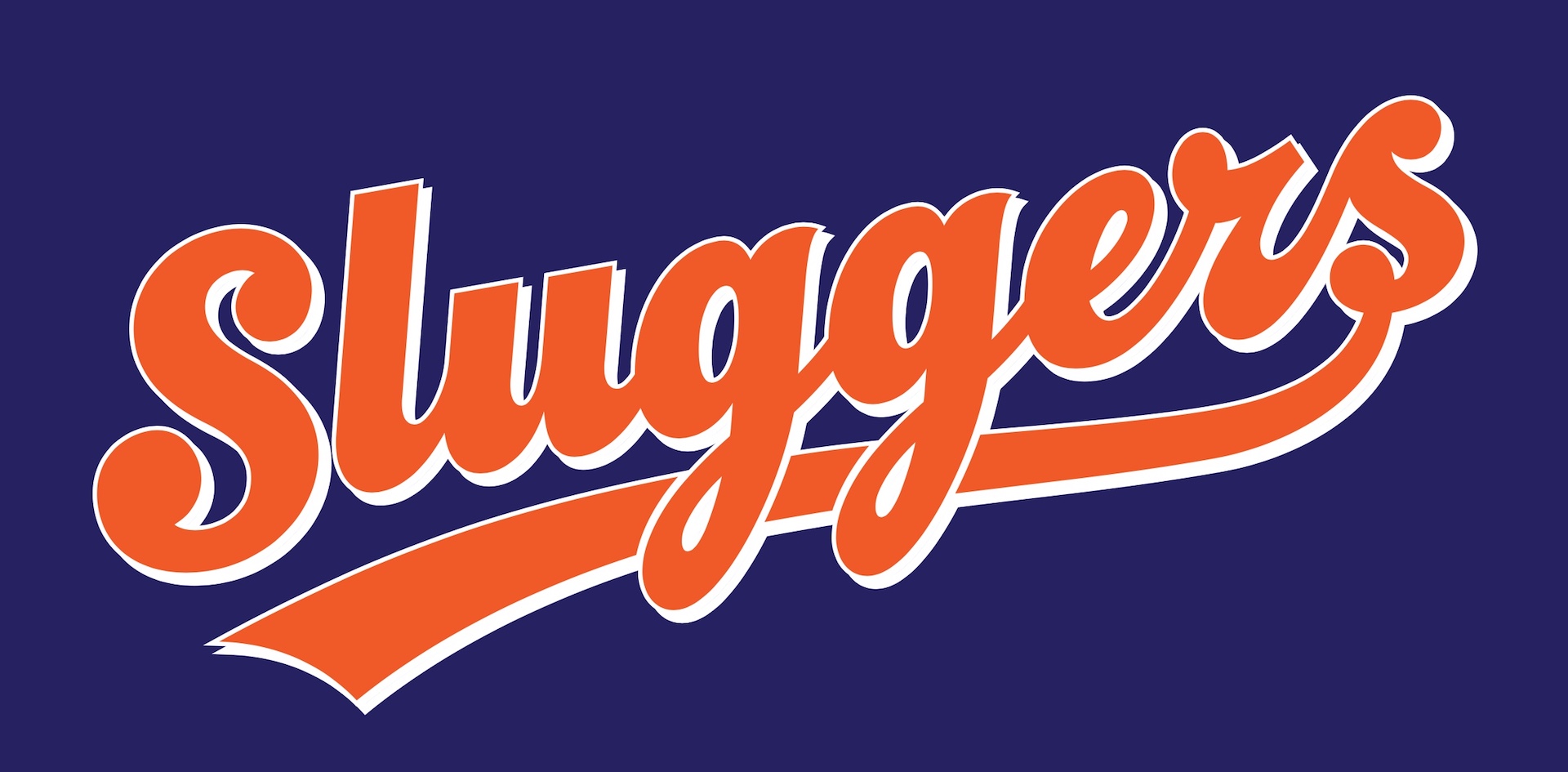 Sluggers was done in 2009 for a series of young adult books published by Simon & Schuster.
I read a quote where you said, “The world around us is not all new or all old, it’s everything all at once. The idea of creating only things that look new and different seems limiting. Anything totally new ends up looking hopelessly dated sooner or later anyway. Very few designs are truly timeless and I don’t know if it’s possible to design something like that intentionally.” Do you think reviving older typefaces, in terms of giving them a life digitally, is important for the development of type designers? Is one of the purposes of digital revivals to contribute to the canon?
I’m not sure about “important”, but many of the old designs still have a lot of appeal, and I enjoy seeing forgotten ideas rediscovered. We probably do not see them the same way as people did when they were new because the context is different. In any case, we can learn a lot from studying and even reviving old designs. The idea that type is progressing toward some sort of ideal state is a myth. Even modernist typefaces have gone out of style and have been revived.
I have done my share of revivals, but stopped doing them a few years ago. It wasn’t because I did not want to see old typefaces revived (I do!). I wanted to focus attention back on my own ideas, which I was neglecting. That said, I don’t think I can escape being influenced by the past.
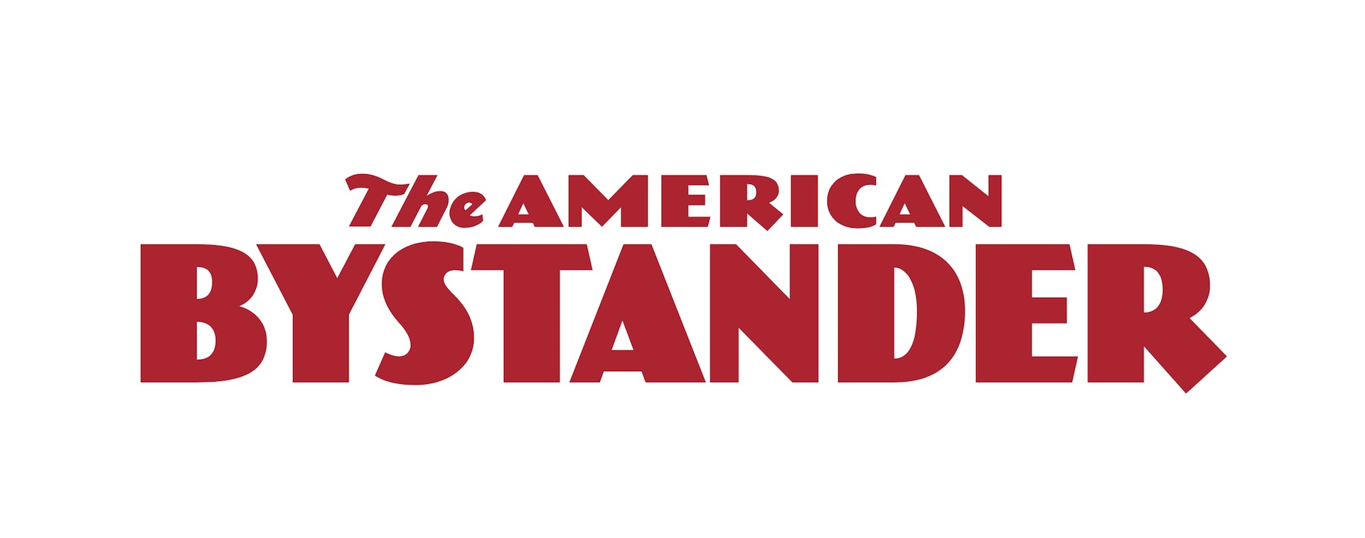 A logo I designed and drew in 2014 for a new national humor magazine.
Mostra makes me want a Campari, stat. That is all.
I’ve been happily surprised with how Mostra and Mostra Nuova have been received in Italy. I felt a little funny about Mostra when I first did it, because it comes straight out of Italy’s Fascist period. I’ve liked that style of lettering as long as I can remember, and I didn’t associate it with any particular political meaning in my mind as an American. At some point, it occurred to me that Italians might be offended by it. Early on, however, I was relieved to receive positive emails about it from Italian designers. Tipoteca Italiana, the type and printing museum in Italy, even uses it on their signage.
Why is it important for you to be a member of the TDC?
Well, getting the TDC annual is worth it by itself, but I think it’s a fantastic organization to be part of for anyone who takes type and typography seriously. I’m very happy to help keep it going.
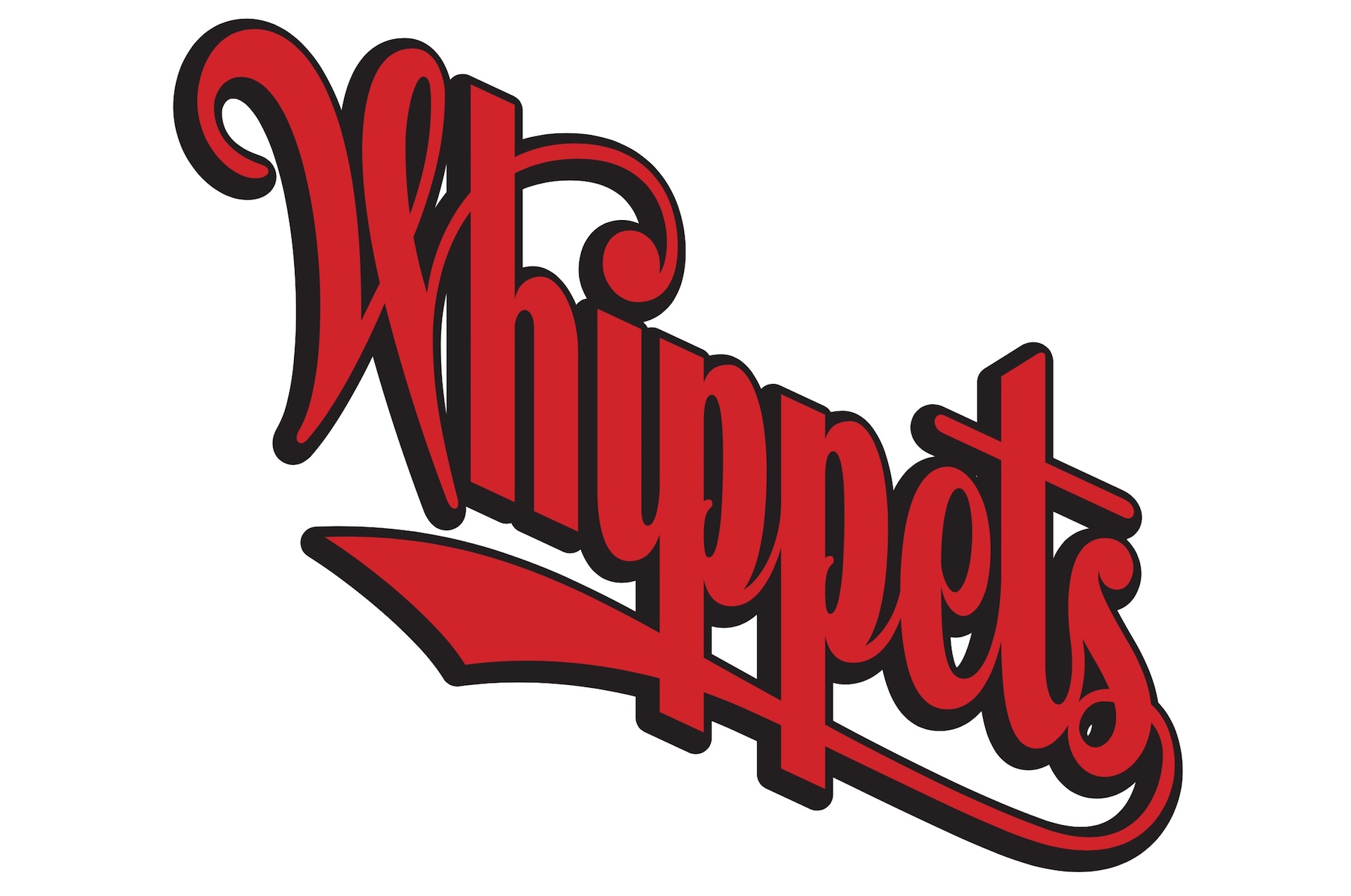 Lettering done in 1984 for A Prairie Home Companion. The Lake Wobegon Whippets were a perennially losing baseball team, so the script goes down instead of up.
Links:
Website: https://www.marksimonson.com/
Twitter: @marksimonson