To celebrate our talented and diverse membership, the TDC is profiling one member each month. We’re asking members the same five questions that will hopefully let us – and you – get to know them better. This month Kevin Cantrell discusses his biggest influences and his sweet design spot…
Tell us a little bit about yourself – what you do and where you work
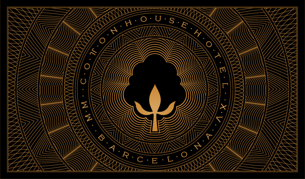
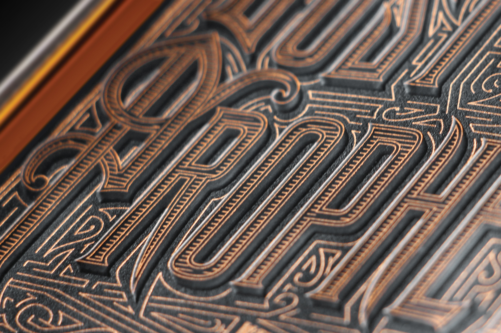
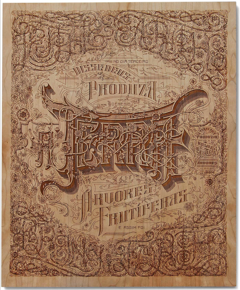
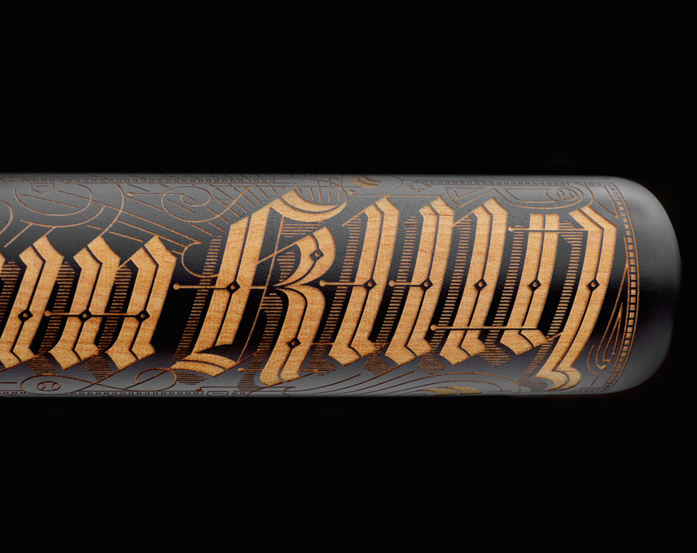
I do a lot of everything. I design typefaces, do custom lettering for branding applications, books, packaging, editorial covers and features, design web sites and digital applications, brand strategy and naming. My sweet spot would be elegant branding with a typographic emphasis. I work in my studio at home in Salt Lake City, Utah. I’d say I’m a type nerd … but I’m not very good at recognizing fonts at all … just if it sucks or not.
What is your favorite typeface? And why?
Really this changes depending on the project I’m working on. Right now I really love Harriet by Okay Type (which is quite a bit better than “okay”). It has a really great range from display to text weights, is a beautiful contemporary take on classically inspired features. Typically I lean sans serif like Univers for it’s immensely broad application and craft, but I’ll go with Harriet today. I tend to admire fonts that I find incredibly hard to execute. Obsidian by Hoefler is really spectacular.
Where do you take your typographic/design inspiration from?
Everything really. I love fantasy and really view fantasy as an extension of branding. You’re creating a world comprised of voice, experience, and imagery (though imagery in more of a written form) and I find inspiration for branding in such worlds and even broader meaning from great stories with prodigious depth. I love reading in general. Period movies really get me and even classical music. Nature. My kids and family. Great work from people I admire. Inspiration comes in all shapes and sizes and isn’t limited to my field of expertise.
What is your all time favorite piece of design?
I have a pretty broad range of work I covet, but one that has been the most influential in my career would have to be the Sanborn insurance map series … which is probably a given seeing my work. The typography and composition are just spectacular; the fact that it was executed by hand makes it even more so. It really became a turning point in my career when I saw the series, where I can’t say, with specificity, the same about any other piece I truly admire.
Where do you see the future in typographic design and typeface design?
Customizability and modularity. Typography is really beyond the functional phase and is becoming a powerful tool of expression. It’s just a given that it has to function. Yet powerful brands and even more corporate ones are realizing the power of the silent yet loud voice of type design and lettering. In a world veering from corporate and molded, the authenticity behind the primordial method of communication is exponentially growing in value. The audience is becoming more informed and nuanced in taste. By all means, let’s satiate the growing appetite for the exceptional.
What is your favorite aspect of being a TDC member? / What drew you to become a member of the TDC?
I spent years trying to get a piece into the Type Directors Club. I won’t lie, I still feel I’ve had a rejected piece or two that deserved recognition (I know, how dramatic); however, every year I was rejected, I rose my level of craft and commitment. I looked at the TDC as a bar of excellence and it really elevated my work. There is no competition where the bar of excellence is as universally inspiring as the TDC. Perhaps it’s my affinity for typography, perhaps it’s the sweetness of getting in after years of disappointment, but I still look at the TDC as the bar for typographic excellence; not only in honoring exceptionally crafted traditional letterforms, but also typography that pushes us to the future and changes the way we see and interact with the world. Being a member of such an organization feels like a natural extension of what I do and a way to honor and support my craft on a broader scale.
Links:
Website: kevincantrell.com
Facebook: kevinrcantrell
Instagram: @kevincantrelldesign
Twitter: @kevinrcantrell