Editorial Designer Jeanette Abbink runs the design studio, Rational Beauty, in Austin, Texas. Abbink and ECS spoke on the phone during Quarantine about life in limbo, complex systems, and her TDC-award-winning work for Pan and the Dream.
It’s been so difficult to focus. I don’t know about you.
Yes, of course. And I just know how dense New York City is. I’m sure you’re having a really difficult time.
We’re a little squirrely. It’s just kind of really, eerily quiet… You just moved to Austin about six months ago, right?
Yeah, we moved here six months ago. Mike works for IBM on the brand and design team so they have a big presence in Austin, and we were just ready for a new adventure, you know. We had been living in New York for 15 years and just wanted to do this and mix it up. Most of my work is editorial. I spoke with all my clients and no one seemed to care that I was moving to Austin. Some people were jealous, they want to come have tacos with me! That’s the beauty of being a graphic designer. You can maintain your relationships and — as we are learning today — you can be social with technology and stay connected. I always wanted to live somewhere new every 10 years — I haven’t really been able to do that, but I lived in San Francisco for 15 years and in New York 15.
When I was younger, I seemed to think that maybe I could just work for a year, travel for a year. But it doesn’t really work that way as you get older.
But I like that idea, right? Because now I’m living here in Austin, with all this expanse of space. It’s inspiring for your design output. In New York, I was sponging a lot — there’s just so much going at you all the time. There are so many people, there’s no place like it. So I’m so happy I had the opportunity to live there. And now I feel like I’m processing it. With technology, if I want to go and look at something from the Met archive, I can go and look it up. Whereas in New York, I was always a little overwhelmed, or not overwhelmed, but super-saturated. It’s been kind of cool for me to be able to process many years of work, especially with shelter-in-place. You have a lot of time on your hands.
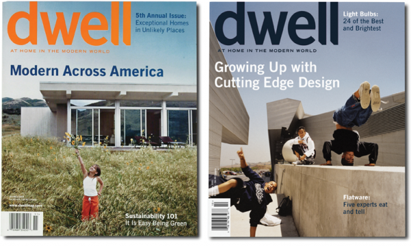
You were the founding creative director of dwell. Did you come into that role with a particular sensibility already for interiors?
I’ve always loved design, obviously, which seems like a very simple answer, but I’ve always had a huge appetite for it. I had been working on the redesign of BP at the time at Landor in San Francisco, so when I was asked to be the design lead on dwell, I jumped at that chance, to go in and learn more about design and architecture. Karrie Jacobs was the Editor-in-Chief and I had read a lot of her work and just wanted to work with her. San Francisco is not known for having a lot of cultural projects; it’s a tech city. So that was just like a dream job. Lara Hedberg Deam, the founder is this very curious, amazing person, and she created this environment for us to kind of explore dwellings.
I love talking to editorial designers because their relationship with typography is so intimate. Like, the practice really tests type in all its sizes and systems of hierarchy. And I wondered about what your approach is to developing those typographic systems?
It’s a good question—that’s one of the main things that I think about. First, I read the content and listen to the editors and do a lot of reading to try to understand the vibe of the publication. Be it friendly, serious, academic, mainstream — get a sense from it. Then I start interpreting it, what kinds of type should we use, and the complexity of the editorial. Some editors want things very simple—one idea. Some editors want multiple conversations going on on the same page. So you have to develop more of a complex grid system for those types of publications. Those are mainly magazines; books are simpler, but have their own challenges.
Then I start looking for typefaces that can do the hard work of the hierarchy and the structure, but also have a bit of flavor. I tend to go to the more classic typefaces and stay away from really expressive typefaces because it has to be legible and readable and I don’t want the type to get in the way of the content. And I also am a designer, right? So I love composition, and moving it all around, and if I want to use a classic typeface but I want it to be edgy, I let it be expressive in layout. I really seem to gravitate toward revivals and just really well-constructed typefaces that have multiple cuts and weights…to me, they’re beautiful.
There’s that notion that there are fonts that do the work for you. And then fonts that are ready for you to put them to work.
That’s exactly right. You said that much better than me.
It’s Commercial Type, actually — they’ve said they categorize type like that.
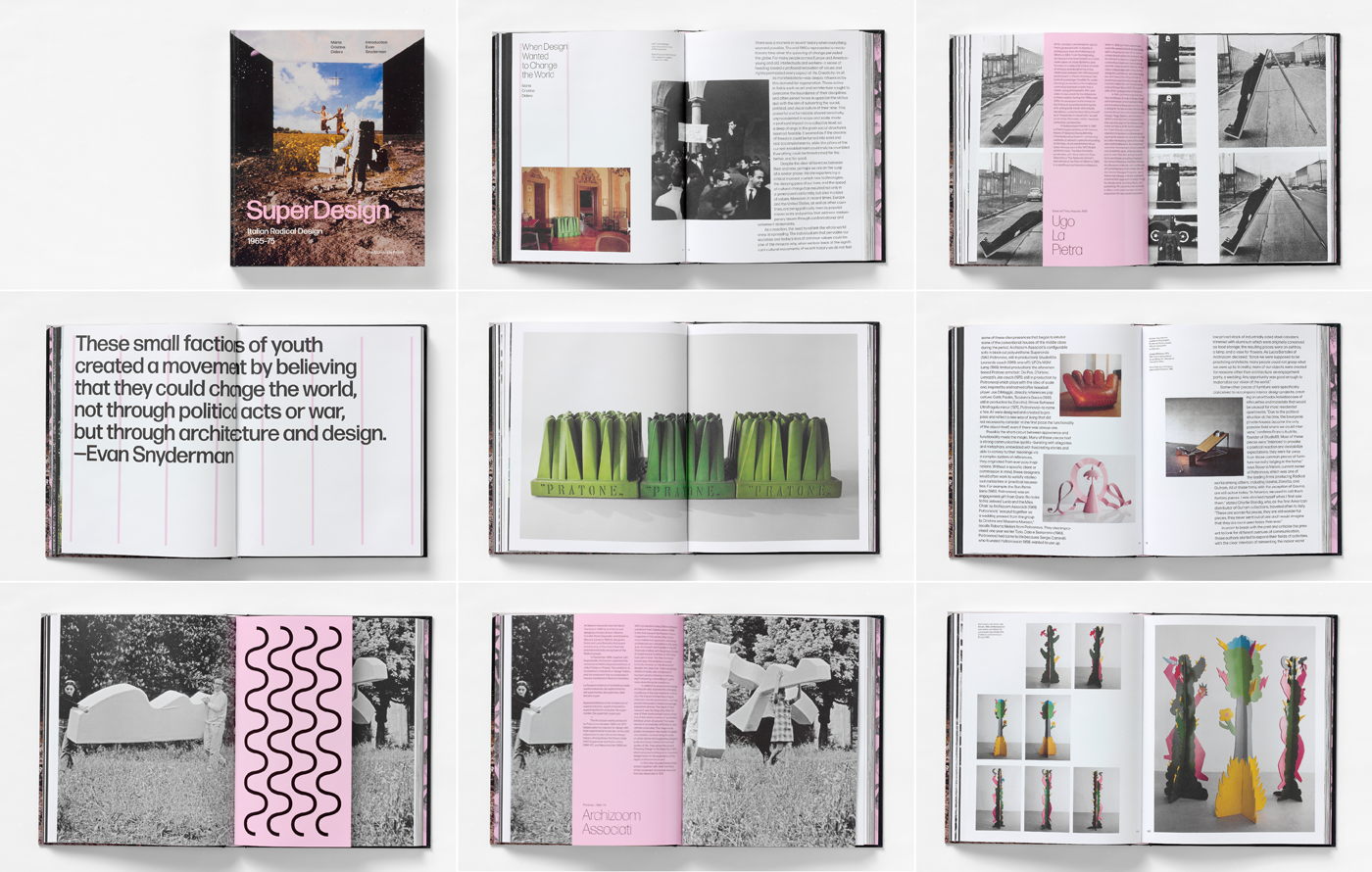
I love Christian Schwartz, that’s the other thing that I have. I know this incredible network of type designers and I’ll be like, you know, I’m looking for this kind of feeling. And then they will say, “Oh, you should look at, you know, Forma — when I did SuperDesign. I love that!
Christian Schwartz, Paul van der Laan, Erik Spiekermann, and my husband Mike — they look at thousands and thousands of letterforms. And I’ve never ingested that, I’ve never looked at that many. But I know that they have and it’s just kind of like, cool to tap into their expertise. So that’s another thing that I really enjoy, is working with font designers. Not that I work with them, but you know, get their opinion. I’ve never had the luxury of having a font designed specifically for a publication.
There’s still time!
Never the budget! You’re just lucky to get the budget sometimes to pay licensing fees. Publishing is just so strict, the budgets are so low, but that’s the path that I chose. Sometimes I think I wish I was in advertising.
That’s a double edged sword, isn’t it?
Yeah, yeah, for sure. Though I love what I do.
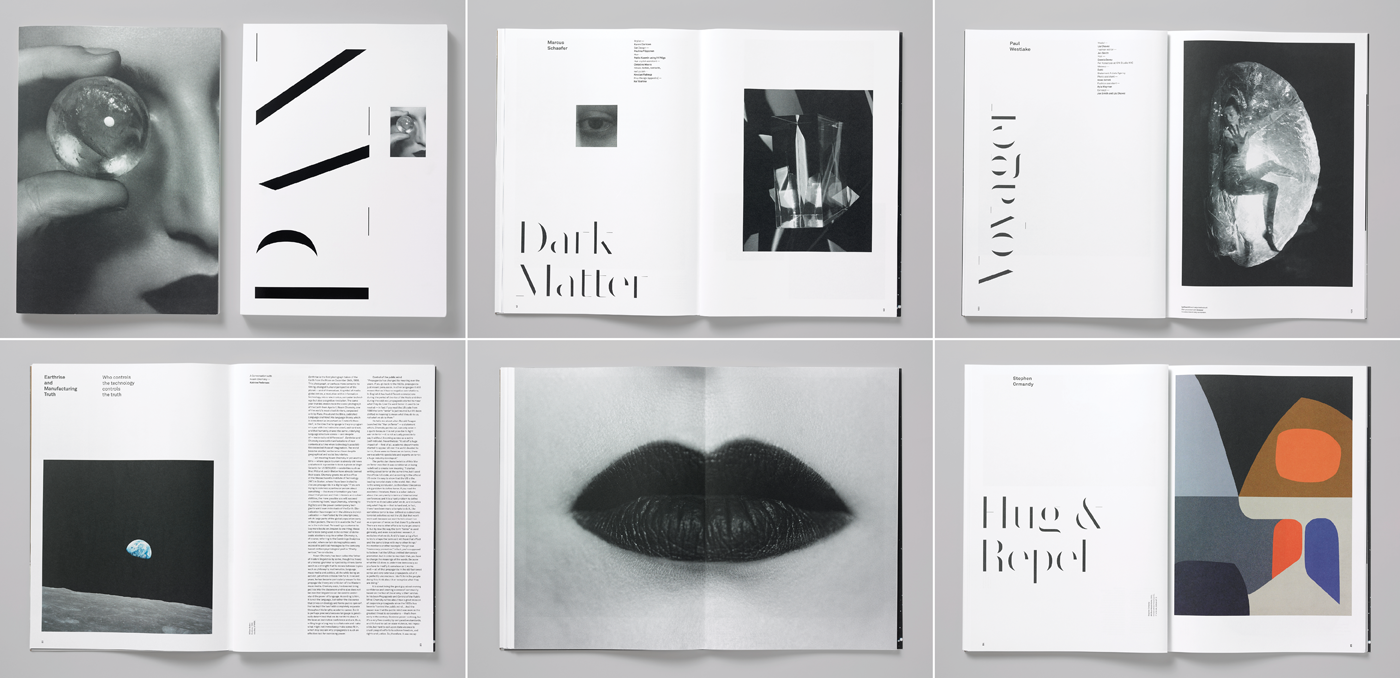
Well, what you’ve been able to make is so beautiful. I wanted to ask specifically about this magazine that you’ve made, Pan and the Dream. Where did that start off?
I was teaching Publication Design at Parsons, and one semester, I decided to look at independent publications, because I was just so burned out with mainstream publishing. And I had covered it, so this time I decided to go deep into indie publications and Pan and the Dream surfaced. So I contacted the editor, Nathalie Agussol, and wanted her to come into the class and I just kind of fell in love with her format and her thinking about subjects. So then she asked me to take on the second and third issues after the original designer wasn’t able to take them on.
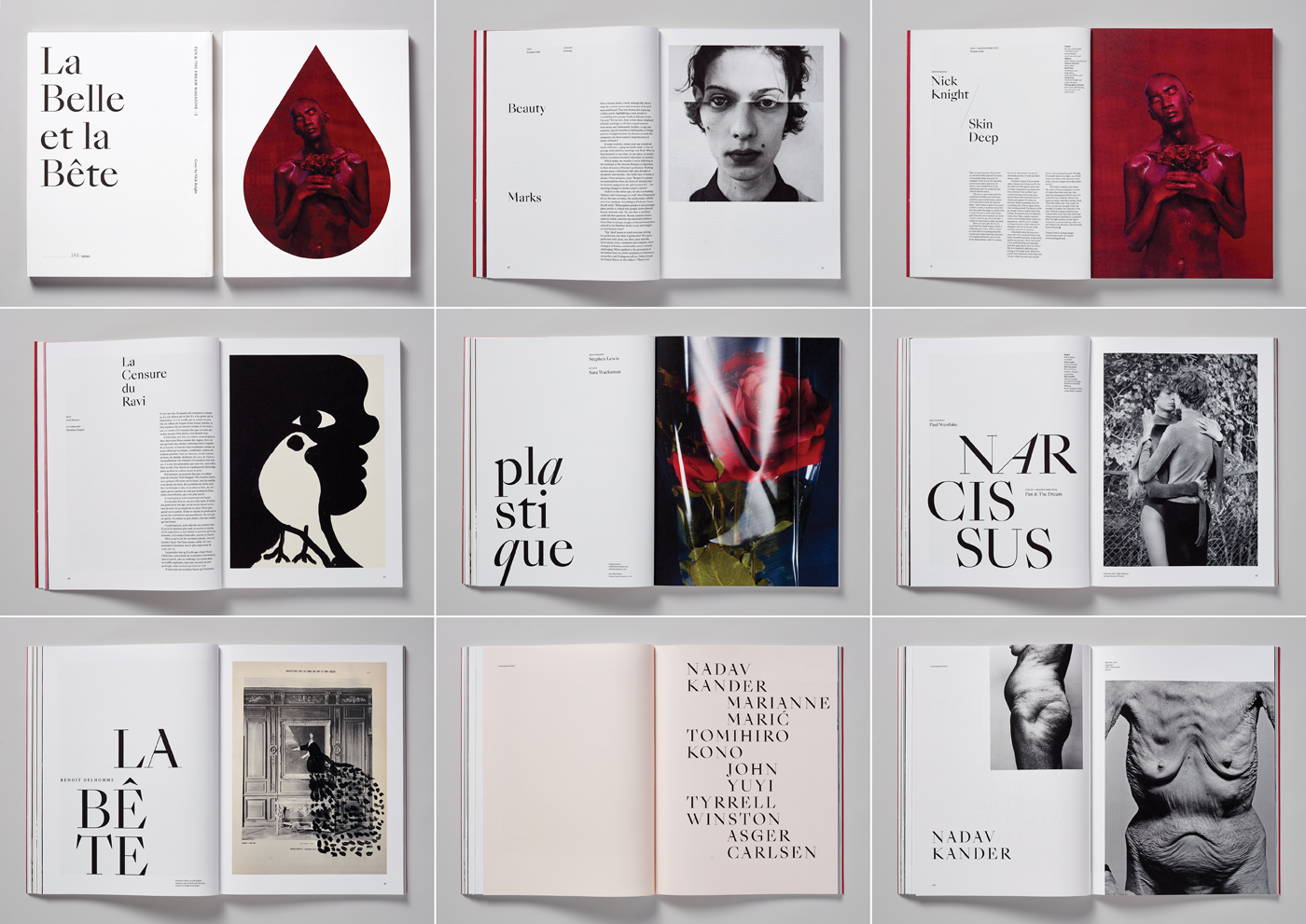
I love working on it because they’re big formats. She’s got an incredible vision and she knows a lot of creative people who want to contribute, so the caliber of the work — from Nadav Kander to Nick Knight — these are amazing people. I also like that these two I’ve done are two different sizes, and different fonts, so I’m able to explore. Whereas typically in magazines, you have your grid and your font family and it just kind of plays out issue after issue. With this one, I’m able to take all of the experience that I have and make them different, plus it’s only coming out one time a year. It’s a little easier than something someone would have to do every month. If I had to do this every month there’s no way I could do the kind of work that I do for Pan.
The first issue was on beauty, and it was based off of Beauty and the Beast from Jean Cocteau. Typographically I went for Sang Bleu. I loved it. I chose Empire for the headlines and Republic was the body text.
Beyond typography, you mentioned working with Nick Knight and other amazing photographers, as you’re also an acclaimed art director. What’s your process when it comes to the photography of spaces?
For Pan and the Dream, the content is already developed. I’m very much a design director, stitching the magazine together. Natalie is kind of doing that and she gives them a lot of play—she just wants it to be original content. I did do a lot of art direction on dwell. I was working with Maren Levinson, the photo editor and we wanted to celebrate the editorial because Karrie Jacobs wanted it to be more friendly, more humanistic. And so we wanted to work with portrait photographers to go in and shoot a portrait of a house; we wanted to stay away from architectural photography. We would kind of give them a storyline.
But you know, people began to be more open to design and obviously, people know more about design today than they did in 2000. dwell was at the beginning of explaining prefab and green design. Could a building really help the environment? I mean, these are things that we’re talking about today, but when we were doing it, it wasn’t readily available to consumers. So it was cool to see that. wallpaper was out, which was very beautiful and seductive and sexy. And dwell was not, I wouldn’t say we were the sexy one. But we were smart, and fun and, really tried to carve out new visual material for design in photography. And sometimes we were really successful and sometimes we weren’t, you know, when I look back at it, I’m like, wow, thank goodness we had another issue to go to. But that’s what happens when you’re trying to create new content.
I worked at Esprit and I was around a lot of really good art directors. But I feel like I’ve always been more of a design person, and less an art director because it’s just not something that I do a lot of.
Yeah. I did a project in school on Esprit.
Really!
I was really fascinated by them approaching a clothing brand with a design system in mind.
Yeah, I love it. It was one of my first jobs.
Your projects seem to have deep systems built into them. Do you find yourself more attracted to things that are complex?
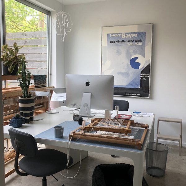
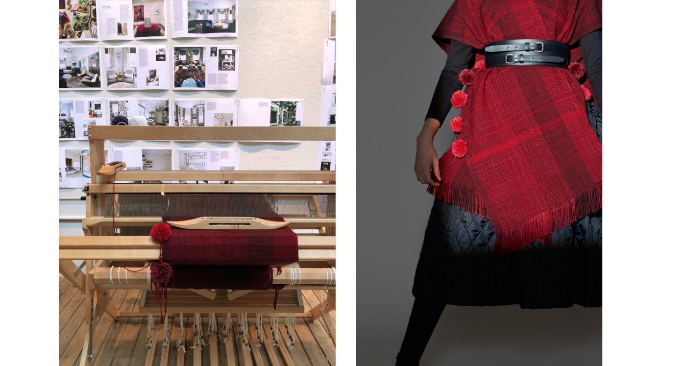
Yes, I love setting up systems to let creativity flower out of it. In the last five or six years, I’ve been taking up weaving, so I have a floor loom and I love engineering it, programming it and then when I start making stuff, it’s not what I had in my head, because of the nature of making it; it’s the same with design. You set up the program and then you think, wow, I didn’t even think that was a possibility. I actually like that. Sometimes, the system doesn’t give a beautiful layout right when you look at it, but it still works holistically.
Yeah, I’m very attracted to systems. I kind of believe in them. I’m sure a lot of people can relate to that. I think there’s a lot of creativity. It’s the color and the shape of the font and the movement on the page and how it works from one page to the other. There’s so much rhythm that begins to happen. As a small child, I played music, so I am very interested in structure and musical forms. And I think it’s just been the way I’ve developed as a creative person. I don’t want to sit down and do a crazy poster…It wouldn’t satisfy me, even though I love posters, I think they’re beautiful and people who do them are amazing. But I wouldn’t want to do them. For some reason, I’m more interested in complex systems.