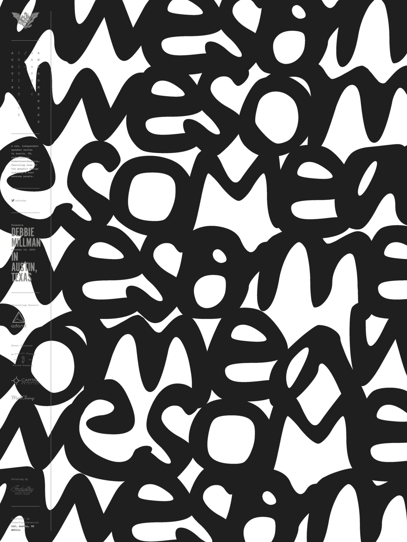
To celebrate our talented and diverse membership, the TDC is profiling one member each month. We’re asking members the same five questions that will hopefully let us – and you – get to know them better. This month we selected the multi talented author-educator-designer-brand strategist-podcastcaster, Debbie Millman!
Tell us a little bit about yourself – what you do and where you work
I am a writer, designer, illustrator, brand strategist, educator, host of the Cooper-Hewitt award winning podcast Design Matters and CMO of Sterling Brands. I recently became the Editorial and Creative Director at Print Magazine, which is a dream come true. I am working with editor-in-chief Zachary Petit to rethink the magazine. It is an amazing opportunity that really puts all of my skills to use. I just started my sixth year as Chair of the first ever Masters Degree in Branding at the School of Visual Arts and I am working on writing my seventh book. I am also helping Mariska Hargitay (star of Law & Order SVU) and Maile Zambuto develop the communications strategy for The Joyful Heart Foundation, one of the most important organizations helping to eradicate sexual assault, domestic violence and child abuse.
I do a lot of different things, and that is the way I like it.
I graduated college in 1983; this is my thirty-second year as a professional practitioner of design. My first ten years after college were experiments in rejection and despair. I knew that I wanted to do something special but, frankly, I didn’t have the guts to do anything special. When I graduated, I didn’t feel confident enough, optimistic enough, or hopeful enough to believe that I could get what I really wanted. I wasn’t living what I would consider to be my highest self—in fact, I was probably living my most fearful self.
My first job was creating rudimentary paste-up and layouts for a cable magazine—fairly old school stuff. But I learned how to use a rapidiograph, cut ruby lithe and create killer mechanicals. After that, I worked as a designer for a real estate company, which was the worst job I’ve had in my career. I quit in despair after a year and started my own little business with a partner. This might have seemed like a fearless thing to do, but I wouldn’t say that the work we were doing warranted that description. It was the mid to late 1980s and back then, there was a big, powerful design scene happening in New York. I felt like I wasn’t contributing anything meaningful and was in awe of designers who I thought were indeed making a difference: Tibor Kalman, Emily Oberman, Steven Doyle, Bill Drenttel and Paula Scher. My work at the time felt very feeble in comparison.
In 1992, I got divorced, quit my job, and moved out of my apartment—all within a few months of each other. I was apartment-less, unemployed, single and had just turned 30 years old, which was really difficult. I slowly started to pull the pieces of my life back together and I’ve spent the last 20+ years trying to build a life and a career that I love. But the entire experience has been one thing leading to another, leading to another, and then another. It has been completely circuitous and mostly unplanned.
This last year has been one of the most challenging since 1992. I moved out of the home I lived in for 21 years, my Dad suddenly and unexpectedly died, I changed my role at Sterling Brands (where I’ve worked for 20 years) and I went through a break-up. But I know that many of these changes are helping me set the foundation for the next big chapter of my life, and now that some time has passed I am beginning to get excited about the new and unexpected possibilities popping up.
What is your favorite typeface? And why?
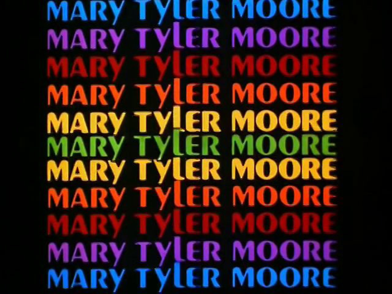
I have a silly favorite typeface; it is Peignot. It was the headline font I used in college at the student newspaper, which is where I first learned about design. AND (as importantly) it was the centerpiece of the opening of one of the greatest sitcoms of all time, The Mary Tyler Moore Show. According to the Museum of Broadcasting, the show was a revolutionary breakthrough, and featured Mary Richards as the first never-married, independent career woman as the central character. As Mary Richards, a single woman in her thirties, Moore presented a character different from other single TV women of the time. She was not widowed or divorced or seeking a man to support her.
Where do you take your typographic/design inspiration from?
I find inspiration in many things and many people. They include but are not limited to the following: cosmology, the music of Ben Webster, the poetry of Charles Olson, James Joyce’s Ulysses, Laurence Sterne’s Tristram Shandy, the magnificent, magical faces of my niece and nephew, my dogs Scruffy and Duff, Law & Order SVU, Steven Heller, movies of all kinds, great theater, street signs, museums, supermarkets, libraries, and so on and so on and so on…
What is your all time favorite piece of design?
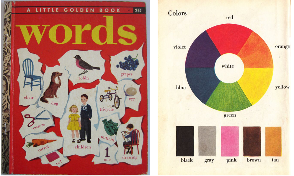
My favorite piece of design is the book The Little Golden Book of Words. It was written in 1948 by Selma Lola Chambers. It is one of the first books I ever remember reading. As an adult, I remembered it having little scraps of paper on the cover, with different illustrations of pets and fruit and somehow, I remembered a carrot. I thought the book was about art, as the main image I had in my head was a simply, yet profoundly rendered color wheel. Long before eBay, I searched for this book in NYC Flea Markets and finally found it. But it wasn’t a book about art, ironically enough, it is called “Words.” And the color wheel was still there! The entire book is magical and perfect.
Where do you see the future in typographic design and typeface design?
OMG I so don’t know. If I did, I’d be a gazillionaire. I often say that I am not a futurist; I am more of an analyst. I love to deconstruct and make sense of the conditions that led us to where we are right now in time. But I have absolutely no idea what the future has in store for anything, other than the supermarket. The traditional supermarket as we know it is dying. But that’s another article entirely!
What is your favorite aspect of being a TDC member? / What drew you to become a member of the TDC?
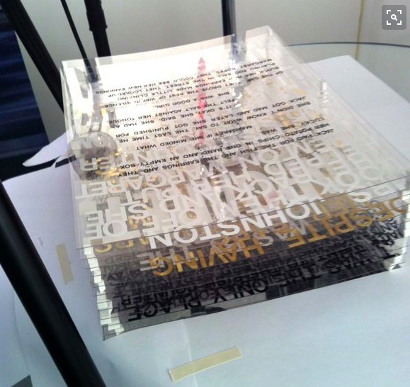
I love being a TDC member because I simply love EVERYTHING about type and typography. I love thinking about typography, talking about typography, collecting ANYTHING and everything with type or text on it (and man, you should see my collection!) and living with typography. Being part of the TDC makes me feel more normal about my obsession and I love being surrounded by like-minded practitioners and aficionados. Oh and I love the current President of the TDC Matteo Bologna. I do whatever he tells me to do.