Each of our 2019 Ascenders spoke with us about their design inspirations and work. Here is our interview with Chicago typeface and graphic designer Greg Shutters.
What schools did you attend?
I went to Marquette University in Milwaukee, Wisconsin for my undergraduate degree. I graduated with a degree in broadcast communications, but during my junior year, I decided to pursue a career in graphic design, and took some additional classes at the Milwaukee Institute of Art & Design (MIAD). By the time I graduated, I had become more fascinated with the intricacies of type design in particular, so I began to teach myself the principles and tools of typeface design using various online resources. After learning the basics on my own, I attended and graduated from the Type@Cooper Extended Program in New York in 2014.
Did you have a teacher, past employer, client, or colleague who was instrumental in your career?
My very first paid graphic design job — designing ads for local businesses in my college newspaper — was extremely instrumental, in a weird way. We had nothing in the way of a font budget, and my boss advised us to pull typefaces from free font websites. I knew most of them weren’t very good, but I became curious as to why they weren’t very good, and that started me down the path to learning about the process of designing a typeface, what qualities affected readability, and so on. Soon enough, I was starting to draw typefaces of my own (which at this point were also not very good).
Further into my career, Jesse Ragan, Sasha Tochilovsky, Cara Di Edwardo, and everybody at Type@Cooper taught me so much more about type — best practices in drawing and point placement, type history, the origins of letterforms, proportions — than I ever could have learned on my own.
Did they have any specific advice/words of wisdom that you remember?
My biggest takeaway, of many, from my time in the Type@Cooper program is the importance of good spacing. It had been something I’d always sort of known, but the practices that I learned there on how to set sidebearings really clicked.
Typeface design.
Which of your design projects are your favorites? Why?
This isn’t even a completed project yet, but so far my favorite design project I’ve worked on is a typeface I’ve been tooling around with that’s based on the early 20th century mosaic lettering found in the New York City Subway. I lived in New York from 2011-2015 and those signs always grabbed my attention.
The lettering on them — the seriffed letters that were used in stations built from about 1908-27 — have this sturdy elegance to them, and feel more related to painted sign lettering from the period than any type, historic or modern. The challenge is, of course, taking a vague style of lettering that differed from sign to sign and turning it into a functioning typeface that works in modern usage without losing its soul. I’ve been working on it off and on since 2011, and it looks nothing like how it did when I started, but it is probably my favorite thing I’ve worked on in my professional life.
What's your worst design experience and project? Why?
I don’t think I have one specific worst experience, but I worked a few contract jobs for in-house design teams where the design process seemed more factory-like than creative. For a lot of “production” design jobs this approach is probably necessary, but the teams I worked for seemed very passive-aggressive and were not interested in hearing any ideas on how to improve processes or quality of the work. I’ve also worked in environments in which the tools I use, or how I use them, or how many keyboard shortcuts I have memorized, seem more important than the end product.
Where do you work now? In a studio, independent, other? What’s a typical workday like?
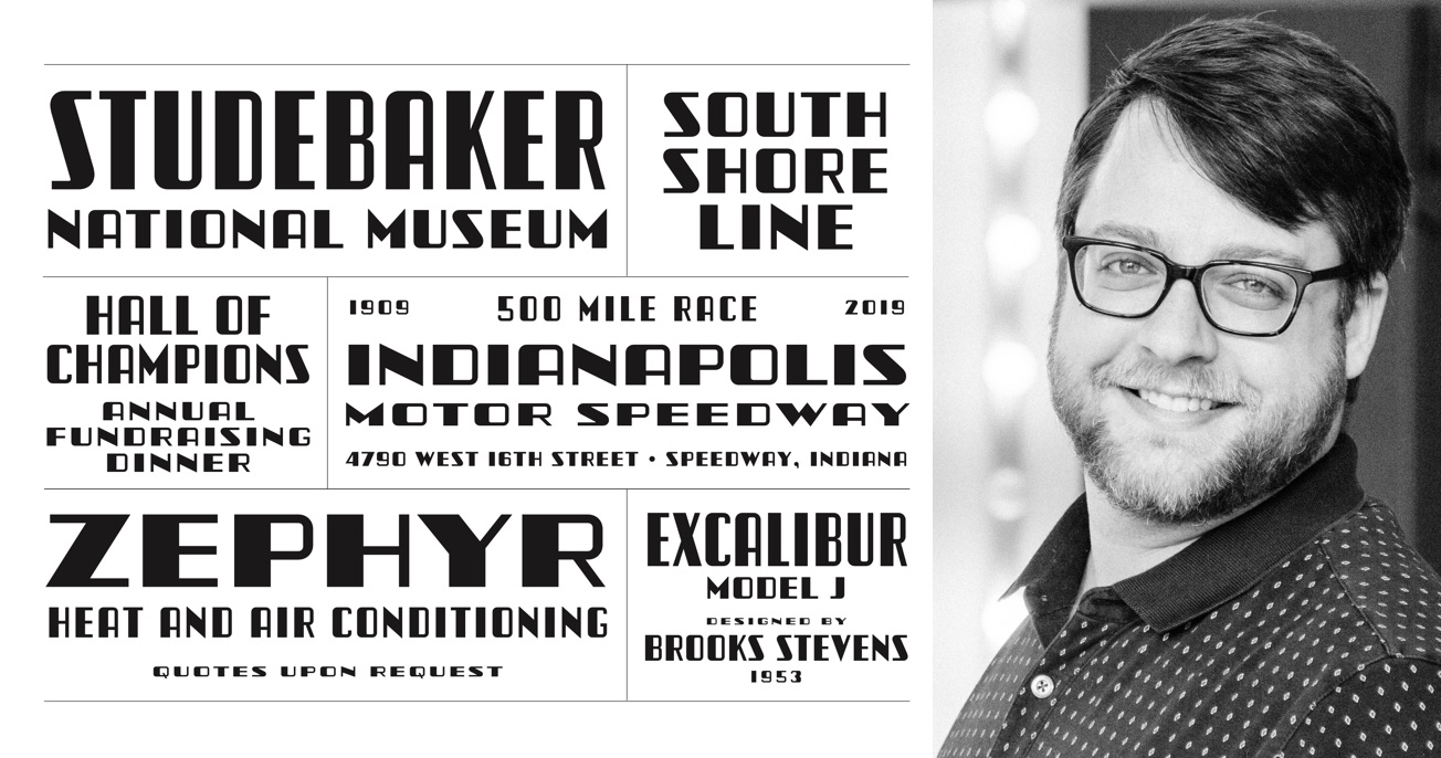
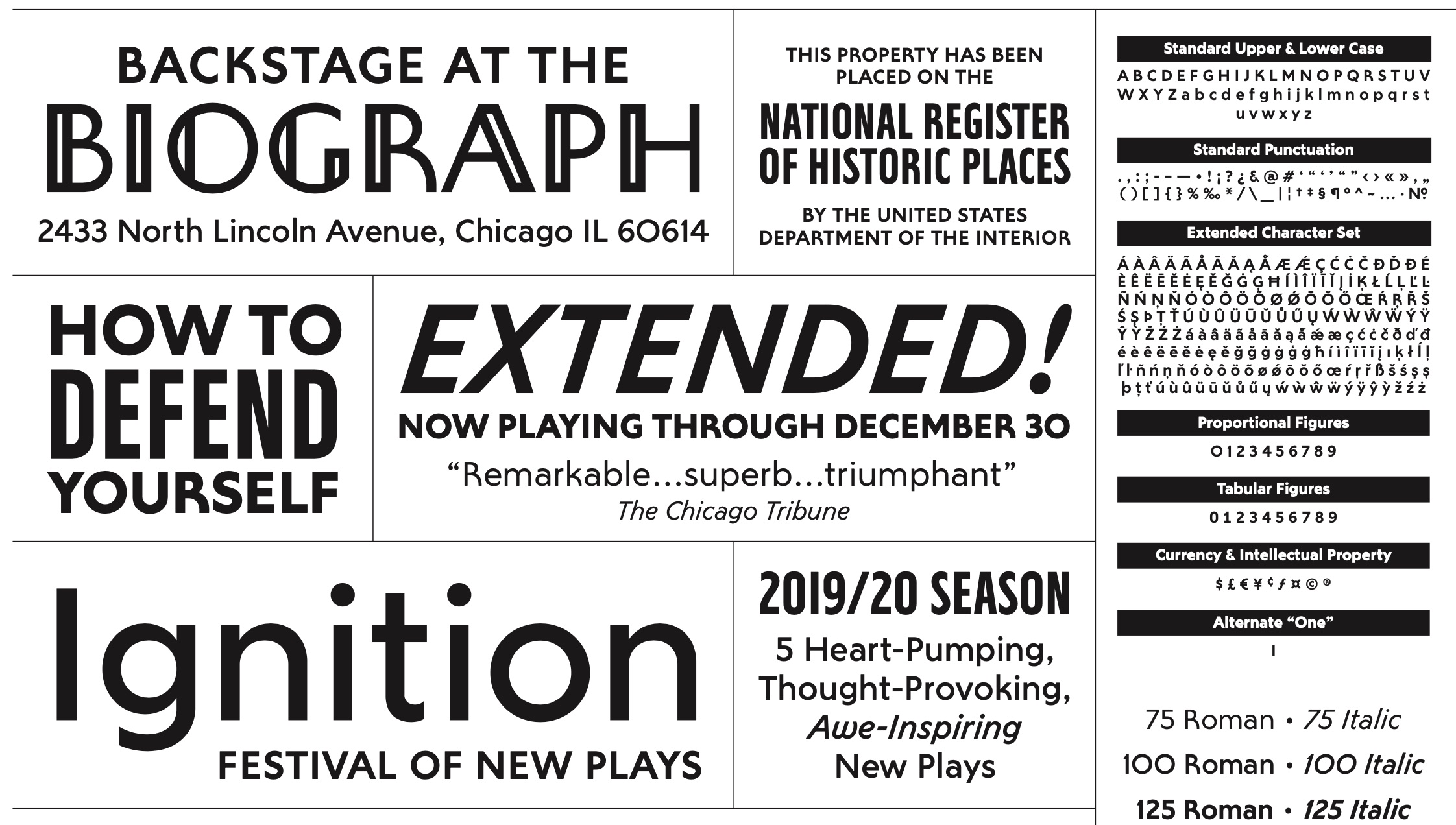
At the moment I work full-time as an in-house graphic designer at a regional theater in Chicago. Most of my work there consists of making simple layouts for print and web ads, program booklets, show posters, and so on. Outside, I continue to pursue my typeface designs for commercial release. As of now, I have five full type families commercially available through my personal type studio Typetanic, some of which have been used by such high-profile clients as NBC Universal, Major League Baseball, and BuzzFeed. In addition, I have several other typeface designs in various stages of completion. Ideally in the future, I’d like to work on my type designs and lettering on a more full-time basis.
Lettering.
What are your hobbies besides typography or design?
I have always been enamored with transportation, particularly vintage or historic modes of travel — old cars, ocean liners, trains — many of which have inspired my designs. I’m also a fairly accomplished “home mixologist”, and have even released a few cocktail recipes alongside my font releases. Additionally, I do some amateur photography (appropriately enough for somebody named “Shutters”), using digital, 35mm, and medium-format film cameras.
Do you know any of the other Ascenders personally? If yes, whom ?
I do not know any of the 2019 Ascenders personally, but am incredibly honored to be included among them and their incredible work. Of the 2018 Ascenders, I briefly met Juan Carlos Pagan and Kevin Cantrell at the TDC60 opening at Cooper Union in 2014, both of whose work I also really admire.
Do you have any favorite designers and/or artists? Who are they?
I particularly tend to appreciate the work of designers who successfully adapt traditional or historic lettering styles into digital typefaces and lettering for modern use. I absolutely love Louise Fili’s work. Everything that she and her studio have done has a spectacular attention to detail and a visual interest that is increasingly rare in this age of the nondescript geometric tech logo.
I am also enamored with architectural projects and historic preservation that make good use of custom typography — specifically, Radio City Music Hall's custom typeface by Jonathan Hoefler and Kevin Dresser and the Empire State Building’s custom typeface by Christian Schwartz. Too often I see otherwise thoughtful architectural projects marred by lazy typography and signage. I also particularly love Tobias Frere-Jones’ typeface for Grand Central Terminal, but wish the architects had used it more consistently throughout the building.
Typeface design.
Do you think you have a design philosophy or methodology? If yes or no what is it?
I’d never really thought of myself as having a particular design philosophy, though I have always admired that Paul Rand quote, “Don't try to be original; just try to be good.”
Now that you have had some time to think about it, what does the award mean to you?
When I think about the amount of incredible talent out there, being included in such a select group of individuals feels like such an incredible honor. It makes me very glad that I decided to pursue my personal passions for type design outside of my normal work environment, even when it meant lack of sleep and financial risk.
Also being an Ascender makes me excited for what’s ahead, whatever that may be — I like to think that this means that my career in type is moving forward and I look forward to the challenges and opportunities to learn that come with that.
Instagram: @grshutters
Twitter: @typetanic
To see the list of all the 2019 Ascenders, click here.