Crochet was on view in The World’s Best Typography exhibition (TDC65) in Barcelona at BAU through November 29, and in Lublin, Poland at Dom Słów-Izba Drukarstwa (House of Words-Print House) through December 27.
About Crochet
- Typeface Design: You Lu, Brooklyn
- Professor: Hannes F. Famira
- School: Type@Cooper Extended Program
Crochet begins with the text face from a French pocketbook published in 1887. To revive this Perle-size typeface for modern uses, the solution is not a direct auto trace. The end result preserves the original face’s skeleton and restores its quirky details from ink spreads, but still maintaining the warmth and elegance of a letter-pressed page.
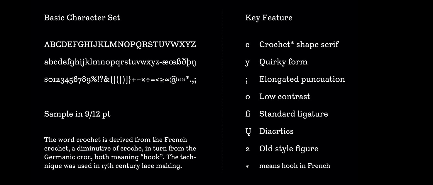
Crochet is readable and intriguing to look at, which makes it suitable for typesetting long, small (8pt – 10pt) text. Fun little details also suggest a potential display use.
The final character set has over 400 glyphs, including one stylists set for tight leading, and two sets of figures and math symbols, ligature, and diacritics.
Comments by Typeface Design Judge Tobias Frere-Jones
" You Lu’s Crochet is a revival and remodeling of Louis XV from Fonderie Turlot of Paris. It shows a sophisticated sense of how to work with historical precedent: what to keep and what to leave behind in working with past sources.
In any revival, but especially one that uses a small size from an old source (around 5 point, from a book published in 1887), it’s tempting to become ensnared in the bumps and wobbles of each shape. But Lu does a good job of looking through that noise and considering the shapes underneath.
The original Louis XV was an oddball design, pushing curves into a squarish profile, so that many letters begin to resemble cobblestones. With so much similarity in the shapes, it relied on loose spacing to be legible. Lu made those blocky curves relax a bit, just enough to reset the spacing and vastly improve its usability. There was a nervous quality in the original — even cranky — but the slightly softened corners also soften the voice. But the French style and formality is still there, tasting as much of the Belle Époque as the present day.
When revivals keep their focus on the big picture, they can improve on the original and still be accurate. Crochet is a promising (and successful) example of that approach.”

About Tobias Frere-Jones
Tobias Frere-Jones has created some of the world’s most widely used typefaces, including Interstate, Whitney, Gotham, Surveyor, and Tungsten. He received a BFA in Graphic Design from the Rhode Island School of Design in 1992 and joined the faculty of the Yale University School of Art in 1996. His work is in the permanent collections of the Victoria & Albert Museum in London and the Museum of Modern Art in New York. In 2006, he received the Gerrit Noordzij Prijs for his contributions to typographic design, writing, and education. In 2013, he received the AIGA Medal in recognition of exceptional achievements in the field of design. Tobias launched his new type design practice, Frere-Jones Type, in January 2015. In 2019, he received the National Design Award for Communication Design by Cooper-Hewitt, National Design Museum of the United States.