The issue invited contemporary artists, writers, and photographers to explore current social issues linked to the perception of beauty in today’s society.
La Belle et la Bête, is part of The World’s Best Typography exhibition (TDC65), seen most recently at Taiwan Tech (National Taiwan University of Science and Technology) in Taipei; at Sheridan College in Ontario, Canada.; and at Dom Słów (House of Words) in Lublin, Poland from November 22 – December 27.
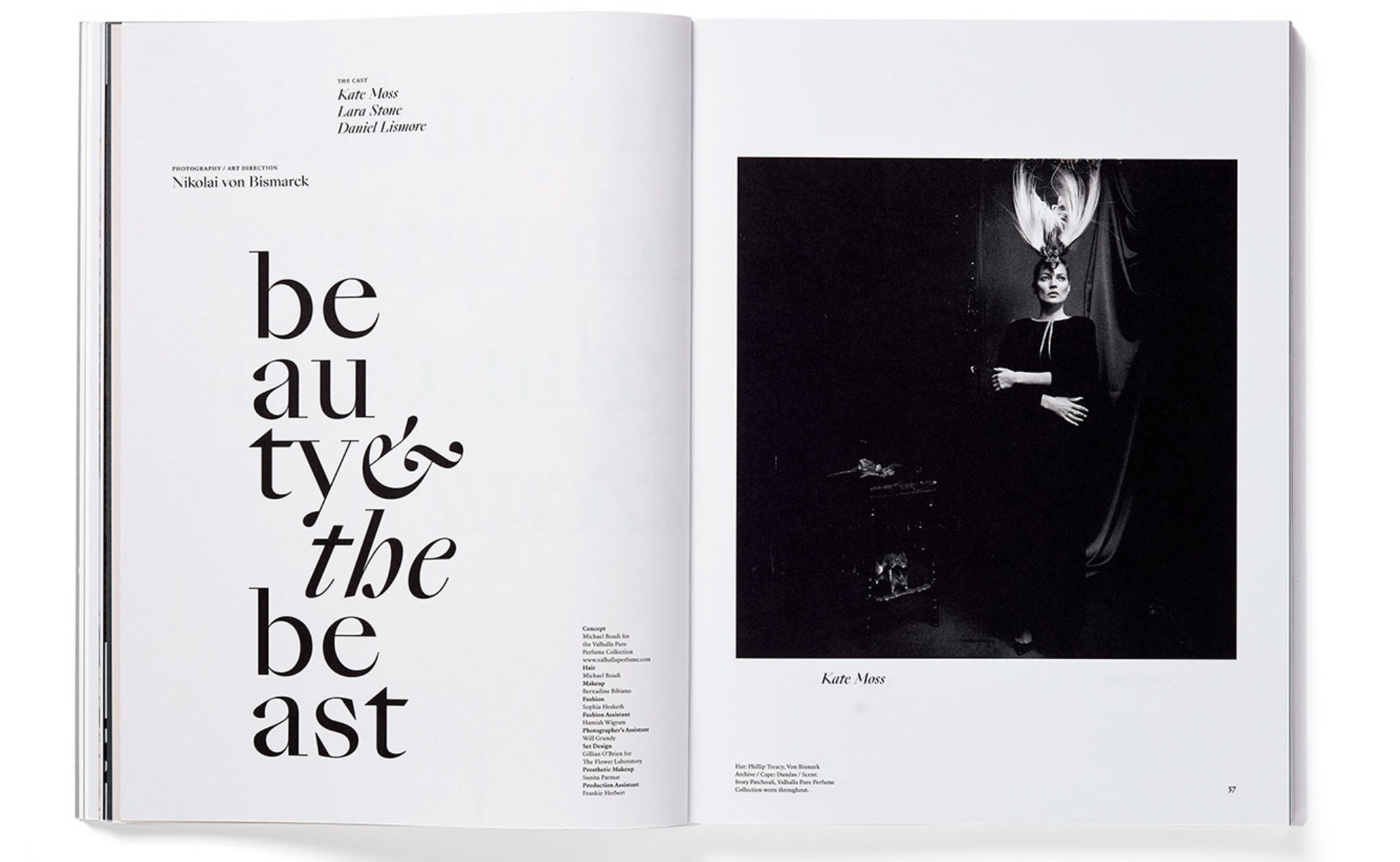
Spread designed by Rational Beauty from La Belle et la Bête issue of Pan & The Dream.
About La Belle et la Bête
- Studio: Rational Beauty
- Designer: Mike Abbink
- Design Director: Jeanette Abbink
- Editor: Nathalie Agussol
- Client: Pan & The Dream
- Principal Type: SangBleu Empire and SangBleu Republic
Jean Cocteau’s surrealist 1946 film La Belle et La Bête was our muse for the beauty issue of Pan & The Dream. The design seeks to balance the emotional and the rational, and to help the reader navigate the often expressive content
A simple grid structure and single font family create a consistent design, girded by Sang Bleu Empire and Republic. At once approachable and magical, the hybrid character of the letterforms are essential to the overall typography, particularly in the feature titles.
Oversized spreads are animated by changes in scale between headlines, pull quotes, and body copy, while minimal use of color allows the reader to focus. In keeping with the cinematic inspiration, there is an asymmetrical interplay between images and typography that amps up the spectator’s experience.
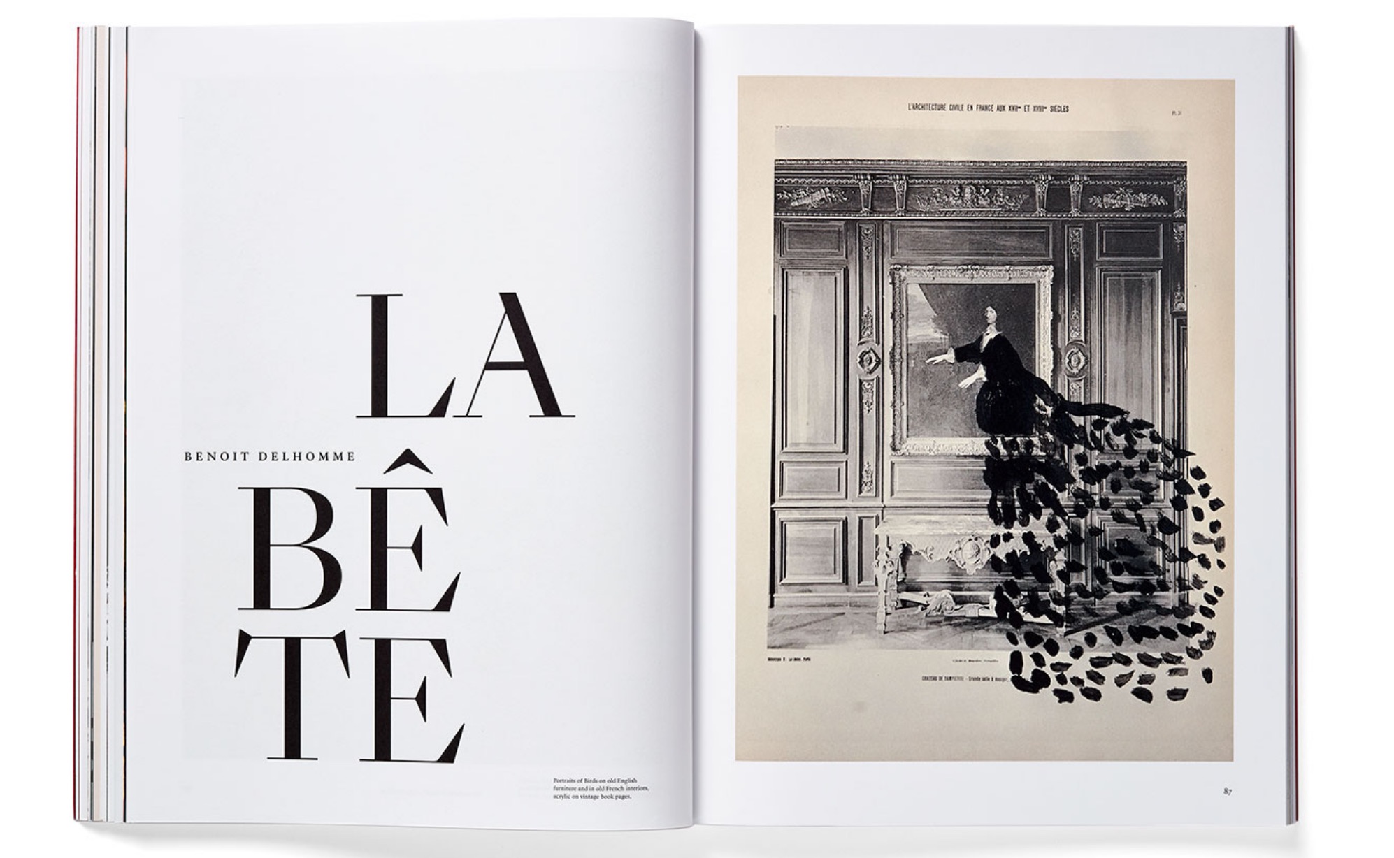
Spread designed by Rational Beauty from La Belle et la Bête issue of Pan & The Dream.
Comments by Communication Design Judge Ian Spalter
"This second issue of Pan & The Dream is an episode dedicated to the topic of beauty, subtitled La Belle et La Bête or The Beauty and the Beast – a reference to Jean Cocteau’s surrealist film. This surface level dichotomy points to the worthy battleground that is the complicated topic of beauty.
There are of course many cliché examples of beauty in the world, however there is also beauty to be found the grotesque. It is about how something beautiful has been constructed or the context it is presented within. Often the most beautiful things stand out when we pay attention to details.
The imagery in this issue is meant to challenge what is beauty and where it can be found. You could imagine an alternative approach to the typographic decisions that stepped completely out of the way, becoming little more than a caption. Instead, the typography is both elegant and voluptuous. It works as an as a dignified narrator with a point of view, pushing the overall work away from a mere visual catalog or feed. A clear grid paired with Sang Bleu Empire creates a lovely system. Each layout has a kind of lyricism using a spare and consistent set of elements that celebrates the magical beauty to be found in contrasts.”
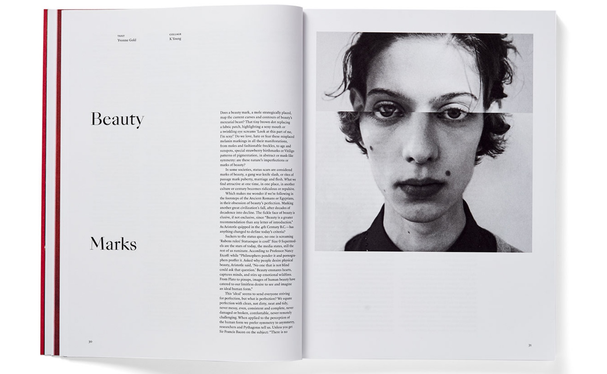
Spread from La Belle et la Bête issue of Pan & The Dream.
About Ian Spalter
Ian Spalter is head of Instagram Japan. Previously, he served as head of design at Instagram headquarters, where he led the team responsible all aspects of design there, ranging from cross-platform app experiences to brand and identity. Ian was previously a senior UX manager at YouTube and director of UX and design at Foursquare. Ian spent four years at R/GA, where he oversaw design development projects such as the Nike+ Fuelband and Nike running, basketball, and training products. Ian was born and raised in New Rochelle, New York and graduated from Hampshire College.