2017 Winner
Typeface Design
Sharp Grotesk
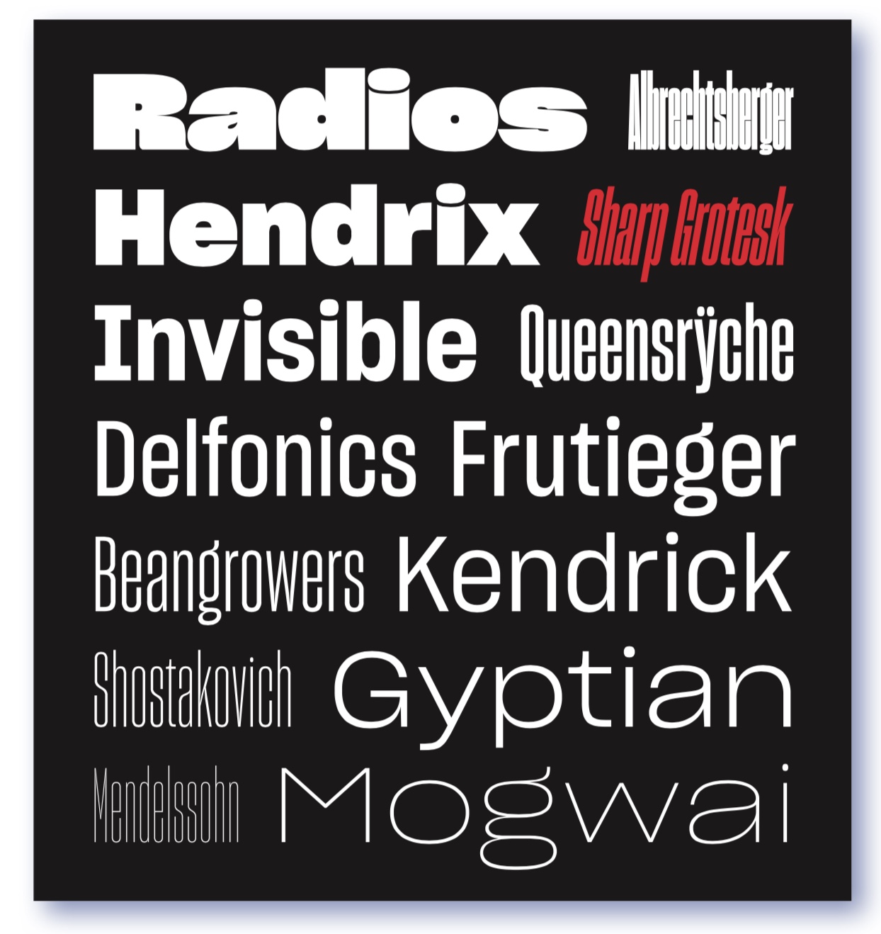
Sharp Grotesk
Category—Typeface Design
2017 Winner
Typeface Design
Sharp Grotesk
Studio
Sharp Type Co.
Designer(s)
Lucas Sharp, New York
Additional Credits
ASSISTED BY: Wei Huang, Ben Kiel, Chantra Malee, and Octavio Pardo
TWITTER: @SharpTypeCo
INSTAGRAM: @sharp_type
CONCEPT:
Swiss styling collides with the unexpected construction and wonky imperfectionism of nineteenth- century American woodtype in Lucas Sharp’s monument to Adrian Frutiger: Sharp Grotesk. With its exuberant personality, ink traps, and incredible range of moods, Sharp Grotesk is a brand-new and uniquely American perspective on the genre of the multi-width neo-grotesk. Originally beginning as hand-drawn poster lettering in 2011, Sharp Grotesk eventually grew to encompass a massive range of 21 widths in 7 weights of roman and italic, for a total of 249 fonts