2019 Winner
Typeface Design
Le Murmure
Le Murmure
Category—Typeface Design
2019 Winner
Typeface Design
Le Murmure
Designer(s)
Julien Alirol, Jeremy Landes, and Paul Ressencourt, Caen, France
Client
Murmure
Additional Credits
ART DIRECTION: Julien Alirol and Paul Ressencourt
TYPOGRAPHER: Jeremy Landes
CLIENT WEBSITE: murmure.me
TWITTER: @AgenceMurmure
CONCEPT:
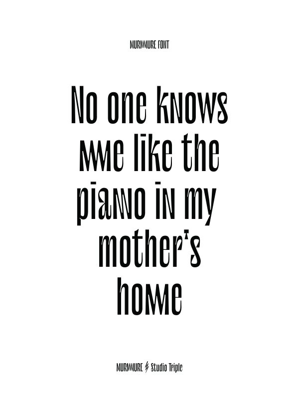
The Murmure font plays on a skillful mismatch between characters, creating a unique rhythm that carries our voice. This fruitful and enriching collaboration strengthens Murmure’s graphic and collaborative vision to undertake singular and sensitive projects. Used as a titling font, it is paired with a text font, the Prophet typeface (from the Dinamo Foundry). Its height and the stability of its shapes lend it elegance, while details inspired by calligraphy and technique reveal all of Murmure’s notions of experimentation, research, and creativity. The Murmure font is a typeface devoid of serifs that combines effectiveness, legibility, and singularity. Its highly condensed proportions draw their inspiration from magazine titling fonts and add the editorial dimension with which we wished to endow our new identity.
INSTAGRAM: @agencemurmure
FACEBOOK: @MurmureCreative