2018 Winner
Typeface Design
Koning
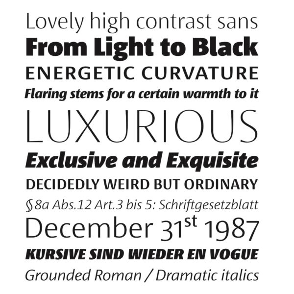
Koning
Category—Typeface Design
2018 Winner
Typeface Design
Koning
Designer(s)
Luc(as) de Groot, Martina Flor, Jan Fromm, Phillipp Neumeyer, Daria Petrova, Berlin
Additional Credits
FOUNDRY: LucasFonts
WEBSITE: lucasfonts.com
TWITTER: @FontFabrik
CONCEPT:
Koning originated as a high-contrast version of the Corpid family, to satisfy a newspaper customer who wanted just a bit more difference between the thin and thick strokes. The high contrast required a new shape language, and, over time, a new name. Koning Display, with ten weights, has the highest contrast; Koning Text, with eight weights, has a medium contrast, which makes it work well in small sizes. Koning is Dutch for “king.” A king represents elegance and prestige while also being in touch with his people—just like this typeface, with its display and text parts.