2019 Winner
Typeface Design
Hope Sans
Hope Sans
Category—Typeface Design
2019 Winner
Typeface Design
Hope Sans
Designer(s)
Charles Nix, Woburn, Massachusetts
Additional Credits
TYPE FOUNDRY: Monotype
TWITTER: @Monotype
TWITTER: @ChasNix
CONCEPT:
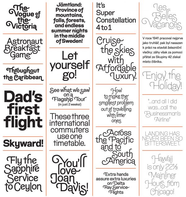
The Hope Sans typeface is a throwback to the type styles of the 1970s, with most of the family’s characters offering swash alternates that enable almost limitless combinations for designers. Designed by Charles Nix of the Monotype Studio, this versatile sans serif comes in six weights. The typeface’s large counters and open spacing allow it to work effortlessly across a range of environments—including digital, print, text, headlines, editorial, advertising, and branding.
MEMBERS OF THE TYPEFACE FAMILY: Hope Sans, Hope Sans Bold, Hope Sans Bold Italic, Hope Sans Italic, Hope Sans Light, Hope Sans Light Italic, Hope Sans Regular, Hope Sans Semibold, Hope Sans Semibold Italic, Hope Sans Thin, Hope Sans Thin Italic, Hope Sans Ultra Light, and Hope Sans Ultra Light Italic