2020 Winner
Communication Design
C&KE
C&KE
Category—Identity
2020 Winner
Communication Design
C&KE
Studio
Curious Productions
Designer(s)
John Fairley, Design and Creative Direction, London
Client
Carlin & Konak Editing (C&KE)
Additional Credits
CONCEPT:
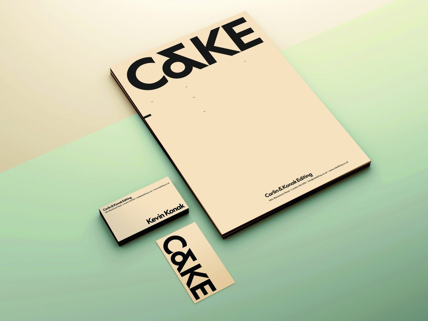
The C&KE identity displays a bold wordmark that is purely typographic in its approach. This is an ultra-modern, clean, and clear typeface that makes a simple statement. The idiosyncratic nature of an ampersand within the font contains a strong geometric form that gives the word “C&KE” more clarity in the way that it “scans” to reveal the word “CAKE.” Careful consideration has been taken to ensure that the spacing (kerning) between the individual letters allows for a further contemporary look and feel.
WEBSITE