2015 Winner
Typeface Design
Brando
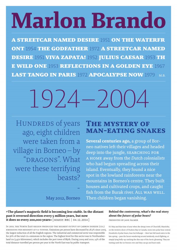
Brando
Category—Typeface Design
2015 Winner
Typeface Design
Brando
Designer(s)
Mike Abbink, New York
Additional Credits
FOUNDRY: Bold Monday
CONCEPT:
Brando is a contemporary serif with humanist proportions, exploring the balance between mechanical and Egyptian forms. The careful interaction of rigid and fluid strokes gives Brando its modern appeal and sturdiness. The light styles of Brando assume the shape of an elegant slab-serif with open letterforms, while the heavier weights feature just the right amount of contrast to give it an even and comfortable texture in text. The distinctive italics strike a harmonious balance between true italics and oblique, with letterforms that are supple and vigorous alike.
MEMBERS OF TYPEFACE FAMILY/SYSTEM: Brando Hairline, Hairline Italic, ExtraLight, ExtraLight Italic, Light, Light Italic, Bold, Regular, Italic, Text, Text Italic, SemiBold, SemiBold Italic, Bold Italic, Black, and Black Italic.
JUDGE'S CHOICE: Dino Dos Santos