2006 Winner
Typeface Design
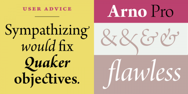
Arno Pro
Arno Pro
Category—Typeface Design
2006 Winner
Typeface Design
Arno Pro
Designer(s)
Robert Slimbach, Adobe System
Additional Credits
FOUNDRY: Adobe System, Inc.
CONCEPT:
Named after the Florentine river which runs through the heart of the Italian Renaissance, Arno draws on the warmth and readability of early humanist typefaces of the 15th and 16th centuries.
While inspired by the past, Arno is distinctly contemporary in both appearance and function. Arno is a meticulously crafted face in the tradition of early Venetian and Aldine book typefaces. Embodying themes Robert Slimbach has explored in typefaces such as Minion and Brioso, Arno represents a distillation of his design ideals and a refinement of his craft.
As a multi-featured OpenType family, with an extensive Latin-based glyph complement, Arno offers extensive pan-European language support, including Cyrillic and polytonic Greek. The family also offers five optical size ranges, extensive swash italic sets, and small capitals for all covered languages.