This month, we spoke to Zan Goodman, a designer and art director who runs her studio, Zan Inc., in Brooklyn. A veteran of the fashion world, Zan tells about her integration of fashion, film, art, magazines, and of course, type.
We are speaking on Day 50-something of Quarantine. How are you finding it impacting your creativity? Are there any bright sides to it?
It certainly feels like Day 1 million. I have found that my creative practice is one of the only bright spots to be honest! It’s a nice routine, to focus on work. It helps me feel normal. I’m also taking my time and nuancing things more. Not something I can usually do when there’s a million meetings, phone calls, social obligations, etc.
One of the things I noticed right away about your work is that it is really rich, with a backstory of references.
Oh thank you! Rich. I love that.
You have a wide palette of tastes, and I wondered what kinds of art forms are most influential to your design and creative worldview?
I find I’m most inspired by fine art, films, furniture and interiors, magazines and books more than anything. I have to say I don’t usually get inspired by other contemporary graphic design. I try and stay away from it so my work doesn’t feel too trendy and maybe has more of a timeless quality. But if I’m needing some inspiration, a day of gallery visits or watching a great movie is my go-to. Always jolts my senses.
Graphic design in fashion often takes a backseat to photography. How do you find ways to integrate them, or to bring more conscious design to your work?
It does, and I think that’s a good thing. I’d much rather see the photography lead the design, than vice-versa, i.e., what usually happens in advertising. But I think design and photography can have a conversation. In fashion, if the shoot is moody and dark, that is definitely going to lead the type direction and layout for me. Or if it’s playful and bright that’s going to push it somewhere else too. I think if you go in with preconceived notions (the photo needs to fit in this box and look like this) it always feels flat!
Your work for agencies and brands, and now for your own studio, has involved both art direction and design. How do you approach your work across both? Do you consider yourself a designer first, art director second? Or is it all just one role for you?
I never know what to call myself and I think we need better terms. For me, it’s all one thing. But an Art Director can mean so many things. I like to say I’m a design-driven Art or Creative Director. You can’t consider the design and not consider the other aspects (like photography, illustration, etc). Or I certainly can’t. And in advertising a copywriter can be an Art Director, or in film a production designer can be one. New words please.
What’s your process like in working with type? How do you get a feel for what’s ‘right’ for a client?
It’s interesting because everyone has an opinion on type, but most clients don’t have the terminology. So when they say ‘sophisticated’, or ‘simple’ I usually try and zero in. Like, what does that mean to you? I know what it means to me, but I also know my client isn’t going to say, ‘oh I’d love a really chic high contrast serif with some character’. Had a client use kerning in a meeting the other day and almost fell over.
What kinds of questions do you ask to solicit more specific ideas around what they want to be / look like?
I ask them for brands they like, even if it’s not in the same field as their project. It’s one of my go-to questions and reveals a lot. If they say ‘Apple’ I know what world they want to be in. Or ‘Acne’.
Can you talk about a project that worked primarily with typography, what kind of process you went through to arrive at the final piece?
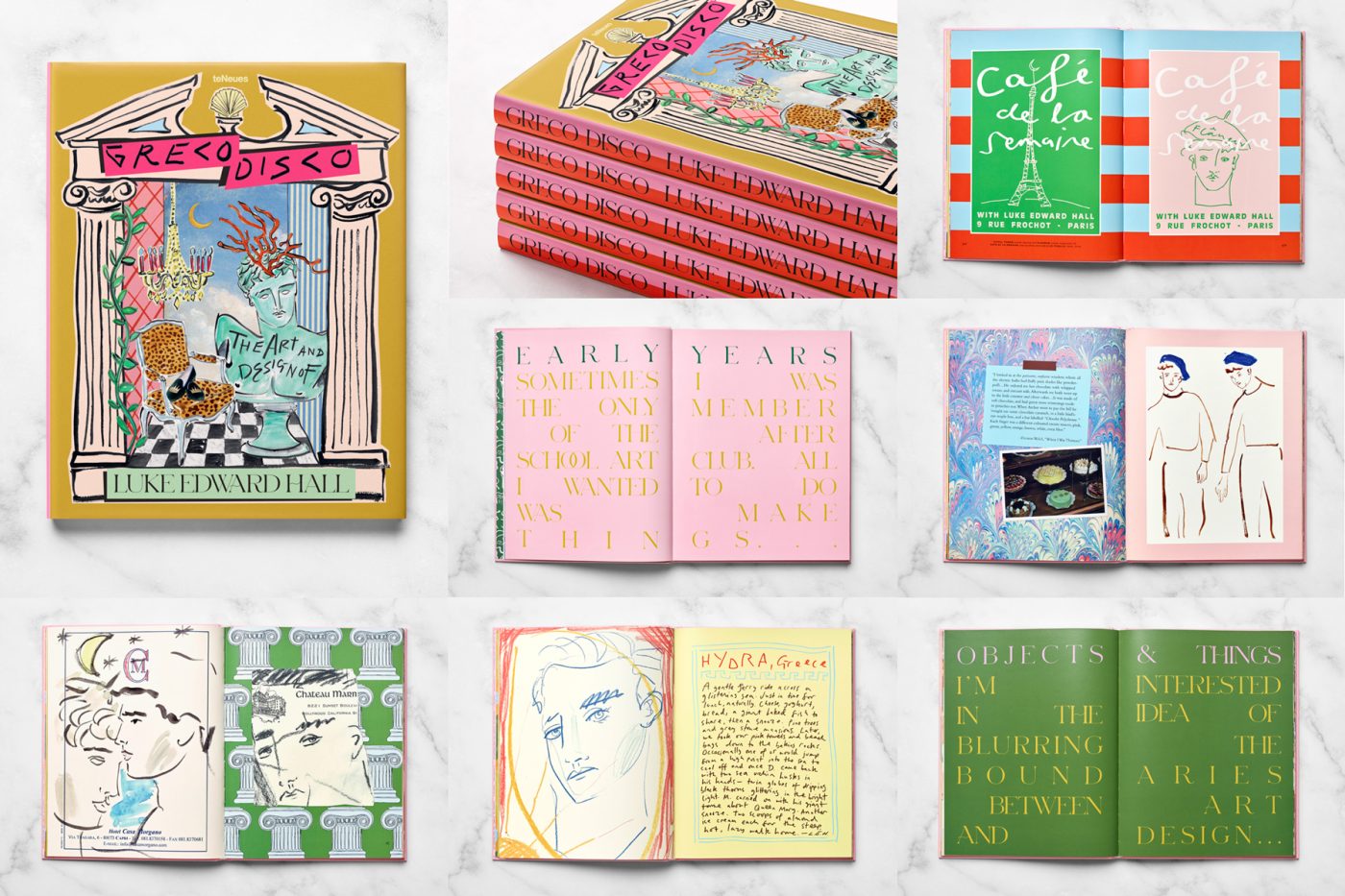
I think Greco Disco is a good typographic project. The artist, Luke Edward Hall, has this really great aesthetic. It’s Cocteau-esque with all these classic references—Ancient Greece, Romans, Shakespeare, mythology… But obviously he is a 30 year old guy and lives in 2020, so it still feels modern. I tried to replicate that same idea with the type for the book. We fell in love with Schnyder, which is classic but drawn in the last 5 years so has some newness to it. Then I started messing with it. Did this kind of crazy column-like justified spacing, and made some kooky squiggly connections here and there (not too many though). And the colors are bananas. So it has this fun tension of modern and playful, but sophisticated and historical.
Your parents are graphic designers, right? How did that influence your decision to be a designer too?
Yes! They are. And a lot of their friends are too. I grew up in a world of almost all creative professionals, so there was never a doubt for me where I’d end up. Probably could have used a doctor or accountant in the family, to be honest. Originally I wanted to go to school for fashion design. I kind of wanted to do something other than graphic design, but what can I say? It’s in my bones. My sister works at a progressive nonprofit as an organizer though. She didn’t fall into the trap!
It was actually school that changed my mind. You have to do a Foundation year at Parsons and I realized I was so much better and more comfortable at the 2-dimensional stuff versus actually building or constructing anything. And I started to realize then I could work with fashion or near it without actually being a fashion designer and sewing all day.
What did you want to do with fashion, from a graphic design perspective?
Create and work with it. Make books and ads and logos and all that fun stuff. Go on photoshoots and create work with photographers, stylists, etc. I learned about designers like M/M Paris, and Ezra Petronio and thought, ‘oh cool, that’s what I can do.’
And you worked in editorial, right? For Teen Vogue?
For NYLON first, then Teen Vogue. Then got into the agency side at Chandelier, which is still pretty fashion-driven.
And how we met!
Conflict of interest over here!
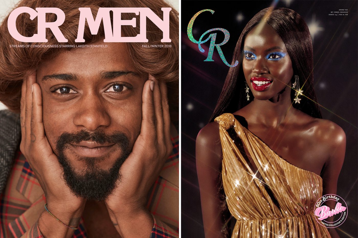
Speaking of fashion, you ended up redesigning CR once you went out on your own. What was the process like of rethinking a whole fashion magazine with an icon of fashion?!
It was a dream come true! Carine is legendary but also fun, and funny—which is not something I can say for everyone. She has a classic, chic, French sensibility but was also ready for some change and newness. It seems like now they’re kind of gravitating towards the old direction, but I don’t take offense! The magazine industry is really tough right now and you have to go with the flow.
That must have been daunting though, figuring out what to present.
I would just bring lots of options and lots of print-outs, which she really appreciated. The old guard loves print outs! Youngins, take note.
Youngins, you have to print out print.
CR is bi-annual and mostly photography driven. There are only a few short articles or interviews. There’s not a ton of typography, so it really needed to be special. On top of that, every issue is themed, so there needs to be something a little special every issue. The design team before had gone with a really minimal approach, and Carine felt like she wanted something more dynamic. She wanted to change the logo. My approach was to bring back some of her French editorial chic and sexy heritage and balance it with some newness, so it wasn’t the same Fabien Baron-esque layouts everyone is so used to. The editors and I all love editorial design from the 70s, so thought that would be a new way in.
Carine has an interesting background because she’s a stylist first, editor second. I would present typefaces then show it on many different samples of layouts.She’s super quick so we whittled it down quickly. She really zeroes in on styling, and she has a roster of photographers that she loves and has been working with for years. I am definitely not a stylist or have that background. I played it safe, and showed her layouts with past photography I knew she loved so she would focus on type. Then when new shoots would come in I felt I could play with it more and show her new options.
We started with fashion stories and title treatments, then interviews, then all the smaller type. Fashion credits are incredibly important. You need legibility there. I sort of built the system from some initial moodboards we all loved and agreed on. The new logos (for both CRMen and CR) were drawn by Aaron Lowell Denton—he and I both kind of reworked and tweaked them until the day the issue went to press. I placed the logos on a bunch of images and set it in many colorways to show how the logo could work and keep evolving. But magazines come together quickly so it really evolves as you work!
Your tactic of presenting something new that you want a client to like, by accompanying it with something you already know they like, is a good one — it’s the kind of thing I feel like you only learn on the job. What else have you learned in your years in design?
I think one thing I’ve learned (and am constantly relearning) is to be really experimental and open to new ideas in design, to never get stuck on one way of doing something or too precious.You may start a project off being like ‘oh yeah, it’s going to look like this and I’m definitely using this typeface’ etc. And if you start with that certainty, the work always suffers!
What do you do to help free your mind, off the computer when you feel creatively blocked?
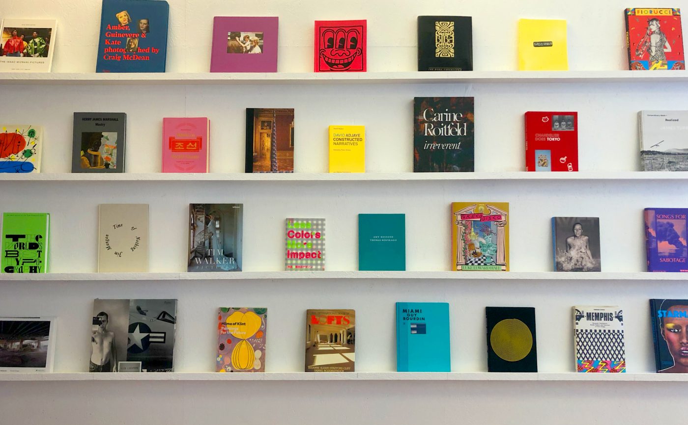
I flip through a book! The pretty book shelves aren’t just for show, haha. A photography or art book usually gets me out of a rut. Some of my forever faves: Memphis by Barbara Radice, Fiorucci the Book, Amber, Guinevere and Kate by Craig McDean, Edward Fella: Letters on America, Jones Beach by Joseph Szabo, and this really fun Japanese book about designing with 2-3 colors I got in Tokyo on a trip! Always gives my mind a break and helps me refocus.