The TDC’s Annual Competition is in its 69th year and we’re thrilled to have a global panel to jury this year’s entries of typographic design excellence. Our jury consists of some of the brightest minds in design, not just as creators of great design, but also as critical design thinking facilitators and mentors to others creating their best work. We reached out to Vinod J Nair, who is on the Type Design discipline panel to share his approaches to type design education for younger designers, where to find inspiration to write about design, what the Type Design scene in Malaysia is like, and also on what he’s looking forward to see in the upcoming type submissions.
Tell us a little bit about your experience as a teacher and lecturer; How do you approach type design education for younger designers?
Vinod J Nair: I have 21 years of experience in teaching and learning art and design, from which 8 years have involved Typography. Teaching and learning typography to young students encountering it for the first time is a challenging endeavour. I try, but likely fail, to ensure a balance of fun but also rigour. While the latter is inherent within the discipline, the earlier I find a lot harder to achieve. My belief is, if I can make the experience of learning typography fun-filled, I would increase retention of knowledge and inculcate long term interest in it. However, I often doubt whether I’m succeeding in this.
What significant discoveries have you made or observed in the design education space?
I don’t know if this constitutes a discovery, but over the last decade I have realised how insidious colonialism really is despite regional independence. It still dominates our visual discourse and aesthetic decisions in spite of our rich historical and artistic wealth. The natural progression and evolution of our arts and crafts were violently disrupted by colonialism, which seems to have terminally affected our ability to pick up from where we had left off. Furthermore, the imposition of a foreign visual culture that has no historical roots continues to dominate and perpetuate through media and curriculum. These heavy but invisible shackles are further strengthened with the popularity of global university rankings, which skew the directions of universities — most likely hampering organic growth. Our need for validation other than our (regional) own is maddening. As a result, I wonder whether we are doomed to play a game of catch-up, on a field not of our creation. This plagues my mind and what makes it worse is a realisation that I am myself perpetuating this visual subjugation through my own actions in my classes.
You often share your design perspectives and analysis on the website kreatifbeats.com; what are some of your sources of inspiration, and how do you choose what to write about?
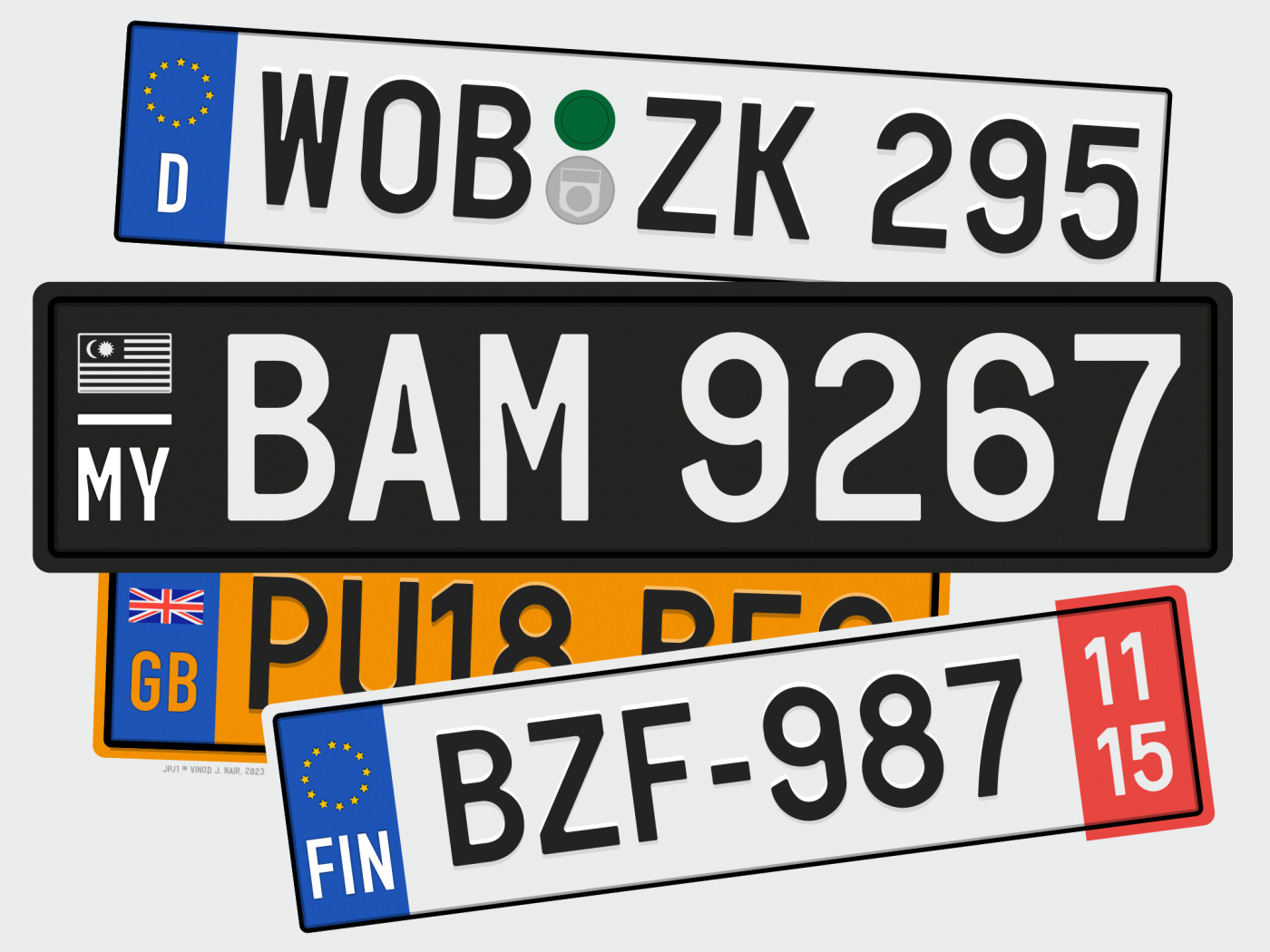
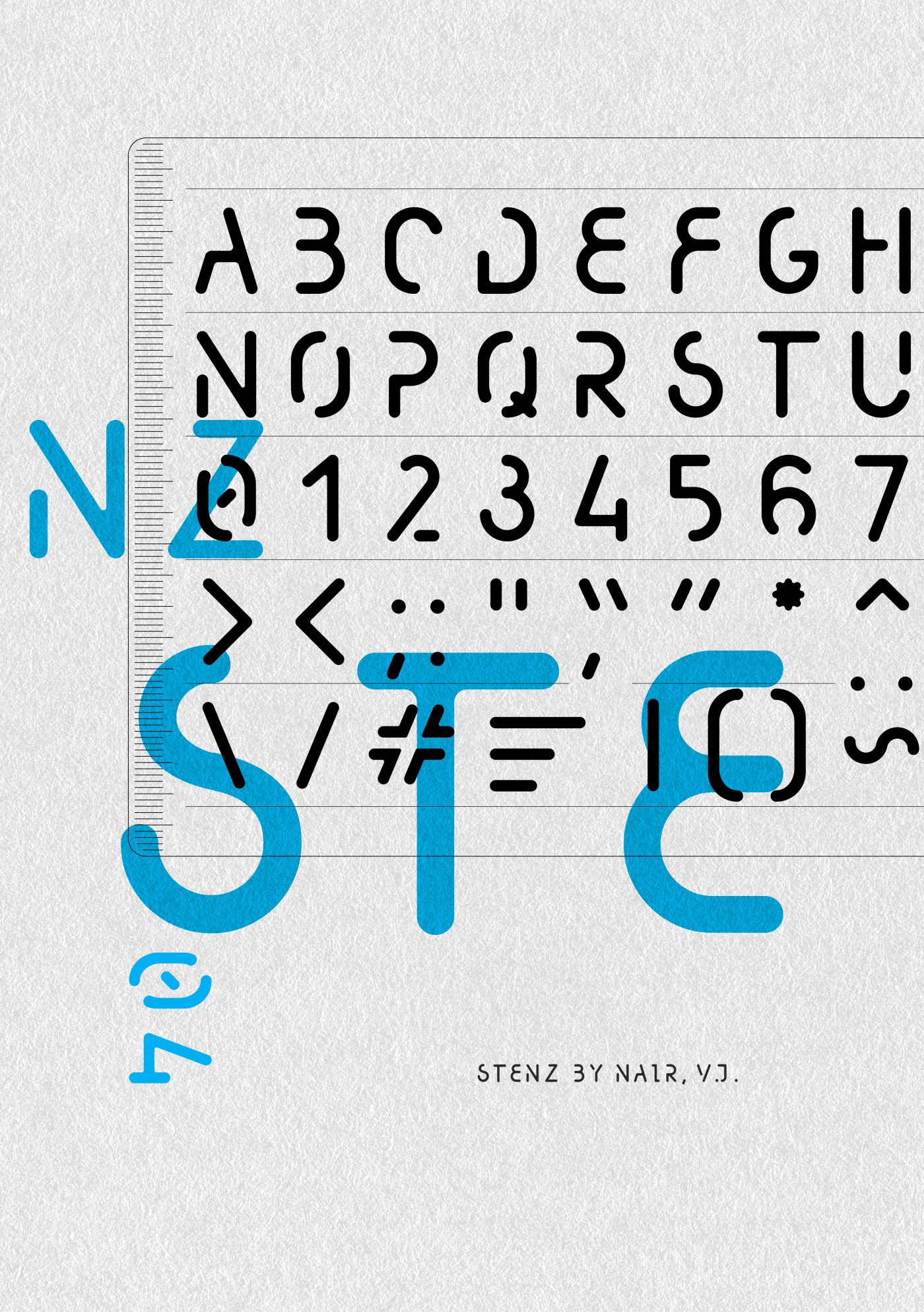
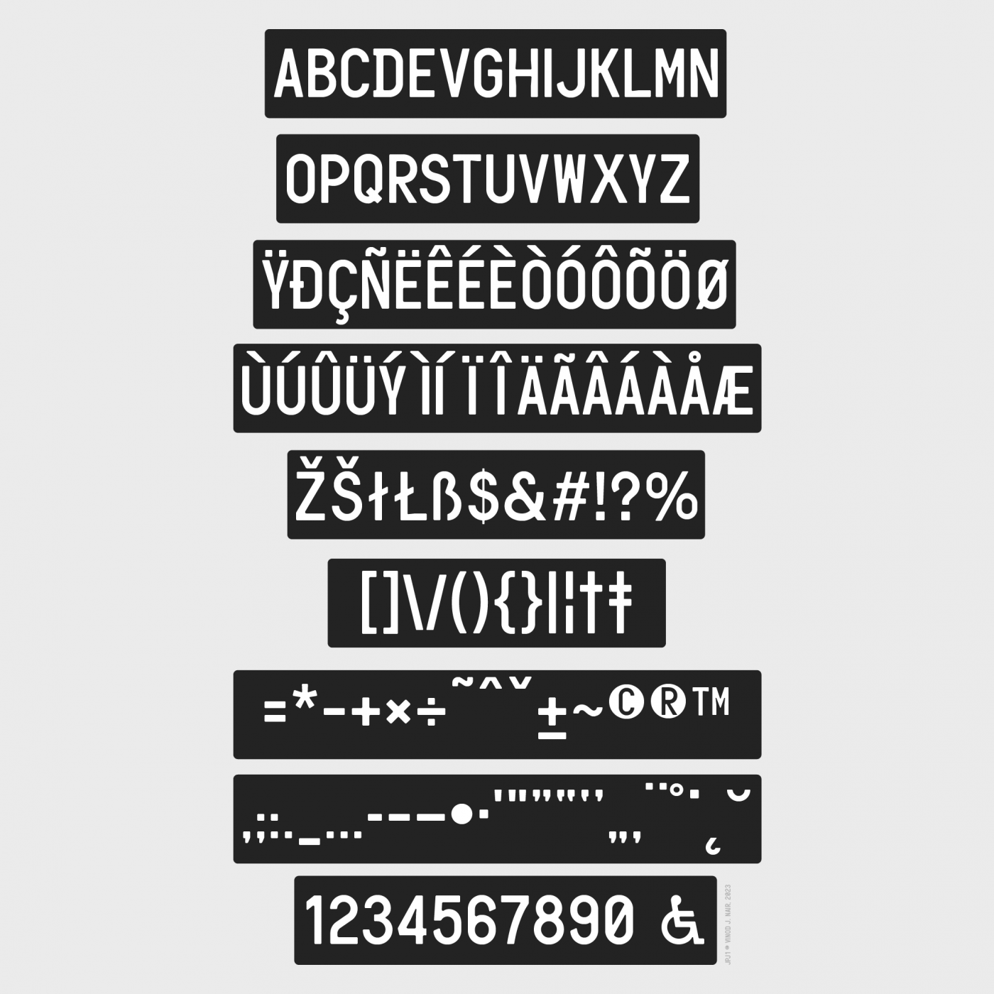
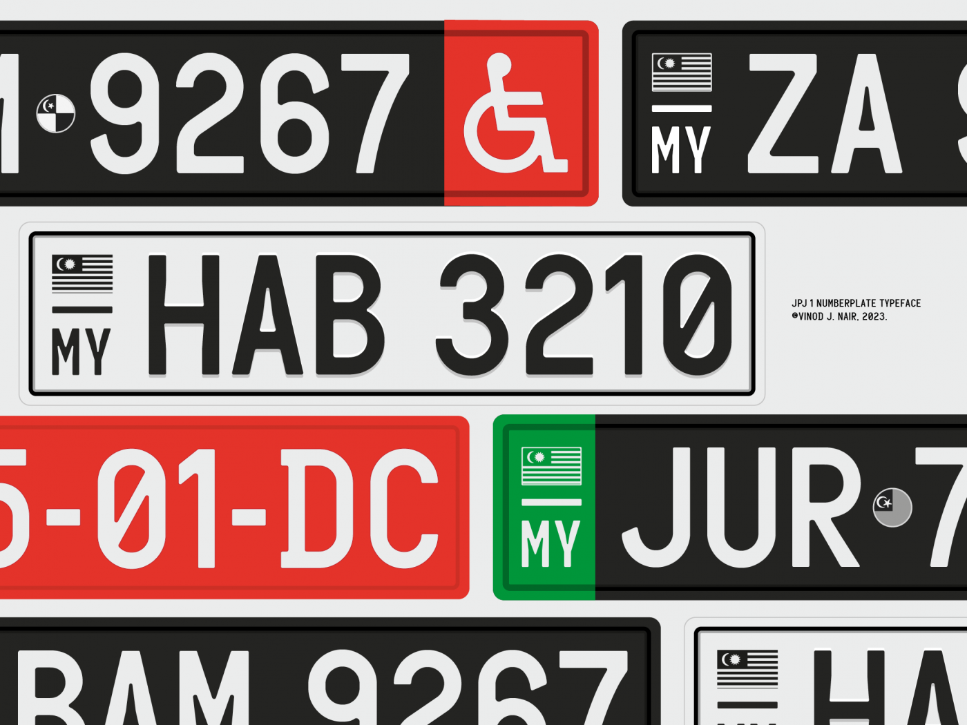
I generally write on topics that I have strong interest in, which is no different than anyone else who writes I suppose. My topics often revolve around my projects, which generally have a social dimension to them or tend to be nation-centric. I try to identify areas within the existing systems, where I believe design interventions are needed. My proposal for an indigenous standardised vehicle number plate typeface for Malaysia is an example of my project becoming a topic. I also write to ensure we add our voice to a conversation that is dominated by one side. To that end I hope kreatifbeats.com and regional sites like it grow to address the imbalance that persists.
Where do you find design inspiration from in Malaysia?
My inspiration comes from causes, or needs that I identify within the larger system at play. This drives me. Type design also has an activist (or moral) dimension and my projects — not limited to type design — are reflective of this. In Malaysia, I believe, our current challenge relates to visual literacy in society.
What are some examples of visual literacy that you’re referring to, and are these specific to Malaysians or a particular region?
The uncritical manner in our use of visual imagery that perpetuates certain stereotypes i.e., images associating fair skin with beauty in cosmetic advertising is notorious and perennial. The overuse of ‘western’ visual culture at the expense of regional culture, potentially sustaining the colonial notion of western superiority is endemic. The use of foreign symbols or artistic disciplines (like heraldry) without proper understanding of its origins, conventions and practice is typical. The aforementioned are largely specific to Malaysia but are likely not limited to it.
What is your perspective on how the practice of typography and design could facilitate the process of achieving (or improving) visual literacy??
The question of visual literacy in Malaysia requires understanding of the colonial construct; to nurture unquestioning and uncritical minds in order to facilitate the business of colonialism. The instruments used to ensure societies obey and conform were bequeathed to successive civil authorities. While this state of mind is increasingly challenged by successive generations, the systemic structures largely still remain.
Knowledgeable use of imagery requires critical minds that need you to think deeply about the use and impact of certain imagery. This necessitates research, interpretation, analysis, evaluation and the ability to create visual images or visual media that are contextual, relevant but also considers its effects. A visually literate population needs to be critical consumers and contributors of visual media, to that end the practice of typography and design nurtures the aforementioned skills in its practitioners. In Malaysia, we are beginning to see an increase in visual literacy skills. Nevertheless, as long as these legacy systems remain, along with newer challenges, we will continue to see impediments to critical thought and visual literacy.
Malaysia is a unique multi-racial and multicultural country with a nuanced history of diaspora in its diversity—What would you like people to know about type and design in Malaysia?
Type design in Malaysia is still at a nascent stage. Other than Ong Chong Wah and Muthu Nedumaran or associations like Huruf, there are very few luminaries. Language and by association their scripts have a political dimension in Malaysia. On the one hand there are clear advantages to having a society that is multicultural and multilingual, but on the other hand these differences have also exacerbated polarisation within society. Strangely, multiculturalism has unwittingly led to monoculturalism and as such typography relating to different languages are sometimes viewed through the lens of nativism.
What are you looking forward to seeing in the submission entries in this competition? What would a submission need to have to catch your eye or make you vote on something?
I look forward to being surprised, and that’s about it. I don’t want to set any pre-requisite or have any expectations when I begin viewing work, for fear this might set limits in my mind, thereby reducing my capacity to appreciate all types of work. I hope I am able to recognise ones that ring true or have an interesting or unique voice.
Bonus Content:
Who are Ong Chong Wah and Muthu Nedumaran and could you quickly describe what their roles are in Type Design in Malaysia?
Ong is a pioneer Malaysian typeface designer who studied graphic design in England in the 70s and worked in advertising for a few years before venturing into type design. He created typefaces including Abadi, Bookman and Ocean Sans for Monotype. He remains largely unknown in Malaysia, except to a few, and not much is written about him anywhere.
Muthu is a software engineer and a vernacular typeface designer from Klang, Malaysia. He was the first to engineer a vernacular (Tamil) keyboard for iOS devices in the world. He would go on to assist in the same for other South Asian and Southeast Asian scripts. His Tamil typeface, Tamil Sangam MN is the built-in default UI font for MacOS, iOS, WatchOS, TVOS and CarPlay. His other UI fonts for Apple include Malayalam, Sinhala, Lao and Khmer languages. His Tamil and Malayalam text types are also used on Kindle devices. His lectures at universities and locally organised talks/forums have imparted much knowledge and hope that Malaysian designers can have global impact, and contribute toward type design especially vernacular type design for Southeast Asian scripts.