Synoptic Office is a New York-based multidisciplinary design partnership between Yale MFA grads YuJune Park and Caspar Lam. The duo recently released Ming Romantic, a fiercely modern, high-contrast Chinese typeface comprising more than 2,300 glyphs, and paired its release with an exhibition, a poster, and a catalog, in which they remark, “because typography is the foundation of graphic design, our perception and employment of it are borne of a pragmatic nature: an urgency to solve a visual problem in the here and now.” This month, we spoke to them about their practice, teaching, and the cyclical nature of life and design.
Your studio, Synoptic Office, is a true design ‘practice’ – your work is exploratory and collaborative. Tell us how you got started in your design partnership?
We first met in grad school at Yale. It was one of those serendipitous encounters where we first began to work together on some projects here and there, and quickly realized that our work could find a fuller expression through collaboration. There was a complementarity but also an overlap in our skills and ways of working. In fact, this is what synoptic means: a coherence when things are seen together.
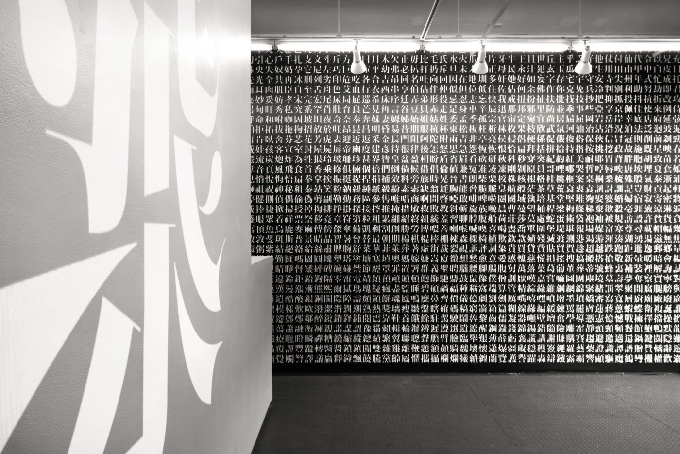
Congratulations on the release of Ming Romantic, your high-contrast Chinese Didone typeface! At the exhibition, it struck me that your system is in some ways the ultimate design Rubik’s cube: in how many ways can we subdivide a square to make 2,300 glyphs? How did you devise the system you landed on?
The typeface has around 2,300 glyphs in three master-weights. We settled on a minimum set so that we could release this over time and spread out the cost, both in terms of time and labor as well as financial. This was important, because our studio is primarily a design studio rather than a type foundry. In many ways, the grid/squares are representations of ways in which the characters can be broken down. The parts of the characters themselves are the “Rubik’s cube,” rather than the grid. Individual strokes can form components or radicals that form characters.
These forms can be sliced and diced, grouped, and organized in a myriad of ways, which really speaks to the modular qualities of the language. At the same time, these “modules” are not exactly rigid with every character adjusted to create a sense of coherence based on an inner center of gravity. Over time, we gradually realized through our making that the rigidity of the system we imposed erodes. We had to constantly negotiate a balance between being flexible to accommodate a character’s individual quirks and the parameters imposed from the beginning. Every time we look at the typeface, these negotiations vie for our attention. It is endless.
Both of you teach. How does teaching inform your design practice, and vice versa? Are there specific things that you are trying to extract from young designers?
We both see making, teaching, and research to be part of a single cyclical pattern of work. Each activity begets the other and offers constraints to the questions we are asking about material culture. These constraints are important in our design work so that a single idea can be explored from multiple angles.
So, we do not see our role as educators to be about “extracting” some essence from young designers. Rather, the classroom dialectic is an important opportunity for all parties to continue a living tradition of design criticism and form making. The community building and mutual learning are important aspects of this. In fact, we learn a lot from our students, particularly about the future of design that has yet to unfold!
Could you give us a figurative pie chart of how much time you spend in your studio on client work versus exploration, versus writing, and versus teaching?
Believe it or not, if we broke down our time for the year, it would show that we spend roughly equal amounts of time on our client work, explorations/research, and teaching — 33.33333% each. When we feel off-balance, it is usually because one of these areas is consuming too much of our time, and we consciously make an effort to adjust.
With an Internet preoccupied with “inspiration”, where do you go to find design criticism? Do you find that design and critical theory are being overshadowed by the overtness of capitalism in design?
Most of our design criticism or critical stance towards design comes from reading books that are not about design. Since books take more time to write and produce, the ideas they share tend to be more stable and better argued than material published online.
We don’t feel that design and capitalism are necessarily at odds with one other. Design is bound with production, and production is bound with economics. Thus, it is up to designers to negotiate and define how these variables can be manipulated to achieve specific ends.