Unsurprisingly for a TDC member, your work is largely led by typography.
That's true, although I think that every graphic designer uses typography—they should just do so consciously and with applied experience.
Tell us a bit about your process when you get a new project, and how you start with typographic ideas.
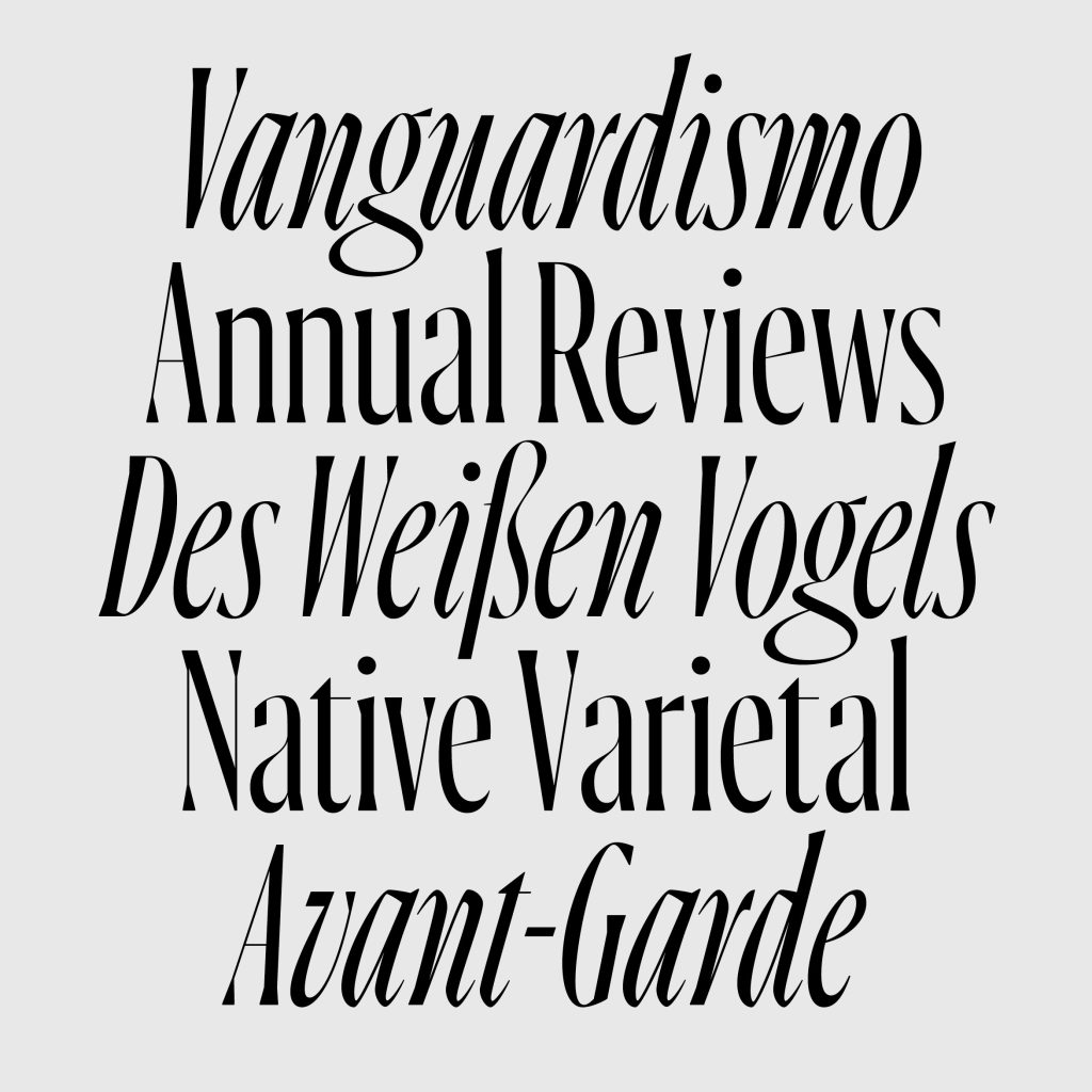
In my posters, I deal very freely with typography. I use type that’s blocky and large, I stretch letters in length … I simply like to do that and have been doing it for quite some time, so it has become a kind of trademark of mine.
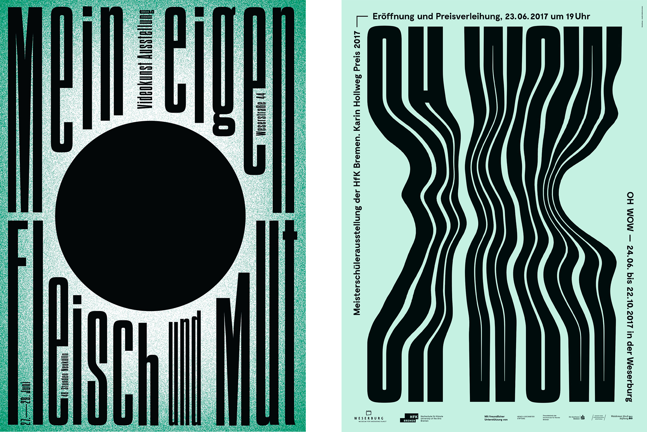
Posters for Mein eigen Fleisch und Mut (My own flesh and courage) video-art exhibition and OH WOW, an exhibition of the Masterclass Design at Weserburg Museum for Modern Art in Bremen.
It is important for me to pay attention to and appreciate the anatomy of a letter/character. So, I don't just distort. I convert text into paths and consciously deal with the resulting surfaces, resulting in a new letterforms.
On the other hand, there are books, where you can of course work experimentally with fonts, but you can't ignore the necessity of comfort in reading. With photo or art books, I don’t think the focus should be on the graphic design itself. It's about the depicted art, not about me as a graphic artist. Nevertheless, the font must fit the character of the project and support the design in its own way.
With a corporate design project, such as the one for the Weserburg, a museum for modern art, it was rather important for me to create something timeless. At the same time, it had to be modern, clean, and objective so it can still be used for the next 20 years. I think the simple and clear basic design, mainly in black and white, in combination with the Neue Haas Grotesk is a good solution.
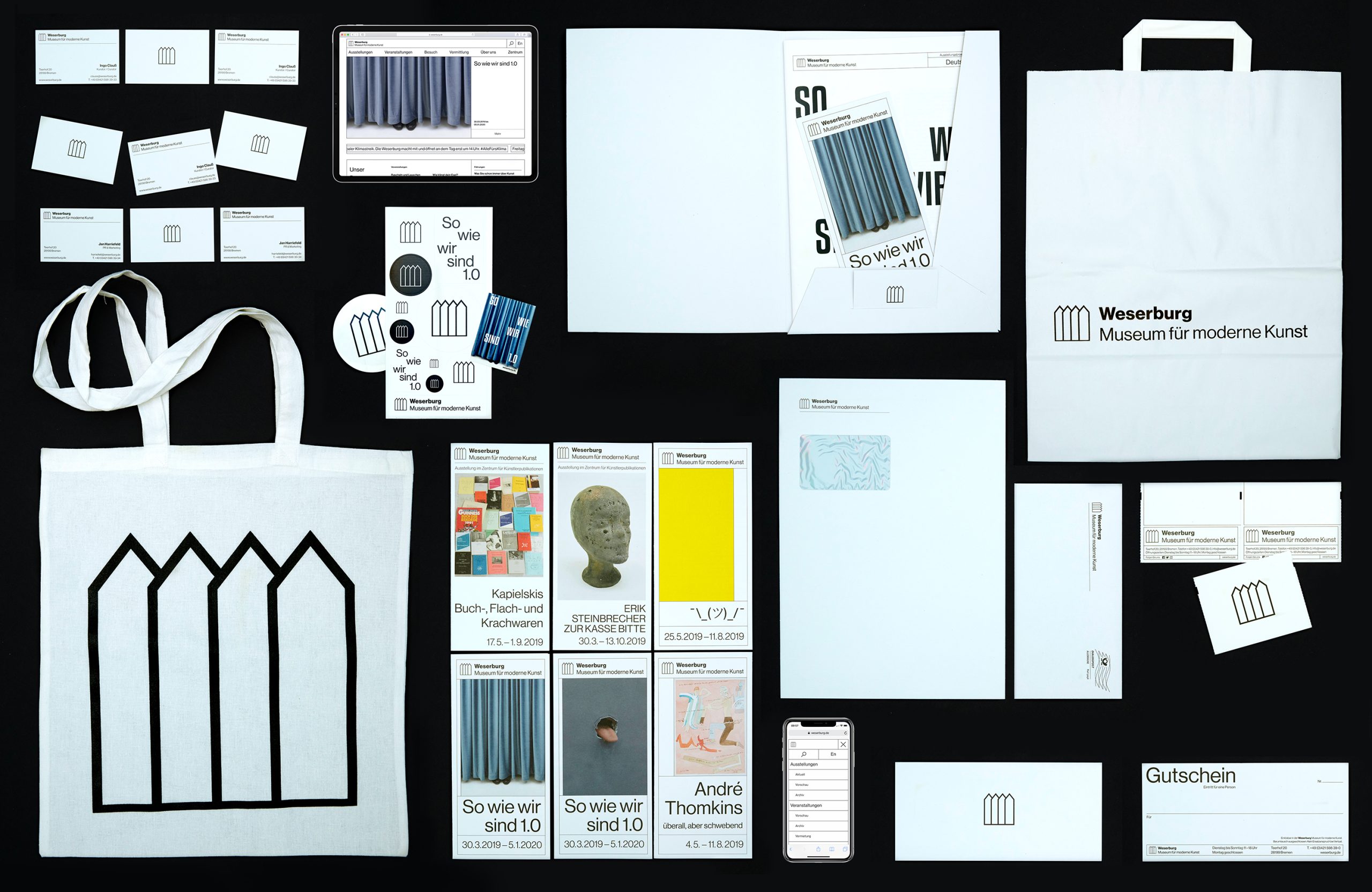
Identity for the Weserberg Museum for Modern Art.
How can someone attempt to achieve objectivity in typography?
From my point of view, this is one of the most important and difficult tasks. Objectivity is understanding where something is appropriate. In a book, for example, the type must not push itself into the foreground.
The font must match the project or event and achieve the best possible effect with the other graphic elements. It can be experimental, and especially with posters, it can also be the main actor. I always research the time in which the font was designed, then analyze the anatomy and see if it can be used for my needs. Another important factor is the copywriting. I can still create something courageous and prominent with a relatively reserved typeface depending on the words.
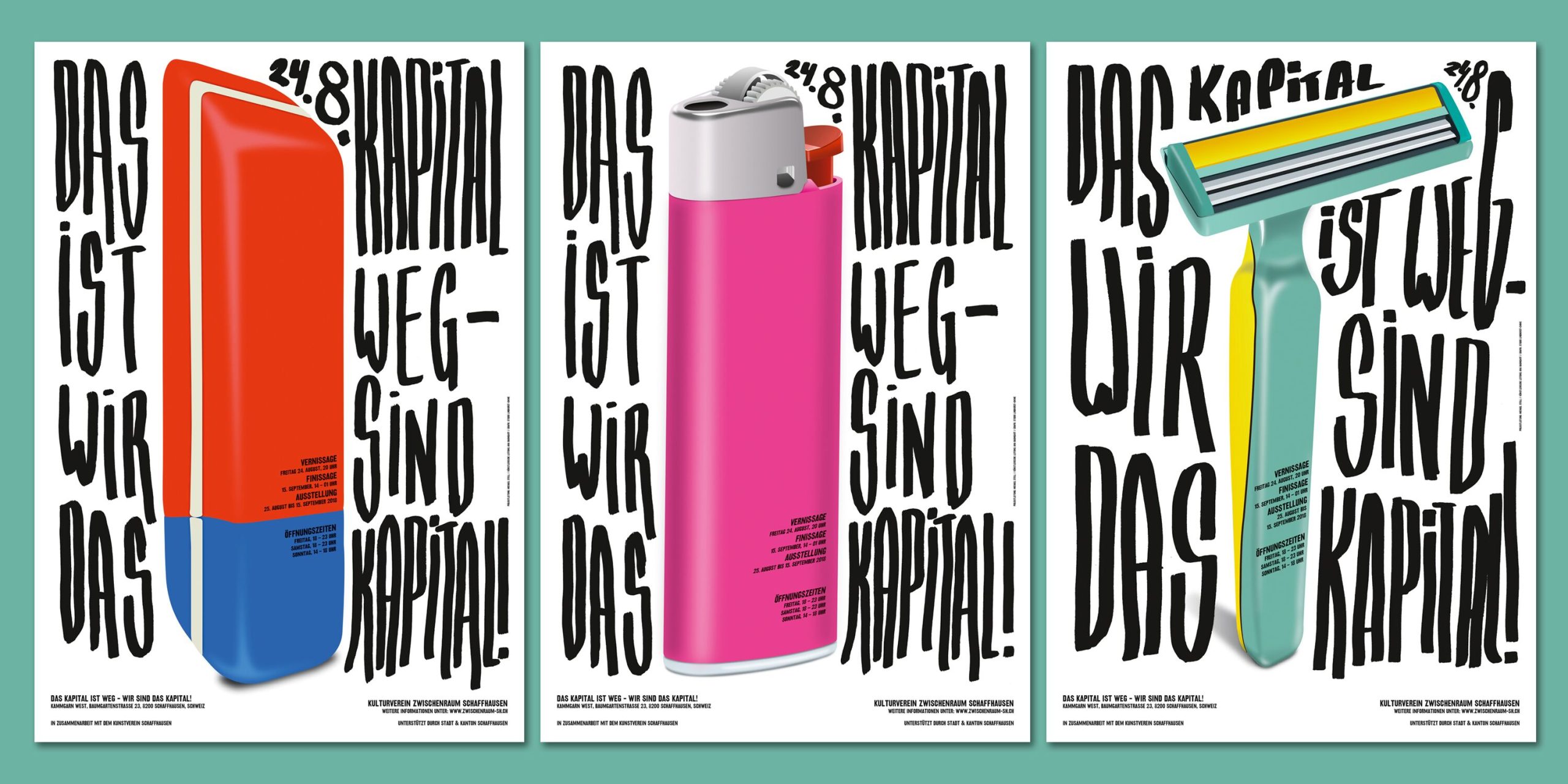
Poster trio created as part of a complete corporate identity for a group exhibition in Schaffhausen.
How have you grown your client list over the years? Is it all referrals at this point? Do you approach organizations you’d like to work with?
I really don't send portfolios to potential clients very often. Up to now, it was mostly referrals from other clients, which resulted in new inquiries about a project, or people became aware of me on their own.
As banal as that sounds, having a certain presence has a very big effect. TDC or other design awards, as well as mentions on blogs, grow that presence. The only places I avoid are competitions that are just commercial enterprises for-profit. I find their approach more than questionable.
You started your career as a lithographer. Does that process inform your graphic design work?
I can't say that for sure about my creative work, but what helps me enormously is the knowledge I've gained from lithography. When it comes to the printing process in general, especially communicating with printers, I know what is possible in printing and what is not, where complications can occur and where you have to be careful.
As for my work process, especially being self-employed, it helped a lot that I already had ten years of professional experience. It gave me self-confidence. What I really liked about the job at that time was that it was much more handcrafted — the handling of film and retouching directly on the film — because in the beginning of my career, the computer was secondary. Maybe that’s why I often try to incorporate analog work steps into my current design, like the vinyl cover of the jazz band Micatone.
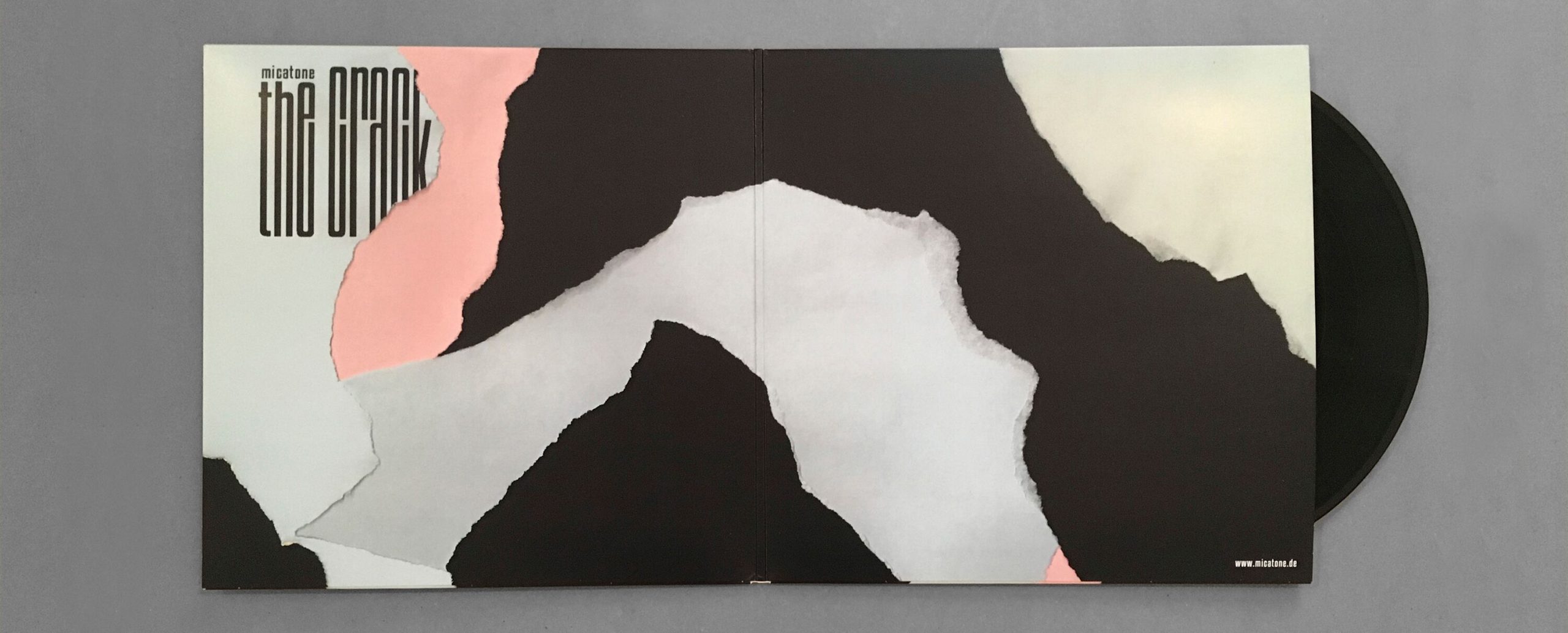
Vinyl and CD packaging for Berlin-NY jazz band, Micatone.
How has the rise of digital products affected your work, which is traditionally print-based? How have you created overlaps between the print and screen?
That, of course, is the question of questions. The digital world is here, but classic print products still have fixed places, so they belong together more and more frequently. My RADIAN poster was both printed and animated. I love books, posters, and everything that has to do with print products, but it is also important to me that I don't shut myself off from the new.
Using the corporate ID for the museum as an example, [that included] a website with many functions and everything that a new website must now have had to be created. I like to be involved in the design process, to make sure that everything still conforms to the print media, but fortunately, I have a good office partner by my side. Lea Hinrichs has more extensive expertise than me in the field of digital media and together we are a good team.
There are things I know I can do well, and I like to carry them out myself. If I find something exciting, but know that I'm not the best for the implementation, then I get the right person on board and we work it out together! This leads to the best result and is also fun. Having fun at work always ensures the best result, and that's why it's so important. I don't think I’m alone in saying that.
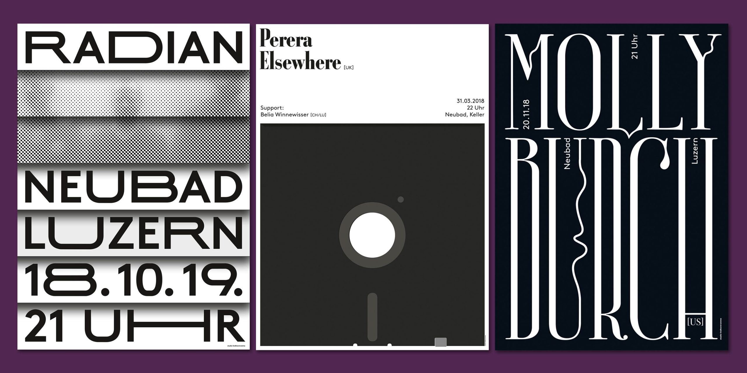
Three concert posters for Swiss arts and culture center, Neubad Luzern.