You came up in one of the Golden Ages for Typography, in the 70s and 80s in New York City. Nowadays, young designers have the internet to tell them who the latest hot shots are, and their career trajectory is in some ways more spelled out. How did you find your place in our industry as a young designer?
To find my place as a young designer, I knew I needed to see what the stars of the industry were doing. I saw that to succeed in that time, before the internet, you had to have your visuals and achievements published in design annuals, and to win awards. So, I started studying the winners. Once I learned who I would be competing with, I had to figure out how to outrun them. I looked at success as a marathon, and saw the importance of being at the forefront.
At Parsons, I was lucky enough to study under Herb Lubalin, Henry Wolf, and Milton Glaser, some of the greatest talents in the field. They taught me the power of typography, and that one word, designed well, can tell a whole story.
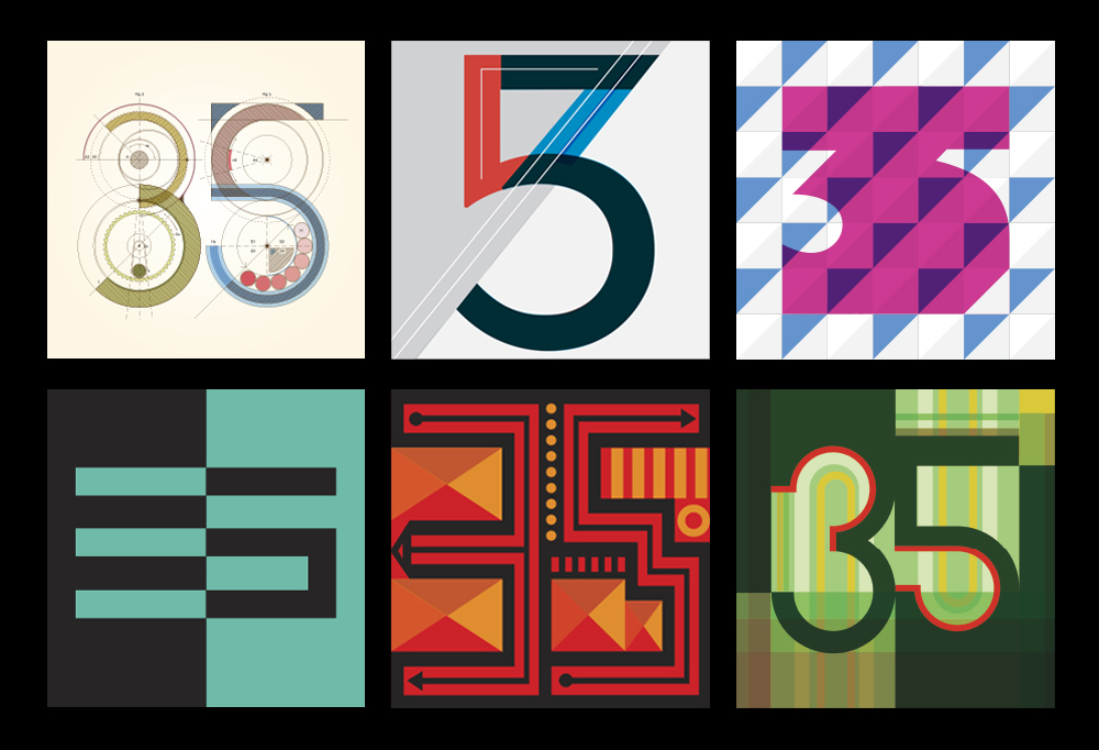
Thirty-Five 35s anniversary.
After completing school and spending time as an art director in advertising, I decided the best way to grow and to gain recognition was to start my own agency. I started with print collateral and even made posters for rock concerts. Then I realized that brand design was an emerging field with lots of opportunities for creative innovation, and limited players in the space. To be on the leading edge as an innovator is to set the pace. I knew I had found my spot.
Identity samples.
What early visual influences triggered your creativity?
As a young boy, I was influenced by the style of the Art Deco period. I was inspired by the expressive, bold use of typography coupled with the beautiful graphics and illustrations that adorned posters and advertisements of the time. As a result, I’ve been collecting images from that period that have come my way over the years. I even used a Deco-inspired look for my own very first identity. I suppose the style stuck with me, and continued to excite me.
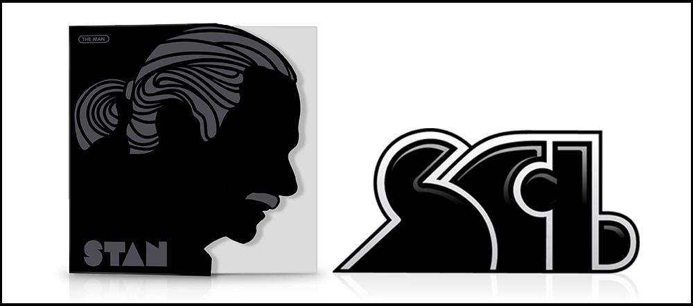
Invitation honoring Stan as an AIGA Fellow and Stan’s original identity, SCI.
You and your agency have designed packaged goods for many years. What are some of the primary considerations in designing for retail products that are different from other design projects?
It certainly presents unique challenges. The designs need to encourage consumers to purchase products and to become loyal customers. Beyond driving sales, our goal was to push package design to be innovative and creative, and to convince our clients to trust in us.
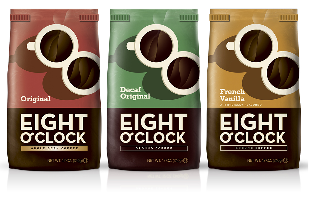
Package design.
Ultimately, we wanted the final result to be one we could all be proud of. This is what set us apart, and brought us success as an agency.
You’ve said that typography is like music, in that we have this set of notes that, every day, can be played in new ways. What music do you listen to?
I for one listen to all types of music. I’m impressed with the new and creative directions music has taken, and I see a connection to typography in its constant reinvention and innovation. It seems that there is no end to what we can do with the tools we have. Every day I see new and exciting designs that surprise me. Creativity is endless. There are new styles, new trends and new expressions that are constantly being created and renewed. As with music, I like to follow and study all types of creativity.
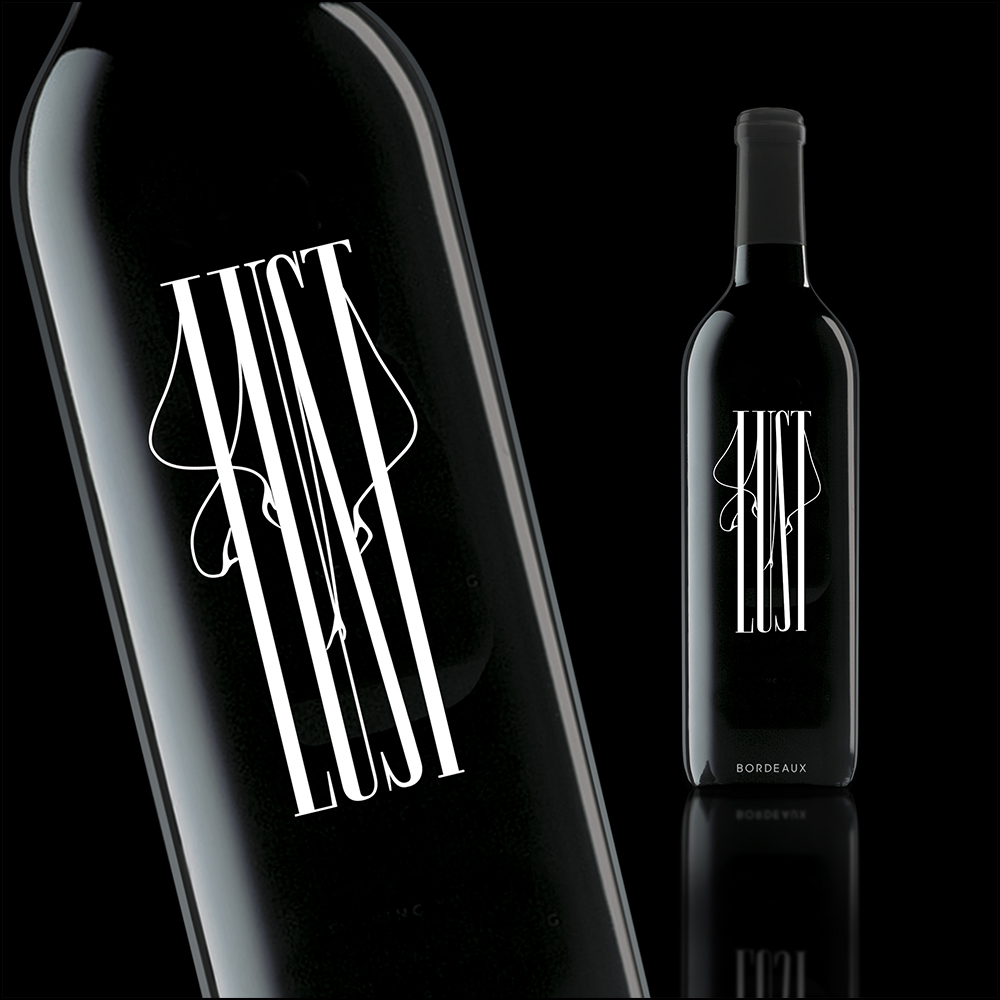
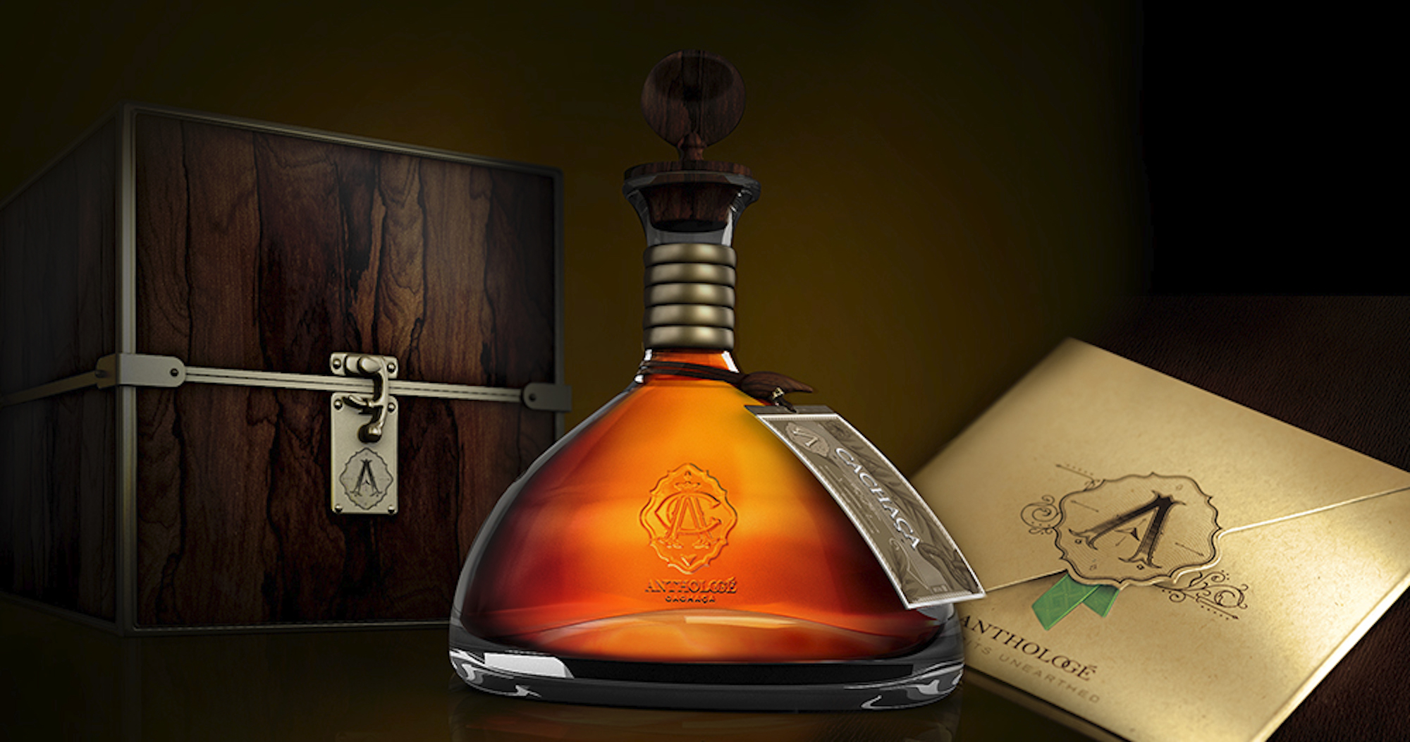
Promotional wine.
I think that’s common amongst designers – either they make music themselves, or seem to find a connection to music. Why do you think that is?
I do find a connection to music with my work, and the reason is that rhythms, lyrics, expressions and originality are what drives it forward. Music represents excitement, romance, soothing, calm and energy. With typography, we can represent these expressions. The individual characters, forms, styles and combinations can act in the same way. Music is what you hear; words and characters are the forms that support it. The use of typography is endless in its expression, as is music.
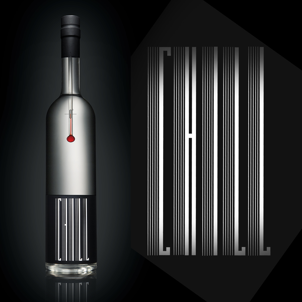
Promotional wine.
You said you “looked at success as a marathon.” As a winner of that marathon, what are some lessons you’ve learned that differentiate it all from the sprint?
What I’ve discovered is that the sprint is not consistent, and can give you only occasional success, where in the marathon you have to have consistent drive, and never look back. Your success will fuel your commitment, and once you’re in the front you’re inspired to continue. The Type Directors Club has many marathon winners, whose achievements with new and exciting creations inspire us all. This makes us proud to be a part of it.
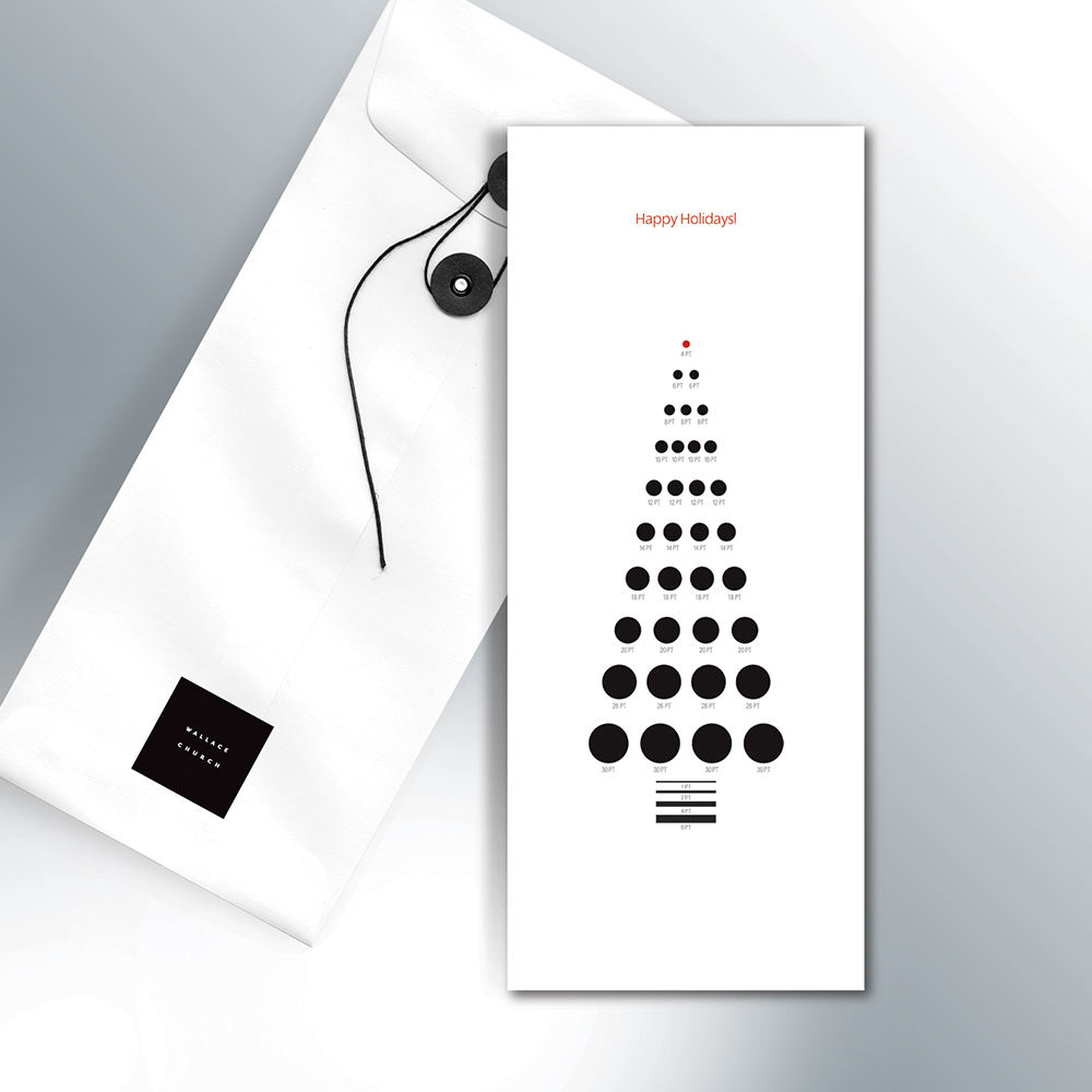
Holiday card.