Scott Kellum is a designer and typographer who cut his teeth early on with type design, before moving into a solid career in digital and product design, all while keeping type at the heart of everything he makes. Scott and ECS discuss his vision for typography on the web.
How did starting off in type design inform your current approach to typography?
I have always had a close relationship with letterforms. As a child, I struggled with reading and writing and was diagnosed with dyslexia at an early age. I vividly remember confusing my p, q, b and d letterforms. I had to imagine each shape carefully and decode its unique meaning. When combined with other shapes, the meaning of these letterforms would transform again. Having to focus so much on the form of written words so early in my life drove me towards an interest in it.
Working as a draftsman at Darden Studio helped me further understand letters and how they work together in providing a voice to text. Joshua Darden has a flair for flavor in his designs and he opened my eyes to how adding more character to forms can enhance, not diminish, legibility. I also learned how these forms worked together.
A typeface is a design system, just like Matthew Carter says, “Type is a beautiful group of letters, not a group of beautiful letters.” This principle extends to all of my work. From design systems on the web, to typesetting, to object-oriented programming, the goal is always for the result to be greater than the sum of each part. The goal is to build a consistent, cohesive experience that communicates meaning effectively.
What interested you most about working primarily in digital typography?
Because it’s so new. This is the first time we as designers aren’t crafting the platform on which our designs are viewed and delivering it with our designs to readers. With print, the designer chooses the paper size, color, and weight, but with digital we have no idea what size, shape, or screen quality with which someone might view your design with. Responsive web design was a first giant step in the realization of this, but there is still so much new ground to explore, especially when it comes to typography.
Typetura, your company, argues for a different approach to typography and web design. Can you tell us a bit about your aims? What feels ‘stuck’ about our current approach to responsive design?
Responsive web design has made our typographic needs more complex. We don’t always know where our typographic styles will appear, on what devices, or where in the layout they’ll show up.
When I was typesetting headlines for Vox’s home page, we had four different article types, six different placements, and three different breakpoints. This adds up to 72 headline styles. We managed to simplify this some, but the experience stuck with me. We were typesetting for each individual context.
To avoid this complexity, most websites oversimplify their typography. Stylesheets remain complicated, and there are still places where typography is strained or could be doing more. At Typetura, we aim to change how you typeset so that instead of typesetting each individual context, you can typeset in a way that adapts to those contexts. This eliminates breakpoints and placement styles entirely while giving you greater control with more flexibility – something we need more of in our web typography.
Do you see it [Typetura] predominantly as a service or as an educational tool?
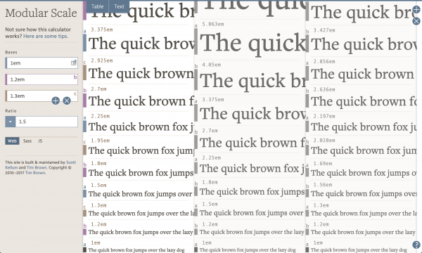
As with any first-to-market thing, we’ll need to do lots of both. I was chatting with Caren Litherland while working on modularscale.com and expressed a concern with the project. I was having trouble both teaching people how to use modular scales, and creating a tool to calculate them. Her advice was to create tools that teach, and it has stuck with me.
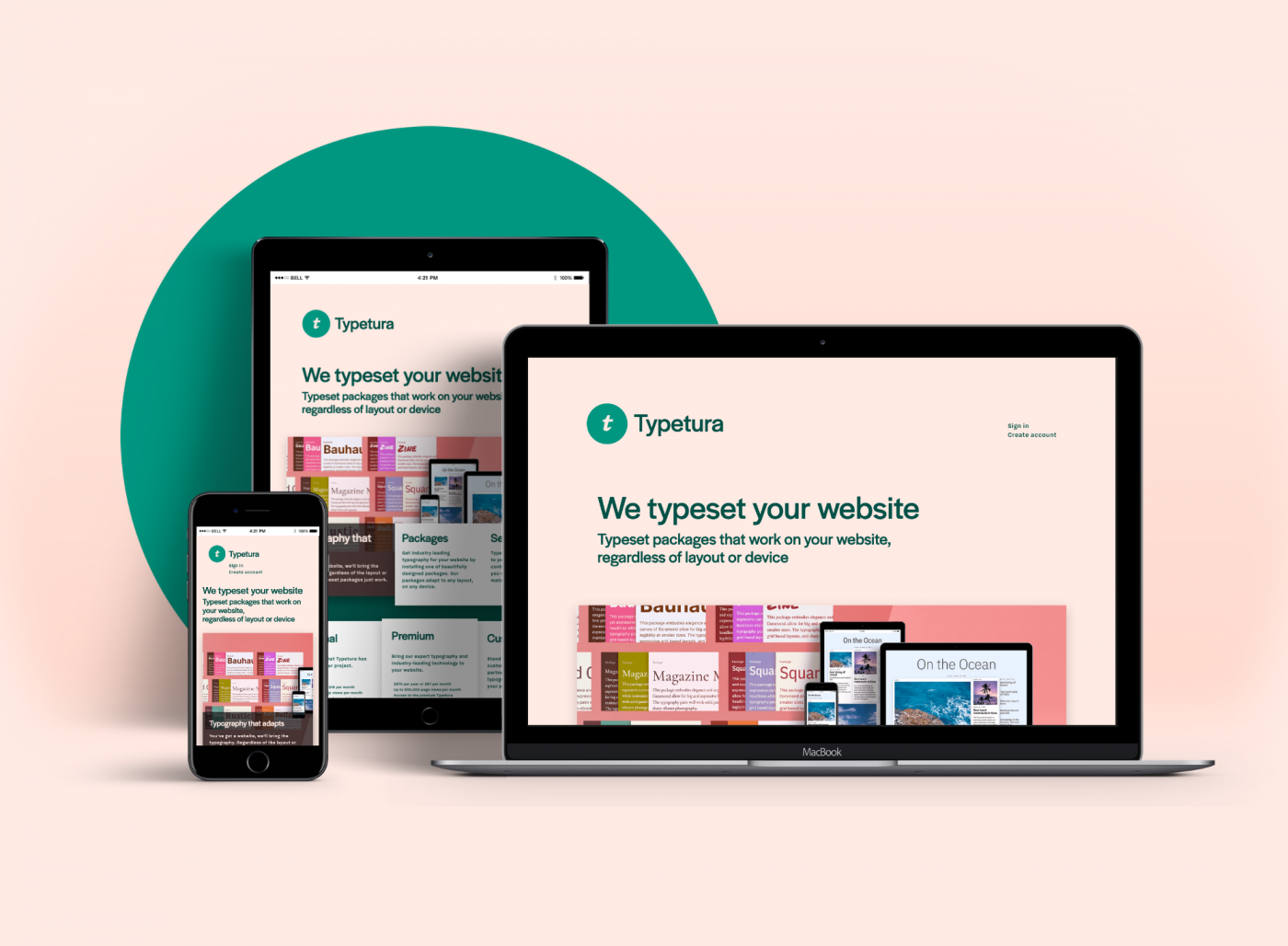
With Typetura, we had this idea of how digital typesetting should be. My business partner, Sal, and I set out to create a tool to teach. This was app.typetura. With the app we were trying to teach people how to fish, so to say, but to extend the metaphor, what we found is that people didn’t even know what fish were yet. We also didn’t have a business plan, so for a little while we were stuck. Then, our other business partner, Ana Monroe, also a designer, solved these issues for us. Our business is focused on services. This way we can work with companies on typesetting solutions for their products, creating examples of our vision for the future of typography.
Because of this idea of infinite scalability, do you find yourself thinking less or more about form?
I think of scalability as just another dimension on which to design. We have width, height, and a third dimension that is scalability. It doesn’t really change how much I think about form, but I do enjoy thinking about how form translates to this dimension. It behaves more like time than space, so I think a lot about the way we design for this and how scalability impacts form.
What’s your dream outcome?
I am building the typographic tools and techniques that I have always wanted and I’m really excited to be doing that. Pushing that further, I would love to see this dynamic typesetting paradigm catch on. Our underlying technology is open source, and if browsers baked in tools like ours, it would help the web become a more typographically rich place.