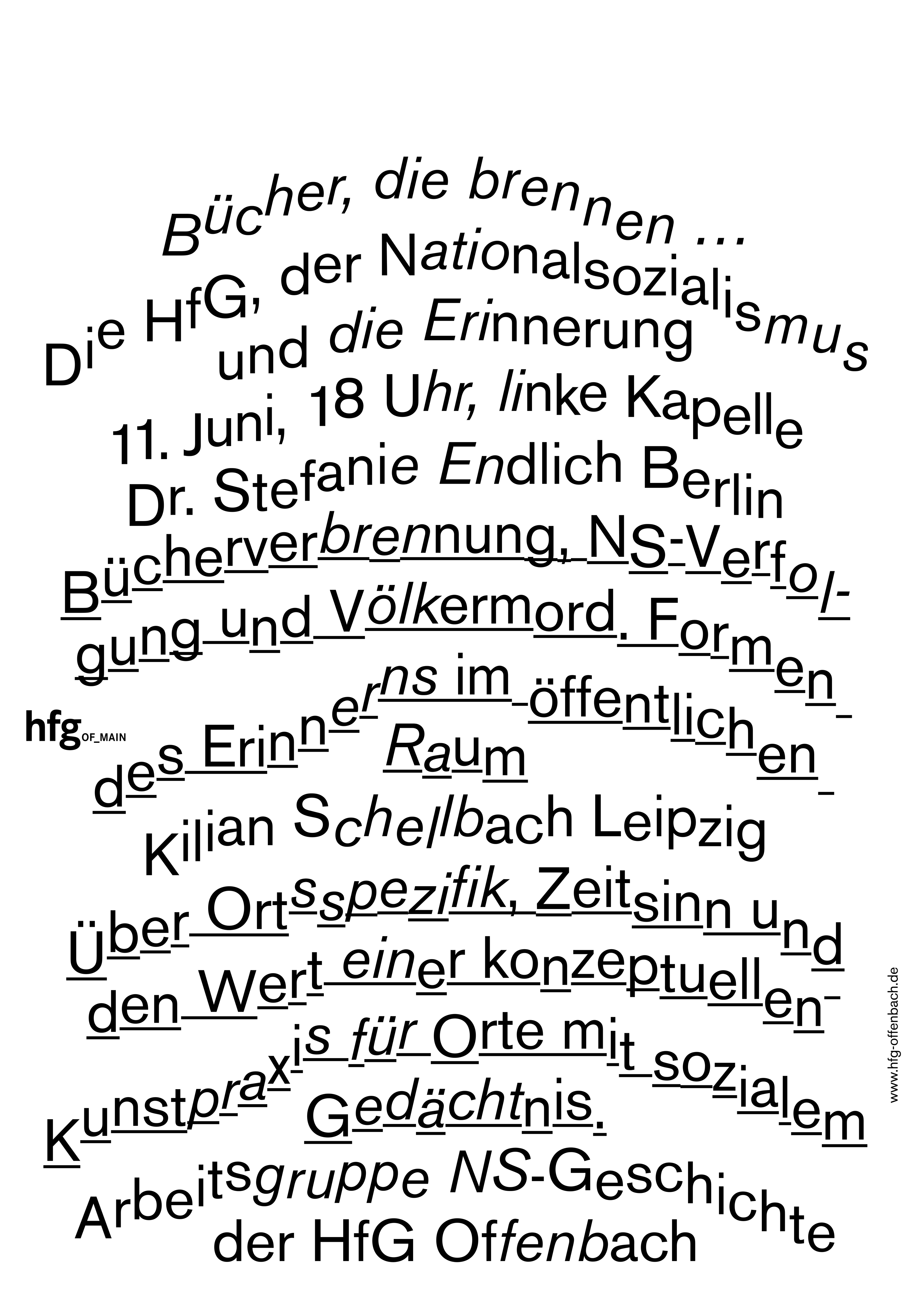
To celebrate our talented and diverse membership, the TDC is profiling one member each month. We’re asking members the same five questions that will hopefully let us – and you – get to know them better. Sascha Lobe – graphic designer, founder and creative director of L2M3 as well as teacher at HfG Offenbach – is March’s choice.
Tell us a little bit about yourself – what you do and where you work
I founded L2M3 in 1999 with architect HG Merz and as of 2001, I head the studio as lead creative director. I enjoy working between graphic design and architecture, wayfinding systems, signage, print, branding and identity projects that take on dual forms creating a distinct visual syntax that translates the idiosyncratic identity of each project theme.
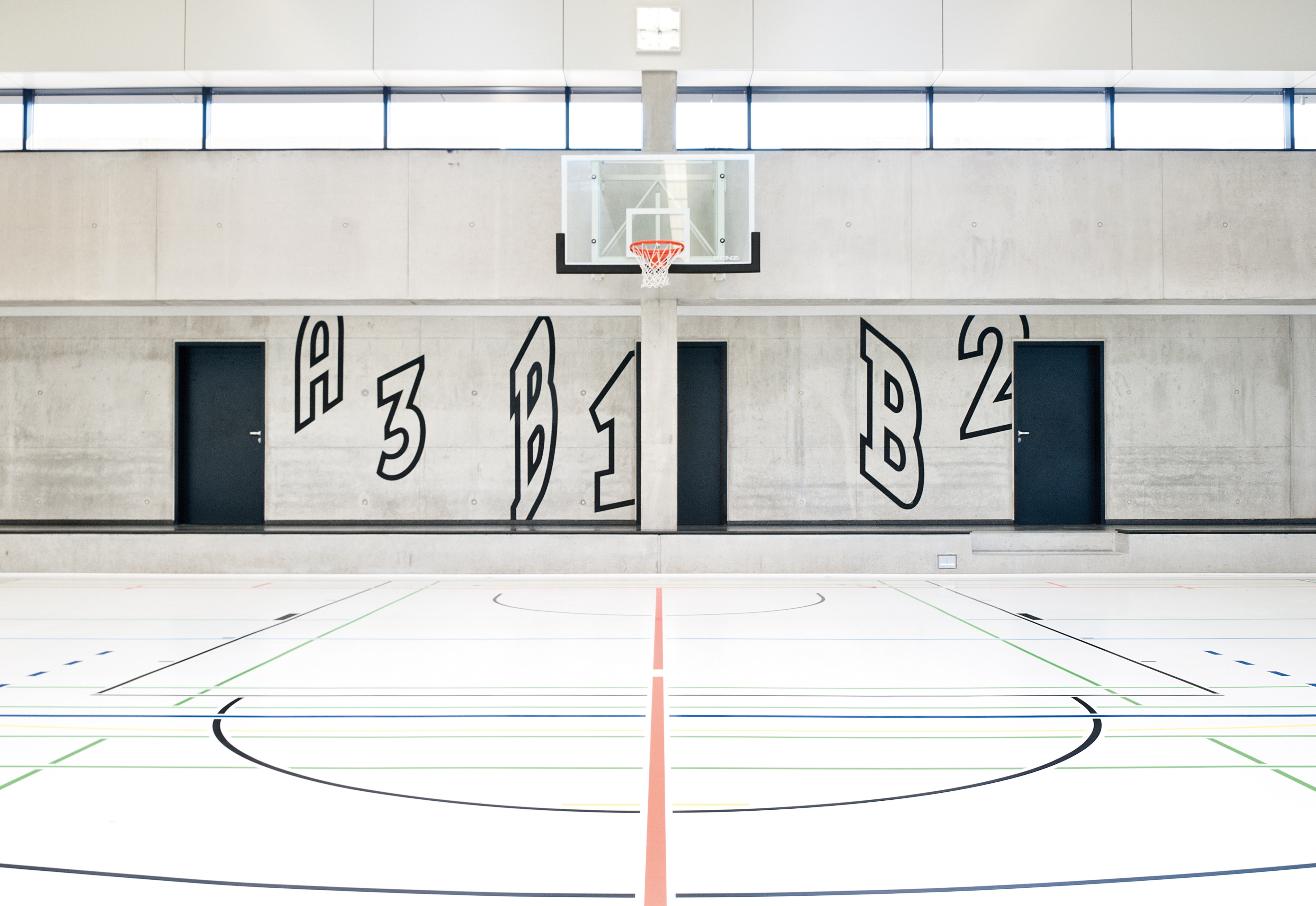
Alfred Kärcher sports hall signage.
What is your favorite typeface? And why?
For me, every specific context potentially generates a new favorite font within the realm it is used for. Still, I will not be able to deliver a typeface one can buy in a random foundry. Surprised, much? That is because, momentarily, I am more fascinated by typeface concepts than in one specific typeface. I would like to give you one example, which is executed by my former student, namely Marc Schütz. For his diploma, he has created a typeface called “Multiple Sans”. The regular font can be both more “geometric” or more “humanistic”, and within its Multiple Sans OpenType’s features the font can differ by the choice of different combinations of its glyphs – meaning the typeface can be either geometric or more humanistic and yet it is not a new typeface but one weight of the type family. So you could choose a more humanistic form for the copy content and a more geometric setup for the headlines or just mix it like you want it to be.
Where do you take your typographic/design inspiration from?
Like everyone else too, I nurture from life. Since I have a smartphone and since there is the platform Instagram I have rediscovered photography for myself. I, literally, snap anything that catches my attention and inspires me but I do not go on a typographic scavenger hunt.
What is your all time favorite piece of design?
At the moment, it is the poster »section allemand« by Herbert Bayer from 1929. Bayer created it for the German Werkbund exhibition at the Grand Palais in Paris in 1930. For me, this art piece marks the zenith of graphic design at the Bauhaus with its newly developed font types, its rather radical, immersive layout while being striking to the maximum at the same time.
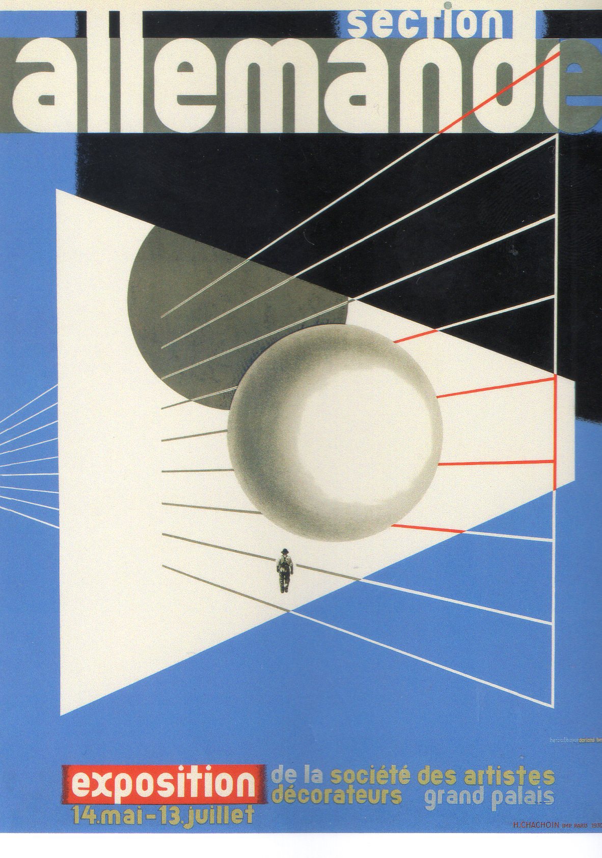
While working on the corporate design of the Bauhaus Archive, I started to study Herbert Bayer’s work with great pleasure and intensity. I think he coined the typical “Typofotostil” of the Bauhaus in which photography and words engage in a direct compositional dialogue. Additionally, his design of the typeface “Universal” was our starting point for the typeface we developed for the archive.
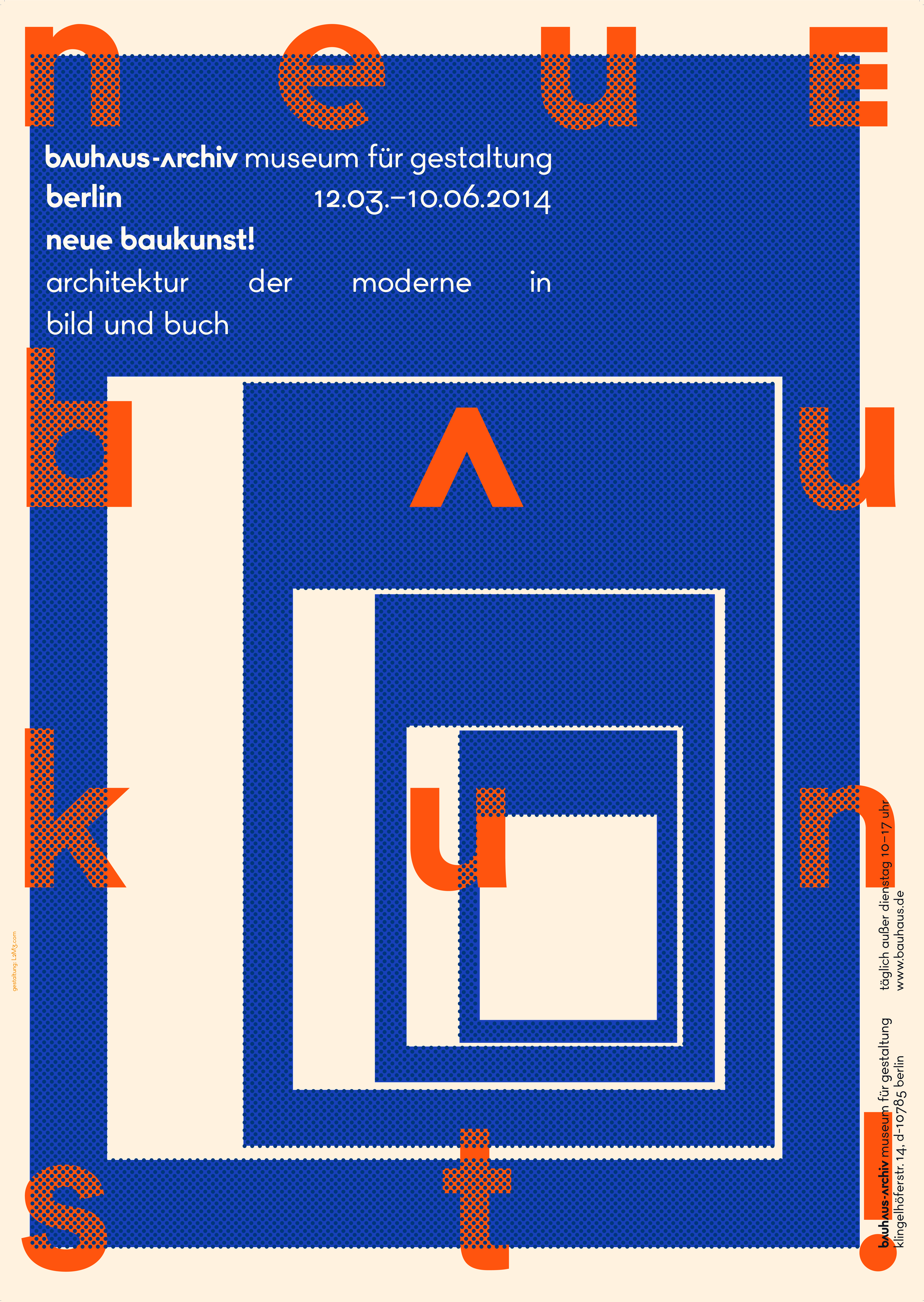
Poster designed by L2M3 for The Bauhaus-Archiv Museum für Gestaltung, ©The Bauhaus.
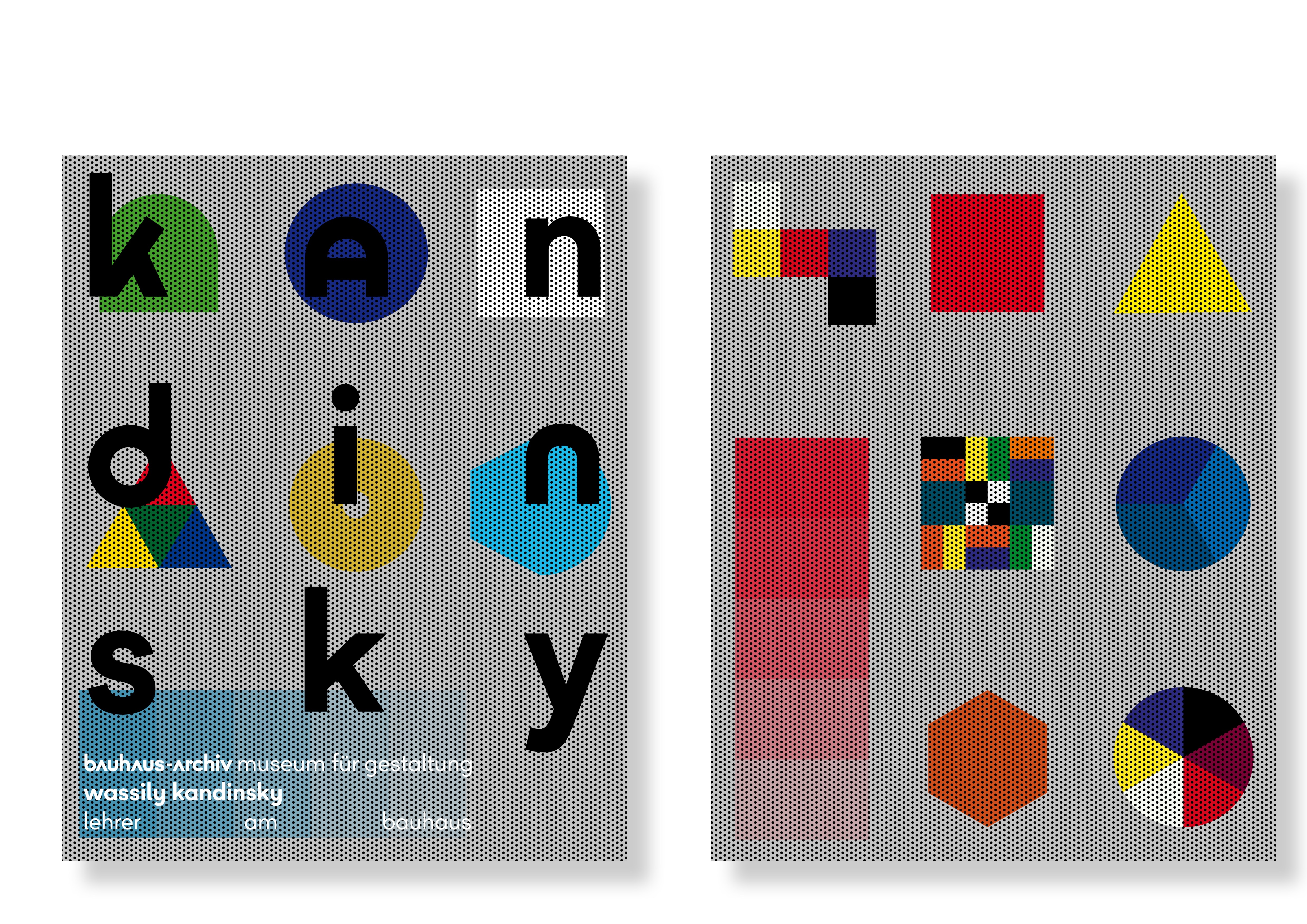
Poster designed by L2M3 for The Bauhaus-Archiv Museum für Gestaltung, ©The Bauhaus.
Where do you see the future in typographic design and typeface design?
Generally, I would say the future is in software-based solutions and fonts with a wider range of glyphs. Let me give you another example of my students: Anne Krieger works on a typeface that reacts to the speed of typing and simulates a handwritten lettering. If you are a quick writer on the keyboard the typeface algorithm will automatically choose a “rapid” looking set of glyphs. If you slow down – maybe because you are pausing while you are writing – other glyph forms will be created as a set. Now how interesting is that?
What is your favorite aspect of being a TDC member? / What drew you to become a member of the TDC?
The TDC Annual was one of the few books on typography that managed to nail the state of the art every single year ever since I can remember and I believe the TDC judges the best show and that every year again.
Links:
Website: l2m3.com
Facebook: facebook.com/sascha.lobe.1
Instagram: @sascha_lobe
Tumblr: saschalobe.tumblr.com
