To celebrate our talented and diverse membership, the TDC is profiling one member each month who is selected at random. We’re asking members the same five questions that will hopefully let us – and you – get to know them better. May’s turn goes to graphic designer and self proclaimed type nerd, Ricardo Cordoba.
Tell us a little bit about yourself – what you do and where you work
I live in Brooklyn, New York, and I’ve worked as a freelance print designer since 2006. I’ve done layout, design, and production work for Manhattan ad agencies and non-profits, and for industries that include communications, retail, pharma, and publishing. I am also a contributor at Stephen Coles’ Typographica, and at Armin Vit and Bryony Gomez-Palacio’s Quipsologies.
What is your favorite typeface? And why?
I don’t have a favorite typeface. (There are so many good ones!) As a designer, I try to keep an open mind, and approach a brief without preconceived notions. That being said, I do have a favorite workhorse sans serif: that would be Morris Fuller Benton’s Franklin Gothic. Perhaps it’s because of details like its double-story lowercase “g”, or the straight diagonal leg in the uppercase “R”, which give it personality. I also have a thing for wood type — slab serifs especially. Those bold, thick lines! (And angles, in the case of Grecians.) I’ve always liked Jonathan Hoefler’s Ziggurat and Acropolis typefaces (part of his “Proteus Project”), and David Berlow’s Giza family. (I first came across examples of Victorian-era “Egyptians” in a book by John Lewis, at my university’s library, but I’m sure that my years of reading “Rolling Stone” magazine also had their influence. Messers. Jim Parkinson and Roger Black: this means you!)

Where do you take your typographic/design inspiration from?
From graphic design history, trade magazines, type specimens, design websites and blogs, comics, movies, album covers, collages, street art… I love visiting bookstores and record stores, just to browse and see what’s being done — or, in the case of used books and records, what’s come before. I also like to read fiction and non-fiction, and try to keep up-to-date on the news.
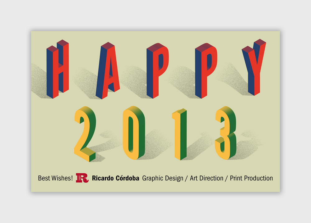 Ricardo’s personal project: New Year’s greeting cards created for his clients and colleagus.
What is your all time favorite piece of design?
That’s a tough question! It might be the packaging for Pink Floyd’s The Dark Side of the Moon album, designed by British studio Hipgnosis (Storm Thorgerson and Aubrey “Po” Powell, plus illustrator George Hardie for this particular album) in 1973. It wasn’t just the album cover, but also the 2 posters and 2 stickers that came with it. (I saw the stickers first, on a classmate’s binder.) There was a visual concept applied to everything, including the labels on the vinyl record. It was probably my first inkling, in high school, that someone did this for a living, and also that a record’s cover could express the mood or message of the music within it (rather than simply having a photo of the musicians on the front).
Where do you see the future in typographic design and typeface design?
Another tough one… Changes in typeface design and typographic design have usually been dictated by changes in technology, and things have changed so much, and so rapidly, in the last few decades! I think that this is a great period for typeface design. I suppose the future will bring more specialization of tools and software, and probably more type foundries as well.
What is your favorite aspect of being a TDC member? / What drew you to become a member of the TDC?
Being able to meet like-minded colleagues, for one thing. And events like the TDC Type Salons and the annual Book Night. (Okay, that’s three aspects.) The first Type Salon I attended, a couple of years after I moved to New York in 2001, was with Gerard Huerta, and I was blown away by his presentation, and all of the work that he showed (not just slides of the finished pieces, but actual comps drawn on tracing paper). I was hooked from then on.
Links:
Behance: behance.net/ricardocordoba
Coroflot: coroflot.com/halftone_dots
FontStruct: fontstruct.com/fontstructors/squarepeg
Pinterest: pinterest.com/coverdesigner