We are pleased to encourage everyone to visit Qian Sun's Architype New York exhibition at Gallery Usagi in DUMBO, Brooklyn from December 9 – 26!
How did you end up at Savannah College for Art and Design?
The short answer is, by following my curiosity and heart. Growing up in Shanghai, studying design in the United States was something I’d wanted to do for a long time. Choosing SCAD was mostly because I wanted to explore unknown adventures as well as enjoy the warm weather and atmosphere of Savannah. I had graduated from Tongji University’s Architecture & Urban Planning Department, majoring in Visual Communication, and was fortunate enough to attend Tama Art University in Tokyo for illustration and graphic design.
After living in Shanghai and Tokyo, I was longing for somewhere different, maybe the opposite of those large, busy cities. Savannah was fresh, romantic, and beautiful. I honestly didn’t think too much about why. I just packed my bags to try it out, and I loved it.
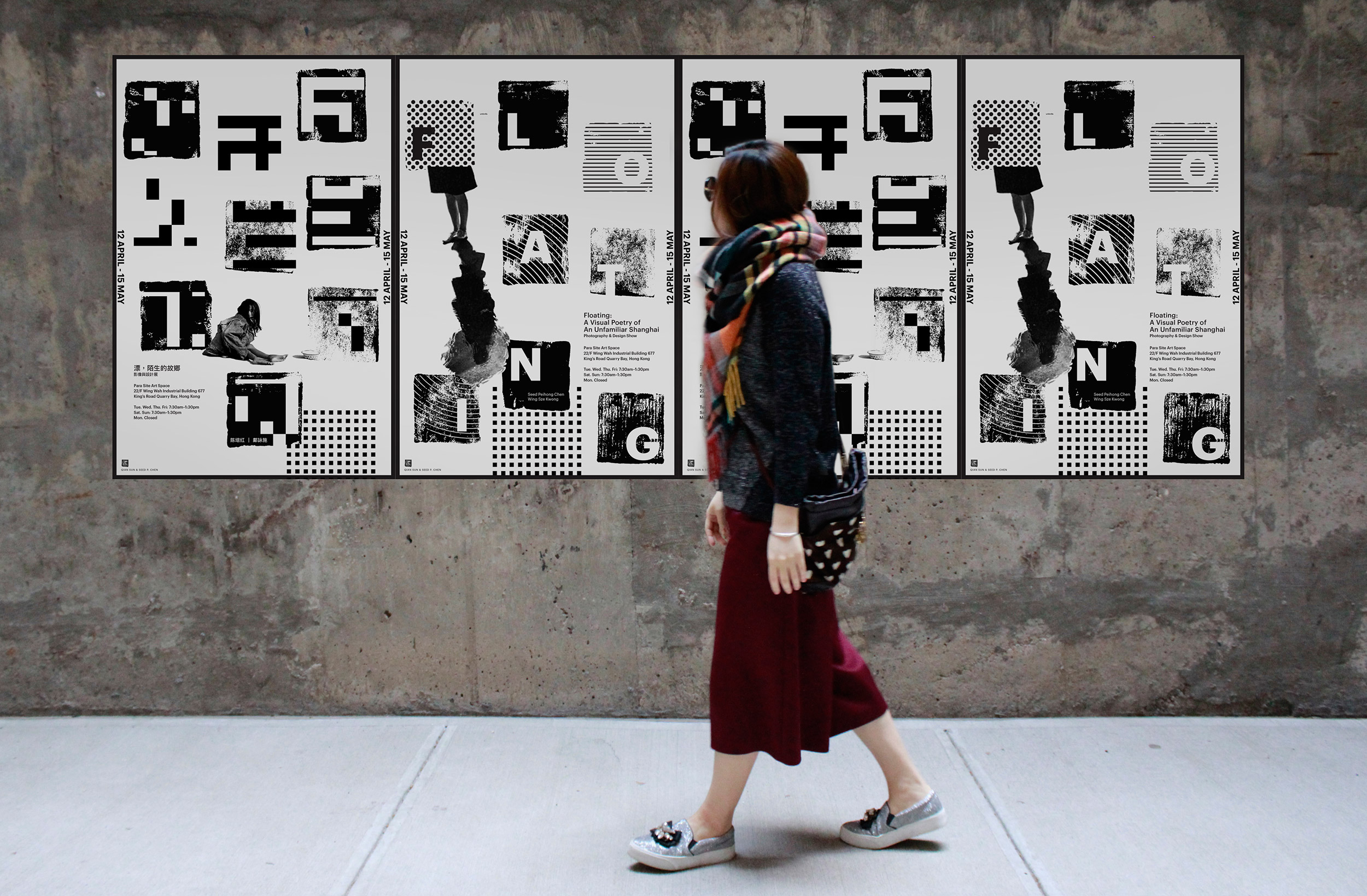
Design for Floating, an exhibition in Hong Kong.
You have a wonderful breadth of environmental graphics in your portfolio. How did you end up working on those kinds of projects?
All my previous adventures and experiences turned out to be connected. My love for architecture, typography, illustration, and branding found me a sweet spot of environmental graphic design. I worked on quite a few EGD projects with Michael [Gericke] at Pentagram. Those projects shaped my focus and I was able to find what I enjoyed doing the most. Once I developed a portfolio focused on EGD, more and more EGD projects naturally come to my door.
When I’m not working on environmental work, I make typographic representations of interesting buildings in New York as well as other cities. This is what led to MaesterDesign as well as commissioned projects.

Type in motion design for IBM’s Think conference.
What are some considerations that you take into account when you use type in exhibitions/spatially?
It really depends on where I’m using the type, or the occasion. This can truly determine the scale of type I'm dealing with, which then leads to the next move: which typeface to use and how to use it. In a wayfinding project, the functionality and legibility are more important than the aesthetics. While they still can be beautiful, a sign needs to function and be usable. If the project is themed graphics, murals, or type sculpture, then you have the opportunity to forget about the rules of traditional print or editorial design and just have fun! Type is very flexible when it comes to large scales. I think of it as more of an illustration or art than the letters themselves.
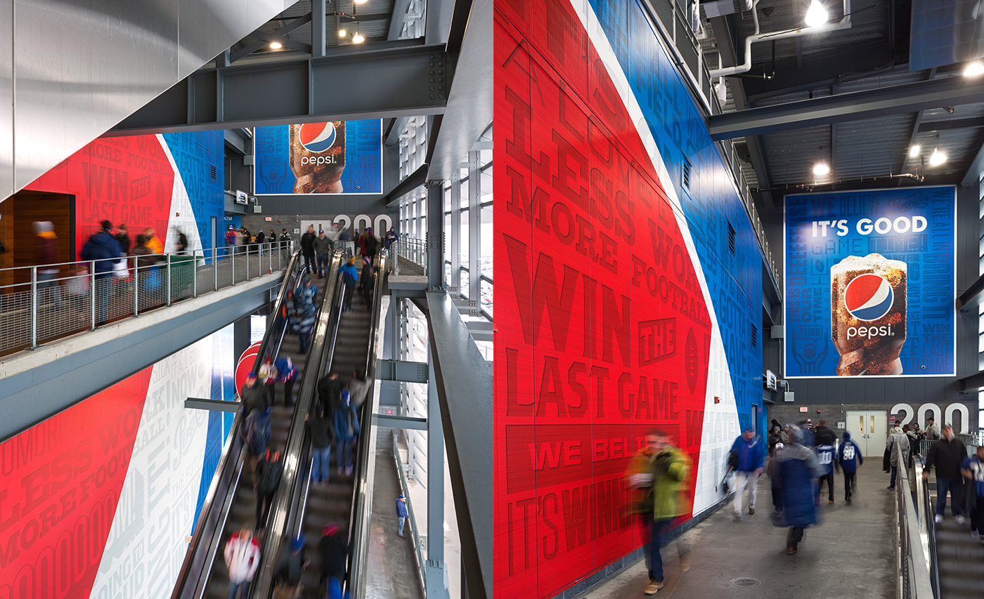
Environmental design for Pepsi at MetLife Stadium in New Jersey's Meadowlands Complex.
What kind of things do you like to illustrate most?
I like drawing under the restraint of simplicity, like my Architype series. I find using black and white, as well as the simplicity of the repetitive action is calming, almost like meditation.
I also really enjoy drawing colorful, cute, and whimsical stuff, digitally or traditionally. I’ve been creating food-themed digital illustrations on my iPad when taking short breaks while working on other projects. I had such a great time making them that I later turned them into iOS stickers and then into a full greeting card line.
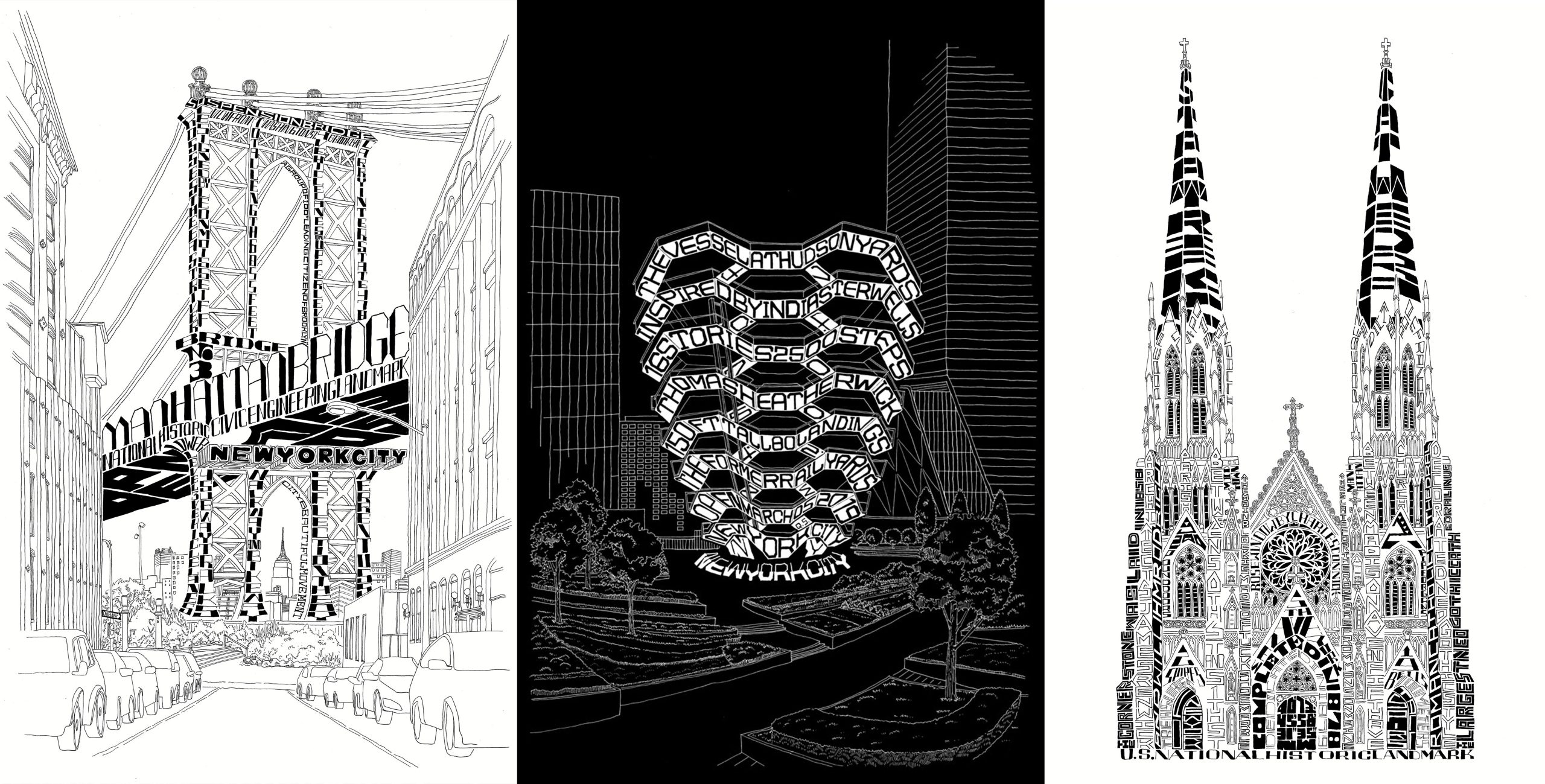
Three New York landmarks from the Architype series.
Whose work has had the most impact on you?
Thinking back, when I just started to understand design as a concept, Kenya Hara’s projects made me want to do environmental graphic design. While I was growing up, environmental graphic design was not taught as a major in my country. At the time it was simply seen as a facet of architecture and interior design. While living in Japan, I was very moved by Sato Kashiwa’s design methodology which opened my mind to a more adventurous approach to not only design, but life as well.
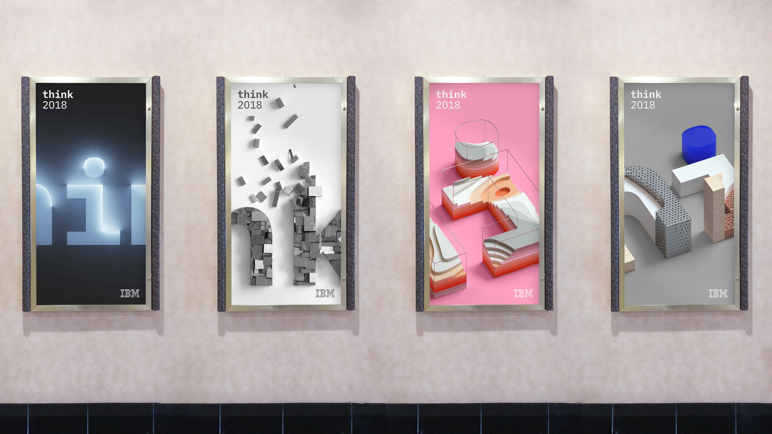
Posters for IBM’s Think conference.
When I’m not working on EGD or lettering/illustration, I’m working on having a super-adorable corgi. Here is a pic of her. Her name is Minna!