This month, we depart from our standard interviews with type and graphic designers to talk to Pamela Green, a creative director, producer, and co-founder of PIC Agency — a Los Angeles-based film production studio that specializes in feature film titles and motion design. This award-winning opening-sequence designer tells us about her career trajectory, the relationship between motion and typography, her title-design heroes, and the latest film that she is directing and producing.
Usually when you read about people in film and television, they often seem to take a circuitous route to their current careers. You rarely hear of someone majoring in title design in college, so what was your path?
That’s a great question. I used to draw as a child and always liked the typography I saw in museums, on posters, in TV, and film. But you don’t really realize the impact these things have on you until you’ve have had a chance to look back and reflect. I worked for two companies in Atlanta that specialized in web design, interactive games, and director presentations. I was not a designer and did not come from a design school or film school, but these jobs are where I got my start looking at typography more closely. We did everything from corporate design and logos to entertainment-related projects with the Turner group.
When I moved to Los Angeles, I worked for a company called Kaleidoscope. Their focus was movie marketing — TV spots, posters, graphic design, and the list goes on. In some sense, this was my school, because I was exposed to all the tools used for film and television.
I was immediately drawn to main title design and motion graphics because you were able to tell a story through design and animation.
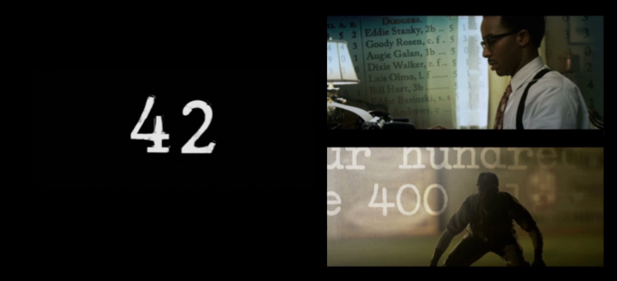
Title and stills by PIC Agency for 2013 feature film, 42.
How does motion affect how you look at typography? Are there certain letterforms that work better on screen than others?
Motion has a huge impact on typography, because type needs to co-exist with the animation. The decision on what to use and how to use it is key.
When giving direction and discussing typography, my preference is to keep it clean and simple, so everything will be legible regardless of the genre. One of my favorites is the Sackers Gothic font, and people tell me that I reference it a lot.
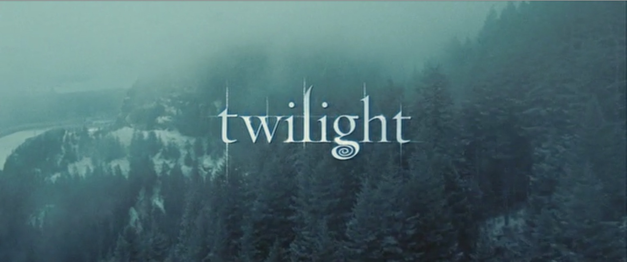 Title by PIC Agency for 2007 blockbuster film, Twilight.
Your style of your work at PIC Agency varies a lot. Are there conscious decisions you make about graphic and typographic style? Are there styles specific to different genres?
The work at PIC is very collaborative, and I am just one of many voices. As a child, I lived in many different countries, so my visual references come to me from outside the design arena. I like architecture, history, and design so I tend to gravitate to those areas. I am a big researcher. I like to find visual references that relate to the story — or to an element of the story — that have an emotional impact, but do it in an abstract way. If we can express that emotion through typography and motion, then we have succeeded.
At PIC, the work we do is tailored to the stories that we are asked to tell within the full scope of the film or TV show. This is why you see such variation in our style. We have to make sure that our work functions as a creative addition to the final product — not a patch or a Band-Aid that gets in the way of overall picture. Our objective is to enhance the overall product.
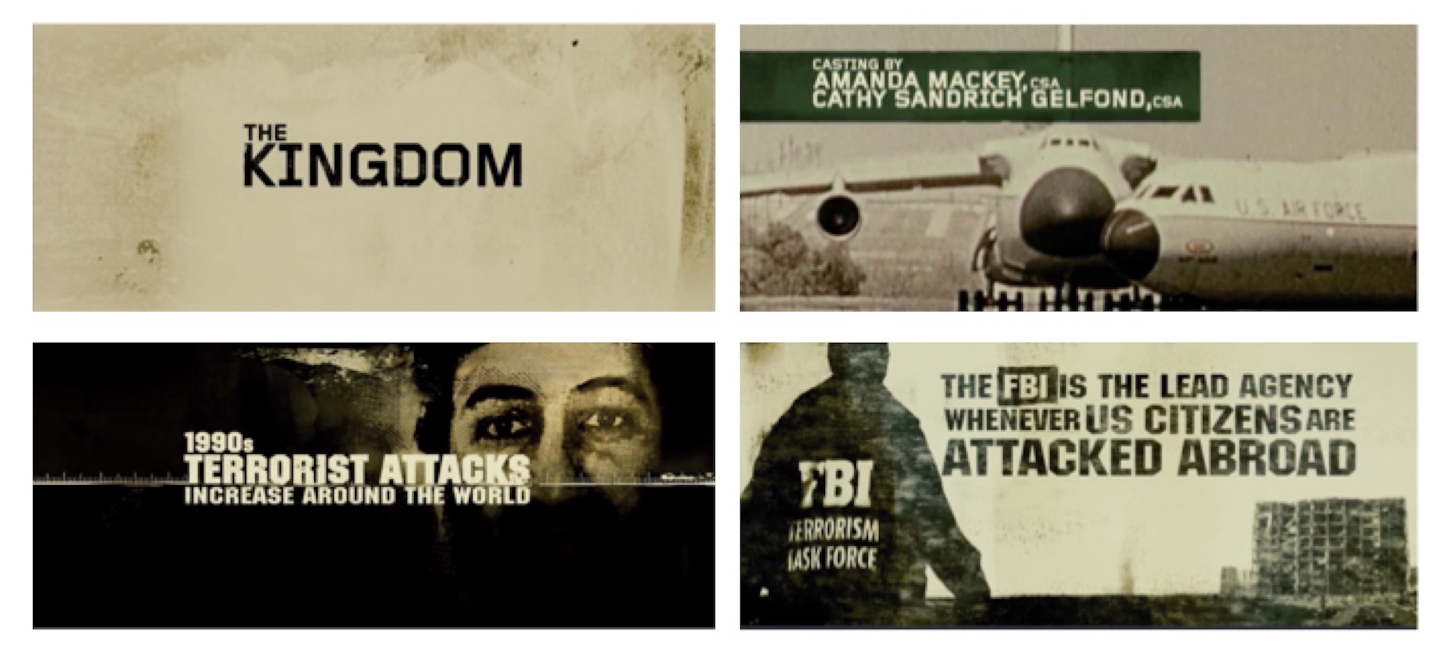 Stills of titles and historic background sequence by PIC Agency for 2007 feature film, The Kingdom .
Do you have a favorite title designer of the past?
One of my favorites is Saul Bass, for sure. I love the animation in his Academy Award-winning short documentary, Why Man Creates. I’m also a James Bond fan and I love Maurice Binder’s titles on so many of the films in that series.
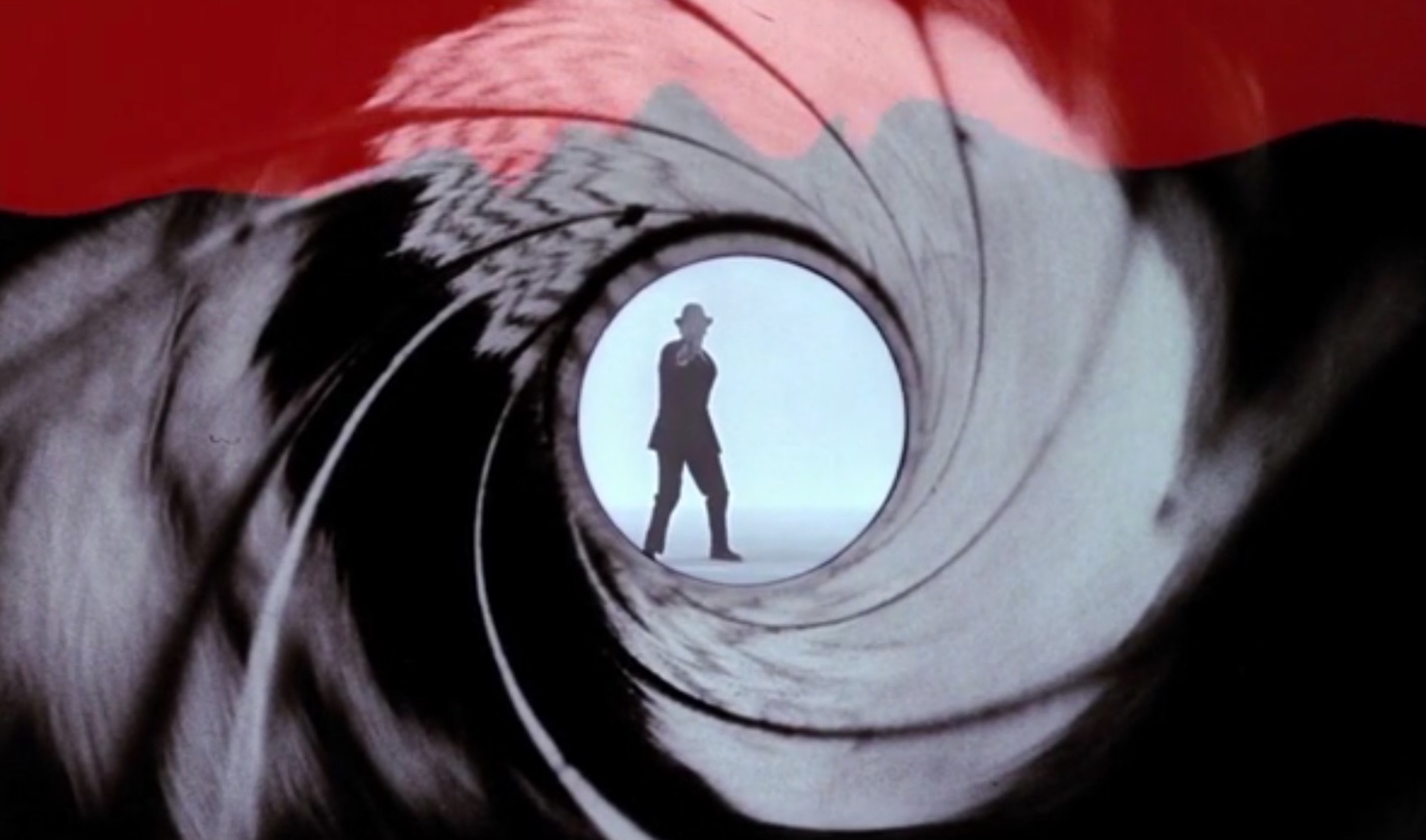 Still from Maurice Binder’s 1962 opening titles sequence for Dr. No, the first Bond movie.
This might be a silly question, but do you see a lot of films? Are you a movie buff? What’s a favorite / standout?
There are so many films that I like—imaginative films, detective stories, and also true stories that involve history. I love the film Amelie.
I haven’t had time to be much of a film buff lately, because I’m currently working on Be Natural: The Untold Story of Alice Guy-Blaché, a documentary about the first female film director. She made her first film in 1896 at the age of 23, and went on to write, direct, or produce more than a thousand films. Working on a film doesn’t leave you time for anything else!
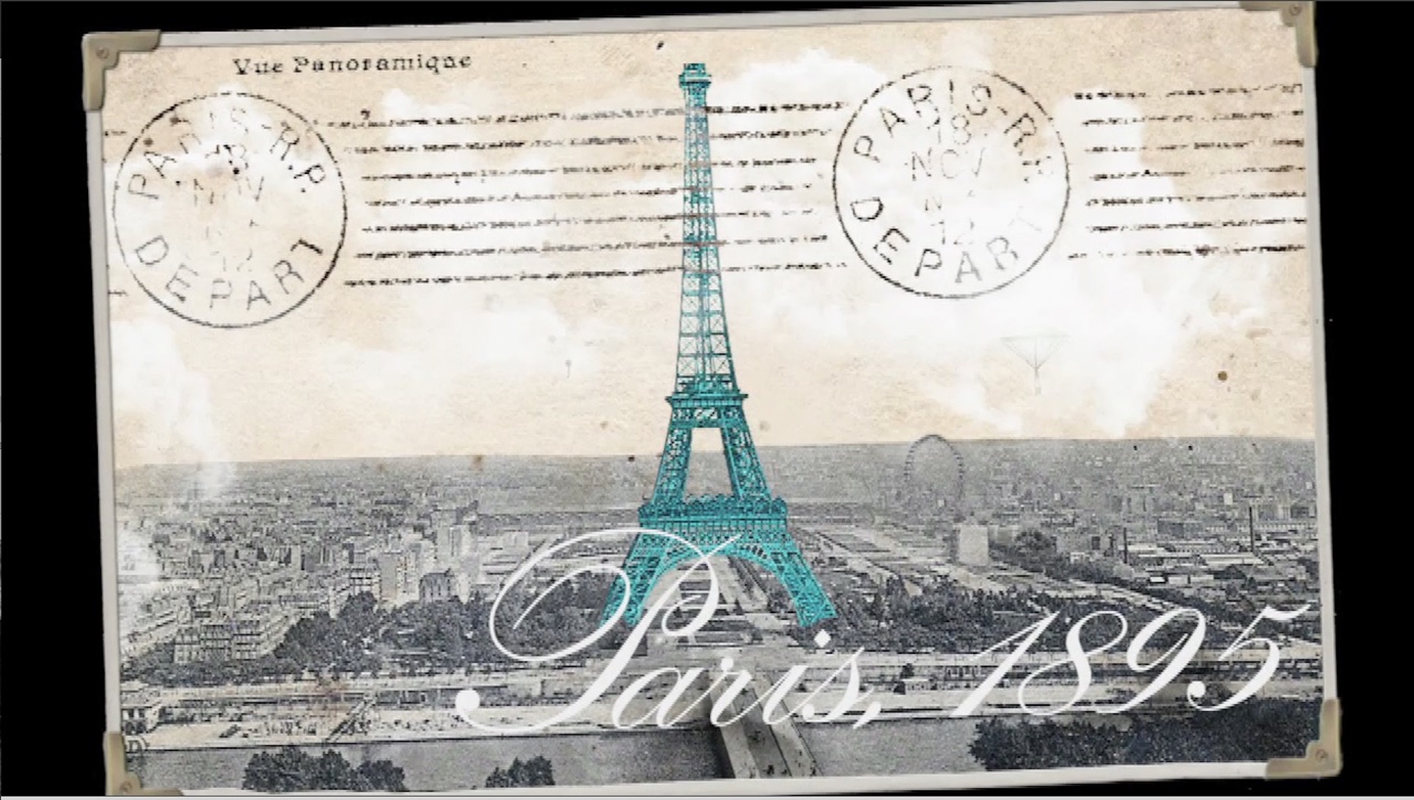 Still from Pamela Green’s documentary project, Be Natural: The Untold Story of Alice Guy-Blaché.
Links:
Web: picagency.com
Web: http://benaturalthemovie.com/
Twitter: @pic_agency
Twitter: @BeNaturalMovie
Facebook: https://www.facebook.com/Pic-Agency-611546502202547/
Facebook: @BeNaturalMovie
Vimeo: https://vimeo.com/benatural