Nour Kanafani is a seasoned graphic designer hailing from Beirut. As a member of the TDC, we asked Kanafani to fill us in on his practice, his experience, and the state of design in Lebanon today.
Nour! I’m so glad we could connect. You’ve been a TDC member for a few years now. How long have you been a practicing designer?
I published my first professional project in 1996, I was still in design school then. I’m a graduate of the American University of Beirut (AUB), the leading academic institution in our region and one of the first universities to house a Graphic Design program in the Faculty of Engineering and Architecture.
What led you to the field?
A smart placement officer in my senior school. I remember in 1993, she called me in to tell me about a new design school at AUB which had been launched a year earlier. During my elementary and senior years, I had shown a clear preference to art and design.
 Cover details of Lead Innovate Serve, a visual history book designed for the sesquicentennial of the American University of Beirut.
Tell us about a favorite project that has used typography in a way you felt proud of, that was meaningful to you.
I think the most challenging use of type was in the AUB150 visual history book, Lead Innovate Serve (AUB Press, 2016). The sesquicentennial of the American University of Beirut was 2016. We were commissioned by the university to do the complete design exercise including a 300-page book visually narrating the chronological history of the university.
Unlike other books in my portfolio, this was a design-led book and not a content-led one. Instead of the authors giving me the content to design, I was asked to design and then all the authors will feed the content into my design. This paused quite a challenge. At its core, this was a modern interpretation of what a timeless history book should be. How does one design modern timeless history?
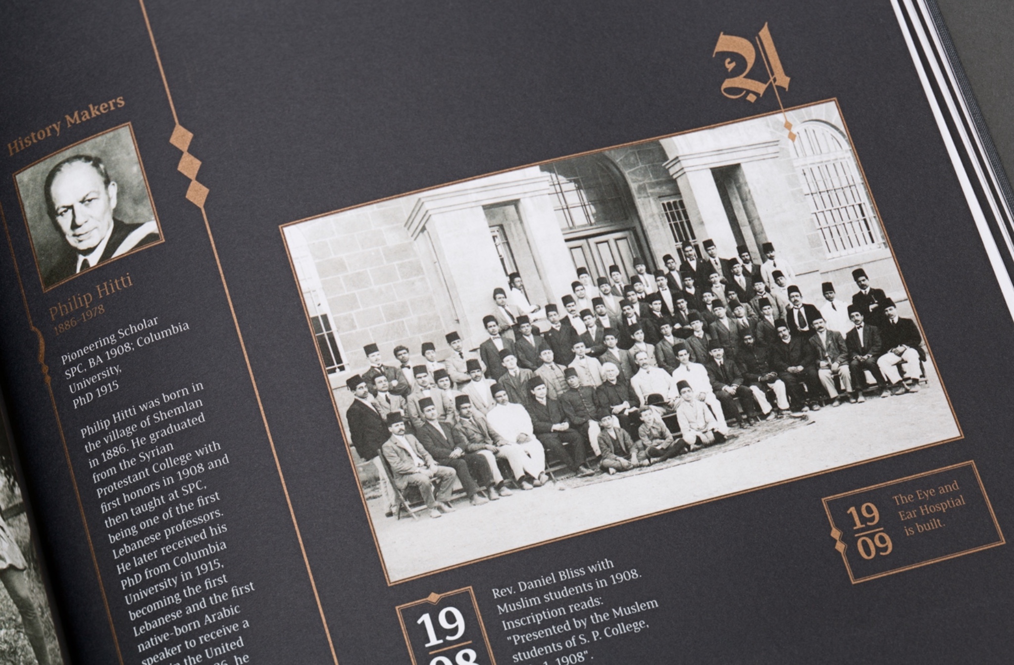
 Page from AUB’s sesquicentennial visual history book, Lead Innovate Serve.
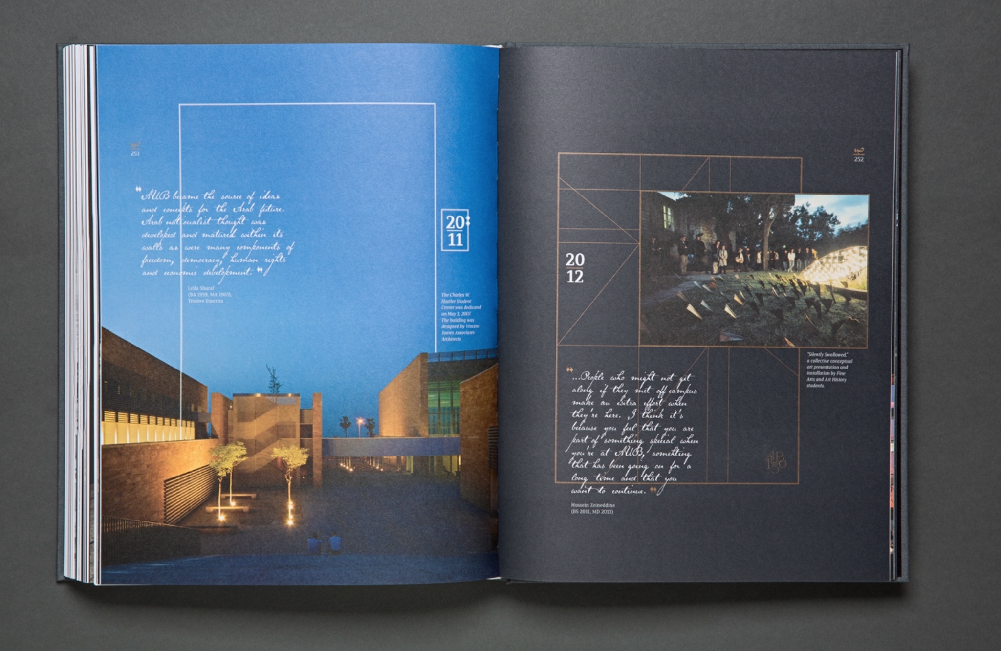
Beirut has always been a cultural crossroads between east and west and so has been the university. The founders, though American, were infused with the rich culture of the region. I believe it was important for the typography of the book to depict that. Arabic calligraphy details were mixed with Latin type and layered over the grid.
New printing techniques were used to highlight the modernity of the piece. This was the first book in the country to be printed with gold LED ink, which decreased the ink absorption of the cotton stock to a minimum, bringing out the grace of the content.
 Inside the AUB’s sesquicentennial visual history book, Lead Innovate Serve.
What is the design landscape like in Beirut? Is there an active community?
The design landscape in Beirut is quite busy, albeit not very visually mature. More than ten universities in the city today house graphic design programs, the majority of them are less than 20 years old. Some are less than five years old. For the onlooker, having relatively young design schools is a good thing, but I believe that a young design school will only be led by a young faculty. Thankfully, maturity is an increment of time, so I truly believe that we only need time to mature visually and intellectually.
 Communication Design created the AUB150 logo and all related branding applications.
Do you have a piece of advice for young Beirut designers entering the field today?
I believe that young designers should understand that they are “young at design”. Give time to hone your problem-solving methodologies. A design graduate is a long way from a design professional.
