To celebrate our talented and diverse membership, the TDC is profiling one member each month. We’re asking members the same five questions that will hopefully let us – and you – get to know them better. To kick of 2016’s Member of the Month feature we proudly present, Michael Bierut.
Tell us a little bit about yourself – what you do and where you work
I’m a graphic designer, and I’ve been a partner in the New York office of Pentagram for a little more than 25 years. In addition, I’m a co-founder of the website Design Observer, a teacher at the Yale School of Art, and the author of a new(ish) book, ‘How to use graphic design to sell things, explain things, make things look good, make people laugh, make people cry, and (every once in a while) change the world’, published at the end of 2015 by Harper Design.
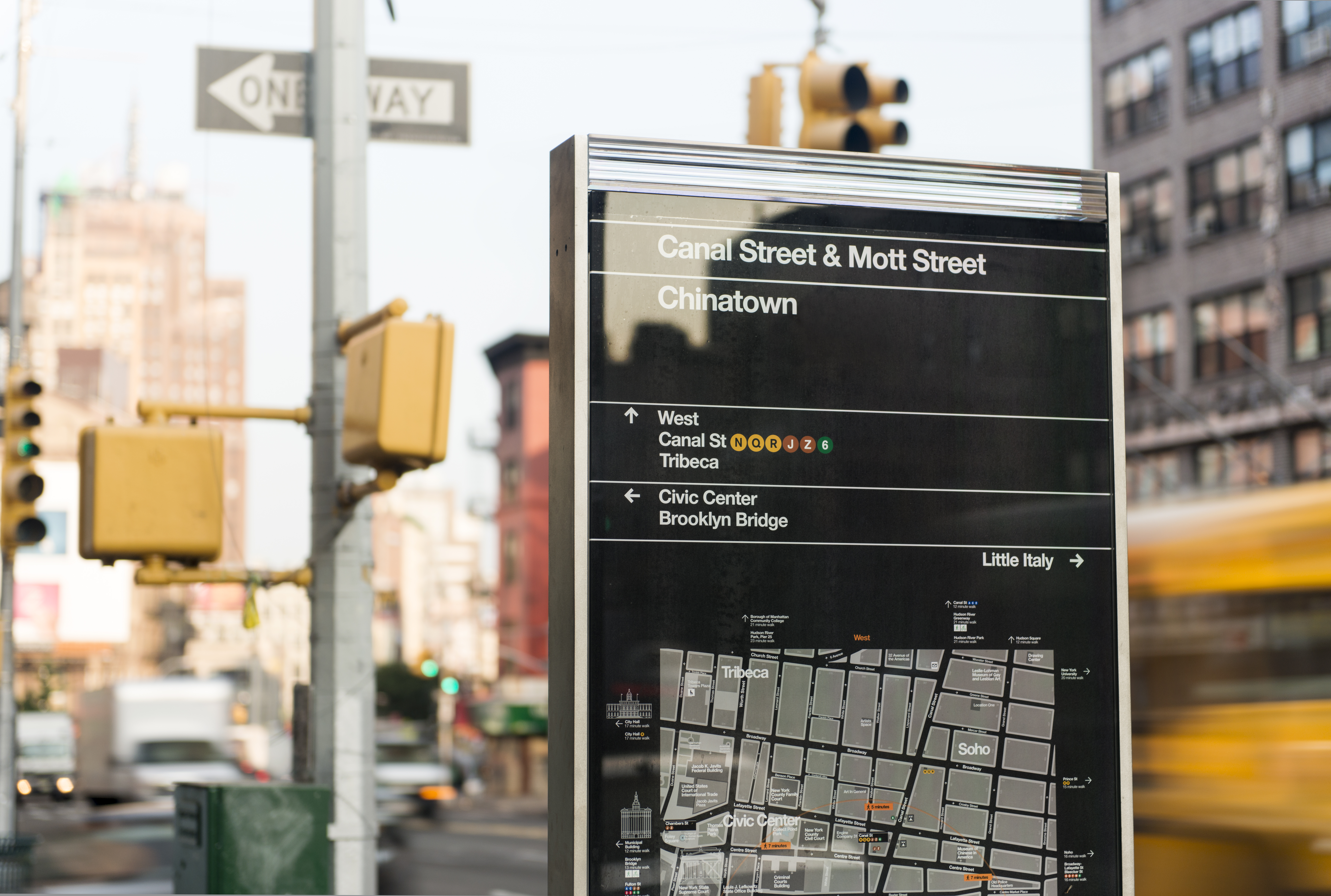
New York Department of Transportation, WalkNYC wayfinding kiosk. Designed by Bierut’s team.
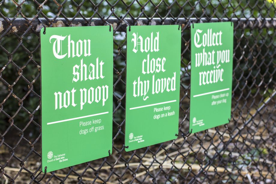
Bierut and Jesse Reed’s signage design for the Cathedral Church of St. John the Divine. A series of signs gently remind visitors to pick up after their pets.
What is your favorite typeface? And why?
I think most people dodge this question, which of course is my first impulse as well. If pressed, I’d have to admit a secret love for typefaces that sort of do the design for you. Helvetica is a classic example. Although people pretend that it’s “neutral,” it really isn’t: like it or not, it’s preloaded with a basic point of view, and depending on how you use it, you can enthusiastically endorse that point of view, comment ironically on it, or attempt to completely subvert it. My new favorite is a typeface most people haven’t heard of, but many will recognize, called Schmalfette Grotesk. It was designed by Walter Haettenschweiler in 1954. It is the greatest bold condensed sans serif ever. If it looks familiar to you, you probably know a legendary magazine called Twen designed by Willi Fleckhaus in Germany in the 60s and 70s. All of his layouts used it, and beautifully. And the minute you start to set it, you turn into Willi Fleckhaus yourself. Although my answer will be different by the time this is published, right now it’s my current favorite.
Where do you take your typographic/design inspiration from?
I can find a piece of new piece of typographic inspiration every day, sometimes every hour. If I had to name my influences, I’d start with my first boss in New York, Massimo Vignelli, who had such a keen sense of scale. I would have to add all of my partners at Pentagram, whose work I see every day. It is inspirational and intimidating. Finally, buried deep in my head are examples from the world of art, from Franz Kline and Ellsworth Kelly to Christopher Wool and Tara Donovan. The gap between these masters and the work that comes from my own hand is maddening.
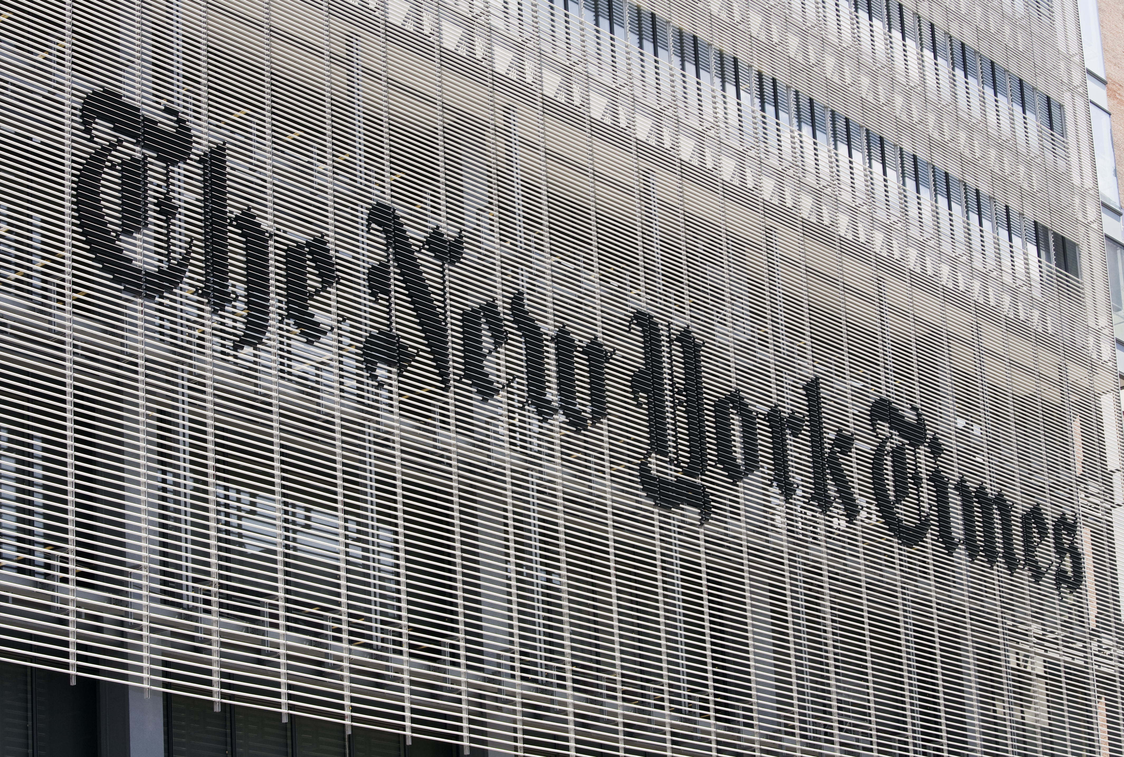
The New York Times building main identification sign design by Bierut.

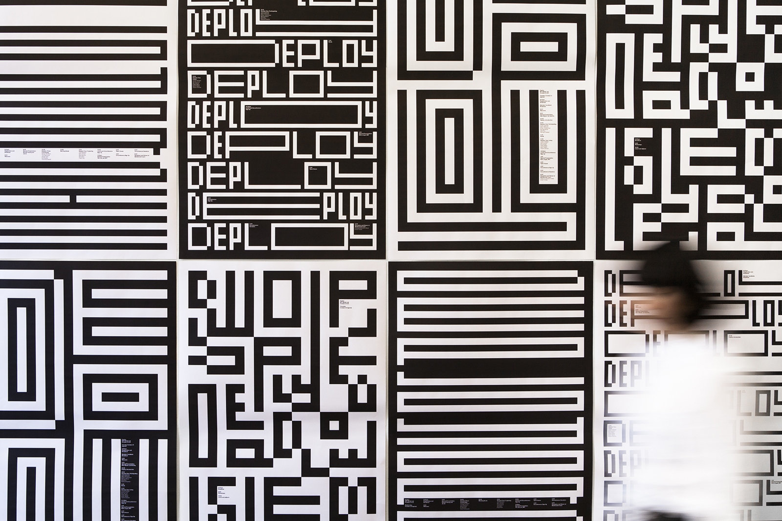
Michael Bierut’s Yale School of Architecture lecture and exhibitions poster.
What is your all time favorite piece of design?
The piece of design I admire above all others is Maya Lin’s Vietnam Veteran’s Memorial. It was a startlingly brave and uncompromising solution to a seemingly impossible challenge. Not only does it serve as a direct metaphor for war as quagmire — as you read the names of the dead, you literally sink deeper and deeper into the earth — but in plan it’s a simple piece of typography, a big V for Vietnam. It was a controversial design that polarized many people before it was built. It’s said that Lin was the only person who fully understood what an emotional impact it would have on each visitor. To combine imagination and courage and empathy in this way is something I can only dream about.
Where do you see the future in typographic design and typeface design?
More customization, more responsiveness, and — I hope — more direct connection between designer and reader.
What is your favorite aspect of being a TDC member? / What drew you to become a member of the TDC
Typography is at the heart of everything I love about graphic design, and it has no greater champion than TDC.
Links:
Website: Pentagram.com/michaelbierut
Books: amazon.com
Design Observer: designobserver.com
Instagram: @bierutmichael
Twitter: @michaelbierut