We are kicking off 2018 by profiling Liz DeLuna, a staple at our salons here in New York City, as Member of the Month. As a Yale and Type@Cooper graduate, she has immersed herself in the substance and history of typography and graphic design. As a teacher and generally great human, it’s always wonderful to see her here.
Tell us how you got started in design? What was your first focus coming out of school?
I grew up in NYC in a Soho loft. Both of my parents were struggling artists, who did graphic design to earn a living. I never wanted to be a graphic designer. I thought it was that secondary thing that you did to make money when you were an artist.
As a child, I loved to dance and draw. Somewhere along the way those passions translated to motion and film. I received a BFA in Film at the San Francisco Art Institute, where we mostly studied experimental film. I ended up coming back to New York City and working in the film business. I worked on crew, in the lighting and then the art departments.
After ten years, I felt creatively stifled, but it was a back injury that made me rethink my career. One of my colleagues from the film business had just started a motion graphics company, and he asked me to join him. I worked for him for many years, designing and animating promos, packaging, and show openings for Showtime, ESPN, and a variety of other cable networks.
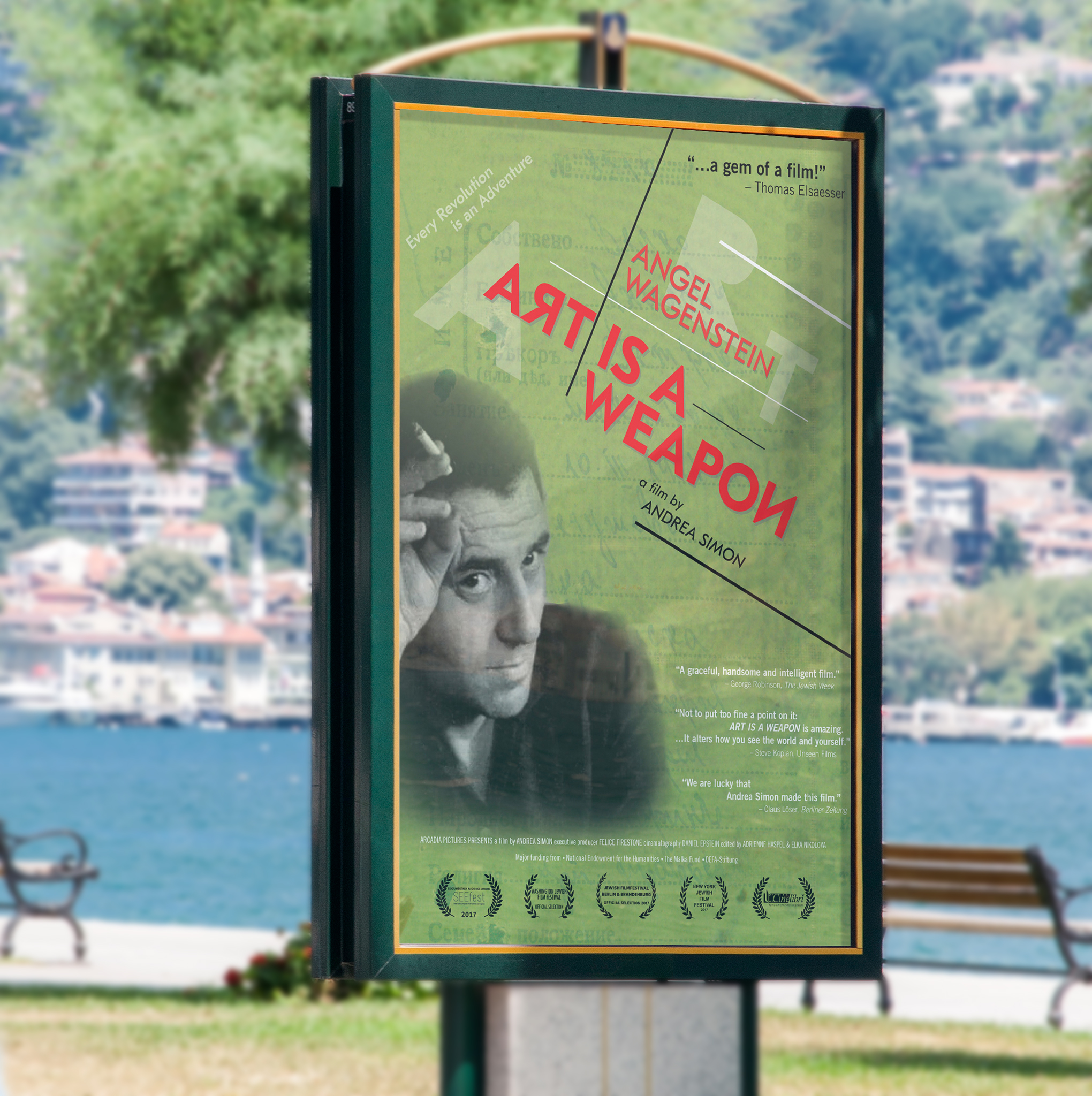 Poster design for Angel Wagenstein: Art Is a Weapon.
I really enjoyed the challenge, and the opportunity to be more creative in my work, but as time went on, I became more and more aware of my lack of formal graphic design skills, especially with regard to typography. I enrolled in continuing education classes in graphic design at Parsons, and then made a pretty radical decision to put everything on hold and immerse myself in the MFA graphic design program at the Yale School of Art.
I returned to NYC with a new lens on design. I continued to do professional work in motion graphics, but also decided that I would like to share some of the knowledge I had gained on my path, so I began to teach design. I have continued to do both ever since. I’m an Associate Professor of Graphic Design at St. John’s University in Queens. Most of the motion graphics work that I do now is for PBS programming and documentary films.
 Title design for the Bill Moyers series, No Choice.
You decided to go to Type @ Cooper to study typeface design once you were already pretty established in your career. What was the impetus?
The impetus was actually due to my involvement with Type Directors Club. I went on many type walks and talks with Paul Shaw through TDC, which was really the beginning of my interest in typeface design. I found myself attracted to the different kinds of letter forms that I started to observe around the city, especially those carved in stone.
As a graphic designer, I acknowledge that I am always using someone else’s designs when I choose a typeface. I wanted to experiment making my own designs by using some of the more eclectic typographic inspirations around the city as jumping-off points.
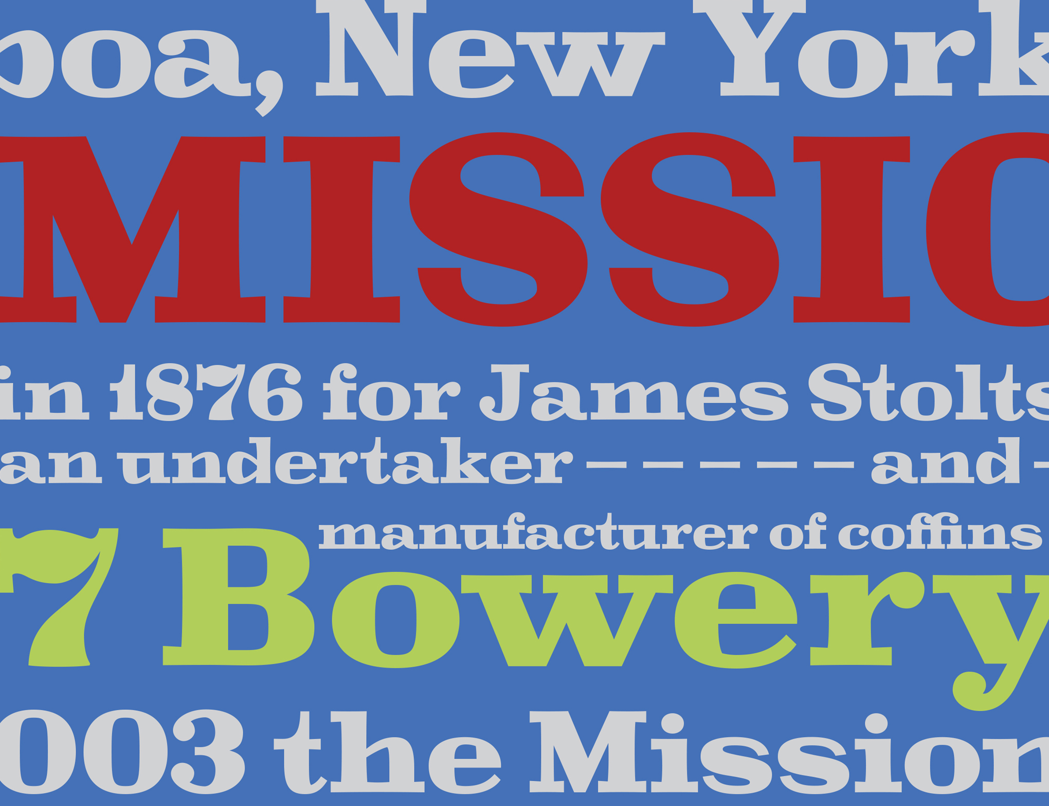 Bowery Typeface.
I took some other classes and did some self-learning but ultimately through TDC I met Jesse Ragan and followed him to Type@Cooper. My intention was not — and is not — to become a typeface designer, but the program fundamentally changed my relationship to letter forms and to typography.
The experience has had a huge impact on my teaching and the references and knowledge that I am able to bring into the classroom. It’s evidenced in my students’ work and in the respect and passion they gain for typography. I firmly believe that to really appreciate and understand typographic specifics, you need to form intimate relationships with the letter forms themselves.
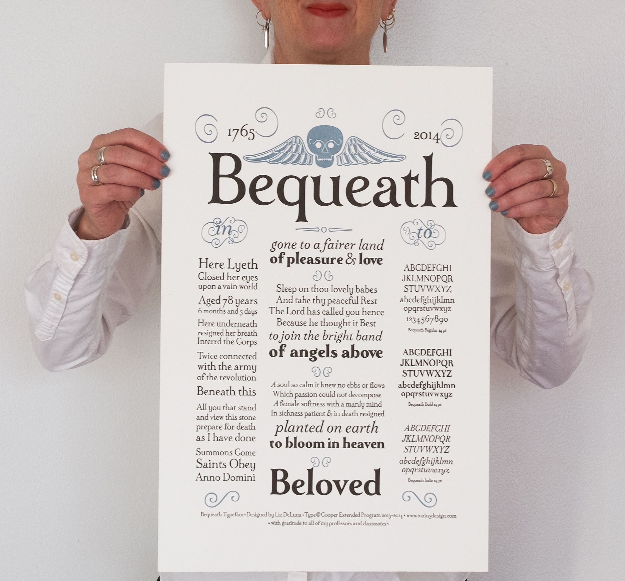 Bequeath Typeface.
You’re a regular at the TDC — one of our most consistent members! What about the club draws you to it?
Ha! That’s great to hear. I love TDC. I am drawn to the ‘club’ atmosphere, its camaraderie and inclusiveness. I appreciate that the physical space encourages conversation and communication, and I know that both will be enlightened and substantive. I feel like I always learn something new and interesting and meet someone new and interesting when I am there.
I also appreciate the aspects of TDC that extend beyond the walls of the club. The board does an incredible job of maintaining the integrity and focus of the organization. It is essentially through TDC that I have informed and expanded my interest in typography. The friends and connections I have made through TDC have been invaluable.
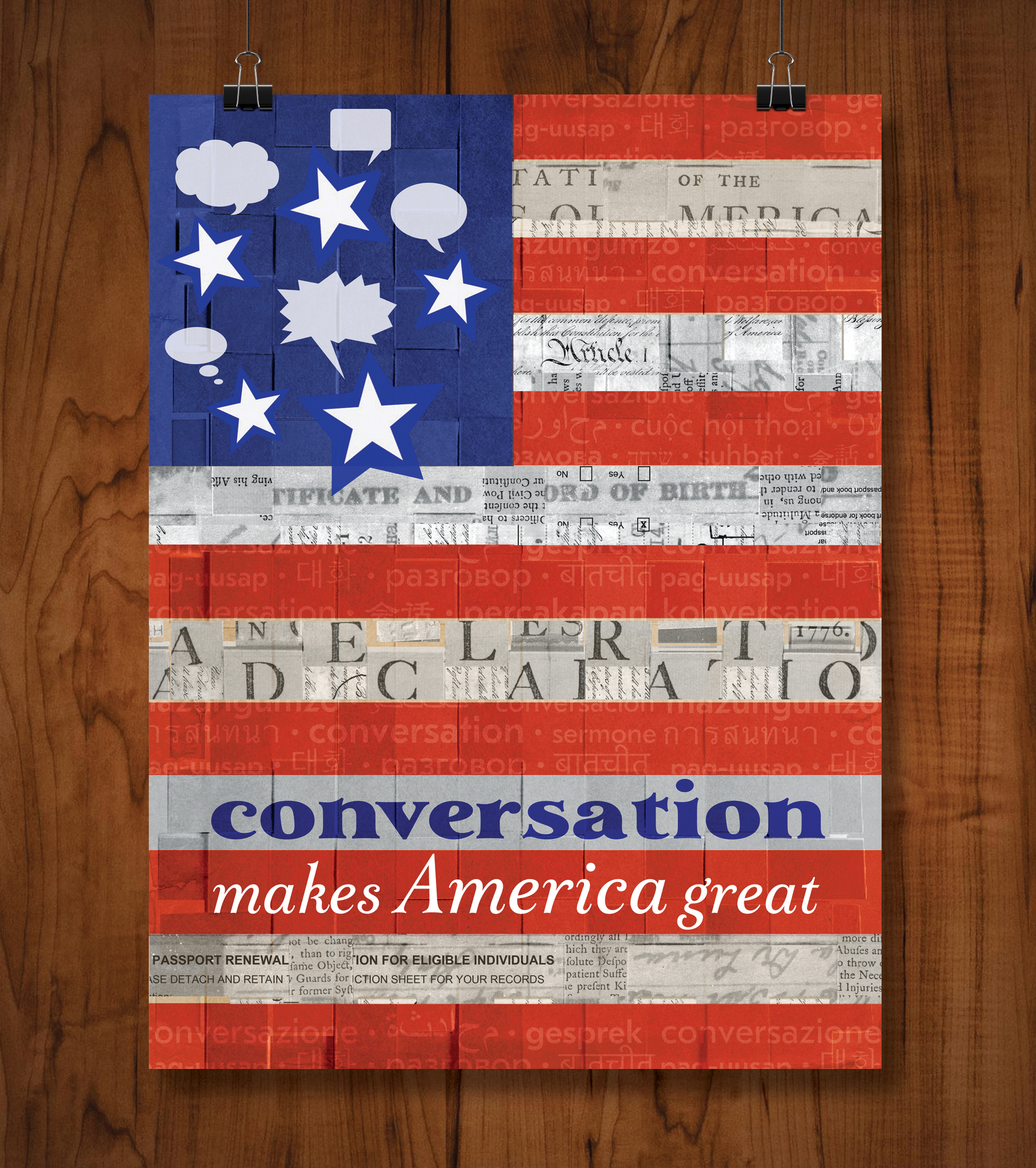 Poster design for What Makes America Great?
Links:
Website: https://www.main5design.com/
Instagram: @main5design