What book are you reading at the moment?
I usually have more than one book on the go. At the moment it’s The Bone People, Printers Type in the Twentieth Century, and The Design Philosophy Reader.
Sincerity/Irony Heldane specimen.
Do you find a connection between avid reading and your immersion in typography? I realized at some point that there’s something to that, for me—I love reading and poetry and rap ... I love words and their combinations.
Yes, there’s always been a connection. I’ve always been drawn to the power, expression and subtlety of language. When language manifests visually as letterforms and typography it can be sublime.
I read for many reasons. Recently I realised that I do my best thinking while reading. And only reading print, not on a screen. I can’t think on a screen, I can only work.
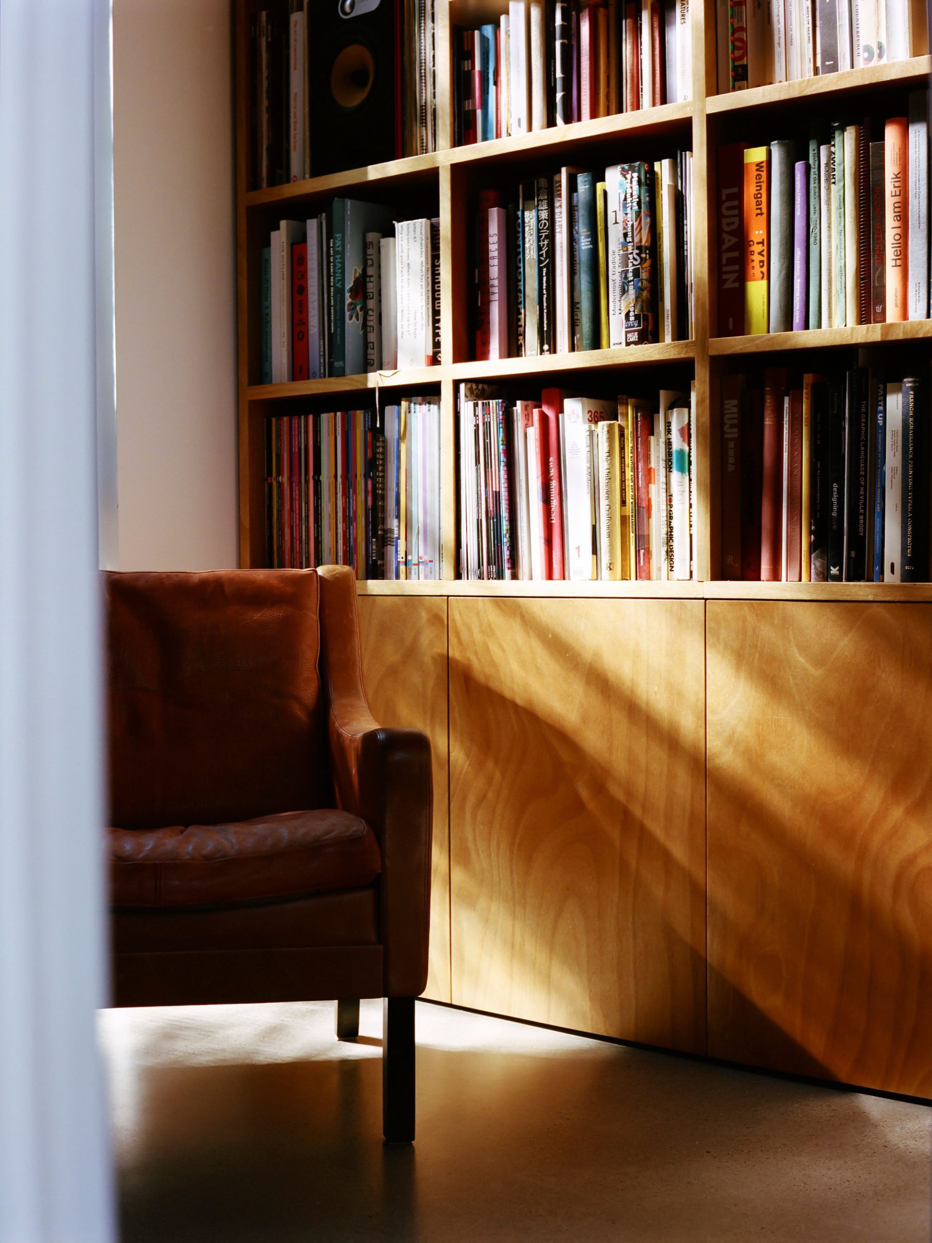
The Klim office.
I can only read printed books. I get that. I can’t even watch a movie on a laptop because laptop = work. How do you document your thinking? Or is it all in your head?
I can and do read on my computer and phone, but it’s somehow not the same. It’s a temporary state, like I’ve just switched a tab and can switch back at any time. Perhaps I just don’t have the discipline…
I document my thinking by writing it down and in the work itself. All those design info posts I do on the Klim site start as massive, unstructured text files. They’re messy, but contain all the fleeting thoughts and concepts about the fonts.
Financier specimen poster.
What I find so insightful about posts like that, from many type designers, is they’re often trying to name a thing into tangible existence. You’re capturing something ethereal and aesthetic and you make literal binary decisions out of them. It actually must be kind of maddening.
I’ve never thought about the binary aspect, but I see what you mean. Translating an ethereal concept into a black & white abstract shape is the job, isn’t it? It’s very easy to describe how a typeface was drawn and what it looks like. That’s almost banal, like describing a piece of clothing by its cut and cloth. The harder, more interesting part is describing why it looks like it does. Articulating the underlying concept — and explaining it to a diverse audience — is the actual hard work. If I’m successful in framing a typeface with a concept and story, it will determine exactly how a designer will think and understand it.
Animation still of Maelstrom Sans.
How much of what you’re articulating, in this analogy, is “how to wear this font”? And how is that related to the typeface’s origins or the motivation or concept that led to its creation?
Ah — I never say explicitly “how to wear this font.” Klim (the site) is organised with three main principles:
- Displaying the font as plainly as possible on the specimen pages.
- Explaining the concept & backstory of the font in the design info blog posts.
- Showing real-world examples of the font in use.
I try to avoid saying things like “Domaine is great for wine labels”, because the implication is that Domaine is only really for wine labels. If a designer is looking for a project-specific font and reads “great for wine labels,” it subtly precludes it from their project. I’ve always wanted to show the fonts in a way that allows designers to see them as raw as possible. I trust they’re more than capable of making their own judgments and choices. This is why I dislike fake “in-use” sample graphics for fonts. It’s sort of pandering to designers under the guise of being helpful.
Having said that, I am quite aware of the fine line between “selling the sizzle, not the sausage” with font marketing.
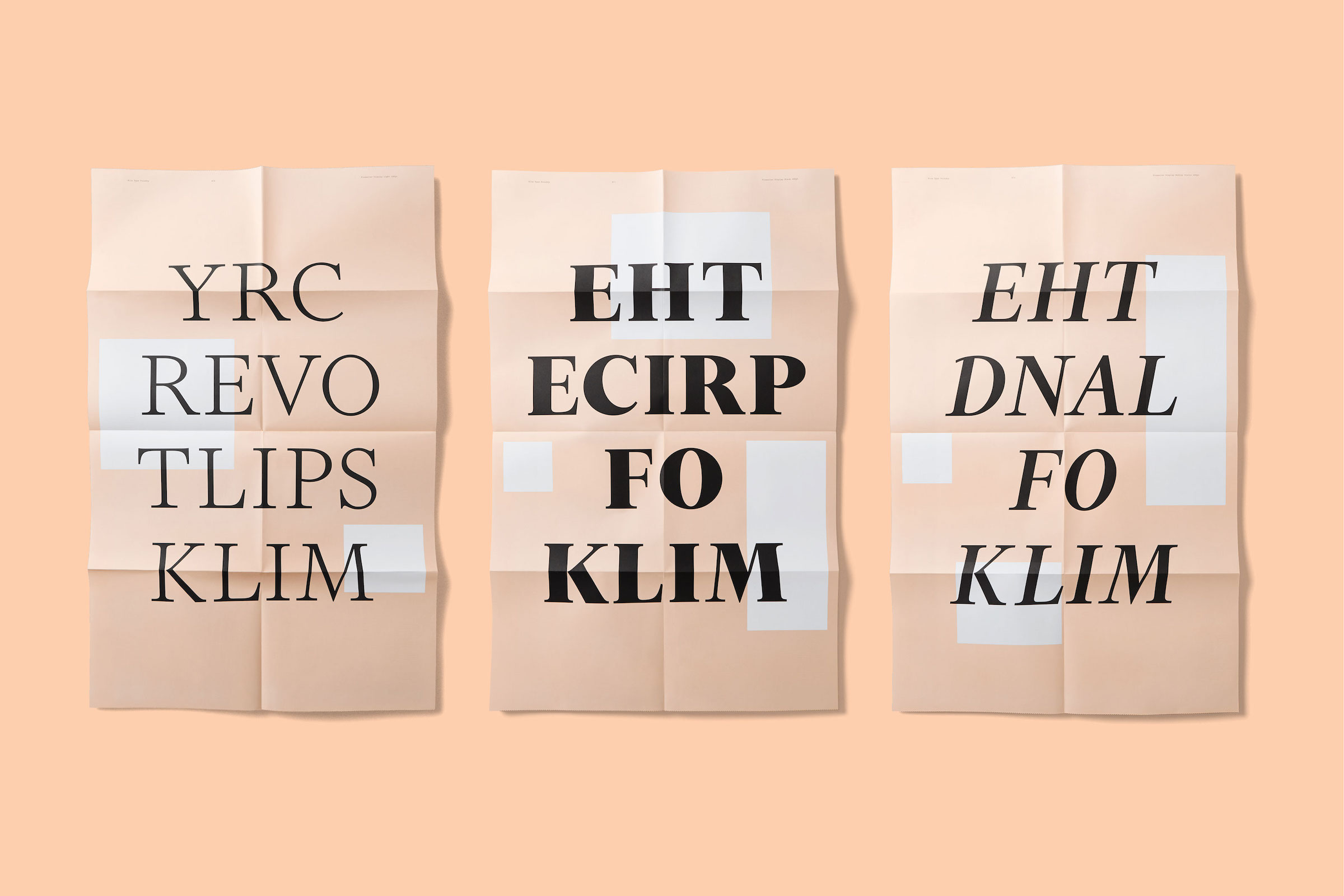
There is no such thing as a New Zealand typeface exhibition.
I’m not really sure what the line is between pandering and marketing, but it does seem like successful font marketing is more elusive than other products. Ultimately type designers luck out when good designers use their fonts better than they could. You’re among a small handful of foundries that consistently releases big hits with good designers. How would you characterize that success? How much of it do you attribute to marketing?
I’m not sure I agree about successful font marketing being more elusive than other things. It’s not that hard if you engage professional designers & marketers to do it for you, like we do. If you’re doing it all yourself then it feels elusive.
Does a foundry really “luck out” when a designer uses it better than they could? I’d hate to think that a foundry presents the best, “canonical” way to use a typeface. At best they should suggest and offer practical guidance (don’t use below 30px, old-style figures are here, etc.). I’ve written before that a typeface is not a tool, but I’ve not quite clarified for myself what a typeface actually is. The closest I’ve got, so far, is that a typeface is more like a material. Just like architects use various materials in space, designers use typefaces. A concrete manufacturer relies on architects to shape and use the material. I think the whole aim for a foundry is for designers to use their fonts. Our expertise is making the material, the designer’s expertise is using it.
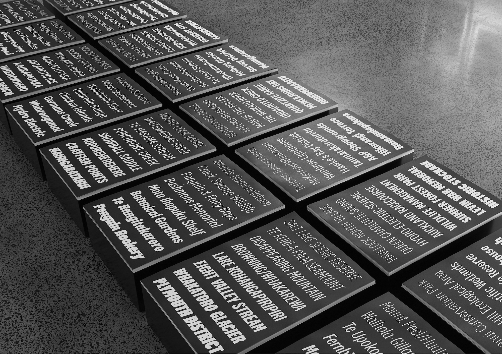
Untitled specimen exhibition.
I’m lucky enough to make fonts that are useful to designers. For a long time my decision making was driven by pragmatism: would this detail be useful to a designer? I’m neither nostalgic nor super trendy with my aesthetic, so perhaps that helps? I believe in type history, but I don’t feel obliged to emulate specifics. I’m not interested in the typeface for its own sake. The things I’m interested in — and good at — drawing are seemingly well received by designers.
I’m also rigorous in documenting our fonts in use. I treat it as both a showcase an archive. It’s very important for me to know what designers are doing with my fonts — it’s endlessly fascinating.
For the first several years of Klim there wasn’t any systematic marketing, except for Vllg’s activities. To be honest, I don’t exactly know how Klim became known to designers. But over the last few years we’ve been executing a consistent marketing & branding strategy. And it’s worked. Sales are way up, traffic is up, everything. Good marketing works.
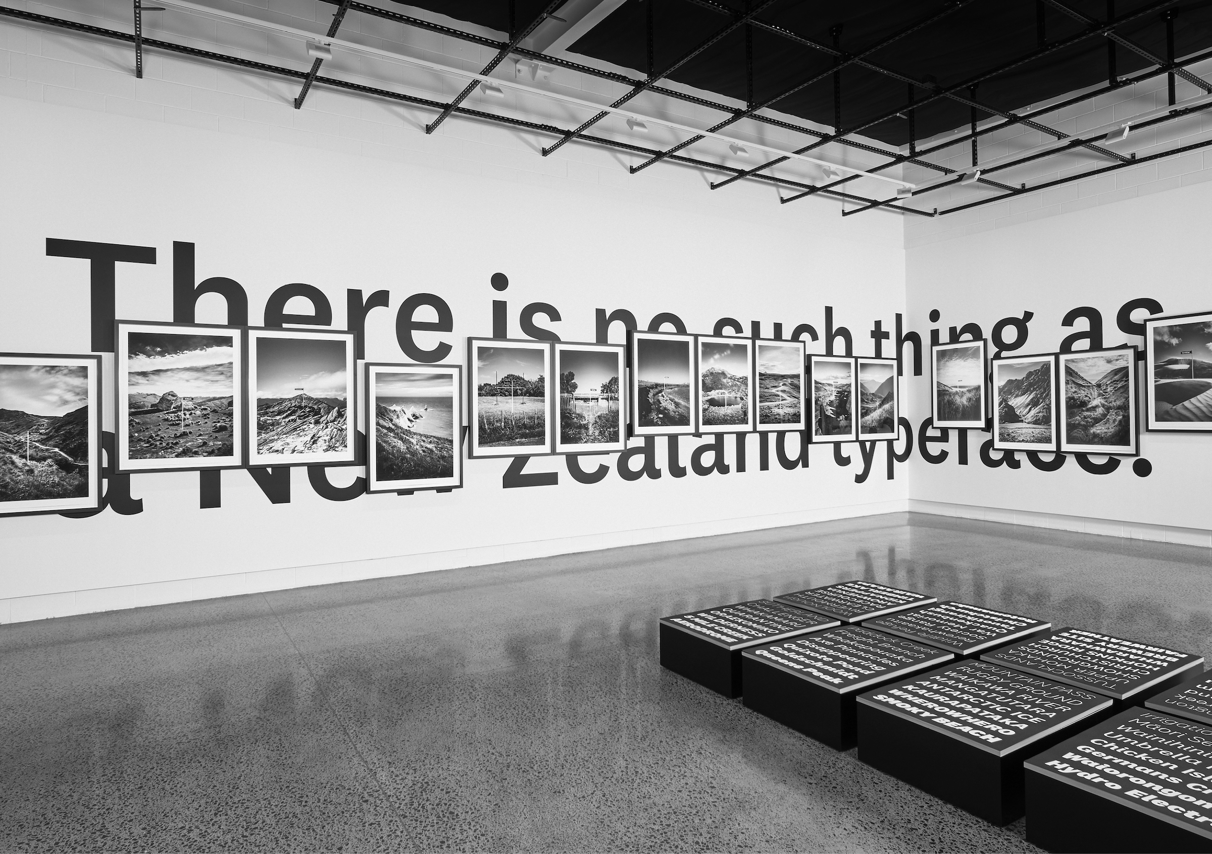
There is no such thing as a New Zealand typeface exhibition.
Do you have emotional connections to what you make? What do you think the connection is between you as a person and what you make? What’s the goal?
Yes, like all humans I have complicated mix of emotions governing my behaviour and relationship with my work. For a very long time I had a toxic mix of high self-esteem but low self-worth. Coupled with a decent talent for drawing letterforms and a high work rate resulted in making lots of good fonts, but never really being satisfied with them. Even as I made more fonts, got awards, recognition, money, etc., I was still not satisfied. All those things were a small dopamine hit, quickly extinguished by a drive to keep working. It’s taken a lot of personal work to untangle all that shit, and now I have a healthier relationship to work.
However, I’m not sure if there is a clear, direct emotional connection to any of the typefaces. At different times of my life I’ve felt differently about them for different reasons. I’ve worked on typefaces in many emotional states, ranging from mild to extreme. I’ve kerned while exhausted and afraid at 5am wearing my baby in a front pack, sketched through tears on long-haul flights, and drawn letterforms feeling fury and shame. None of these emotional states manifest in the letterforms themselves, because my typefaces take a rather long time to make, usually measured in years. Working on something over time and distance evens things out. It’s very hard to see the emotion that goes into a typeface, unlike music, painting, or writing.
The goal has changed over the years. First it was to survive, to learn how to make a typeface and earn a living. Then it was refinement, to find my rhythm and place in the design world. Now it’s focus and expansion.
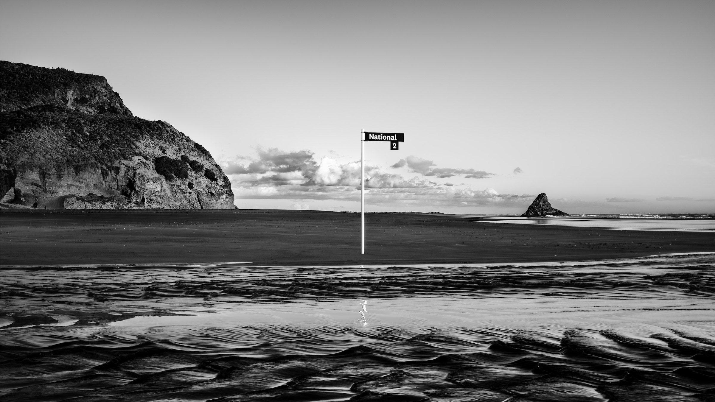
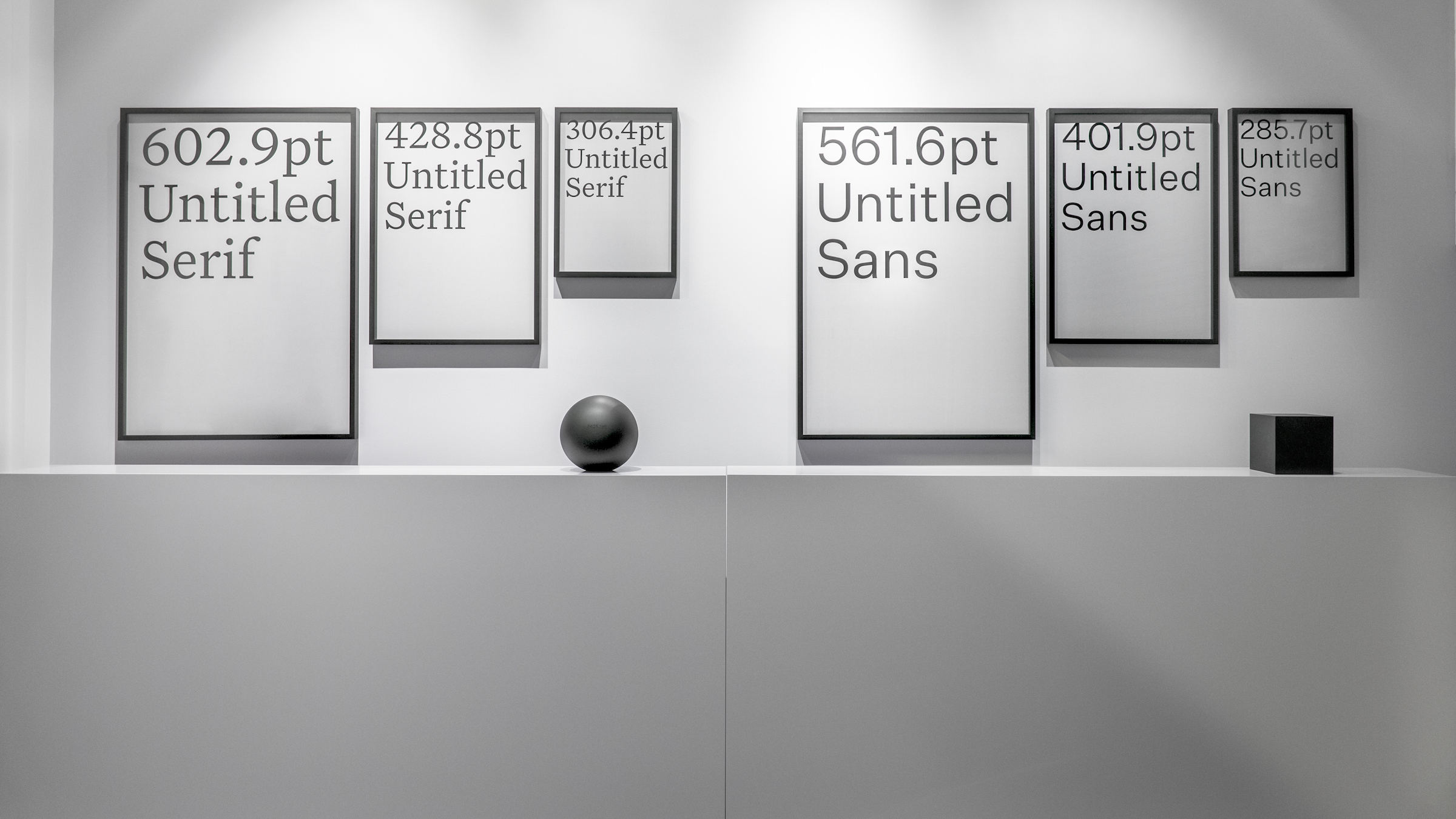
National specimen campaign.