Tell us a little bit about your experience as a brand designer and art director; How would you describe your creative process and the goal of each of your creative projects?
I worked at several well-known design agencies in Kyiv, Ukraine. I started as a graphic designer but quickly realized that I was interested in branding and found my focus in this field. In branding, I could apply myself in different roles as it is a broad field to develop my skills as a T-shaped specialist. Thus, I was able to immerse myself not only in the visual execution but also in defining copywriting and strategy, the general perception of the product, as well as conducting research and analysis. Currently I work as an independent brand designer and art director, but my visual focus in all kinds of work is always on typography.
For many years, my creative process was balanced and clearly prescribed in stages — from the briefing and creative sessions, to analysis, definitions, search for positioning, and only as the last stage, the development of the visual execution. But for the last two years, I've been trying to work less with strategy and make the process more flexible and easy depending on the project. I perceive texts better than pictures and think in words rather than images. Therefore, all my visual ideas are born through language and verbal expression. Since typography is the visual expression of the language, and typefaces are like the tone of voice and intonation, it was perhaps only natural that typography became my focus and eventually led to the design of typefaces.
The goal of every commercial project that I undertake is to identify the business goals of my customer, understand them and their target audience, the market, and develop a solution that will stand out and meet the tasks as much as possible. But I also try to educate my customers, and help them find the individuality of the project through meanings, but not through references on Pinterest or solutions of their competitors. And, of course, I want to be proud of every project and collaboration, so I try to do a little more than I promised.
The purpose of my personal projects is somewhat different. I always raise topics that are important to me, and I want to change something in the perception of at least one person, highlight a topic that is important to me, and to educate; for example, with my Misto font or with the personal art project UKRAINIAN LETTERS (temporary) MUSEUM created in Weimar, Germany. The project highlights the revival of the works of Ukrainian graphic artists of the last century, shows the beauty and diversity of the Ukrainian alphabet, and tries to bring the average viewer closer to the awareness that letters are not only a tool of visual expression of language. Letters are art.
Gart Mono
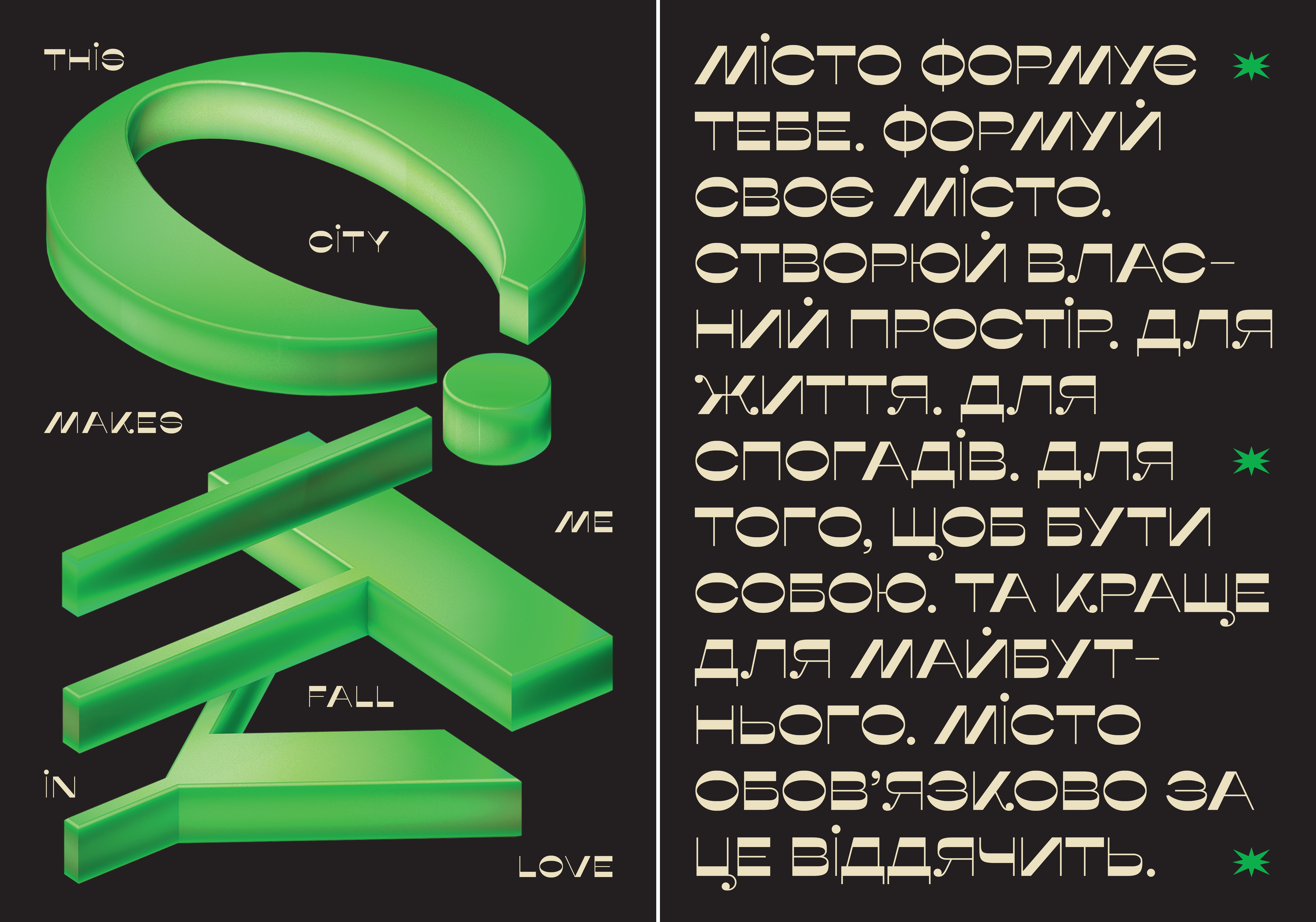
Misto font posters
BigBig identity. Bespoke logo and custom hand drawn typeface
Being Ukrainian, and as a practising designer in Kyiv and in the creation of the Misto font; What is something you’d like people to know about type and design inspiration in Ukraine?
I was born in Slavutych and have lived in Kyiv for half of my life. With the Misto font, I wanted to draw attention to my hometown, highlight its unique history and architecture, and reveal its tourism potential. However, it so happened that due to Russia's war against Ukraine, I was forced to leave Ukraine, and now I am temporarily in Weimar, Germany. But my heart is in Ukraine, and I'm waiting for the opportunity to return.
The world knew little about Ukraine and our history before another war that Russia started against my country to once again try to destroy the idea of independence of our people, our cultural identity, and the very idea of being Ukrainian. We are rediscovering our history ourselves and realizing how many times Russia has rewritten history and how history repeats itself. So, it's understandable that the international community doesn't know a lot not only about our culture but about Ukrainian type design as well.
The modern Ukrainian type design market is small, but during the last 5 years, it has been developing very actively. Therefore, I want to talk about Ukrainian type design through personal projects, lectures, etc. Even more, I want to talk about the fact that the Ukrainian Cyrillic alphabet is far from the same as the Russian one. As well as our language. Ukrainian type designers want to talk about Ukrainian identity, the peculiarities of our alphabet, its deep roots, and origins, which were destroyed by Russia, including the reform of Peter I, and how Ukrainian type designers are researching and reviving traditional Ukrainian graphemes. Actually, in our identity we find the strength to fight and the inspiration to work.
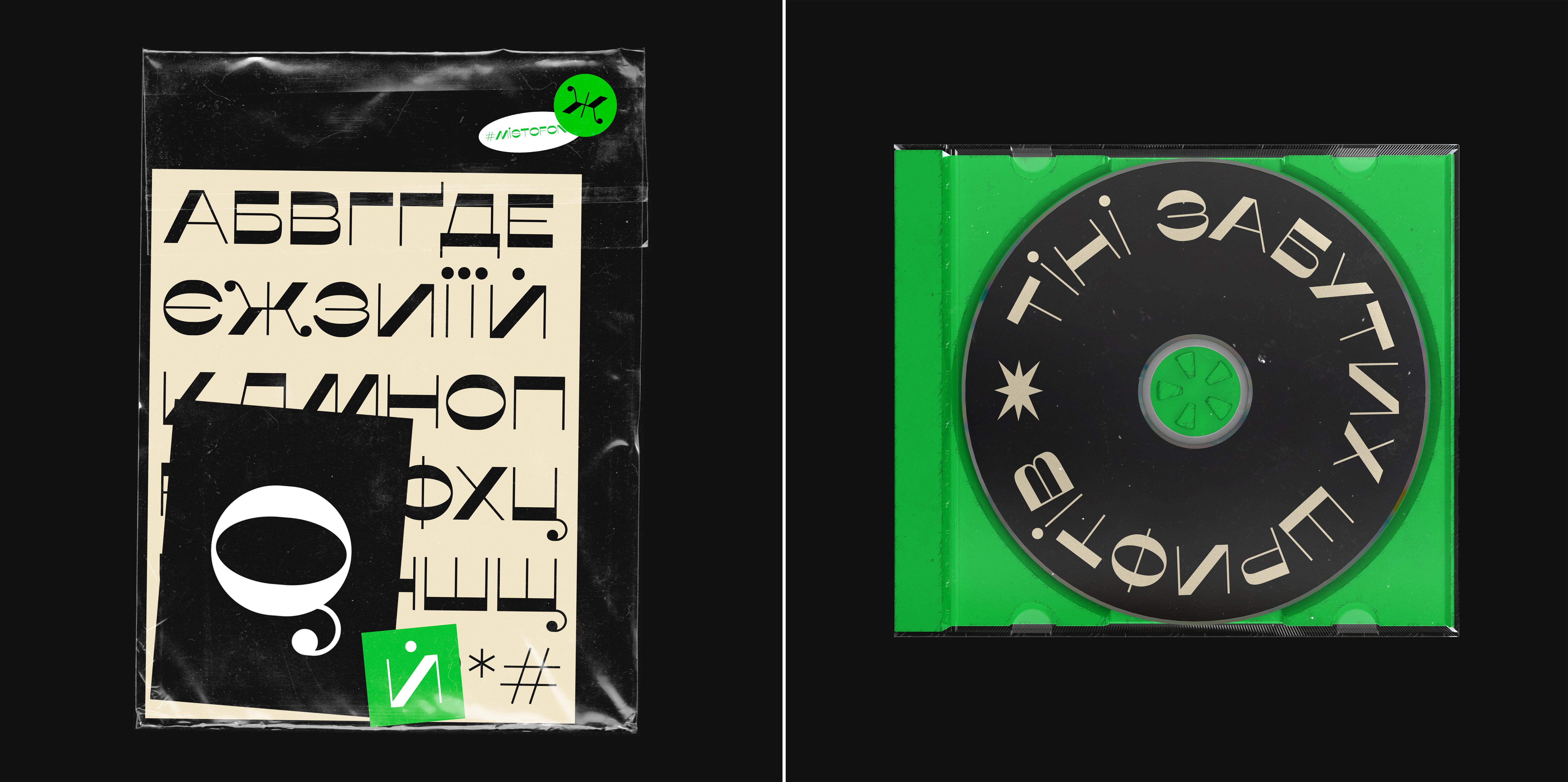
Misto font
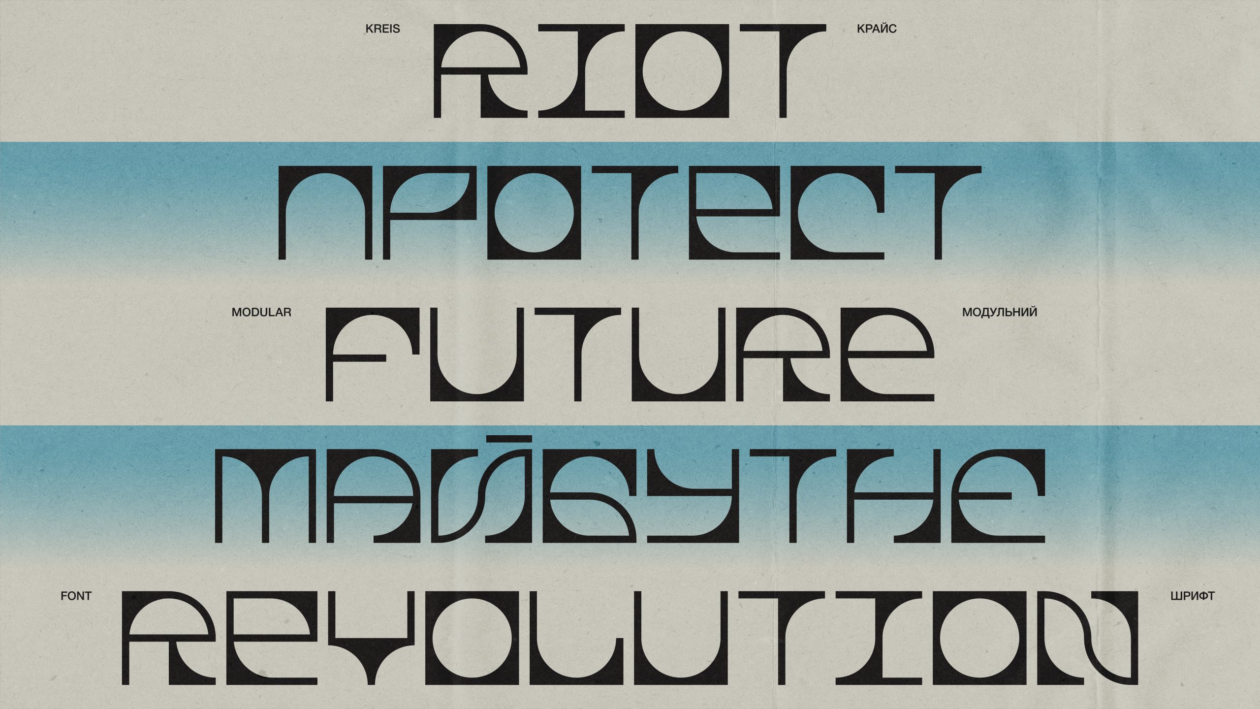
KREIS Modular Typeface
It’s been a year since the Russian invasion of Ukraine. How are you doing and how were you able to mobilise design for real time advocacy to rally support for your country? What do you think the role of design can do?
The beginning of a full-scale war was the most shocking and painful. Like most of my friends, relatives, and people throughout Ukraine, I woke up to the explosions. And then I heard them repeatedly. I lived to the accompaniment of constant air raid sirens and experienced difficult situations that I don't want to remember, but that cannot be forgotten. The war continues.
Surprisingly, the design helped me and many designers, especially in the first most difficult days, weeks, and months. Sheltered under my house with a bunch of strangers, I would open my laptop and create call-to-action posters. In English — for an international audience to spread up the situation in Ukraine and with appeals to support Ukraine and fight against Russian propaganda with actions, in Ukrainian — with gratitude to the Armed Forces of Ukraine and to support the inner spirit of Ukrainians. Just like designers used to do during World War I and World War II. I was supported by the thought that if this is the last thing I do, then let it be something that is important to me. As the prominent Ukrainian graphic artist and independence fighter Nil Khasevych said — “As long as there is at least one drop of my blood left, I will fight the enemies of the Ukrainian nation. I can’t fight them with weapons, but I fight with a cutter and a chisel.” He did not have one leg, but he had an indomitable spirit.
It was unexpected for me to find the strength to create the design in such conditions, and realize that design is also a means of struggle, that my skills can be at least a little useful for my country, which is trying to be destroyed by the invaders. But we fight as hard as we can. We are fighting for our own life, freedom, identity, our future, and the future of our children.
Therefore, Ukrainian designers do what they can — some defend us on the front line, some fight on the information front, help volunteer projects, and spread Ukrainian culture. And, of course, everyone donates to support our military. It's important for me to feel my benefit because there is nothing worse than closing your eyes, being scared, and doing nothing. "You ask, what is our aim? I can answer in one word: victory," as Churchill said in 1940.
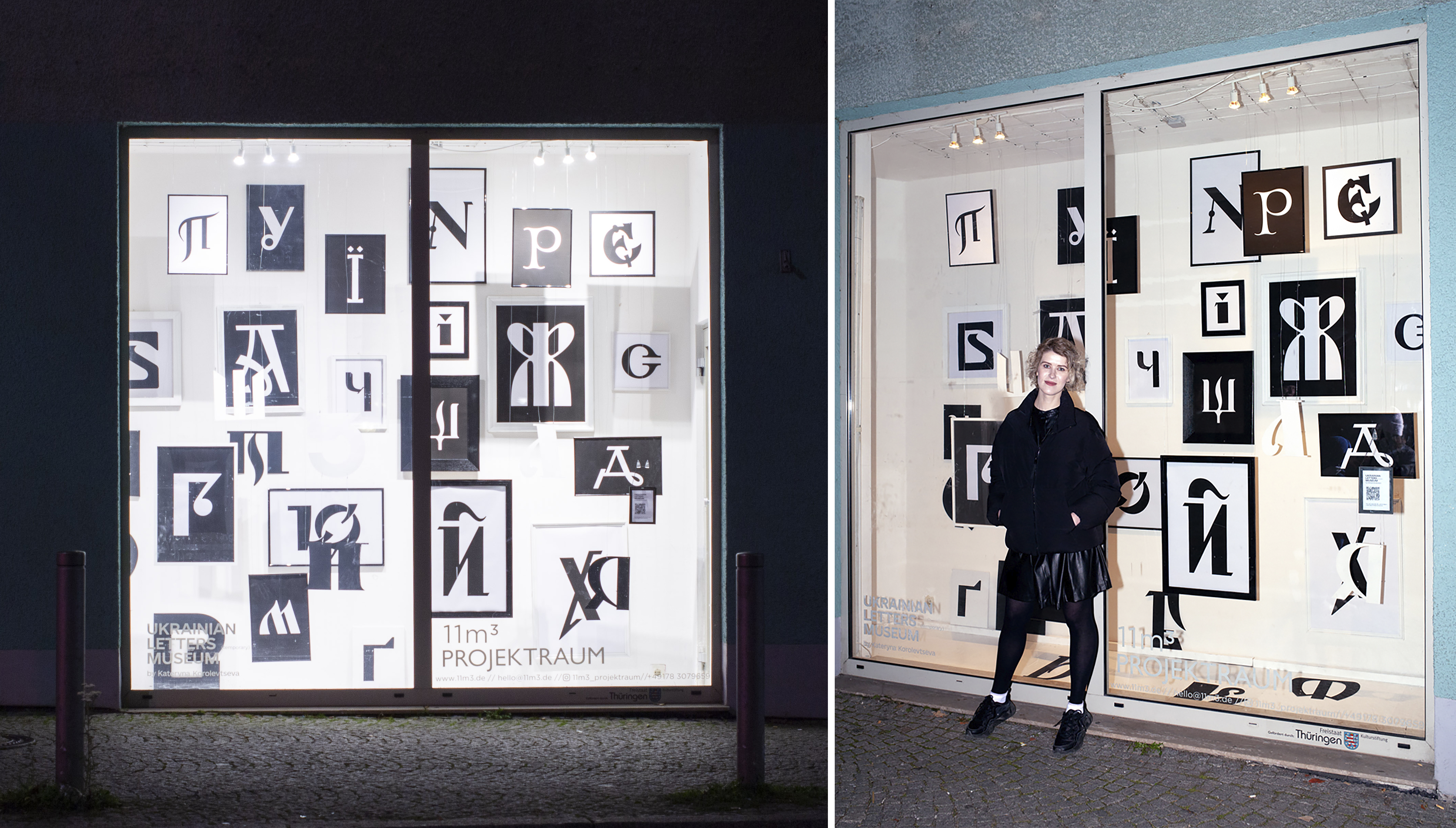
Ukrainian Letters Museum exhibition window
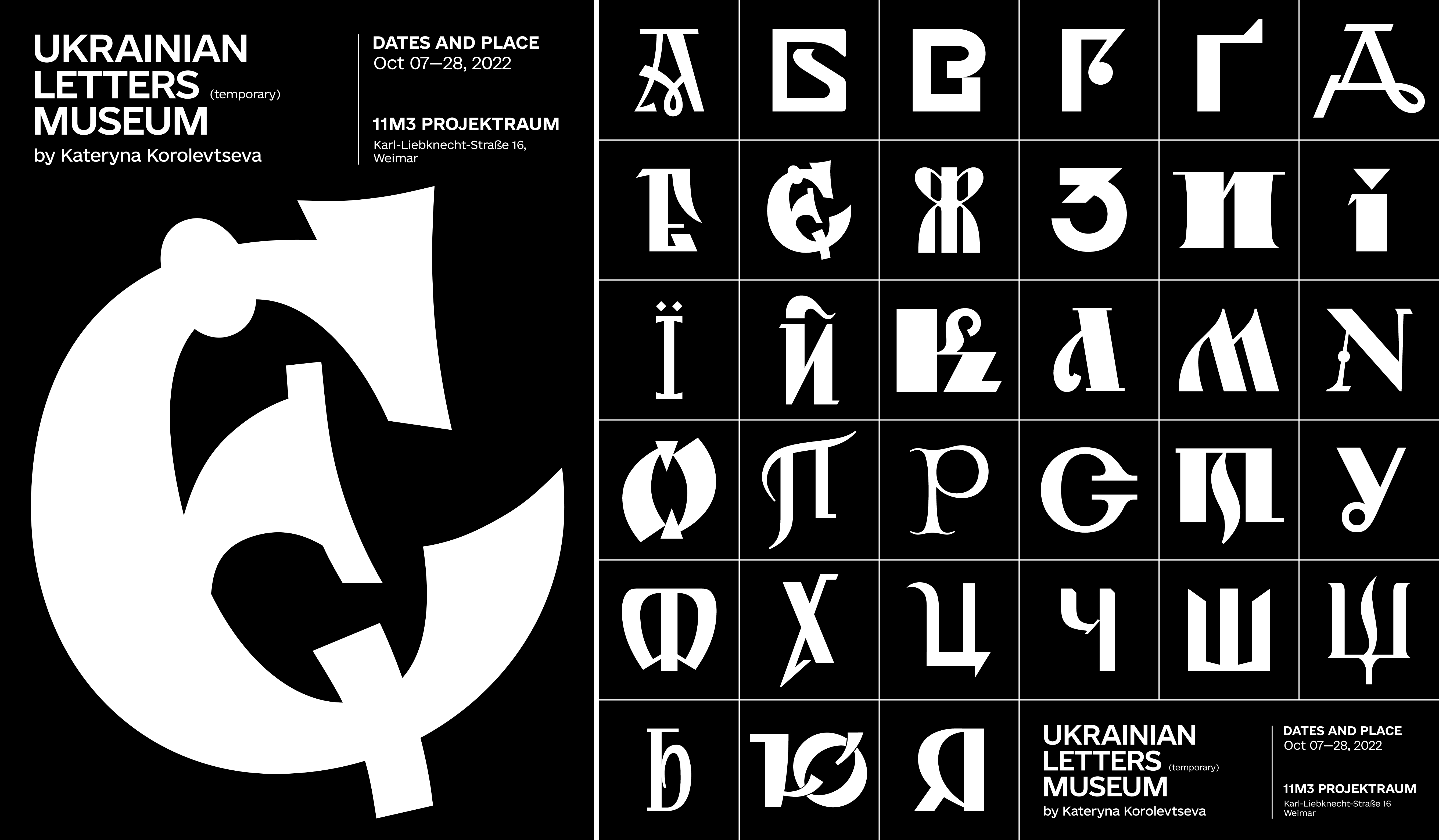
Ukrainian Letters Museum all letters
What are you looking forward to seeing in the submission entries in this competition? What would make you vote on something? What would a submission need to have to catch your eye?
I'm very excited and looking forward to seeing the works of the contestants and discussing them with the jury members. For me, the very moment of the discussion is very interesting, because all the members of the jury are designers with unique experiences and different backgrounds. Because of this, everyone will have slightly different evaluation criteria and what they will pay attention to. And this is very interesting because seeing different points of view helps to expand one's own views.
Since my path to type design was through branding, it also influences what catches my attention and excites me. Of course, unusual fonts attract my attention - something I haven't seen before, interesting details, bold solutions, and the use of new technologies. But as in branding, what sticks with me the most is the presence of an idea or creation story behind the project. Perhaps this can be compared with art — sometimes you need to learn the context and history of the creation of a work in order to really feel it and understand the author's idea.
The presentation is also very important to me because the work does not end with the export of the final font file. I pay attention to the integrity of not only the font but also the project — from naming and description to presentation, design of slides, and colors. What is important is the overall consistency of perception in all aspects and details that help better reveal the font, its features, where and how it can be used, and so on. But I will be no less interested to see what other members of the jury pay attention to and expand my perception.