ECS interviews Ingrid about postmodernism, brand identity, and the considerations of spatial design.
H.Y. Ingrid Chou has worked as a designer for The Museum of Modern Art for a decade. Now the Creative Director, Chou is also a brand new board member of the TDC.
I read that you went to California College of Arts for your undergrad and Yale for graduate school, which is such a formative design background. Can you tell us a bit about your time there, and what you took away from that experience?
I was very fortunate to attend them. In one sense, the two schools are completely different, and I found this diversity to be healthy. CCA is a small art school known mostly for it hands-on craft, while Yale is known for its blockbuster academic discipline.
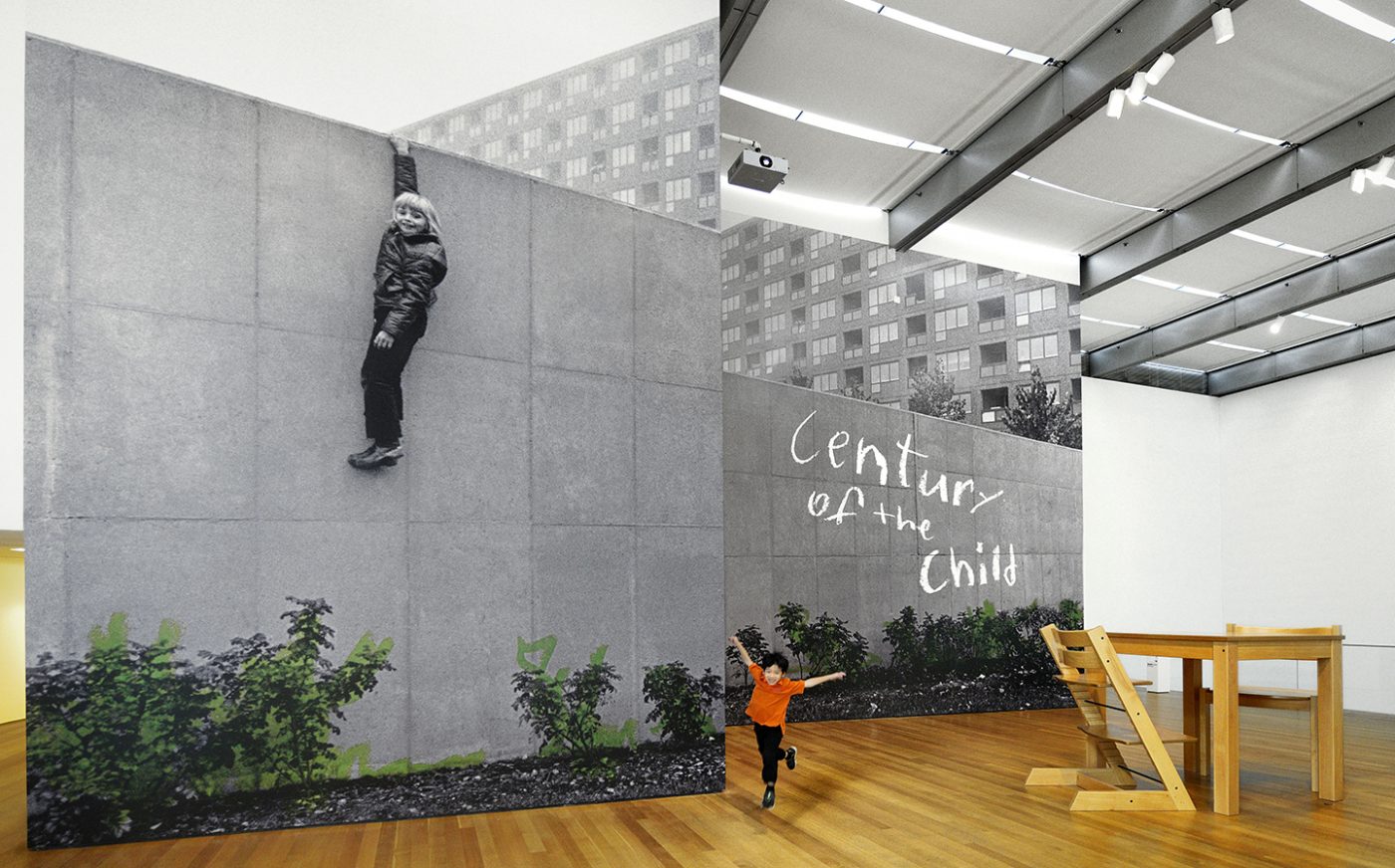
But in one specific sense, I think the two schools are very similar. Both schools encouraged me to “go wide” and “to explore everything” and take the dive deep into the unknown. Both schools have a passion to push the borders of the discipline further.
What I have taken from this experience is to cherish this drive to explore the unknown as the kernel that extends a sense of good design based on the curiosity for stories and the desire to communicate.
I imagine that working within such a structured brand identity for so long can be both challenging and fulfilling — it kind of requires that willingness to explore that ‘kernel’. What is your process for determining what ‘fits’ and what doesn’t within the MoMA brand?
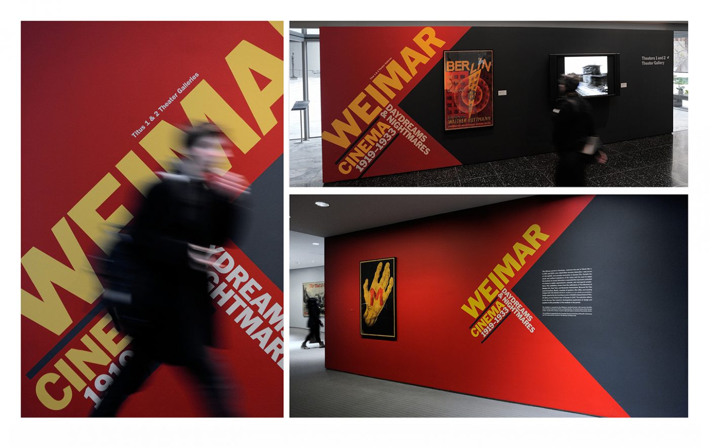
Working for MoMA is a blessing and a challenge. There are two parallel design paths occurring at MoMA at all times — extending the MoMA brand and providing a uniquely compelling identity to each and every exhibition and event.
The MoMA brand is iconic and disciplined. The reinvention and extension of the brand is about understanding where the limits of the brand can be pushed and where it is better to leave alone.
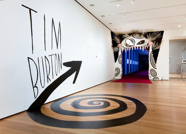
On the other hand, exhibition identity is about total expression and letting the creative ideas overflow and then realizing where restraint will make the initial idea stronger and more compelling.
It’s challenging but fulfilling to be able to do both at the same time. It gives both sides of the brain a complete workout.
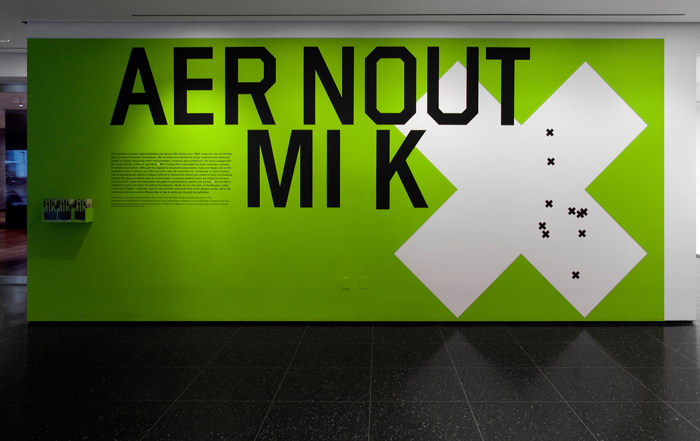
What are some of the most interesting considerations you deal with in designing for physical spaces?
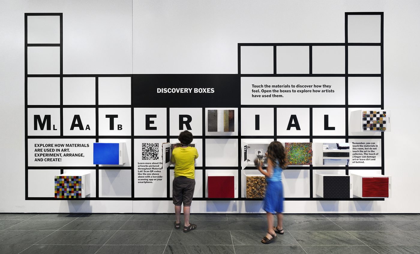
For spatial design, the most interesting part is how everything really changes once you translate an initial two-dimensional concept into a three-dimensional space. Very often, I am compelled to rethink the initial concept when translating into space.
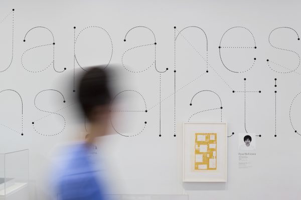
This rethinking seems to be related to how space comes alive when there is human involvement. The specifics of scale, orientation, interaction, sequencing, and perception become design tools that are fluid and changeable. When these aspects are further manipulated with skill and care, the designs become more moving and successful.
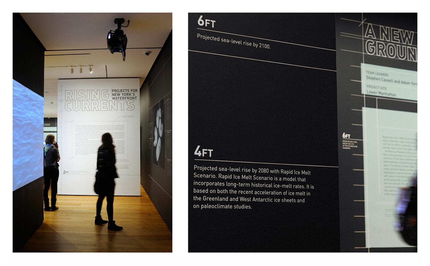
I also enjoy investing the creation of content that is embedded into the design of physical spaces. In these projects the design of the physical space is not at all an afterthought, but at its essence is the primary design element.
