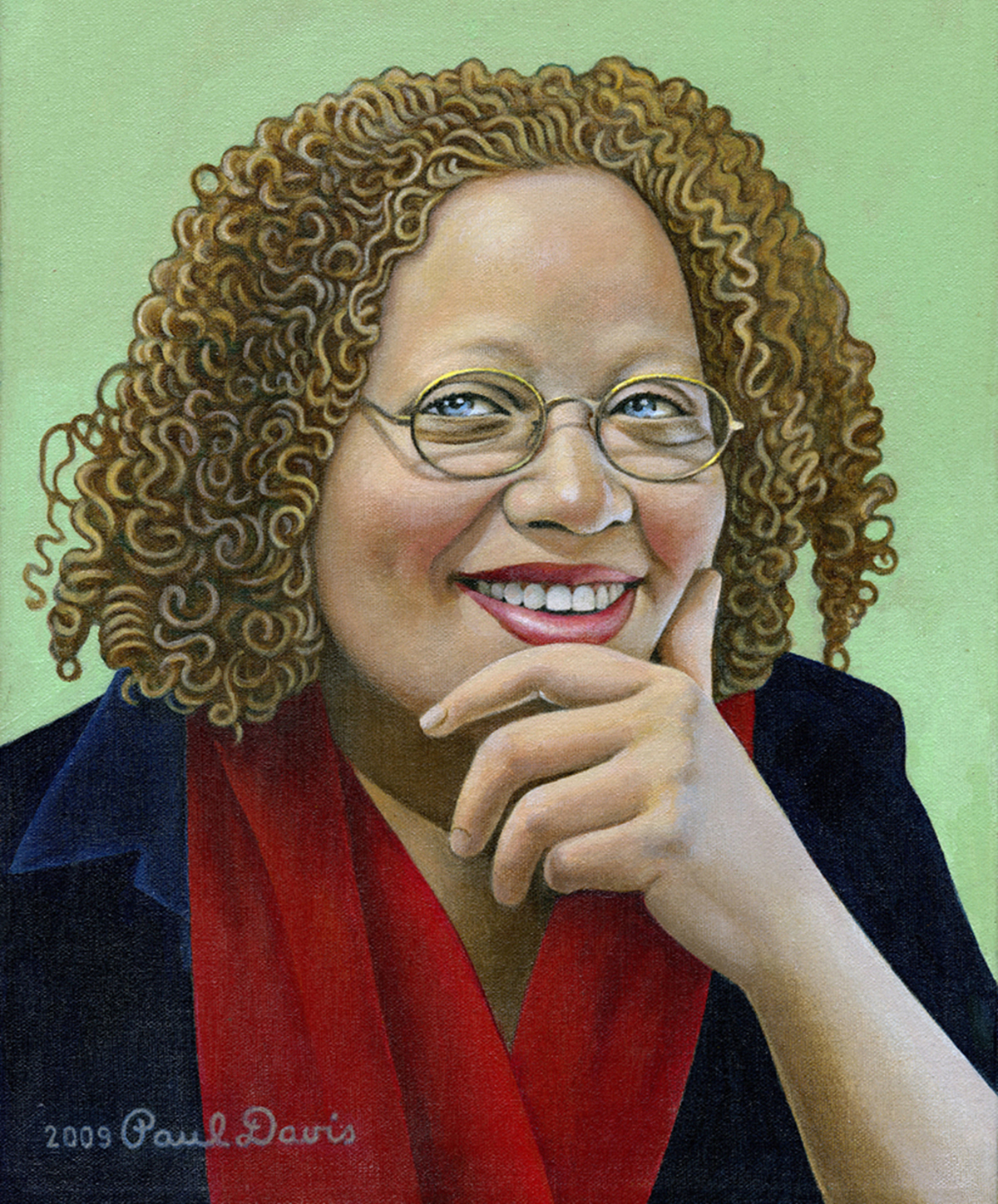
Tell us a little bit about yourself - what you do and where you work
I am a designer, writer, and educator. Fellow TDC member Joe Newton and I have a studio on West 29th Street in NYC, and we work on everything from book covers to outdoor installations. I’ve co-authored ten books with Steve Heller, and have one of my own coming out in September (shameless plug below). I teach at the School of Visual Arts, and do lectures and workshops both in the US and abroad. I serve on the Citizens’ Stamp Advisory Committee for the US Postal Service, and on the TDC board. I’m busy, but in a good way.
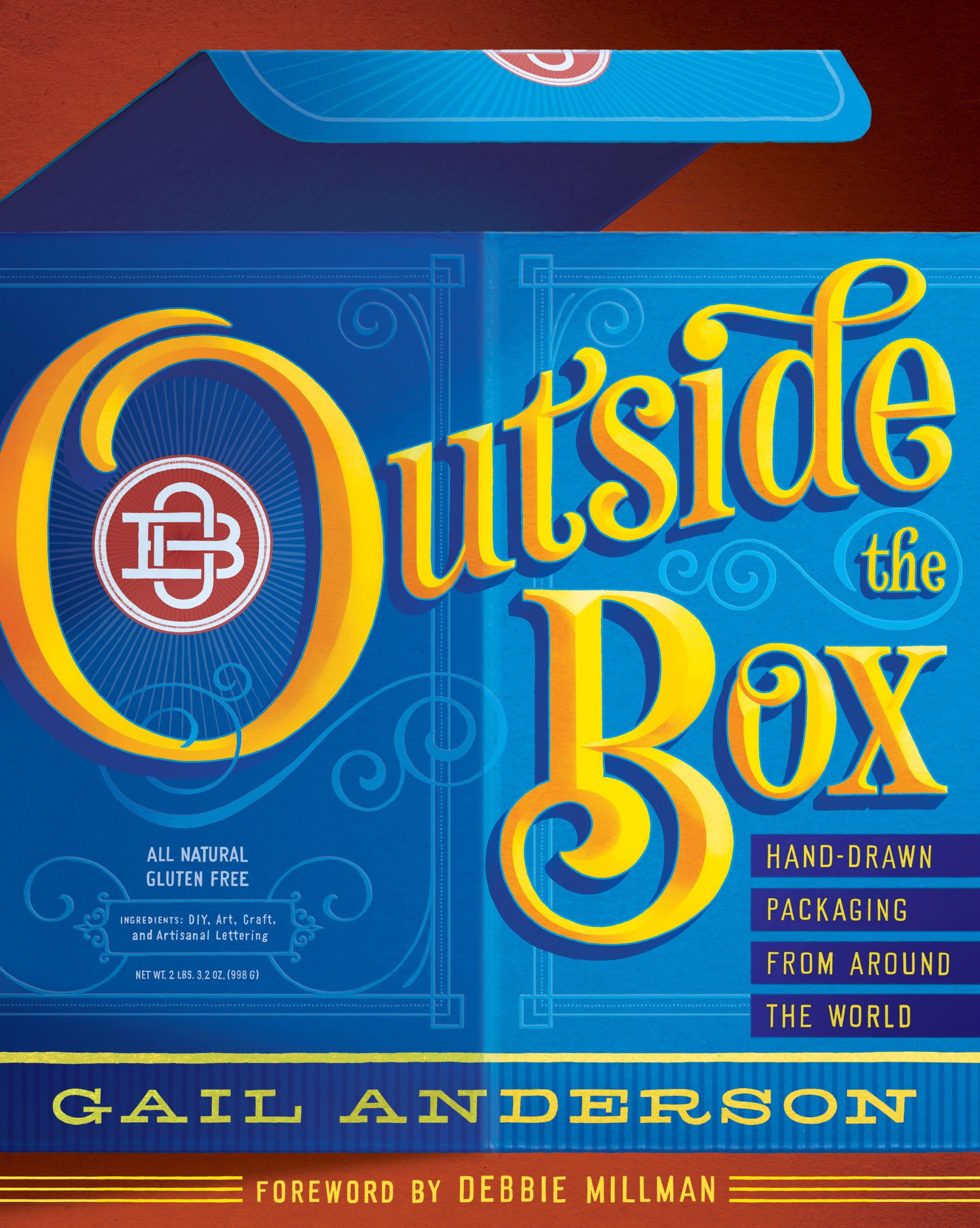 Cover design of Gail's upcoming book 'Outside the Box: Hand-Drawn Packaging from Around the World' for Princeton Architectural Press.
What is your favorite typeface? And why?
You can’t go wrong with Trade Gothic. I love a good utilitarian font family, and Trade Gothic is a reliable old pal.
Where do you take your typographic/design inspiration from?
I try to absorb the design that I am surrounded with daily, whether it’s on the streets of New York, or in the books and objects I squirrel away (okay, hoard). In the last few years, I’ve found inspiration in other countries as well as in the mountains of upstate New York. I bought a camera and it changed my life. There’s so much amazing type out there that needs to be photographed.
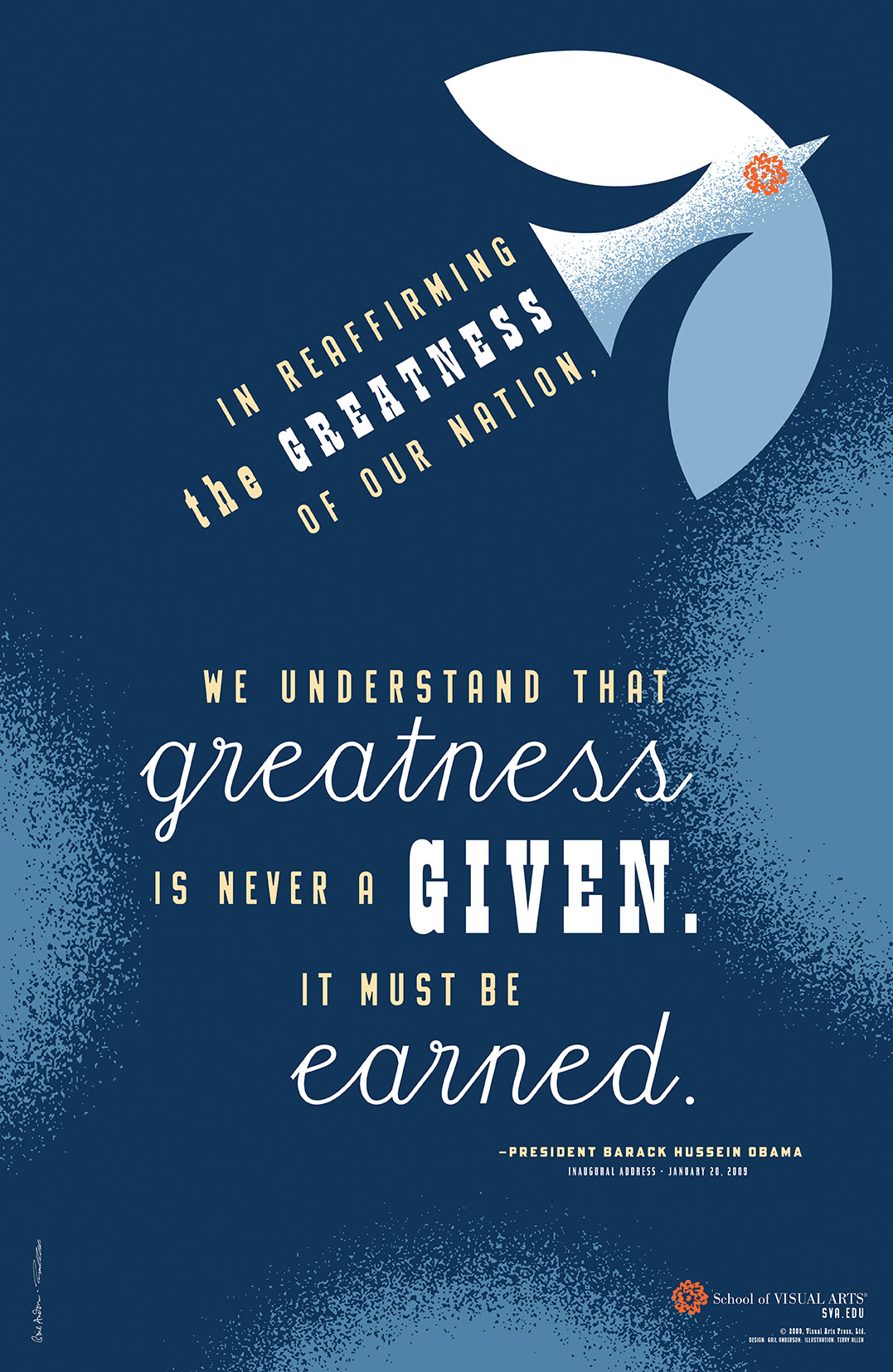 Gail's 'Obama Bird' part of SVA's 2009 poster campaign.
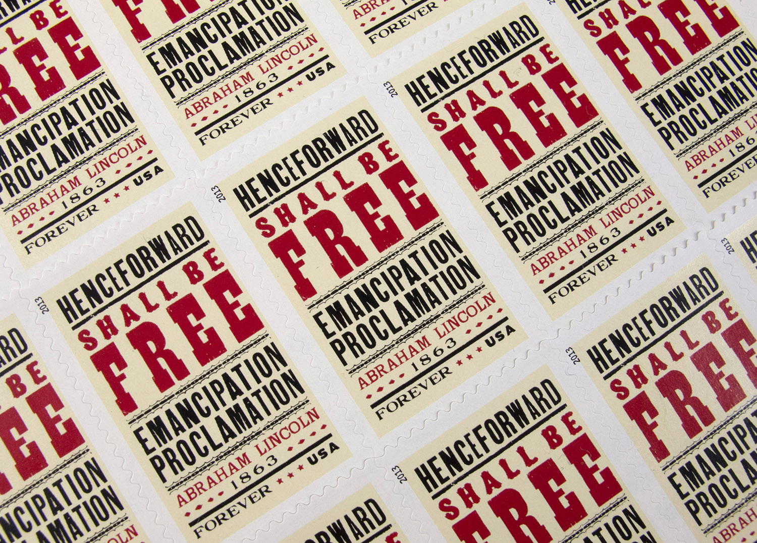 Gail's 2013 'Emancipation Proclamation' stamp for the USPS. The stamp commemorates the 150th anniversary of the Emancipation Proclamation.
What is your all time favorite piece of design?
I am partial to a poster that Swiss artist Donald Brun created in the 1950s called “Zwicky”. It’s a really swell illustration of a cat playing with a spool of Zwicky yarn. It sounds corny, but do a search and you’ll see what I’m talking about—the poster is completely charming. And nothing beats the design of the original Ford Mustang. That’s my other favorite. I drove one through my teens and twenties, and no other car I’ve since owned lives up to it in terms of style.
Where do you see the future in typographic design and typeface design?
The hand-drawn type trend has blossomed into a movement, so I think we’ll continue to see more and more of it. I am a fan of type superfamilies, so I hope they’ll flourish in the coming years, too.
What is your favorite aspect of being a TDC member? / What drew you to become a member of the TDC?
The TDC feels like an intimate club, where people who love type can happily geek out together. And yet its membership spans the globe, so it’s actually all encompassing. Carol Wahler has been the heart and soul of the organization for my entire career—it seems like she knows all of the members by name. That makes me feel all warm and fuzzy.
Links:
Website: gailycurl.com
Blog: gailycurl.tumblr.com
Facebook: gailycurl
Twitter: @GailAndersonNY