Flavia Zimbardi is a type designer and visual artist from Rio de Janeiro, currently based in New York. ECS interviews Flavia about her early editorial design projects in Brazil, and how she came to concentrate on type and lettering.
You worked in magazines back in São Paulo. What was the editorial design scene like there? Was there a community that supported your typographic explorations?
Oh! It was very different back then. I moved to São Paulo in 2005 to work at the largest media conglomerate in Latin America, a publisher called Editora Abril. The magazine business was booming, lots of new titles being created and some of the more established ones being reinvented. I was lucky to be immersed in such a prolific environment, where most of our crazy ideas were endorsed. Now, with the economic crises, the publishing scene is almost gone.
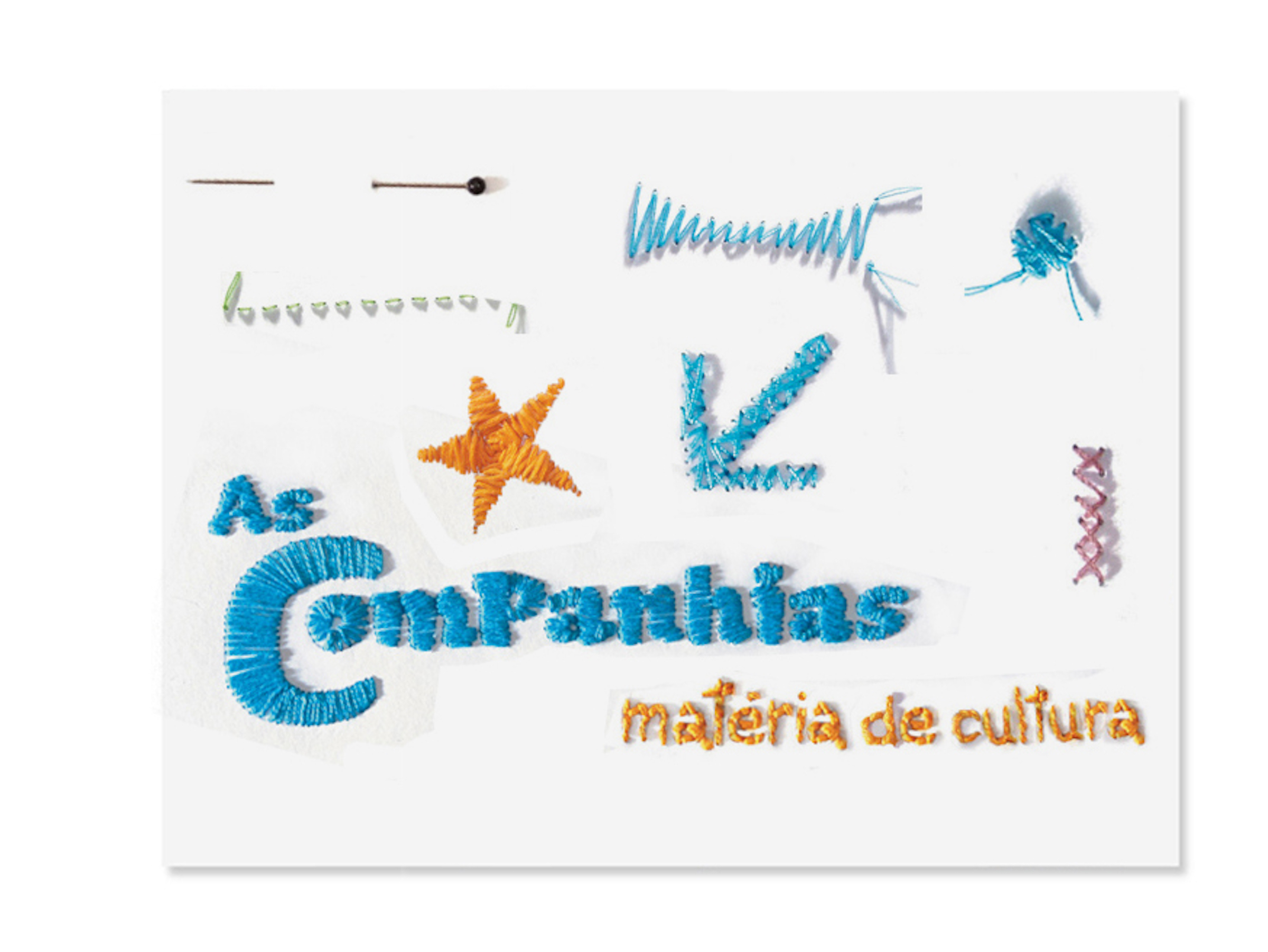
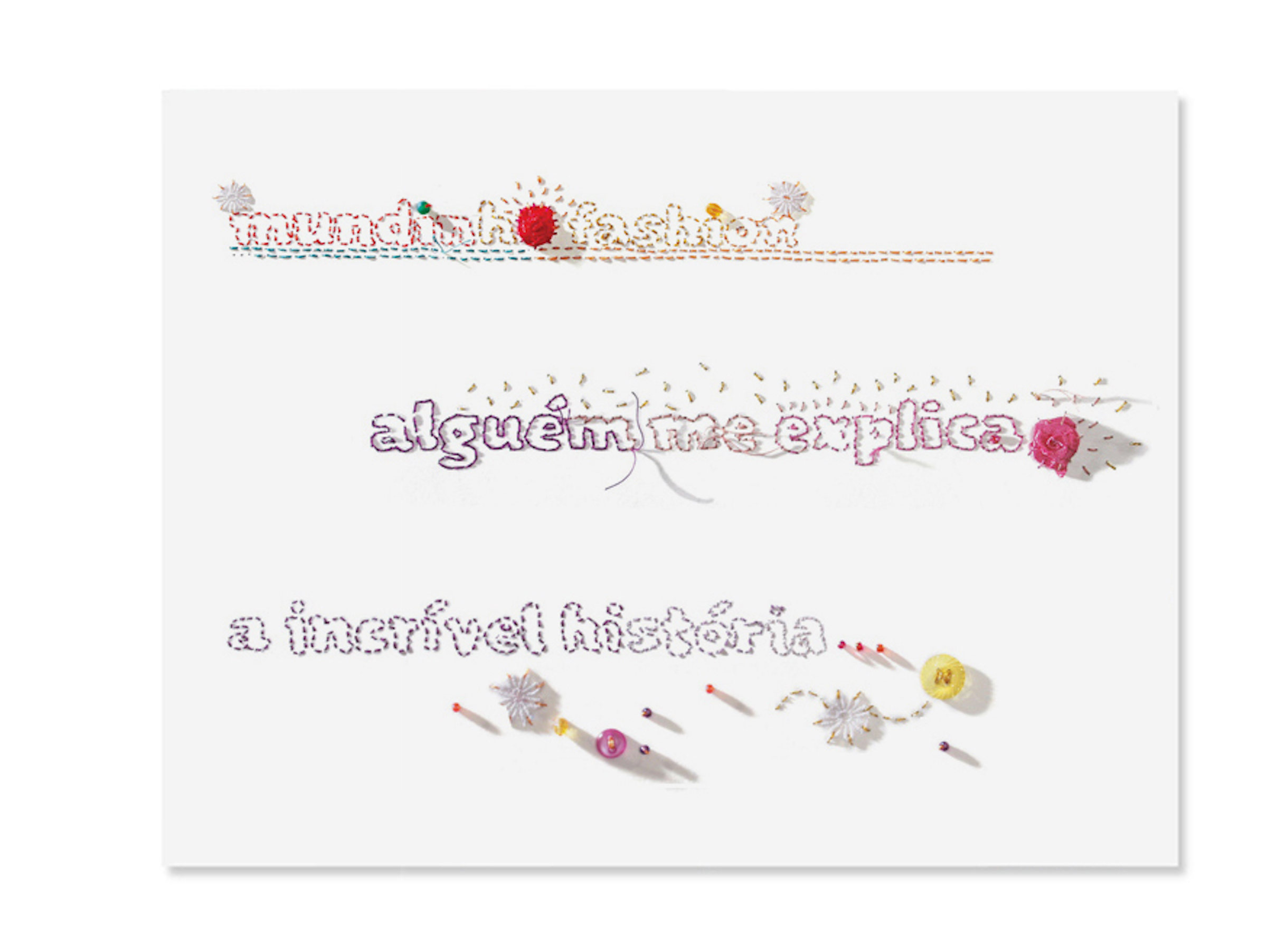
One of my favorite projects from that time was the redesign of Capricho magazine (for girls between 13 and 17 years old)—in which manual and custom processes were key for the graphic concept as a way to reflect the constant changes in the teenage world. For the first phase, we used needlework and hand-stitched elements like arrows, quotation marks, and boxes tailored by the art team and illustrator Ionit Zilberman, including all running heads pre-designed using Sauna by Underware. In the second phase, a year later, we did the same experiment with stamps. So yeah, although I was interested in type/ calligraphy since college, I definitely had a community that supported that passion in my editorial work.
Do you find any connection between editorial design and branding?
100%. Editorial design combines lots of disciplines. It’s primarily about decoding information in the most palatable/interesting way for your readers. But knowing the audience is equally important. It’s very different to create spreads for a teen, a fashion, or a science and culture magazine.
These days, are you primarily:
• making type & lettering
• using type & lettering
• making custom letters for graphic applications?
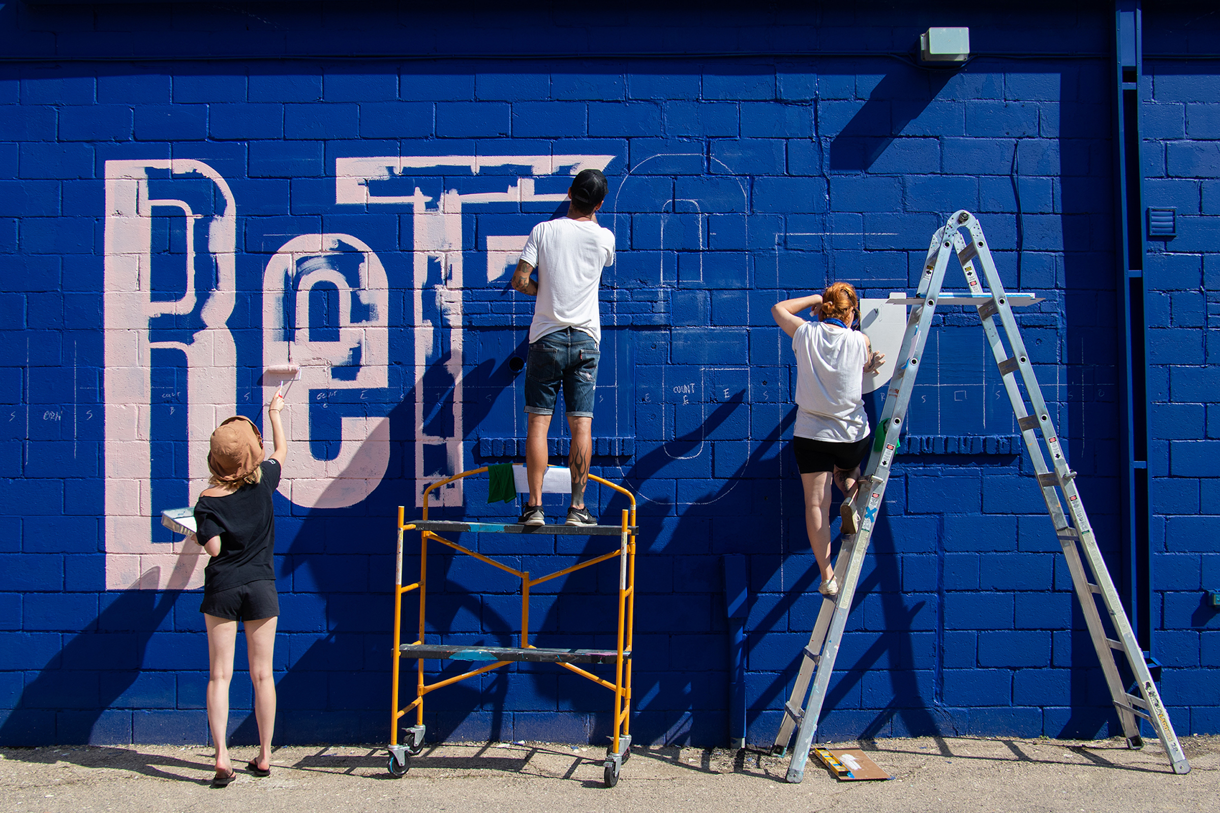
Making type and lettering, either custom typefaces for clients or drawing my own retail fonts. And eventually collaborating in typographic murals.
You’ve created so far—from what the public has seen—some very creative, expressive typefaces that are quite different from each other. How would you describe your aesthetic approach to type design projects?
Hmm… I am not sure if I have one yet. As a graphic designer, I always had a strong, yet chic, contemporary and minimalist aesthetic. And maybe this will translate to my type work. Or not. So far I have been enjoying experimenting with (and learning from) lots of different styles.
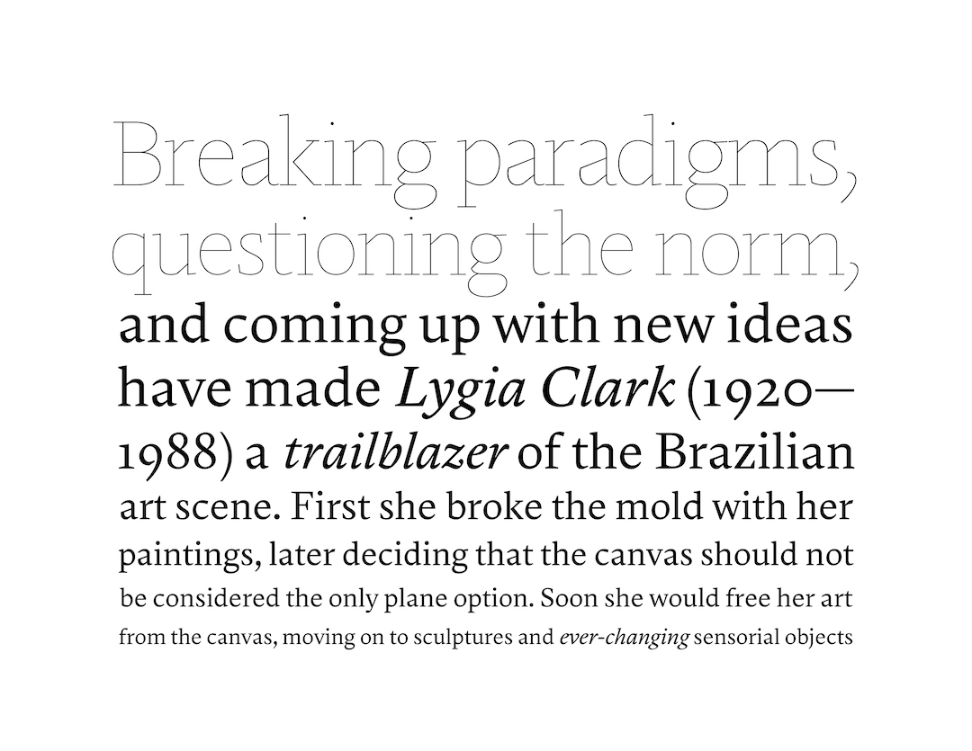
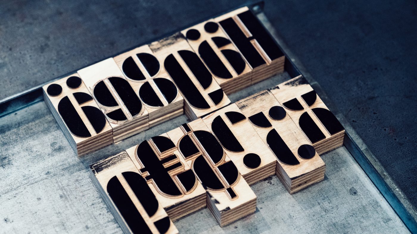
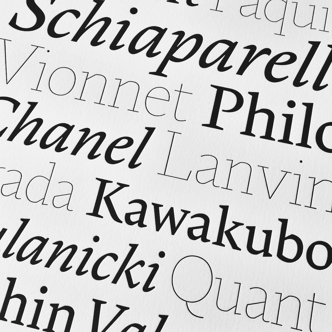
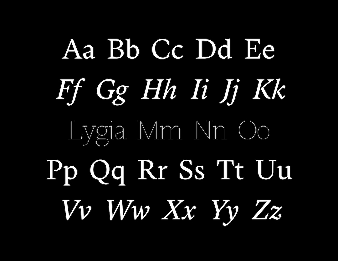
While ZC Casual and Joschmi are reflections/re-interpretations of a specific technique that marked a time in design history, Lygia (my Type@Cooper graduation project) is a mix of various elements: gestural and elegant cues that are definitely an influence from my past in fashion and references from 16th-century masterpieces by Robert Granjon to the geometric approach of W.A.Dwiggins. But it also brings a Brazilian flavor, an homage to neo-concrete artist Lygia Clark, that shares both visual and conceptual references to her work and questions the idea of frontiers, the inside and the outside of what we are versus what we want to show.
And that is something I am really interested in. Incorporate more Brazilian culture as a celebration of our diversity and to use a different artistic platform as awareness catalyst to the international market.
As an accomplished graphic designer too, I wonder what’s your ultimate work scenario? Is it a combination of the disciplines, or are you more content with having morphed your career to be more type-focused?
For 10+ years I tested and abused other’s people typefaces. Working with magazines was a tremendous learning experience about typographic voices and hierarchy. I learned what works well, to tell when the kerning is off, which features are more useful (like OpenType), etc. Today, I have all this baggage in my favor, of being the user of the product I create.
Type design feels like a natural evolution and I am really enjoying the change of scenery. The ultimate plan is to continue working exclusively with type and balancing both commercial and independent releases.