Dave Bailey is a letterer and typeface designer living and working in San Francisco, who’s been practicing the craft of letters for more than a dozen years. As our November Member of the Month, Elizabeth Carey Smith spoke to him about his perspective, his community, and the perils of being a perfectionist.
It seems like you have a really fun, playful view on type. The letterforms you make are really lively. Do you find that your clients are after a certain spirit when they hire you?
In the past, some have referred to my letters as weird or experimental, but I like your word lively! In an effort to come up with more original forms and ideas, I’ve developed a habit of not looking at too many references or what others are doing unless it’s absolutely necessary. I have no idea if my clients are specifically looking for that, but I like to believe that standing out among the crowd is always a good thing in a personal and business sense. Have you seen my colorful pants collection?
Until recently, all my work has been display type or lettering. My primary goal in attending Type@Cooper West was to challenge myself to bring that unique approach to the traditionally reserved and predictable genre of text typeface design.
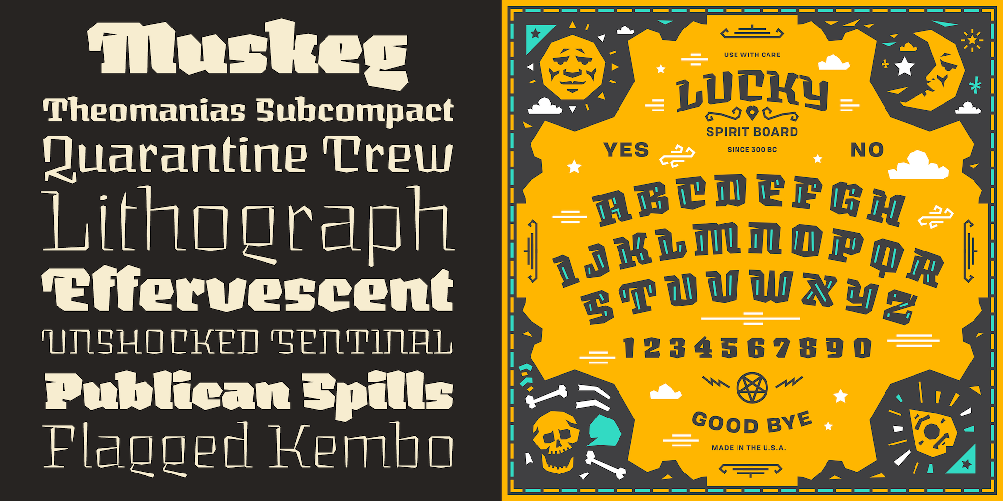 Graphic design by Kendrick Kidd. Muskeg, the typeface, is available for licensing at Lost Type Co-op.
How long have you been in San Francisco? Long enough to witness the startup boom? How has that influenced your work?
I’ve been in the Bay since the summer of 2014, and moved here from San Diego on the night before my birthday. I had never been here before. It was a pivotal time in my career where I knew I had to be around other practitioners, learning institutions, and mentors. The two choices seemed to be New York City or San Francisco. I tried living in New York during my early 20s, but happily left after finishing my six-month internship with RCA Records.
I don’t feel that my career has been influenced by the typical San Francisco startup culture or boom, but the Bay Area does include many legends of type design, lettering, and calligraphy. With the advent of TypeThursday, local Typnics (picnics with type folks), Letterform Archive, Type@Cooper West, and the frequent free lectures at the San Francisco Public Library, I’ve seen the community that I originally sought when moving north grow exponentially — either there is a new-found interest since I arrived or these events are catalysts for strengthening the local community and sharing knowledge.

I’m sure both observations are true! Communities rarely grow from one direction. What have you noticed in your time as a letterer that has changed about the typical practice? Has it all gotten trickier or easier?
When I started practicing lettering with intention, it was 2005 — the year YouTube was invented. It was only a year since Facebook had been founded, so Instagram didn’t even exist. Online resources were slim, and you had to hunt to find good lettering artists and bookmark their personal sites. I remember visiting Mark Simonson’s website quite a bit in my early years. I relied on drawing lots of well-designed classic typefaces by eye, which helped reinforce the concepts of proportion and stroke modulation.
My Speedball Textbook, 20th Edition given to me by John Langdon in 2005, has been with me for the past twelve years and has honestly been the most influential piece of literature on my progress as a letter craftsman.
Today, an unprecedented number of people are becoming reacquainted with the act of creating letters, which means an unprecedented number of folks wanting to teach and relay what they’ve learned. When I first started, the practice was very internally focused and there were few public venues to share, learn, look for feedback, or discover other lettering artists. Now, with an overwhelming number of online learning options coupled with an increased emphasis on sharing, it seems as though the modern-day beginner’s focus has shifted to seeking peer approval rather than informed feedback.

Getting a jump-start these days is definitely a lot easier, but because the industry has exploded, gaining visibility in the job market is exponentially lower than it was a decade ago. It’s extremely hard to not be influenced by the bombardment of letters in the world around us, let alone by the impact of following multiple social feeds of others’ work. So, although we are more connected and conversational, I almost feel that it can be detrimental to the creative flow and to finding one’s unique visual voice among the field of currently practicing designers. Those of us living in type-centric cities with access to frequent lectures and workshops are spoiled, because we don’t have such heavy reliance on the double-edged sword that is self-teaching in the age of the Internet.
Your website is really cool. What a great way to show your lettering and typeface work! Why do you have such a great website? Did you make it yourself?
As a designer, having a website is a constant personal struggle. It’s never as up-to-date as I’d like, because it’s always more fun to work on personal or client projects than spend time wrangling responsive layouts and code. When I booked a plane ticket ten days in advance of moving to the Bay Area, I had two primary goals — to find a place to live and to refresh my web presence. I mocked up what I thought would be a dynamic, visually interesting way to display all my lettering work.
As humans, we are so familiar with letters and how they are constructed. So, I found joy in abstracting those shapes and designs into something with a bit more tension and with a figure-ground relationship. This is how the thumbnail design elements were born. Setting those dynamic crops of my work against one another felt visually captivating.
The color palette is the same one that I’ve used since my first personal identity, just over ten years ago. I built my site using Squarespace, but the reasons that others think it’s so great is probably best answered by a third party!
I’m already in the process of planning a whole new site and identity, which I’ll reveal next year. Nothing is ever done or good enough…the perils of living and breathing design.
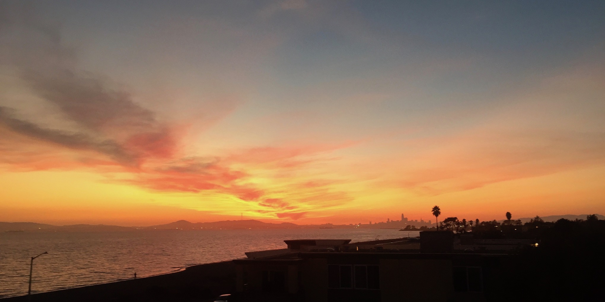 Portrait: San Francisco skyline and night sky.
Links:
Website: bezierwrangler.com
Twitter: @bezierwrangler
Instagram: @bezierwrangler