Let’s tell the studio audience about your career trajectory — I always find fascinating those fortuitous connections that help a young designer grow into their own.
I’ve been working in book design in one capacity or another since 2003. I worked in-house at Simon & Schuster, Random House, and Hachette as an Art Director and Designer, and I started my career at Rodrigo Corral Design. Because I worked at an independent design studio and freelanced on the side throughout my career, running my own company was always in the back of my mind.
In 2016, I (finally) opened my own studio, Casalino Design Inc, and I couldn’t be happier. While most of my clients are publishing houses, running my own company has allowed me to take on some great new clients outside of traditional publishing. Over the last two years, I art directed and designed bespoke books for IBM and A+E Networks, designed a collectable limited edition of Stephen King’s Misery, and created the look for an indie magazine called Ravenous.
I didn’t set out to work in design. I was an English major and a History minor in college at William & Mary, and was also heavily into photography. I was the photo editor for my college newspaper and slowly transitioned the paper from film to digital while I was there— we had one Nikon digital SLR that my team shared! My only real “design” experience was playing around with PageMaker in High School.
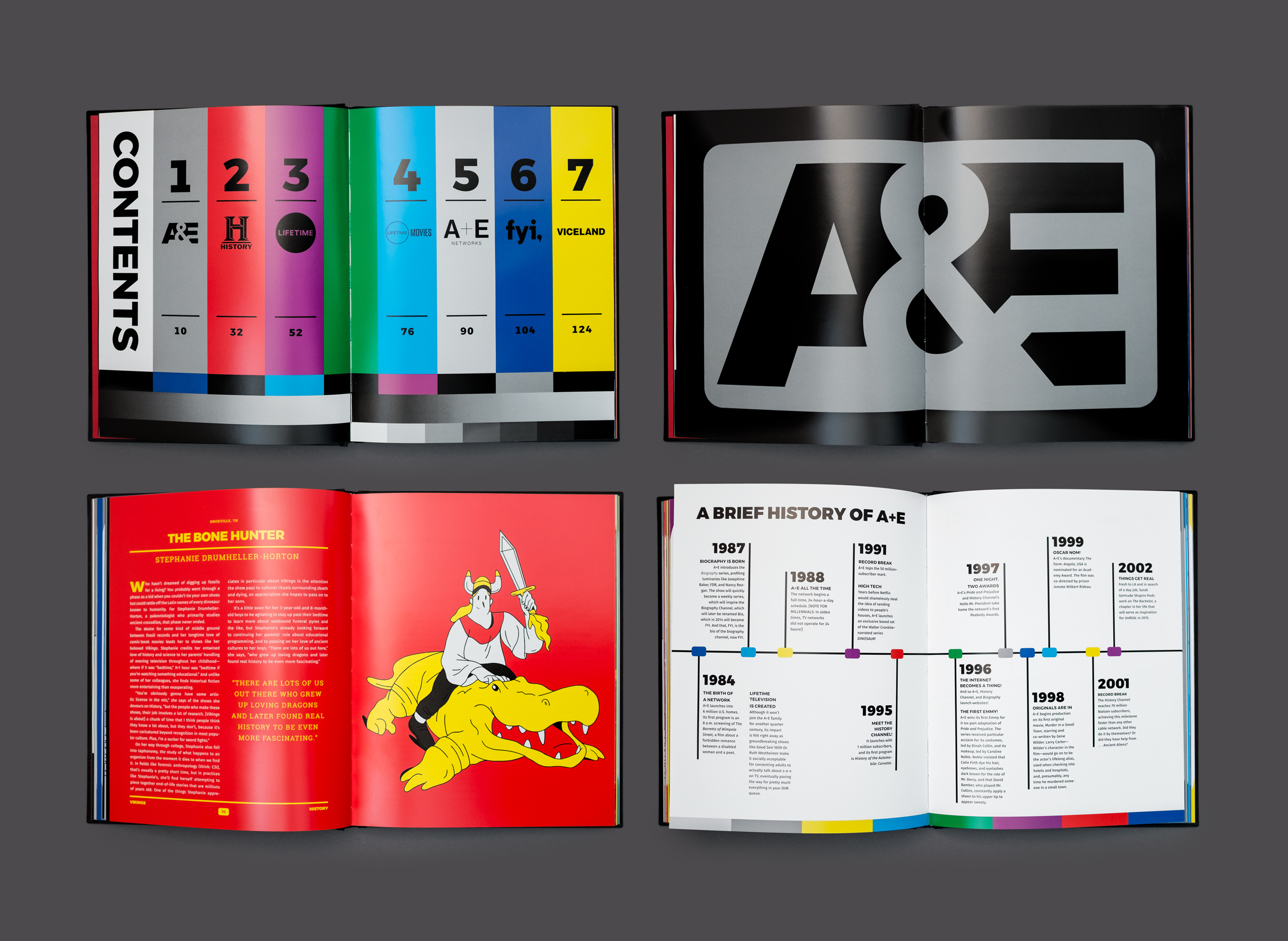
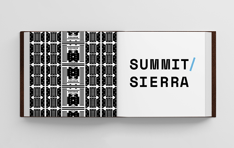
Casalino Design for A+E Networks
I came to New York after college to take NYU’s Summer Publishing Program hoping to get into magazines. I was talking with magazines likes Nylon and Maxim about editorial assistant jobs when two book cover art directors came in to speak to our NYU class. Book design was a job I hadn’t realized existed, but fit perfectly with my interest in books and visuals. I reached out to one of the ADs, Rodrigo Corral, and he ended up hiring me as an intern because I knew Photoshop—and because his former intern had left the week before!
Rodrigo was only a year or two into running his own studio and was a rising star in the book design world, so I learned a lot about both design and business in the three years I worked there.
Pivoting from writing to design, when I first got to New York, made me realize that it’s important to follow your interests, even if they lead you off the path you’re already on. My trajectory makes a lot of sense looking back, because I had always been in love with both words and visuals, but I never would have discovered that if I hadn’t let go of the idea of what I was supposed to be doing.
It was a big risk to set aside what I had been doing to pursue design, but I think that made me work harder. I felt like I needed to catch up to those that had the benefit of having gone to design school. Making an unexpected turn like that, so early in my working life, also gave me a lot of confidence. It made me realize that if you put in the time and effort, it’s always possible to make a change and learn something new.
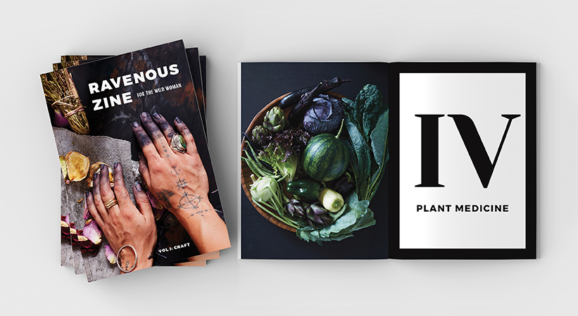
Indie magazine Ravenous
What are some things you do when assessing the layout of a book cover that could use type as image?
I love using type as image on covers. Most of the time with covers, either image or type comes to the forefront, so when you can meld image and title together seamlessly it’s really satisfying.
With all of my cover designs I start by asking myself what is the theme and mood of the book (my English major is very helpful here!) and what visuals are in the text that might be useful.
For example, the design I did for Stephen King’s Misery started with knowing that I wanted to use a typewriter in some way because, of all the amazing visual elements in the book from the axe to the bed to matches, the typewriter best fit all the themes of Misery. It’s an object that symbolizes writing, which is Paul’s vocation, but also the reason Annie becomes obsessed with him. It serves so many purposes in the book (anchor, weapon, creative escape) and is omnipresent and integral to the story in a way that some of the other visuals are not. And luckily, it’s a visual that has a wealth of type built in. There are keys, the impressions they make, the label on the machine, and the hammers. I played with all of those elements, but in the end, the hammers felt most menacing and weaponlike. I created the final design by photographing the hammers with a macro lens to make them feel huge and horrifying.
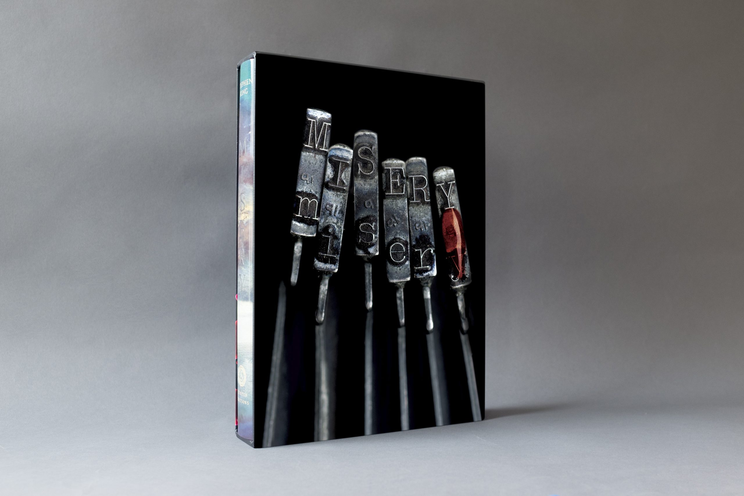
Art direction and design for Stephen King’s Misery
Sometimes a type as image solution is obvious when you have something in the text that naturally has type, like a typewriter or a movie theater marquee or fast food wrappers with a logo on it, and other times you have to stretch it a little. The cover I did for Procession of the Dead took the idea of creepy shadow puppets directly from the book, but instead of having a shadow puppet with the title over it, I made the title become the shadow puppets. Sometimes you have to get a little playful with your type to get a design to a unique place.
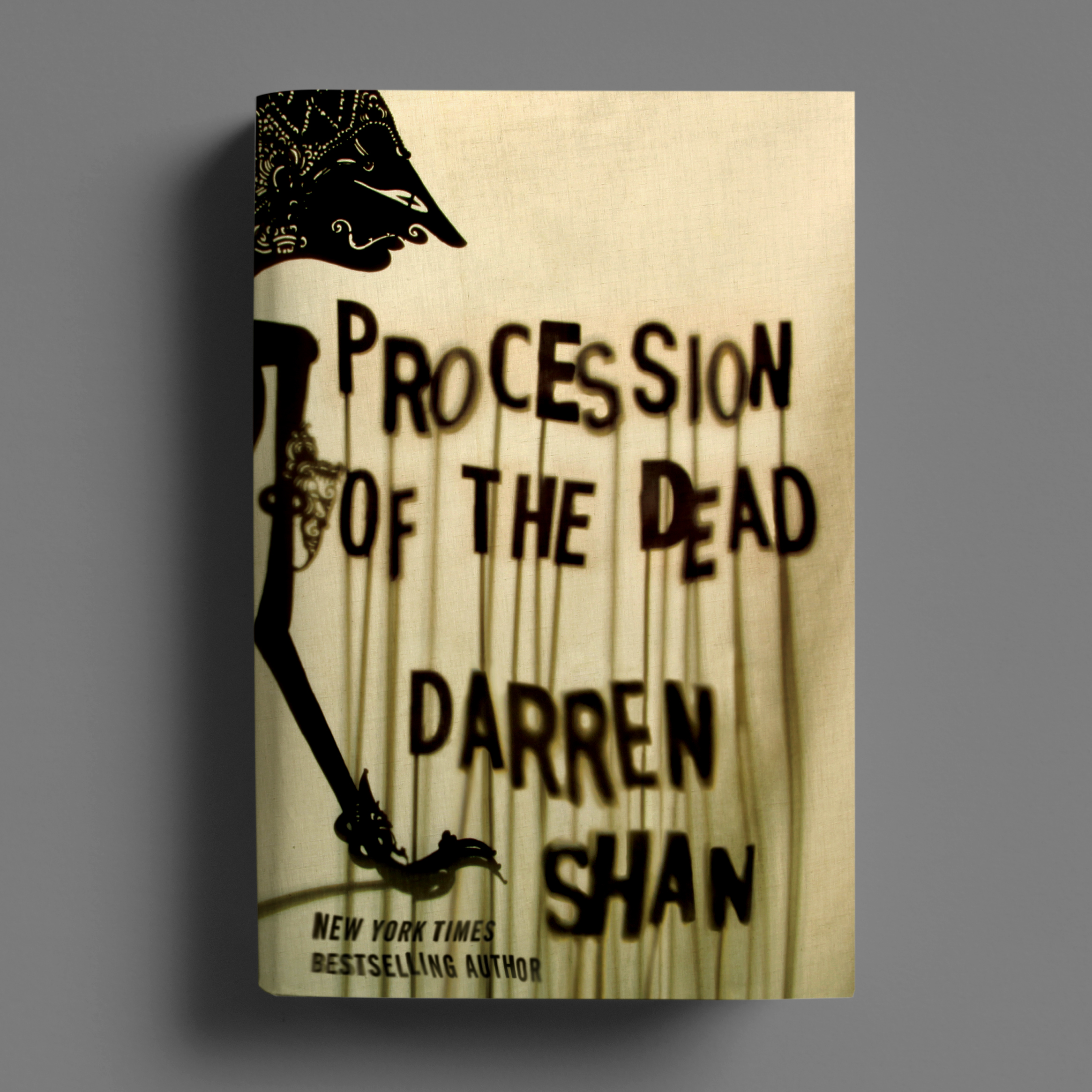
Book cover design for Procession of the Dead by Darren O'Shaughnessy
You and I were just talking about our kids and art the other evening at Judges’ Night (Casalino’s son has his own flat file!) and it made me think about early hobbies that sometimes weave into our adult lives. Are there things you did as a kid that influence your creative habits now?
I was definitely creative as a kid— everything from drawing to making really intricate friendship bracelets to building Lego empires. When you’re a kid there are no boundaries to creativity, which is amazing. No one’s saying “I’m a book designer” or “I’m a photographer.” One minute you’re designing and building a fort and the next you’re producing, styling, and starring in a play complete with puppets, all the neighborhood kids, and the family dog. I think harnessing that creative openness and collaborative spirit is something I’m always trying to bring into my current work, and it’s particularly helpful when working on book design. Every book is really unique and each project has a different set of collaborators and hopes for the design. One day I’m on set art directing a photoshoot, the next I’m working with typography, and the next I’m simply picking up a pencil and drawing. You have to be receptive to whatever that particular book calls for.
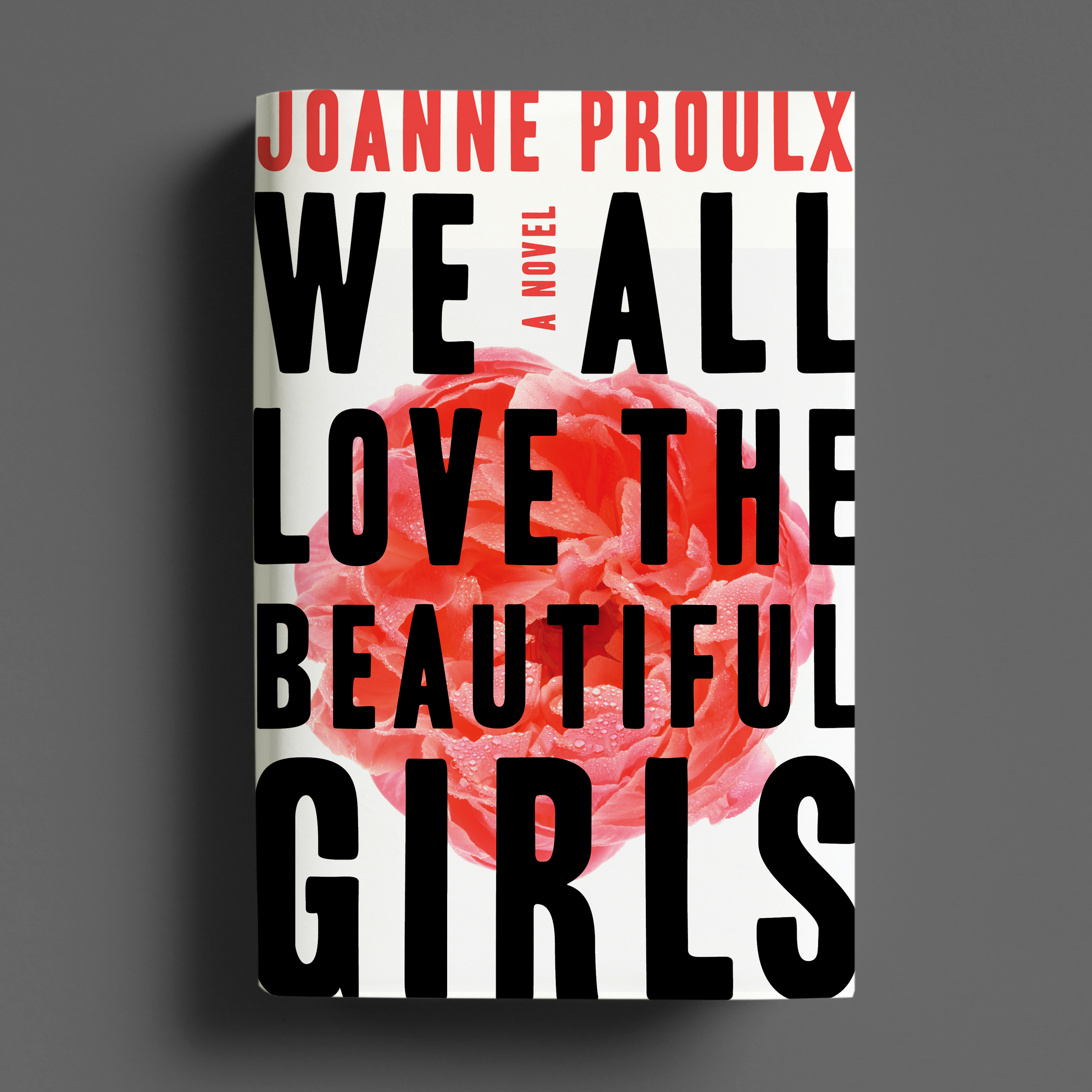
Book cover design for We All Love the Beautiful Girls
I was also fortunate to be one of the first generations that was able to use technology in our play. I think now there’s a little self-consciousness and fear that comes when we’re confronted with new technology, but growing up in the 80s and 90s it was new to everyone and figuring it out became part of the fun. My sister, my best friend, and I were always goofing around with a camcorder or making newsletters on our early IBM computer. I also clearly remember going to my dad’s office one Saturday and seeing a pen plotter for the first time, which blew my mind. I think all of that fed into my enthusiasm for working on the computer in a creative way.
I was also hugely into photography starting in middle school. I learned in the darkroom and then transitioned to digital in the early 2000s. I love working with photographers and existing photography and even shoot things myself from time to time. Photography is the first creative discipline where I really learned composition, craft, and technique, so I’m always coming back to it.
Design for Supercomputer
How do you feel about being in your discipline right now?
I really love working in book and print design. Designing for web and apps is definitely fun, but print design has a permanence about it that’s really special. I collect Alvin Lustig books from the 40s and 50s and sheet music from the turn of the century, and they’re still as functional and beautiful today as they were when they were produced. I love the idea that a book or poster I create could still be relevant 100 years from now.
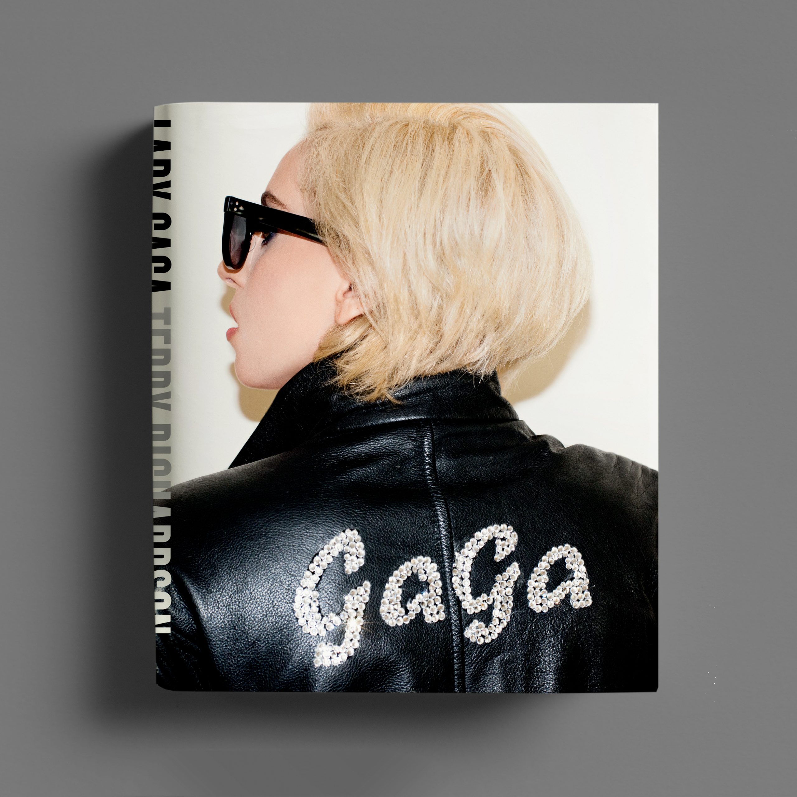
Book cover for Lady Gaga