Where are you from? What led you to graphic design?
I'm a born-and-bred Manhattanite. We had an apartment on the Upper West Side that looked out onto Broadway, and a truly spectacular neon liquor store sign across the street. Both of my parents were in the arts. My mom had a MFA in theater and absolutely no capacity to survive auditions, but she eventually turned to photography and showed regularly at the SoHo Photo Gallery on White Street. My dad was a sound engineer for a label called Audio Fidelity at a time when one could make a good, middle-class salary walking around and recording stuff that sounded cool on a portable reel-to-reel tape machine, ultimately to be committed to vinyl.
My brother and I got used to being photographed and recorded from early on, and we knew to be quiet when the red light was on. Incidentally, my then-four-year-old voice can be heard saying "Everybody's kissing" at the end of the track "Central Park Happening" from Audio Fidelity Sound Effects Volume 14, and my brother and I appear together eating corn chips on the "Fritos" track from the same volume.
My parents took us to concerts, museums, galleries, movies, and protests. (There were almost as many to go to then as there are now!) Most of our friends were artists of one sort or another, my dad had a lot of records, and did I mention all that beautiful neon on Broadway?
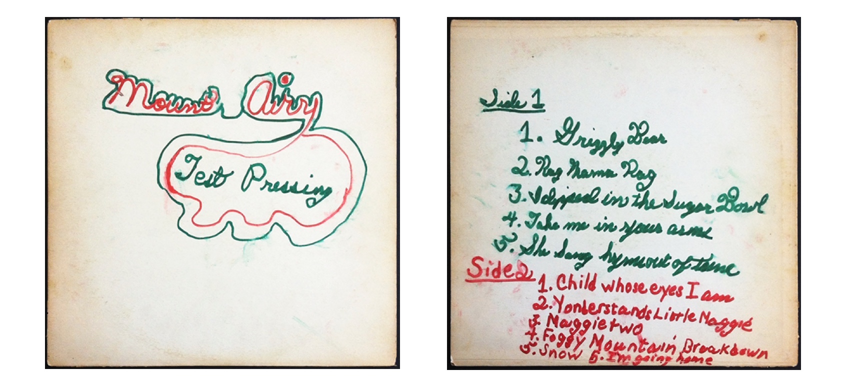 Album cover "design" created for an album my father was working on when I was eight years old.
I was so heavily steeped in contemporary culture that I got into graphic design more or less by osmosis. I certainly didn't think of it as a possible career. I was way into letters from about the age of about seven. I have examples of letters that I copied from album covers at that age, and I still have the first Dover Book of Alphabets that my dad gave me when I was about ten. But I don't recall ever being told that this interest could lead to a particular career path. It was just this kooky thing that I was into. Even at the High School of Music and Art (now known as LaGuardia), where I was an Art major, there was only one graphic design-related course at the time, Advertising. As I recall the course was mostly illustration-based, which wasn't really my thing.
Graduating from M&A did, however, give me the confidence to learn how to do mechanicals on the job right out of high school in order to support what I thought was my art at the time-singing in a band. I did all of the group's graphics as well as graphics for most of my friends and boyfriends, making flyers, record covers and labels, and applying logos to drum heads and guitar headstocks, mostly by hand. I didn't know the first thing about print production then. I learned what a bleed was the hard way.
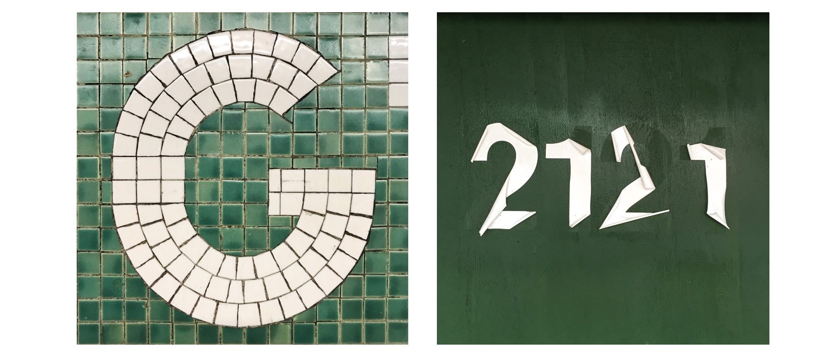 The letter G and number 2121 found and featured on my Instagram feed.
Over the next few years, I was able to find enough work at a number of studios to support myself, and then a stint at PolyGram Records. Working among a team of really great designers brought some direction to my innate passion and made me keenly aware of the rather significant gaps in my knowledge. Also, I finally came to terms with the fact that I wasn't much of a singer.
I enrolled at Pratt Institute in Brooklyn and got a BFA. I've since worked for RCA Records, Doyle Partners, Empire Design Studio, and HBO among other places. I have a solo practice now where I mostly design book jackets, and I teach design and typography, too.
Was there an early career experience that shaped how you practice design today?
One of my teachers at Pratt, Cyrilla Mozenter, had an ability to articulate what she saw in an almost visceral way during critiques, and that had a way of stripping away everything superfluous and getting right down to what was working and what wasn't. When I began teaching, I was channeling straight-up Cyrilla the whole time, and the repetition of that process made me begin to see my own work in much clearer and straightforward terms. I'm definitely a better designer because I have taught for a while.
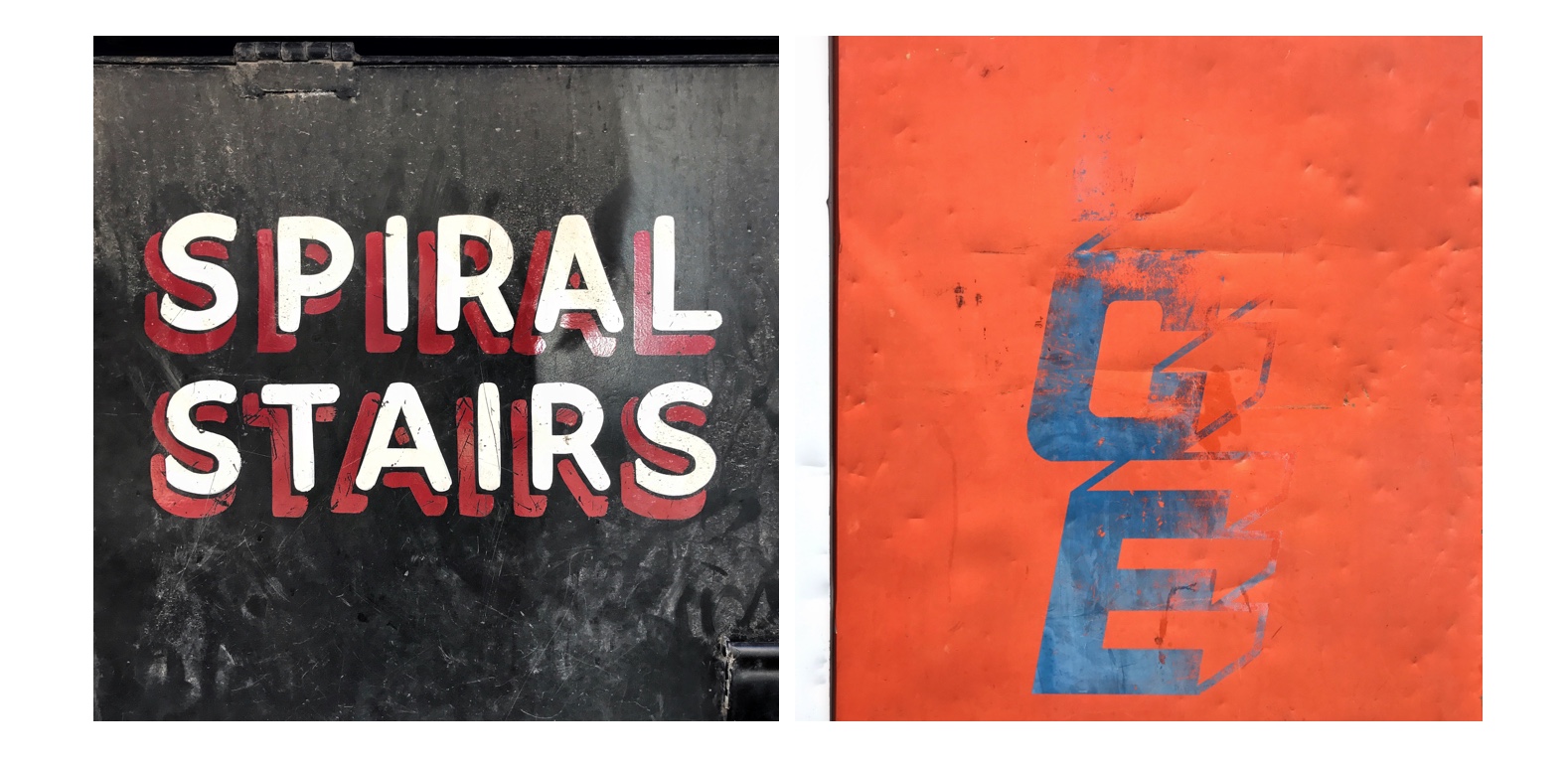 Type and letters on my Instagram feed - Spiral Stairs and ICE.
I have always liked how art schools, in particular, connect to their neighborhoods. Pratt is in Clinton Hill in Brooklyn, which is kind of a strange, super-residential spot for an art school. What was it like when you went there?
I was at Pratt from 1990 to 1994. Clinton Hill has gentrified significantly since then. As I recall, aside from there being a coffee shop on the corner called Mike's, and a bar nearby called the Alibi-which was every inch as charmingly scuzzy as it sounds-there didn't seem to be much to do around there, and petty crime was pretty prevalent.
Getting into the city involved transferring from the G train, a move not made for beginners, so it seemed that it took a lot to get students to leave the campus. It always felt a bit isolated there, but the upside of that isolation was that it caused the campus to have an energy that was quite palpable. You could be there at any hour of the day or night and find people in the labs working their asses off. It was my impression that it was purely for the love of working. To me, that was magical.
I should add that I lived off-campus. That fact and my being a little older than everyone else may have left me out of the loop on student life to a certain extent. I made great friends at Pratt, who I'm pleased to say have remained my friends, but I wasn't invited out much. However, other students often asked me if I knew what the homework was and if I had an extra pen.
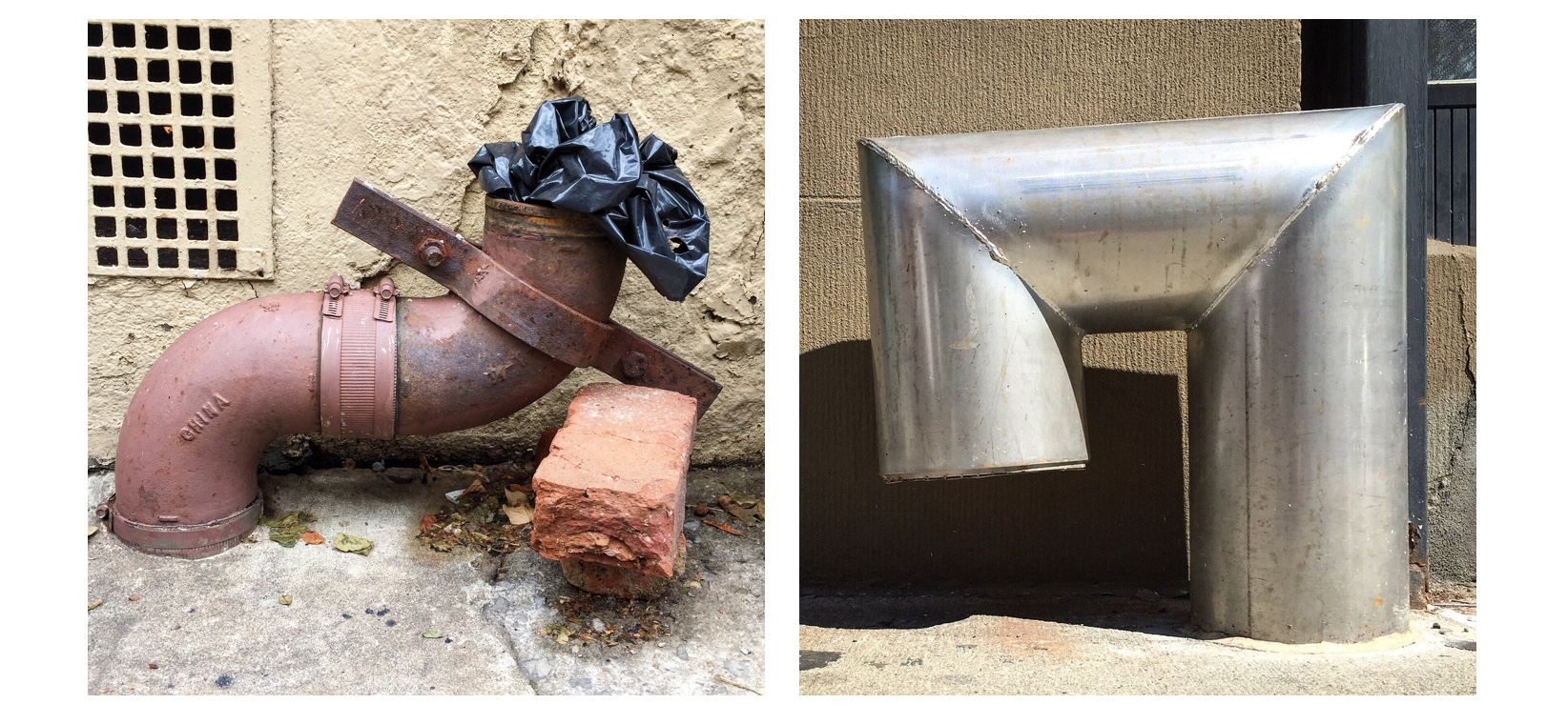
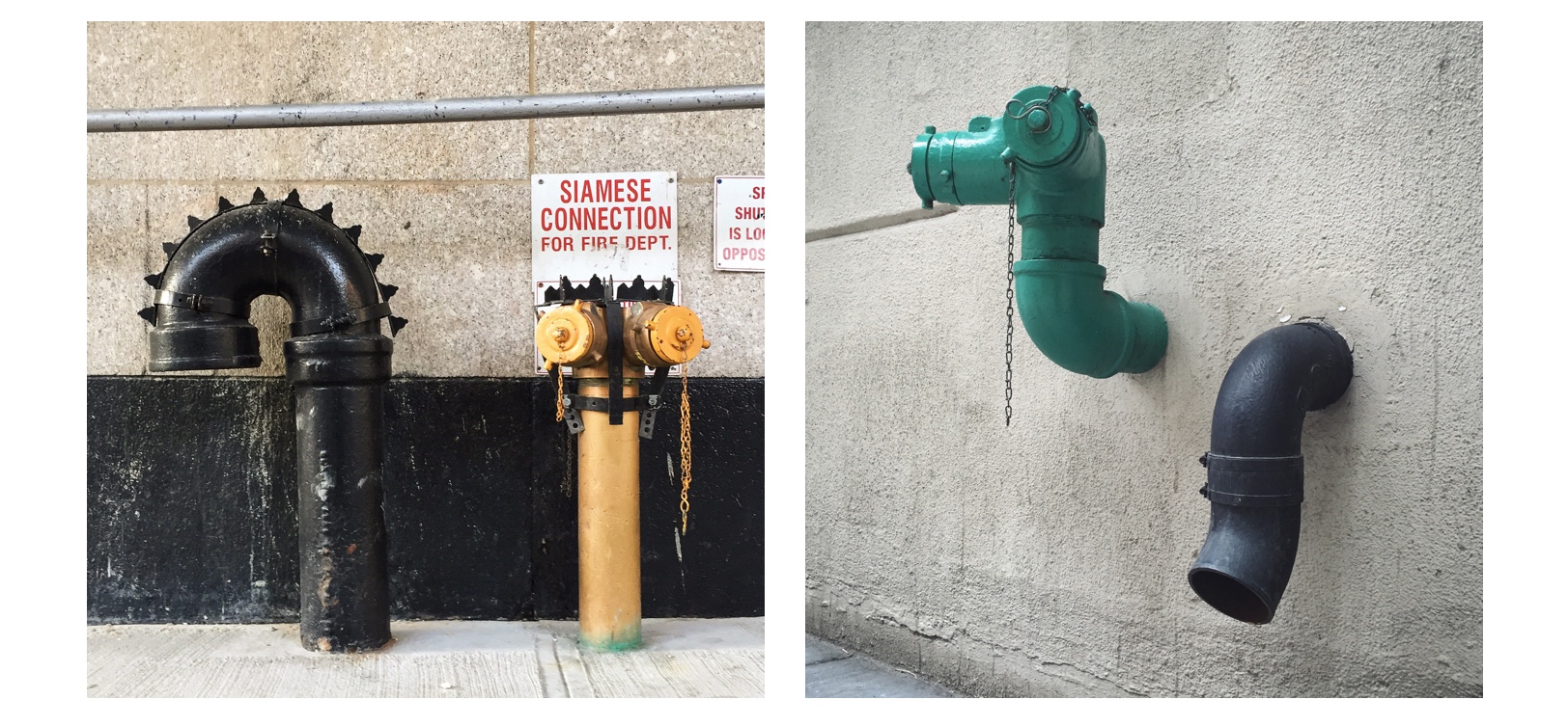 Pipes of New York City on Instagram - Chelsea and Dumbo, 2015.
I love your photographs on Instagram, specifically your series of pipes in New York City. It's such a delight to see these still lifes as compositions through the lens of your camera! What prompted the series?
I've been walking around the streets of New York all my life, pointing at things and saying "Hey, look at that!" to anyone who would listen. (Usually, it was just myself.) The camera on my phone and my Instagram account provide me with a medium that's just a natural extension of this. Initially, I posted whatever appealed to me, although it became clear relatively quickly that letters held the most appeal. I particularly liked letters that revealed humanity in their making, whether through inventiveness, skill, reverence, or a total lack of any of those properties. I thought I'd be over the whole project in three weeks, tops, but I kept finding signs I liked. The more I kept at it, the more signs I kept finding.
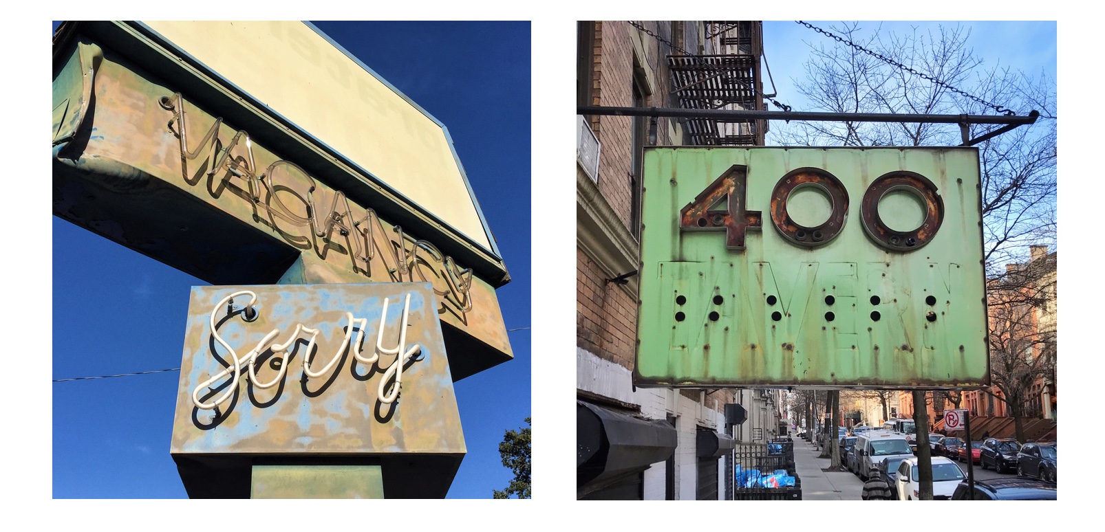 Signs found and posted on Instagram - Vacancy Sorry from 2016 and 400 Tavern.
I think the pipes came along because I was taking pictures of signs all the time. The more you look, the more you see, right? I started noticing pairs or groups of various kinds of standpipes, drainpipes, and vents on the street that seemed to bear some kind of relationship to their environment or to each other, almost as if they suggested some kind of a story. I started taking pictures of them. Then one day, defying my better judgement, I posted my first few, certain that I was about to be universally unfriended and unfollowed. Much to my surprise, they started getting likes.
Oddly, no one seems bothered at all about the incongruity of showing type and pipes together, as if the two have everything to do with one another. People sometimes pay me the complement of telling me that my photos cause them to notice things they hadn't before, and sometimes they send me pipe pictures of their own.
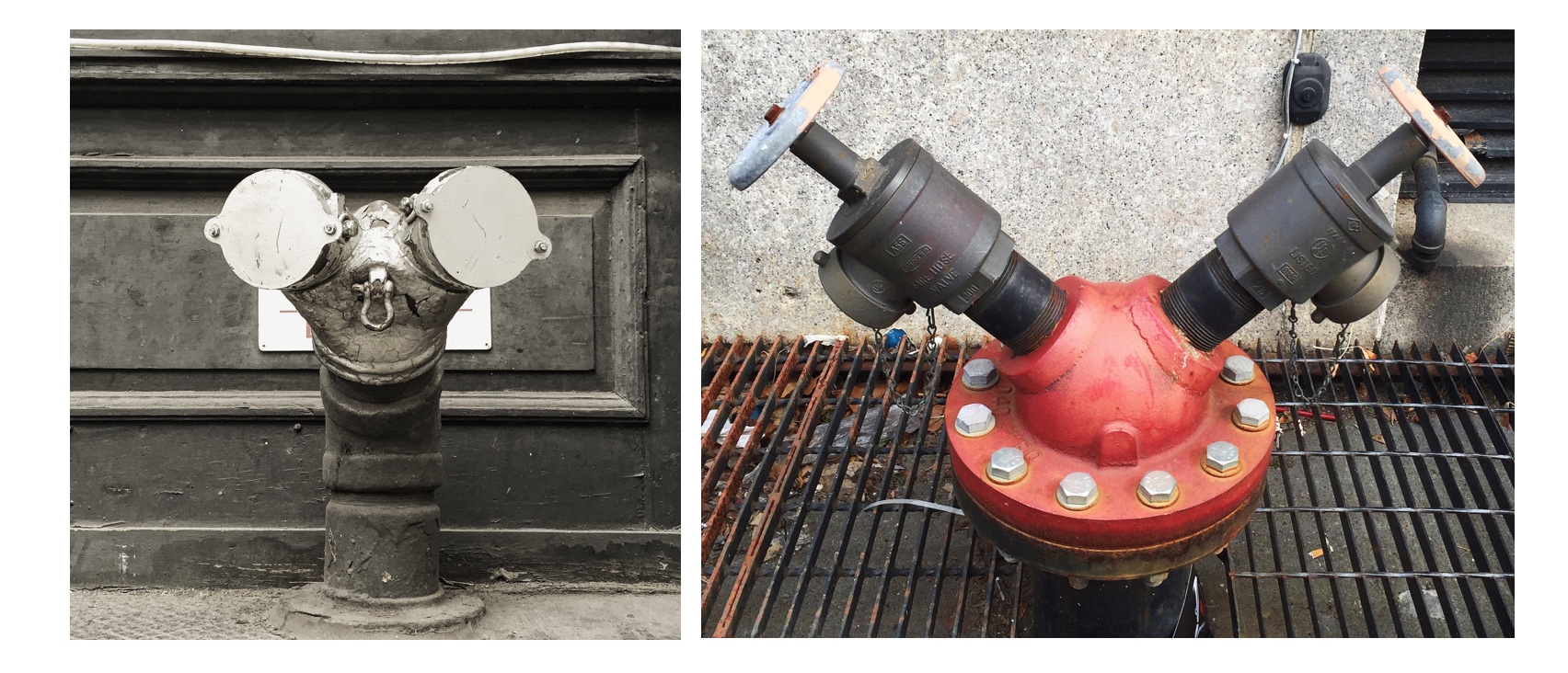 Pipes of New York City on Instagram -Duane Street and Minnie Mouse Doing a Cartwheel, 2015.
Tell us about your relationship with type. You've been a Type Directors Club member for a while now!
I went on my first lettering walk with Tobias Frere-Jones in 2007 through the AIGA. I recall being almost embarrassed by my excitement over discovering that there were actually other people who were as enthralled as I was at discovering a tiny snippet of beautiful, almost-painted-over hand lettering behind a storefront gate on Canal Street - and that some of those people were really, really smart. Some even made beautiful letters themselves.
I've belonged to a number of design organizations over the years. I was on the board of Spark Design Professionals, and I'm a longstanding member of the AIGA (shout out to Stacey Panousopoulos!), but the TDC holds a special place in my heart, because it's the only place in the world that I know of where an audible gasp can be heard among the audience when the speaker is explaining, say, the difference between tabular and proportional figures. I love all my design colleagues, but the TDC are my peeps, you know?
 Pipes seen in New York - Morton Street and University Place, 2016.
Photos copyright ©2015-17 Carrie Hamilton
Links:
Instagram: @carriehamilton
Twitter: @chamiltontweets
Website: http://www.carriehamiltondesign.com/