Each year, as part of the Type Directors Club Communications Design competition, the judges panel chooses three works by students to receive special recognition. This year, TDC also added a student section to its Typeface Design competition and awarded a top prize in that division.
At our July 17 awards ceremony in New York, we were honored to present awards to this international group of students from Hong Kong, New York, Taipei, and Los Angeles, whose work is included in the exhibition, The World’s Best Typography, which is currently on display at The Cooper Union’s Gallery 41 in New York until August 9 and at PJITK in Warsaw until September 1.
We invite you read about this award-winning work inspired by airport wayfinding, bacteria, time, and the arts. Congratulations to all!
Student Typeface Design – First Prize Award
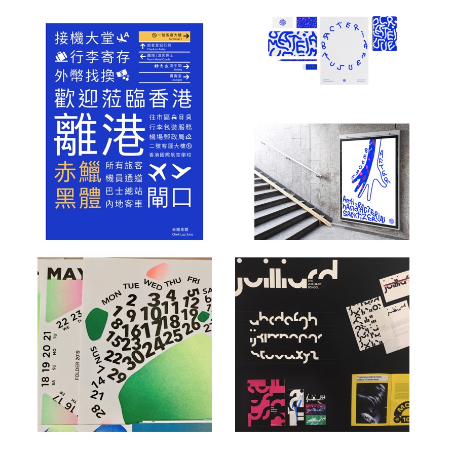
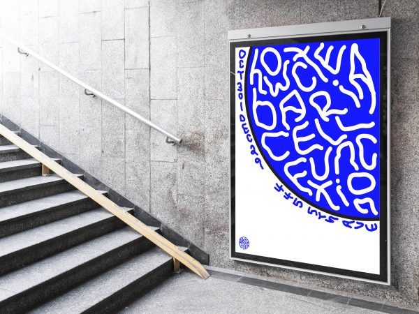
Chek Lap Sans
- Designer: Tsz Yan Kwong, Hong Kong
- Professor: Brian Kwok
- School: School of Design, The Hong Kong Polytechnic University
Designer’s statement: “Chek Lap Sans is a Traditional Chinese typeface designed specifically for signage of the Hong Kong International Airport in Chek Lap Kok, aiming for both functionality and personality. The typeface is designed with considerations of legibility under negative polarity display, to suit the need of the current blue light-box signs with white text. It has generous negative spaces within character, optical adjustments to compensate the glowing effect, and subtle features that contribute to its visual identity.It also includes relevant icons with references to the local context. Several design decisions were informed by the findings from user tests.”
View the complete set of 150 Chinese characters and 39 icons here.

Student Communications Design – First Place
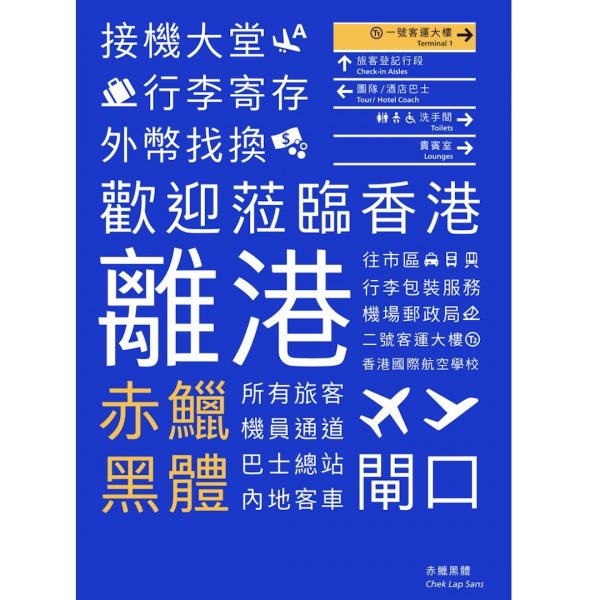
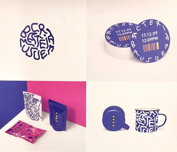
Bacteria Museum
- Designer: Sunnie Lee, New York
- Instructor: Natasha Jen
- School: School of Visual Arts, New York
- Principal Type: Custom
Designer’s statement: “A visual identity design for an imaginary Bacteria Museum. The use of playful colors are to convey that bacteria are not necessarily all bad but there are good bacteria as well. I also wanted to make this museum children-friendly so that they can come and explore and have fun at the same time. The logo was created in an organic form with handwritten letters, relating to the ever changing forms of bacteria. My inspiration came from the 4 most common bacteria in our living houses. The circular forms are to depict bacteria being seen through a magnifying glass. The use of neon bright colors and the organic feeling of the whole visual identity worked well together to catch people’s eyes.”
Student Communications Design – Second Place
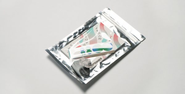
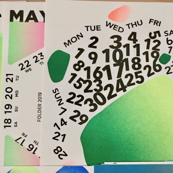
Unnamed Folder Calendar
- Designers: Chih-Wei Hsu, Chen-Wei Lin, and Xao-Wen Su, Taipei
- Professor: Sih-Wei Jheng
- School: National Taiwan University of Science and Technology
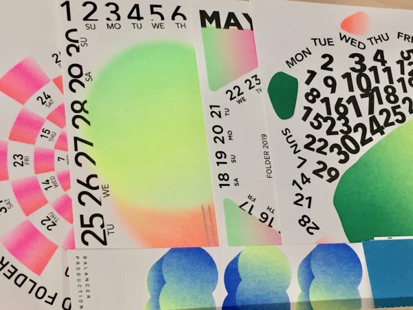
Designer’s statement: “This calendar uses visual symbols and colors to communicate the meaning of the new year: unknown, uncertain, and various. We used Risograph printing and different post-printing methods to present the concept.”
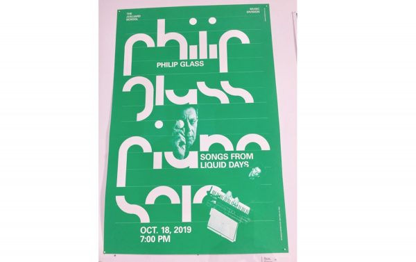
Student Communications Design – Third Place
The Julliard School Rebranding
- Designer: Karlo Fuertes Francisco, Los Angeles
- Instructor: Brad Bartlett
- School: ArtCenter College of Design, Pasadena
- Principal Type: Juilliard Display and Univers
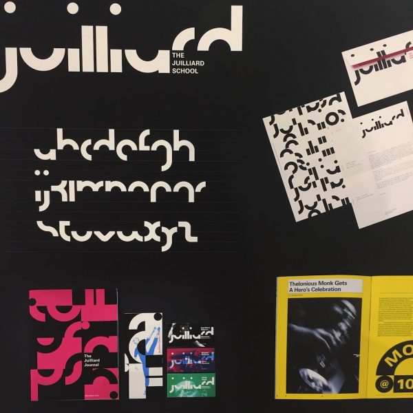
Designer’s statement: “The Juilliard School’s performative logotype consists of modular dynamic forms which can be applied as a flexible tool to communicate information in a number of ways. The expansion and retraction of graphic forms utilizes compositional arrangements to emphasize spatial cognizance similar to musical scores and dance lab annotations. The proposed identity delivers a visual performance of forms and color for both the students and faculty while providing a sense of clarity to the daily rigors of school life.”
The 254 Communication Design competition winners, as well as the 22 winners of the typeface design competition, are on display at The Cooper Union’s Gallery 41 in New York until August 9 and at PJITK in Warsaw until September 1.
This award-winning student work will travel to many cities and design conferences around the world, and will be published in the upcoming TDC annual, The World’s Best Type and Typography.
We would like to thank our competition and exhibition sponsors — Monotype, The Cooper Union, Fordham University, and A to A Studio Solutions.