When asked to select his favorite from among all the entries, communication design judge Leo Jung chose Bacteria Museum by SVA student Sunnie Lee, a visual identity project that also earned Sunnie the first-place student prize in the TDC66 competition.
Bacteria Museum is part of The World’s Best Typography exhibition (TDC65), seen most recently at Taiwan Tech (National Taiwan University of Science and Technology) in Taipei and at Sheridan College in Ontario, Canada.
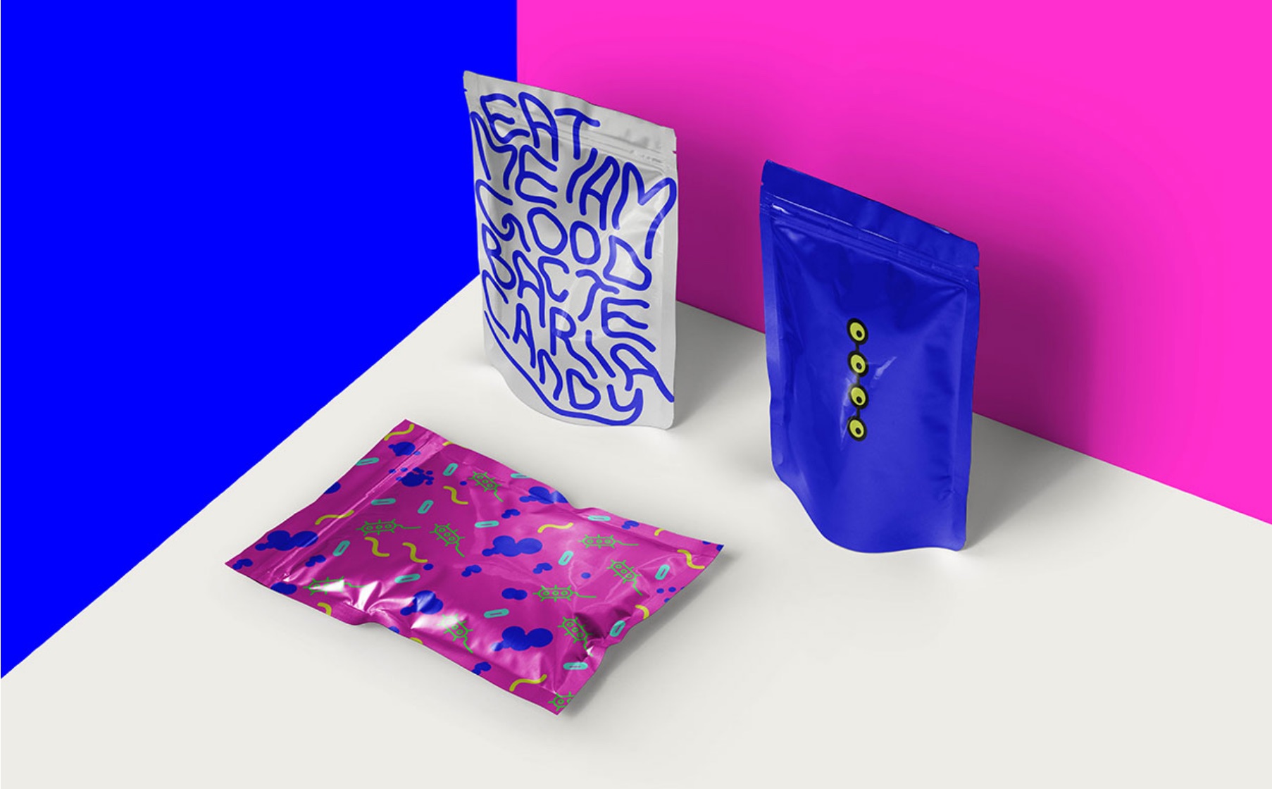
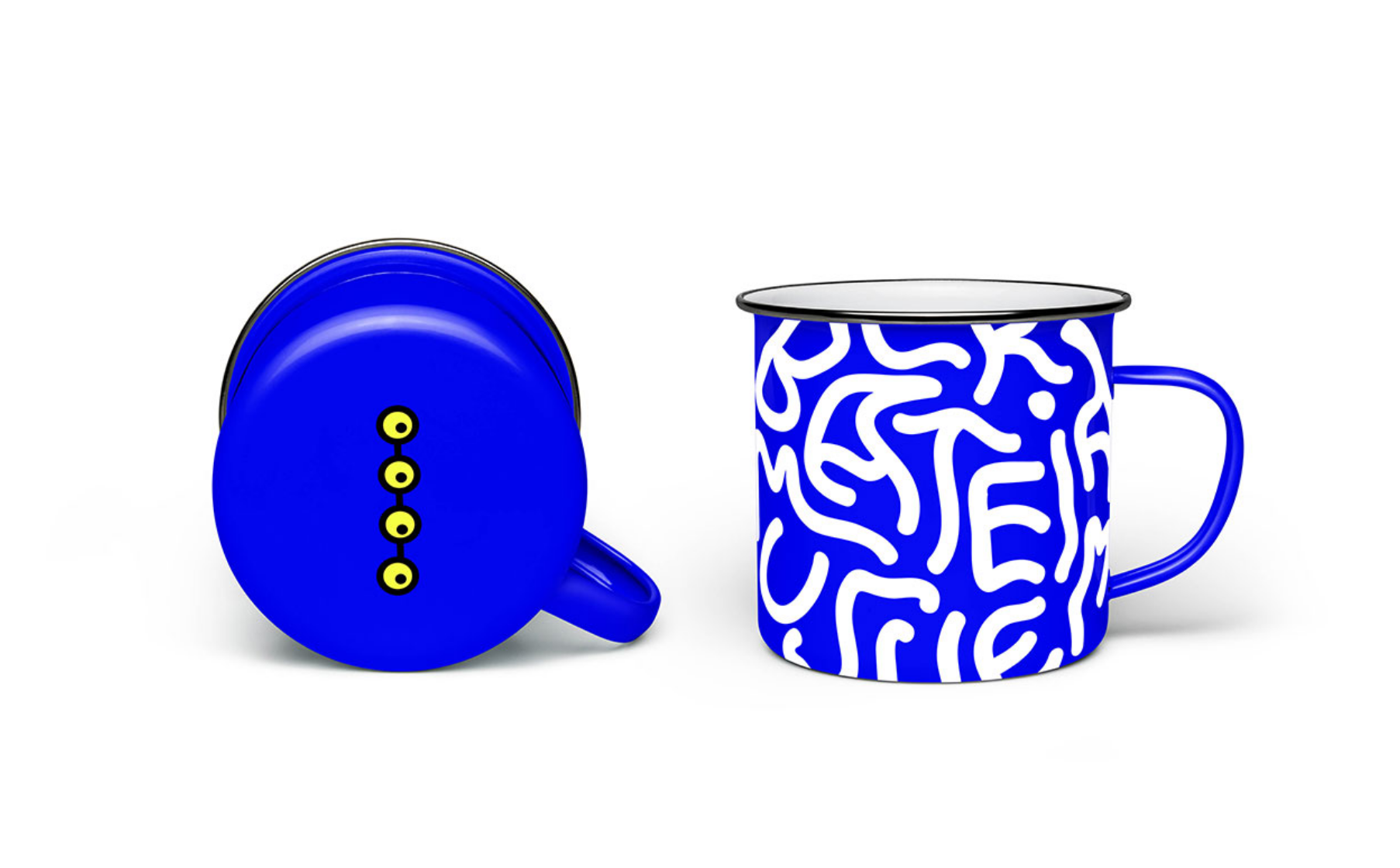
Branded with the Bacteria Museum identity.
About Bacteria Museum
- Designer: Sunnie Lee, School of Visual Arts, New York
- Instructor: Natasha Jen
- Principal Type: Custom
A visual identity design for an imaginary Bacteria Museum. The use of playful colors are to convey that bacteria are not necessarily all bad but there are good bacteria as well. I also wanted to make this museum children-friendly so that they can come and explore and have fun at the same time.
The logo was created in an organic form with handwritten letters, relating to the ever changing forms of bacteria. My inspiration came from the four most common bacteria in our living houses. The circular forms are to depict bacteria being seen through a magnifying glass. The use of neon bright colors and the organic feeling of the whole visual identity worked well together to catch people's eyes.
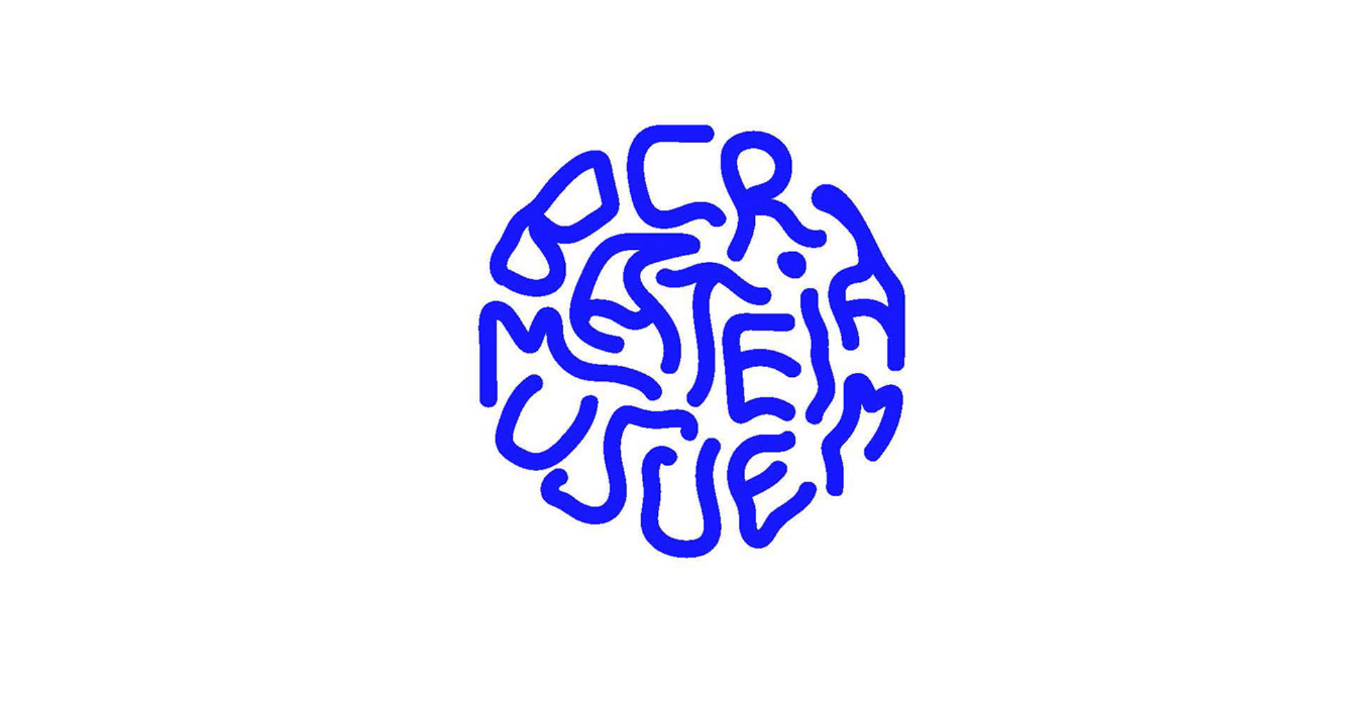
Logo for the Bacteria Museum.
Comments by Communication Design Judge Leo Jung
"With accessibility to software that give us greater control to manipulate form, perspective, and space like never before, the potential for pushing typography to new creative heights is inevitable. It’s happening already. And I voted for many of them!
At the same time, this capability can sometimes lead to an unplanned path towards sameness. It can also put emphasis on aesthetics and form over an underlying function. And with anything machine-made, its form can often feel cold and mechanical. I found myself questioning why I liked certain pieces. And often those reasons felt hollow and superficial.
Having said that, I’m always drawn to work that solve a problem in a way that feels different than all the rest — and at the same time, challenges my own sense of biased visual preferences. After viewing thousands of entries, I realized why I kept coming back to this oddity. I was charmed by its simple, gestural, and lyrical form — in direct contrast to many of its technically complex counterparts. It’s a reminder that no matter how far we develop our tools to create things that are beyond our imagination, a strong and simple idea is often what carries a piece beyond what form can do alone.
Unrefined, barely legible, and as TLC would say, “damn unpretty,” this piece seems to be the antithesis of beauty and craft in typography. But yet, it’s for all of those reasons that the solution works so effectively. Bacteria is unpretty. It’s gross. And creepy. And yet — as the focus of a museum, it looks undeniably fun and intriguing. It’s ugly in a beautiful way. It ignores idealism and embraces imperfection. But more importantly, it feels human-made.”
Branded with the Bacteria Museum identity.
About Leo Jung
Leo Jung is Creative Director for the acclaimed live series Pop-Up Magazine and The California Sunday Magazine, which won the Society of Publication Design’s award for Magazine of the Year in 2018. He is the former design director at Wired and deputy art director at The New York Times Magazine. His work has been recognized by the Art Directors Club, Type Directors Club, and the Society of Publication Designers.