An exhibition currently on view in New York City celebrates the German designer and typographer Jan Tschichold and reminds us of his prominent position within design history. One gallery in the exhibition Jan Tschichold and the New Typography at the Bard Graduate Center shows his design work, while the rest of the space is devoted to Tschichold's collection of work by his contemporaries, now part of MoMA's collection.
Given the current attention on Tschichold, it is with some pride that we recall a little-known connection between the Type Directors Club and Tschichold. In 1959, Tschichold participated in a TDC seminar in New York City on the theme “What Is American Typography?". The essay that he delivered for the seminar, entitled "Quousque Tandem…" ("How Long...") has become the most commonly-cited text about why Tschichold turned away from his youthful, dogmatic modernism.
In the short essay, Tschichold wrote that he did not believe in a national typography, except when it is the "casual result of work." He had strong opinions about nationalism and design because of his persecution before World War II. As National Socialists gained power in the 1930s, they criticized leftist and communist (that is, Modernist) design for being un-German, and Tschichold was briefly imprisoned in Germany before he fled to Switzerland with his wife. Then, interestingly, he came to see parallels between the restrictions of Modernist typography (the exclusive use of sans-serif type in asymmetric arrangements, etc.) and the intolerance of the German fascists. After the war he became more broad-minded, and wrote, "The aim of typography must not be expression, least of all self-expression, but perfect communication achieved by skill. Taking over working principles from previous times or other typographers is not wrong but sensible."
Following here we offer here the full essay text and we also ask for your help in solving a mystery. TDC records fail to show if Tshichold delivered the essay in person in New York in 1959 or instead sent it to be read by another. The essay was not included in the TDC publication of seminar talks, and only appeared in print in Print magazine in 1964.
If you know of any proof that he came to New York or did not, please email us at [email protected]. Thank you!
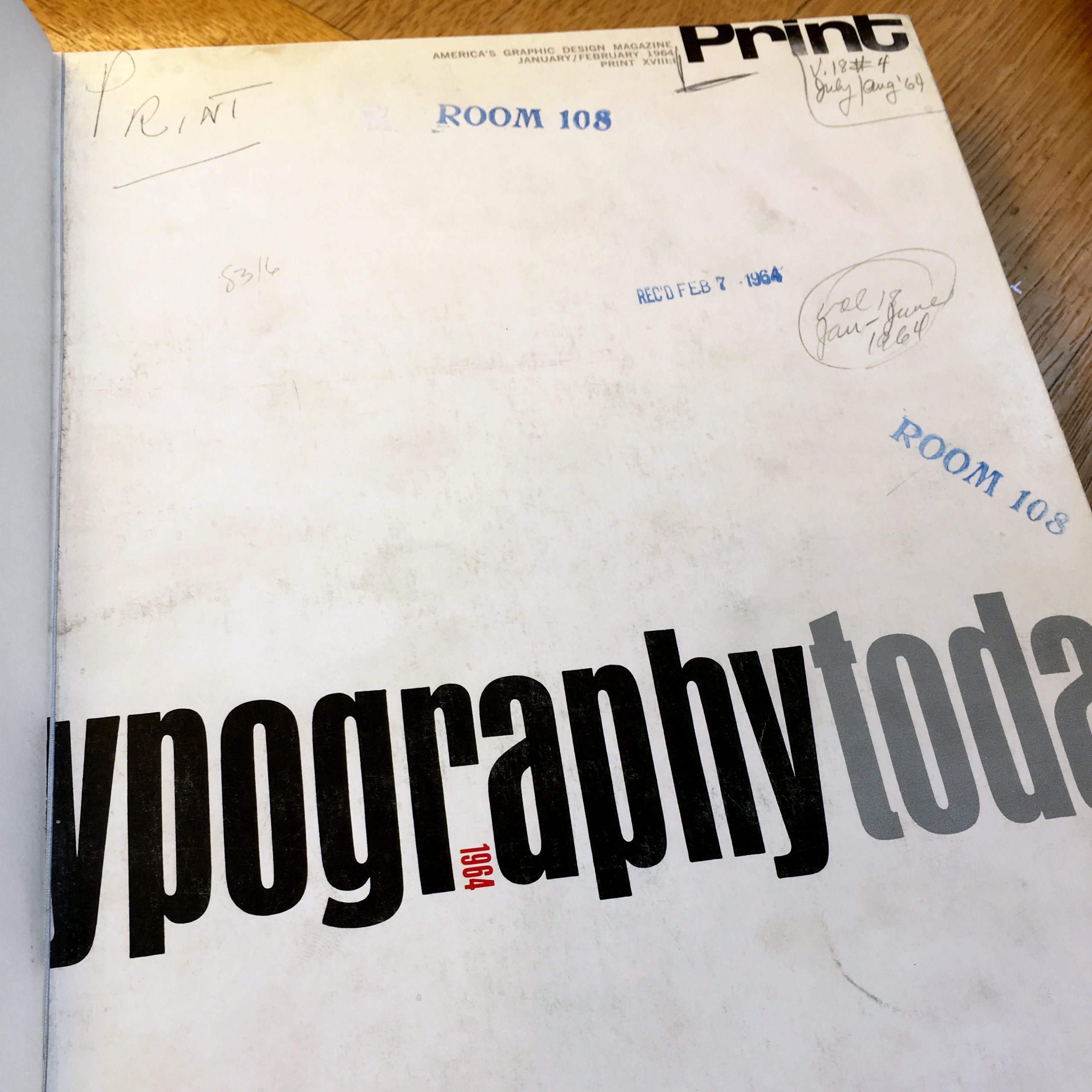
Print magazine "Typography Today" issue, 1964. Bound copy at the New York Public Library
Quousque Tandem…
by Jan Tschichold, 1959
…In Switzerland, a few years ago, there was a rumor…about the possibilities of a “Swiss” typography. I do not believe in the value of a “national” typography. The attempt to create a “national” typography is certainly, to my mind, a fallacy. Still, even when such an approach is expressly avoided, it is in practice often the casual result of work. In general, we should consider the typography of the western world as one and the same thing. True, we can no more overlook the English approach than the American one, and probably nobody will be doubtful that there is a certain Swiss approach of today. The latter, for which I do not feel responsible, is the exemplar of a most inflexible typography which makes no distinction between the advertising of an artistic performance or of a screw catalog. Nor does this typography allow for the human desire for variety. It has an entirely militaristic attitude.
What I do today is not in the line of my often-mentioned book, “Die neue Typographie,” since I am the most severe critic of the young Tschichold of 1925–28. A Chinese proverb says, “In haste there is error.” So many things in that primer are erroneous, because my experience was too small.
In Germany in 1925 (and the present situation there is not too different from that period), far too many typefaces were used and, with a few exceptions, only bad ones. (I still remember the deep satisfaction of the moment when I saw, by chance, at the tender age of seventeen, English magazine pages set up in Caslon.)
Those German typefaces appeared in undisciplined arrangements, not at all “traditional” in the present-day meaning of this word. Those unacquainted with it can hardly imagine the mediocrity of German typography of that period. As a letterer, I felt insulted, day after day, by the ugly appearance of the newspapers, magazines, and the many sorts of advertisements. To cure these weaknesses I suggested two remedies, one for the type and one for the arrangement.
In order to reduce the number of typefaces…I thought the solution to be in a single typeface only, for all purposes, namely that which is called in German “Grotesk,” in English “Sans-serif,” and in the United States “Gothic.” For the arrangement, I suggested total asymmetry instead of centering the lines.
Now I have to reveal what I think is wrong with these juvenile ideas and with the situation of 1924. It was not the great number of typefaces in fashion then, but the poor quality of practically all these typefaces, and it was not the general unsuitability of a centered order but the lack of the compositor’s skill in such arrangements. Had I been more experienced then than could be expected at the age of 23, and had I been instructed in arranging type (of which I never heard lectures in my youth or later, because there weren’t any available), then perhaps I should have thought over my immature ideas more carefully.
So far, in this haste there was certainly error. Yet, very often, error is creative. My errors were more fertile than I ever imagined. Certainly the typography of the time shortly before 1925 was, in general, ailing, and in urgent need of a doctor. The treatment was heroic but healthy. Yet one cannot live by abstinence and pharmaceutics. The weakness of the period before 1925 was the lack of at least one good type. It would have been better to look out for a good type or, better, for a greater number of useful typefaces, than to reduce their number to a single typeface of doubtful utility. In the light of my present knowledge, it was a juvenile opinion to consider the sans-serif as the most suitable or even the most contemporary typeface. A typeface has first to be legible, nay, readable, and a sans-serif is certainly not the most legible typeface when set in quantity, let alone readable. Nor does a centered arrangement of too many different and even ugly letters prove the inappropriateness of line centering in general, but [rather is evidence of] lack of skill and artistic intelligence.
A few years after “Die neue Typographie,” Hitler came. I was accused of creating “un-German” typography and art, and so I preferred to leave Germany. Since 1933 I have lived in Basle, Switzerland. In the very first years I tried to develop what I had called “Die neue Typographie” and, in 1935, wrote another textbook, “Typographische Gestaltung,” which is much more prudent than “Die neue Typographie” and still a useful book! In time, typographical things, in my eyes, took on a very different aspect, and to my astonishment I detected most shocking parallels between the teachings of “Die neue Typographie” and National Socialism and Fascism. Obvious similarities consist in the ruthless restriction of typefaces, a parallel to Goebbels’ infamous “gleichschaltung” (political alignment), and the more or less militaristic arrangement of lines. Because I did not want to be guilty of spreading the very ideas which had compelled me to leave Germany, I thought over again what a typographer should do. Which typefaces are good and what arrangement is the most practicable? By guiding the compositors of a large Basle printing office, I learned a lot about practicability. Good typography has to be perfectly legible and, as such, the result of intelligent planning. The classical typefaces such as Garamond, Janson, Baskerville and Bell are undoubtedly the most legible. Sans-serif is good for certain cases of emphasis, but is used to the point of abuse. The occasion for using sans-serif are as rare as those for wearing obtrusive decorations.
Every asymmetrical arrangement needs its own individual design. Asymmetry is a secret known to a group of initiates and not easy for the average compositor to acquire. He learns to push a line to the left or to the right; never center it! True, a perfectly symmetrical arrangement is not easy. This in no way invalidates the principle, however, and no asymmetrist is entitled to blame it for this difficulty since his own arrangements lack even common sense; and the most slavish compositor will in time lose all pleasure in such work. A centered typography, while certainly not suitable for all purposes, is comparatively simple, and even the inexperienced compositor without intelligent guidance cannot commit grave faults there.
Unfortunately, this bad rigid typography still persists, especially in the town where I live. Is the typographer a prophet or a propagator of a new faith? Typography should be allowed individuality; this is to appear as different as the people around us, just as there are girls and men, fat and thin, wise and stupid, serious and gay, easily-pleased and fussy.
The aim of typography must not be expression, least of all self-expression, but perfect communication achieved by skill. Taking over working principles from previous times or other typographers is not wrong but sensible. Typography is a servant and nothing more. The servant typography ought to be the most perfect servant.
Our needs change, and for this reason alone the attitude of typography may also change slightly. Our eyes, however, do not change. They are still the same organ as Garamond had. As printed matter sometimes (we hope, in the most deserving cases) survives its originators and what we plan today may be read two hundred years hence, just as we can read books printed three hundred years ago, typography must not change very much. Essentially dependent on the shape of letters, it is an example of genuine tradition. Probably nowhere else is so little change noticeable and necessary as in typography.
The term used to characterize such activities as my own of today, traditionalism, deserves a short consideration. It is definitely not a natural continuation of the typography before 1925, and has, in fact, practically nothing to do with it. That tradition, if it was one, was dead. The few who work today in the same way as I do had to regain another healthy tradition by hard labor, which is neither the useless repetition nor imitation of the 16th or 18th century manner nor a blind revival of obsolete rules. It uses all the contemporary possibilities and responds to all needs. A draftsman or a compositor of the 19th century could hardly comply with modern tastes.
After having spoken most critically about my own early work…I want to use this opportunity to pay tribute to the outstanding high quality of typography in the United States. Even if you yourselves deny it, I as a historian must assert that it has a history as long and glorious as that of the States. The happy unity of language of almost a whole continent, allowing for huge printings, in combination with your unlimited technical possibilities, and last, and by no means least, the presence of so many highly-gifted individual typographers, often produce printed matter of paramount quality which I admire.
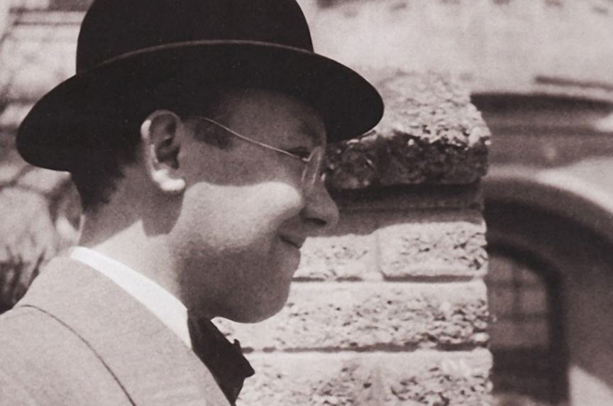
(Transcribed from Print XVIII:1, January/February 1964. Photo of Jan Tschichold, ca. 1926, by Kurt Schwitters)