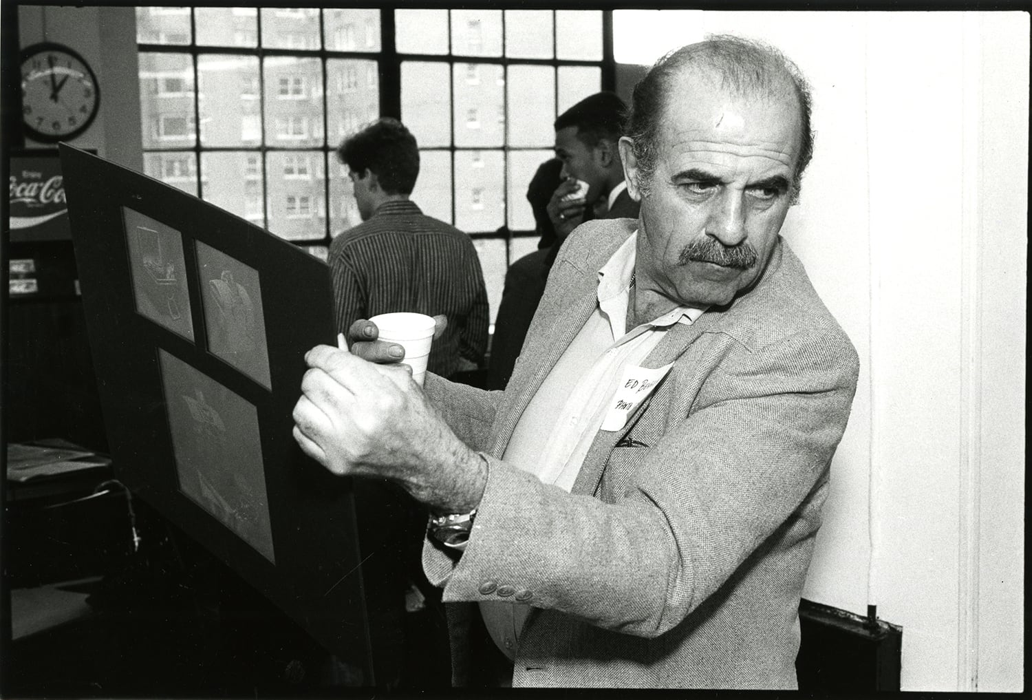
It is with sadness that we say goodbye to our dear friend, TDC Medalist and former President, Ed Benguiat, who died on October 15, at age 92.
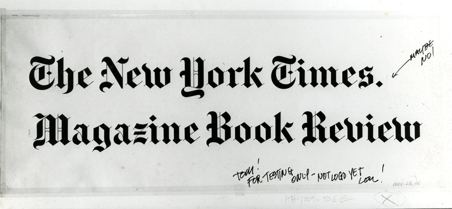
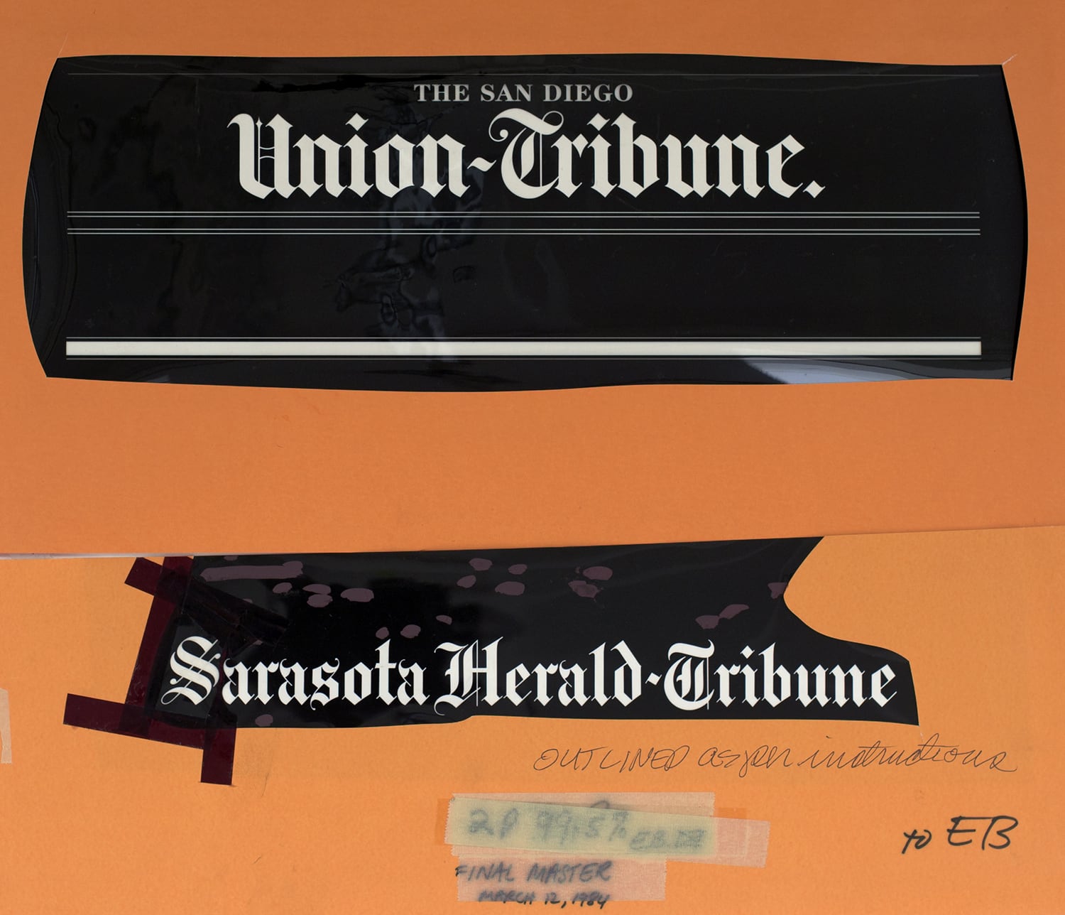
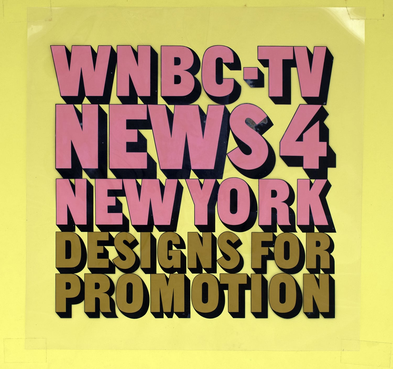
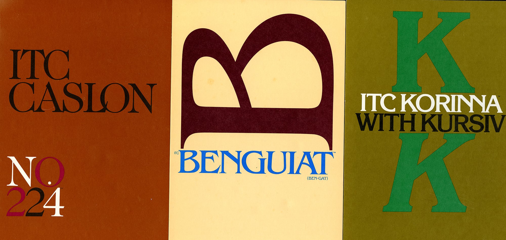
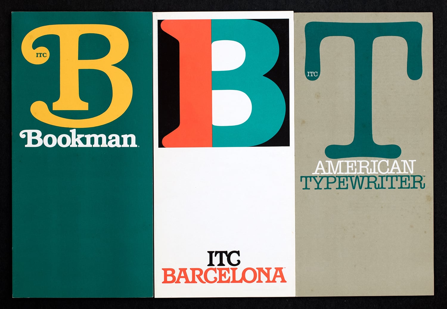
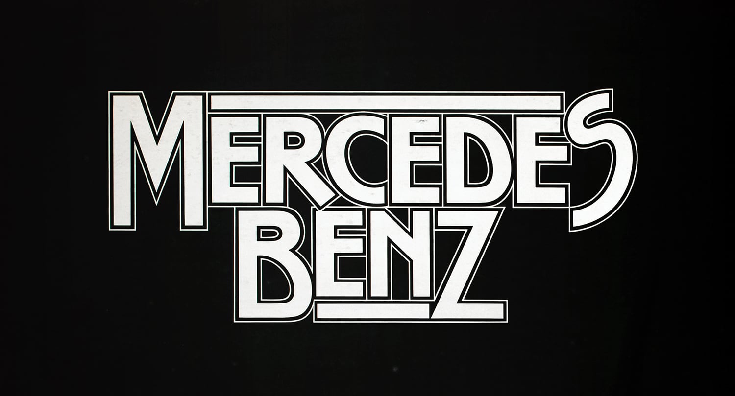
Ed was the designer of over 600 typefaces, including Tiffany, Bookman, Panache, Souvenir, Edwardian Script, and the eponymous Benguiat and Benguiat Gothic, as well as countless logotypes, for films like Planet of the Apes, Super Fly, and Guns of Navarone, and designs or redesigns for Esquire, The New York Times, Playboy, McCall’s, Reader’s Digest, Photography, Look, Sports Illustrated, The Star-Ledger, The San Diego Tribune, AT&T, A&E, Coke, Estée Lauder, Ford and many more.
Born in Brooklyn, Ed earned a BA degree in Music, and was, at one time a successful progressive jazz percussionist, playing with the likes of Stan Kenton and Woody Herman on 52nd Street, then called “Swing Street” in New York City. According to his wife of 38 years, Elisa, he was once named the #3 sideman/drummer in America in a poll in Metronome magazine.
Ed later attended the Workshop School of Advertising Art on the GI Bill, and from there began designing and art directing. In 1962, he joined Photo-Lettering Inc.as typographic design director, and ultimately became its Vice President/Creative Director. However, his contribution to the type community went far beyond designing. In addition to his informal role as enthusiastic mentor to generations of type designers, Ed was integral to the establishment of the International Typeface Corporation, the first independent licensing company for type designers, and was partner with Herb Lubalin in the development of U&lc, lTC’s award-winning magazine. He taught at the School of Visual Arts for nearly 50 years.
Ed was also an avid pilot, and owned his own plane, which he is said to have enjoyed flying with Elisa.
Among Ed’s many contributions to the TDC as Board President from 1990-91, according to Carol Wahler, was the doing away with the requirement that prospective members submit work samples and letters of recommendation for acceptance. “Anybody who loves type ought to be able to join this club” he said, “even if she’s a secretary in a church office!”
He is greatly missed.
Carol Wahler and Ed Benguiat, TypeCon 2011, New Orleans
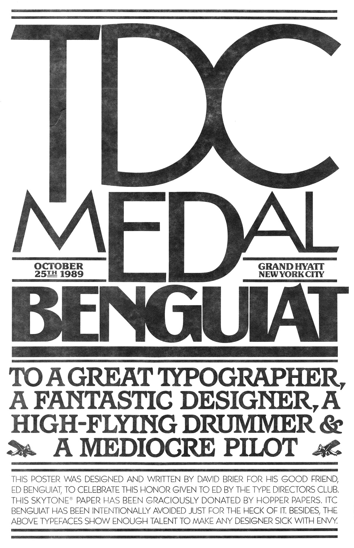
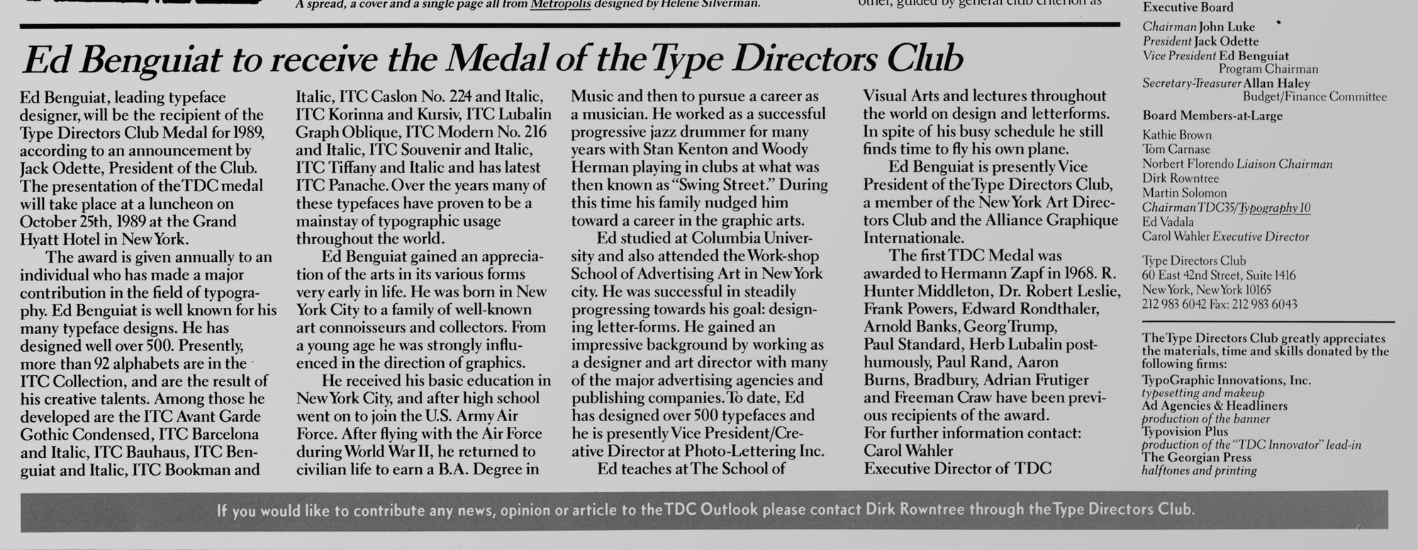
Article in TDC Gutenberg & Family about Ed receiving the TDC Medal
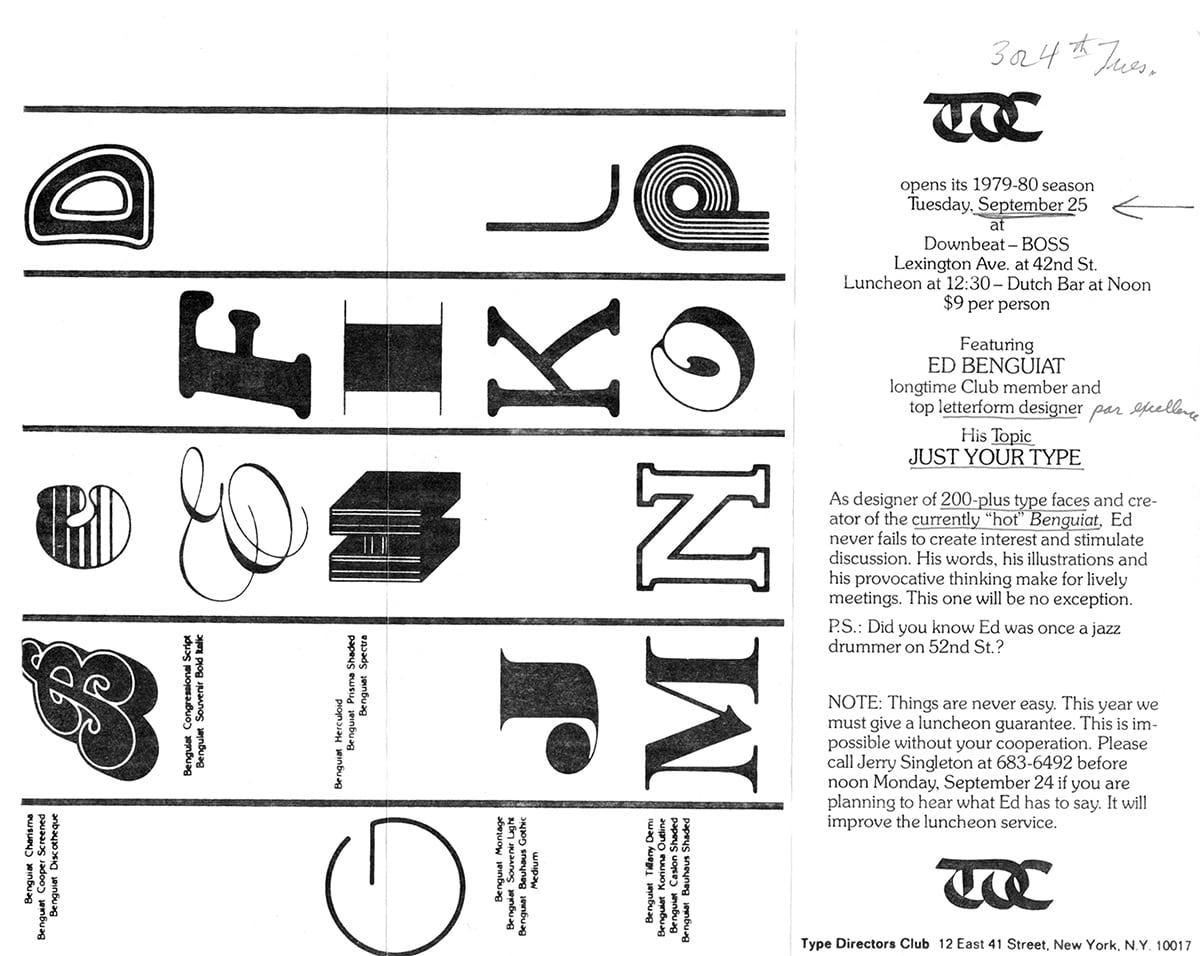
Invitation for a lunch meeting with Ed Benguiat, 1979.
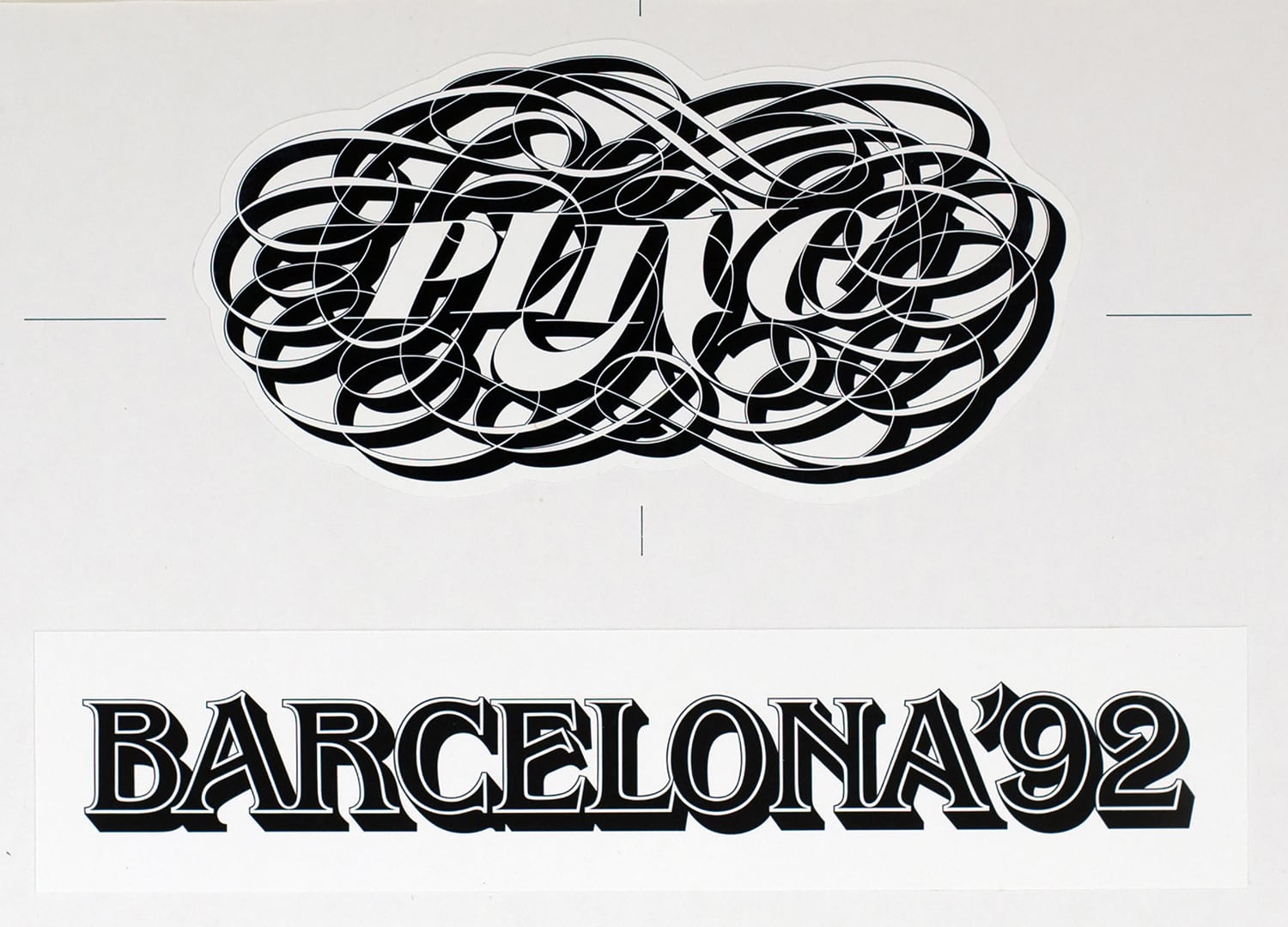
Ed Benguiat was one of the most prolific lettering artists and became typographic design director at Photo-Lettering, known as PLINC, "one of the earliest and most successful type houses to utilize photo technology in the production of commercial typography and lettering" for the advertising and design industry in New York City. Ed Benguiat was inducted into the Art Directors Hall of Fame in 2000. In 1961, he began teaching at the School of Visual Arts in his native New York.
Matthew Carter with Ed Benguiat, Techweenie Conference at The New School in 1996.
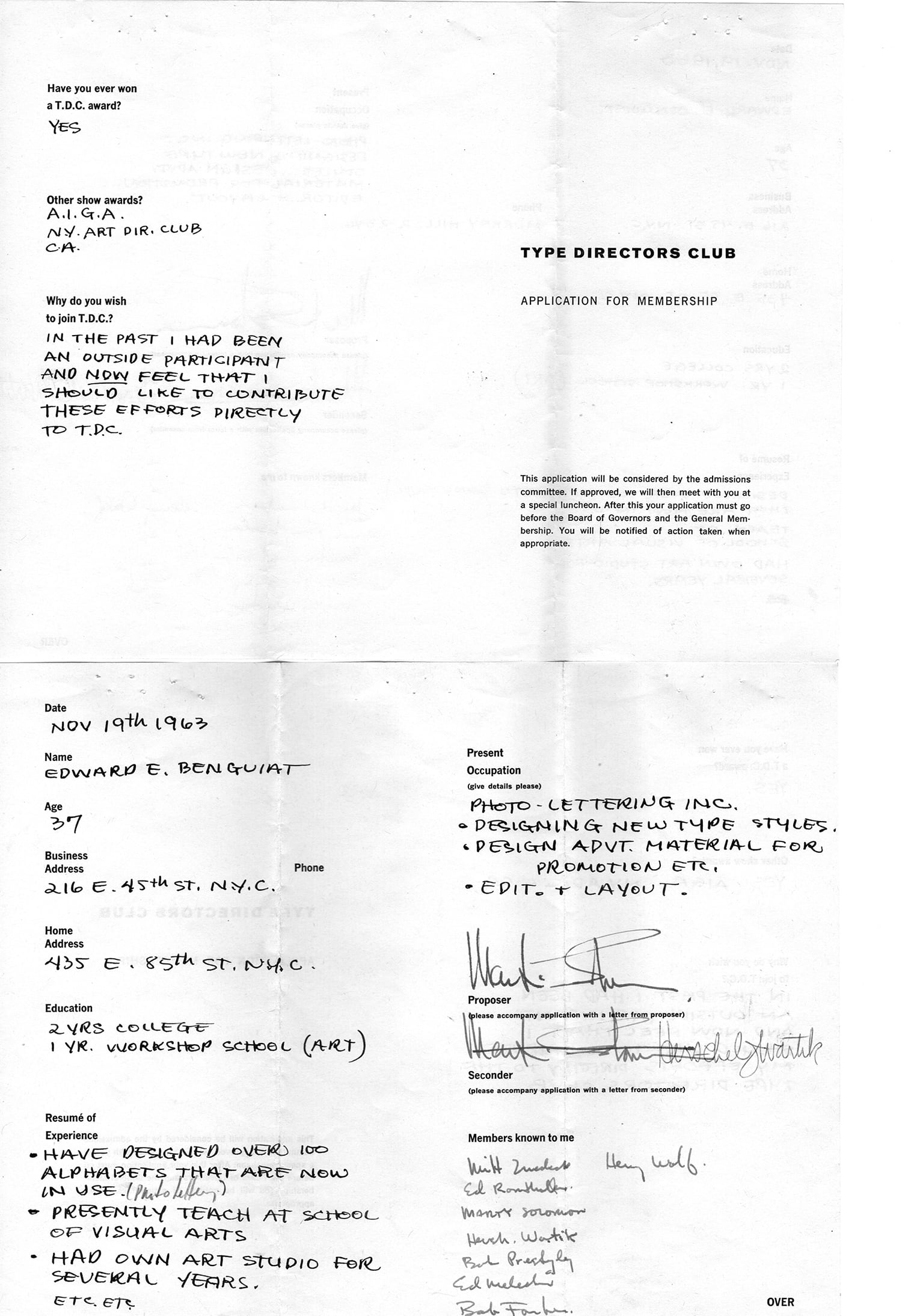
Ed Benguiat’s application for TDC membership (1963–64)
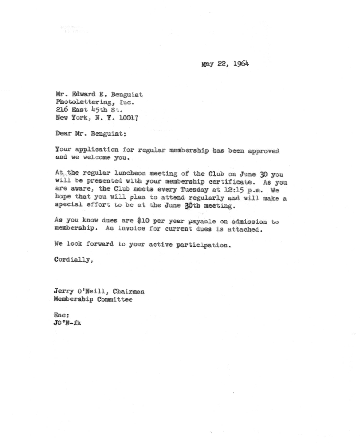
TDC membership acceptance letter, 1964
* * *
From Allan Haley:
Ed Benguiat passed away last October 15.
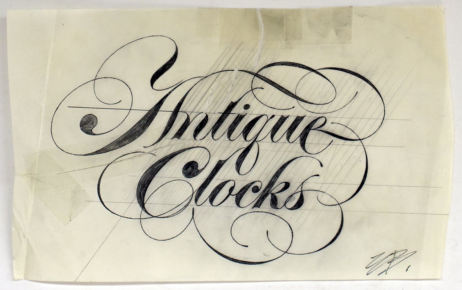
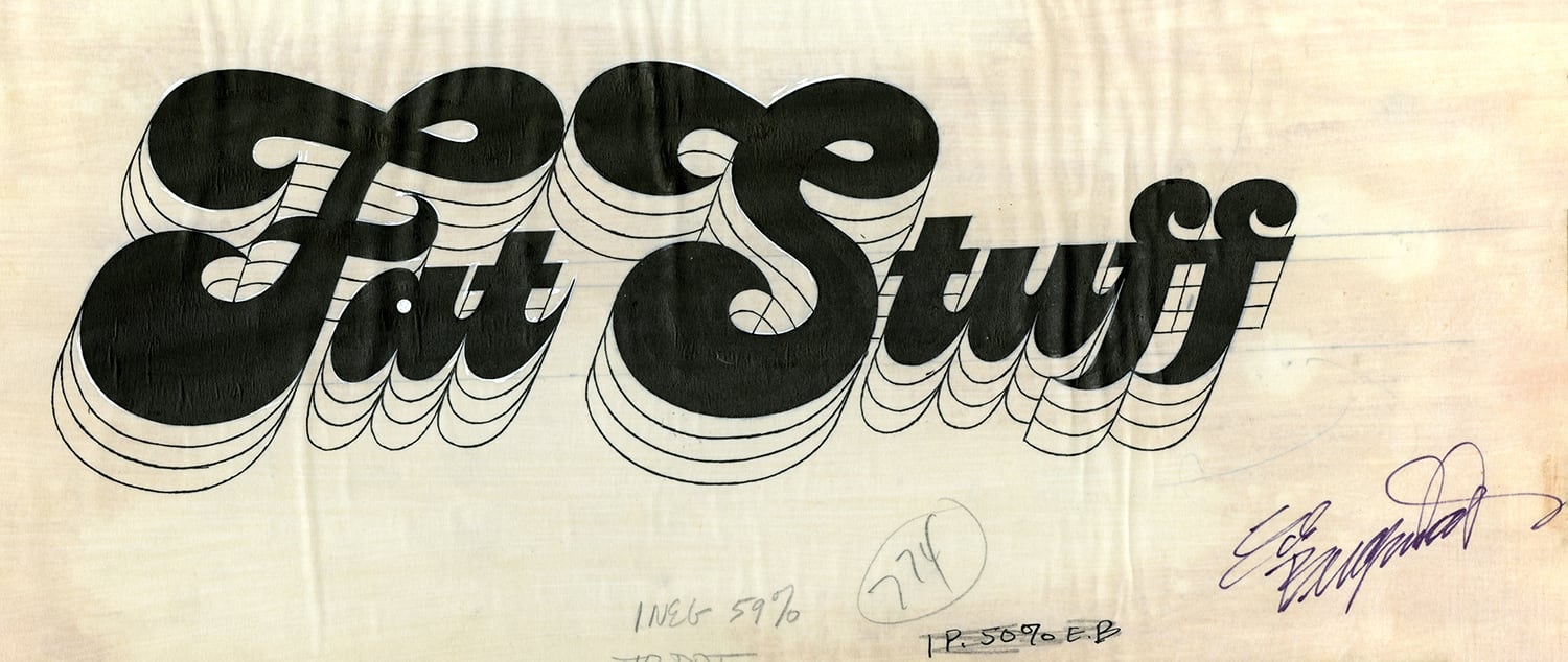
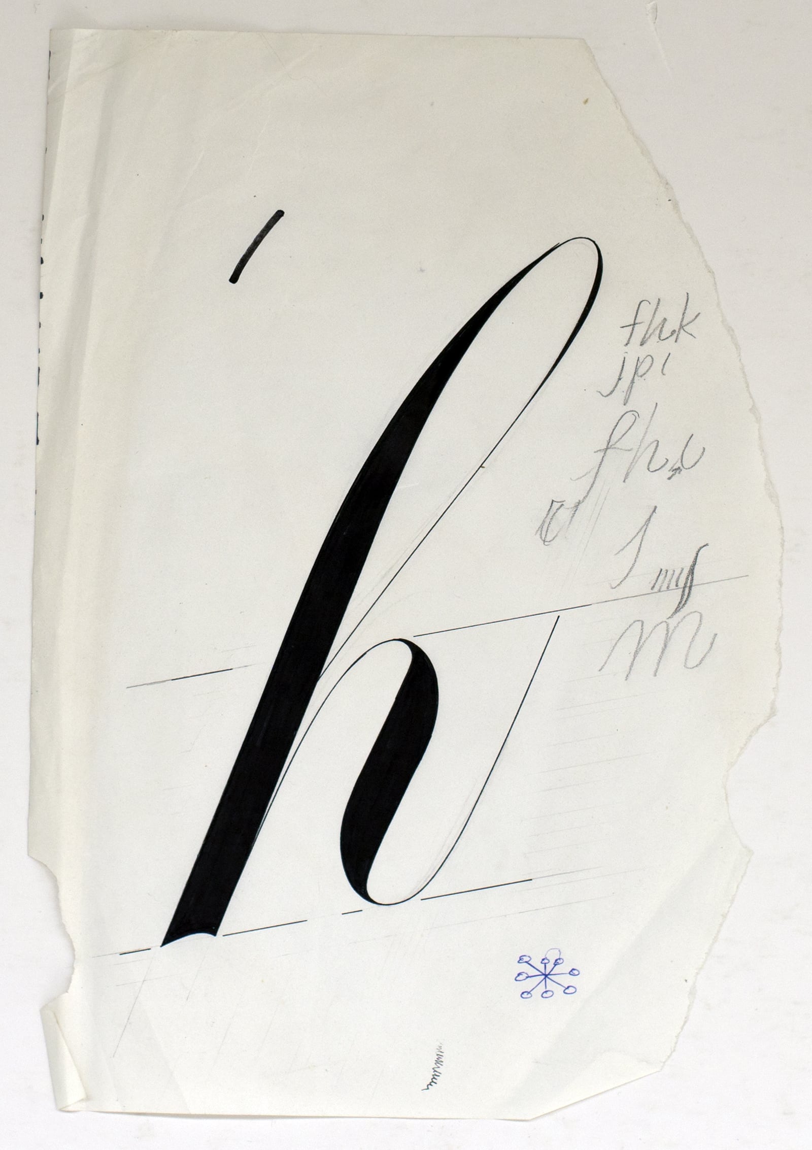
Benguiat loved to draw letters. It’s what he did best. When he was not creating a new typeface he could usually be found working on a piece of hand lettering or logo design for one of his many clients. Even when Benguiat officially stopped working for the day, he was more than likely doodling, drawing, or sketching letterforms. In restaurants he sketched logos and new alphabets on napkins, in business meetings he doodled in Spencerian Script, and his greeting cards were always hand-lettered works of art.
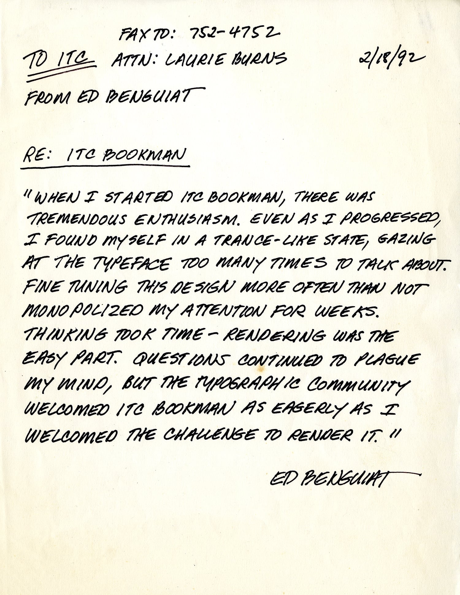
Benguiat drew over 600 typefaces. That’s a lot of letters – especially when you consider that they were all drawn by hand with pencil, pen, ink and brush. He designed faces for International Typeface Corporation, for PhotoLettering Inc., and for corporate clients such as AT&T, Estée Lauder and the New York Times newspaper. Benguiat created revivals of old metal faces such as ITC Souvenir and ITC Bookman. He drew absolutely new, and original designs such as ITC Benguiat, ITC Edwardian Script and ITC Avant Garde Gothic. And long before sophisticated software and type interpolation programs became available to the type design community, Benguiat was drawing large typeface families and combining two and three different types into one design. ITC Tiffany and ITC Lubalin Graph are just two examples of his ability to combine and manipulate multiple typeface designs.
Benguiat was born in Brooklyn in 1927. The son of a display director at Bloomingdale's, he got his hands on his father's pens, brushes, and drafting sets at an early age. As young man, Benguiat liked music, he liked to draw, and he wanted adventure. America was involved in World War II at the time – adventure won out. Benguiat lied about his age and joined the Army. He then cheated on a color blindness test by memorizing the correct answers and was accepted into the Air Corps. He wanted to learn to fly. And fly he did. He was responsible for photoreconnaissance flights over Nazi occupied Europe with a camera equipped P-51 Mustang. He later restored and flew vintage airplanes.
When he returned to civilian life, Benguiat followed his first professional dream: to be a musician. He went to Brooklyn College and received his degree in music. Eventually he began to play in clubs with professional musicians. Benguiat played drums, and was good at it. In fact, at one point Downbeat magazine declared Ed Benguiat to be the third best drummer in the United States.
But even the third best drummer in the United States could be out of work more often than not; and Benguiat decided that he should be some other kind of artist. He enrolled in the Workshop School of Advertising Art with the intention of becoming an illustrator. Benguiat tells the story that his first break as a lettering artist was basically a fluke. According to him, he was working at a studio, doing photo touch-up, and the person responsible for lettering called in sick and the studio needed a lettering job done. Benguiat said he’d take on the project. He figured he could do anything – until somebody told him different. Nobody did.
Ask Benguiat about this best typeface design and he’ll tell you it will be the next one. “I’ve never been satisfied with my work,” he told me once. “I want each typeface, each piece of lettering, every logo I design to be better than the last. No one climbs a mountain in a single leap, but rather step by step. My work has been as simple as that: one design, then another, always striving, always hoping that each new design will be better than those that preceded it.”
Benguiat was also a teacher of the highest order. He held no secrets about his work, or what it took to create a beautiful and distinctive typeface design. Thousands of students owe success in their careers, in part, to Benguiat – and they all owe their love of the typographic arts to his energy and charisma. When he worked in New York, he taught design after hours. When he began working out of the studio in his house, he drove into the city to continue teaching. When he could no longer drive, he took a cab. When he could no longer do that, he stopped teaching – but that was only a couple of years ago.
Benguiat liked working for himself. Even during the few times when he had a 9-to-5 job, he free-lanced for a variety of clients. Freelancing gave him a relished freedom. Benguiat has a new gig now – working for a pretty large organization – and you can bet the Pearly Gates will be sporting a new custom typeface soon. Maybe he’ll be satisfied with that design.
* * *
From Louise Fili:
“I was a fan of Ed Benguiat before I knew who he was—starting on the day when I saved the before and after mastheads from The New York Times—with and without the period. It had made a big impression on this 16-year-old. A few years later I was taking a course from him during my one memorable semester at School of Visual Arts. A master letterer and teacher, Ed inspired generations of students, and, I learned decades later, he remembered all of us! Who knew. There will never be another Ed.”
* * *
From Roger Black:
The Plane
Ed was a pilot in World War II. At the 1985 ATypI conference in Kiel, Germany, I asked him what that was like. He said he had been a fighter bomber pilot. “What I did was bomb infrastructure, actually right around here.” I asked, did you ever get in any dogfights?
“No, are you kidding? he said. “ That could be dangerous. He explained that the harbor shipyards and rail depots all had anti-aircraft artillery. Even the trains had guns, and the bridges were all guarded.
“What I did was look for a train, and then fly ahead and find a stretch of track with a big turn—or a tunnel—where the engineers and lookouts couldn’t see ahead. Then, just before it reached that stretch, I bombed the hell out of it.”
In the 80s Ed’s royalties from ITC began to roll in and he bought a number of airplanes including a private plane once owned by Howard Hughes. He was famous for redesigning the lettering on the instrument dials, using his own typefaces.
His favorite aircraft was a very sleek four-seater Aero Commander, made by North American Rockwell. There were a few turboprop versions made that could cruise at nearly 200 mph, but they were hard to get. Ed instructed his broker to keep an eye out for one, and eventually he found one that had been bought when new by a mayor in a southern Illinois town, who hadn’t put many hours on it. The broker said that he wanted to trade down and get a little cash.
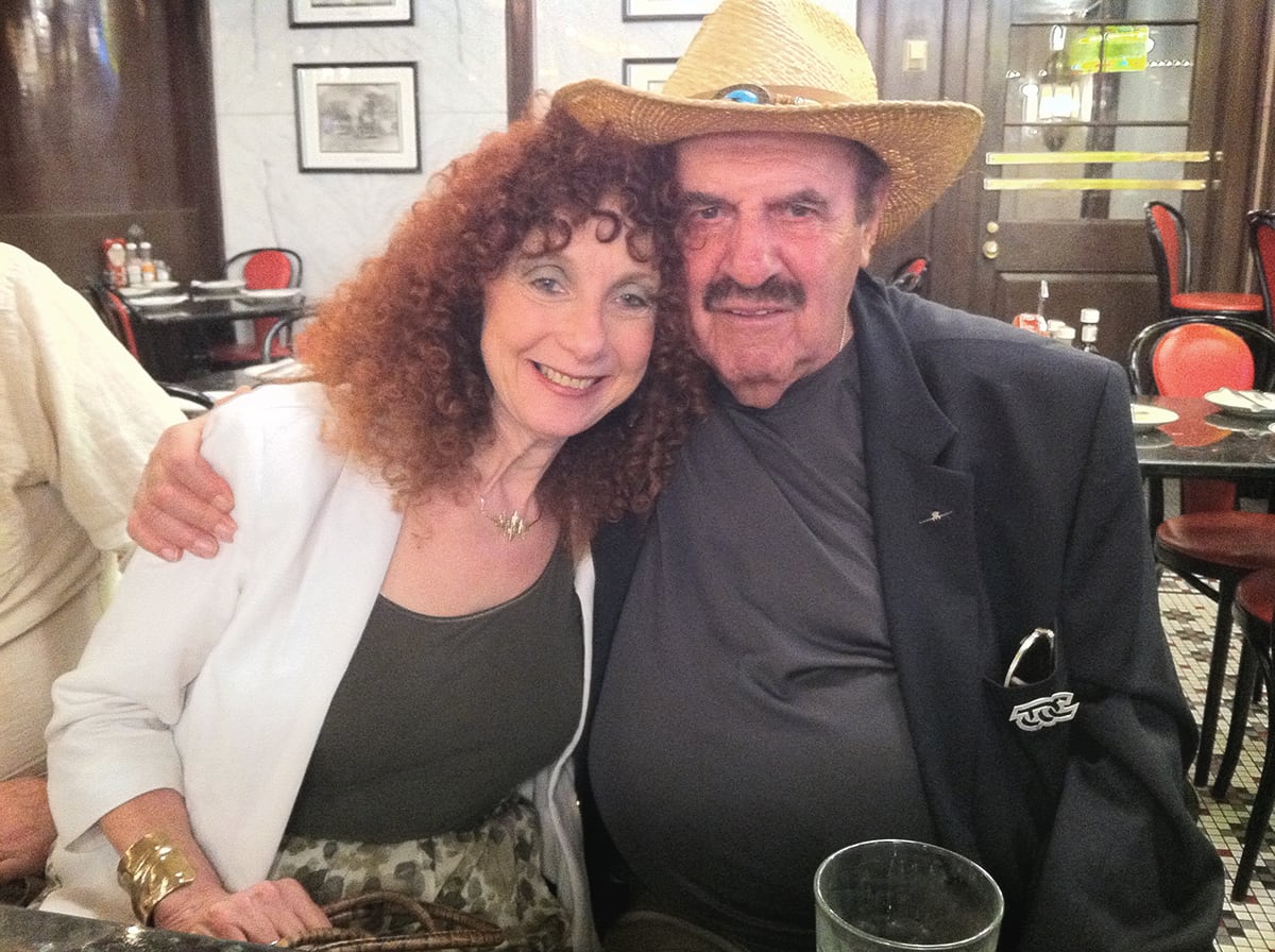
Ed said he had a little Cessna that could work, and asked why the mayor wanted to make the trade. The broker said, “Well, it’s Illinois. He’s a mayor, and he just got sentenced to a prison term.”
Through the broker a deal was made, and Ed agreed to trade planes at a small general aviation field in Western Pennsylvania. They met at the airport coffee shop, and mayor walked in with a big envelope and wearing a big cowboy hat. Ed said, “I like that hat.” He had brought a brand new Samsonite briefcase where he’d put the manuals, flight records--and “200 hundred-dollar bills in a nice fat envelope.” They had some coffee and talked, and then started signing the papers. Ed was getting ready to sign the last line when he looked at the mayor and said, "And the hat."
The mayor’s eyes widened. “What do you mean the hat? That’s my favorite hat!”
Ed said, “Well, no hat, no plane.
Sheepishly the mayor took off the hat and gave it to Ed, with the envelope. Ed gave him the briefcase and the keys to the Cessna. He walked out to his new Aero Commander, wearing the hat. It became his favorite hat.
* * *
From the Milton Glaser Design Study Center and Archives/Visual Arts Foundation: