The Ascenders’ 2019 Uses Fadoli and Kern for Its Call for Entries Campaign
The name of the type foundry started by Luc Borho and Adrien Midzic might suggest light-heartedness and mirth but they are serious about their craft and practice. Originally from Aix-en-Provence in Southern France, Luc and Adrien first met in German class 20 years ago. However, they were more interested in graffiti and drawing letters instead of learning German. Both Luc and Adrien have been freelancing in different cities for 10 years. Luc decided to move to Paris a year ago and they started Pizza Typefaces in the same year.
Why is your foundry called Pizza Typefaces?
A friend told us that he studied all sort of businesses and found out that making pizzas was the most profitable one. It became an inside joke between us and we had fun with the idea of stopping our graphic design practice to start a pizzeria. So with this statement, we tried to combine what we love with a good business plan and started a foundry called Pizza!
We didn’t want to have too serious a positioning for our company as well as keeping the brand friendly. Having a type foundry is a good way to connect with other designers and we really enjoy this aspect.
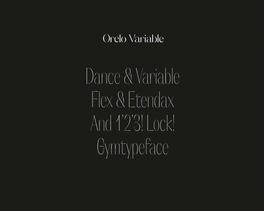
What’s the inspiration for Fadoli and/or Orelo?
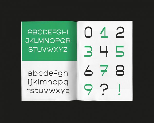
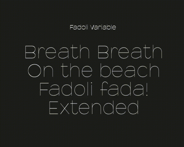
Actually the first version of the Fadoli was designed for a magazine article illustrated with pizza close-up photos. We had in mind to draw an inverted weight font and this puffy aspect fitted well with melting pizzas.
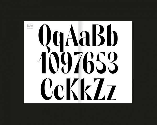
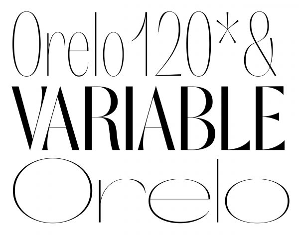
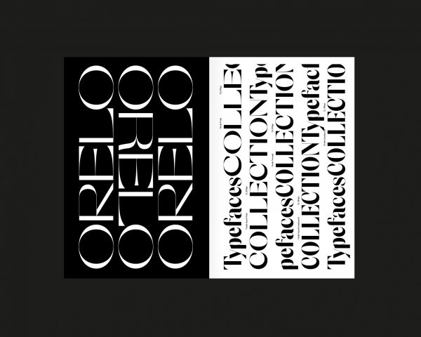
For Orelo the first attempt was to design a display font influenced by a traditional French and overused Didot font. It was a huge challenge to find something new and we started with the main characteristics of Didot: contrast and elegance. We re-interpreted it our way while pushing the contrast to its maximum and added a bit of mozzarella and some South of France herbs and Orelo Standard was cooked. As we wanted to offer variable weights, we decided to extend the family into a larger one — from condensed to wide in 10 weights, and corresponding italics. It resulted in 120 styles working like a charm in variable-font.
Outside of your foundry, do you work together on design projects?
We are doing more “pizza” meetings than actually working. Now that we are in the same city we will collaborate more closely.
-
Fadoli specimen. Who or what are your design, typography, or art influences?
We first started by drawing letters on paper and walls and step by step we discovered graphic and type designers. Of course, names such as Herb Lubalin, Herbert Bayer, David Carson, and Massimo Vignelli have been part of our influences but today it is influenced more by our surroundings and that motivate us. We can create a full font just by seeing a shape on the street or a letter on a bad kebab sign.
Orelo. What’s your favorite or ideal project?
From our experience, the ideal project is not always the one you expect it to be but developing a custom typeface for a “pizzeria” is kind of a life goal in itself! For the foundry, we really like to experiment with new things and variable fonts are really exciting for that.
What new typefaces are you developing now?
We had the chance to work with a few brands and develop custom typefaces but it takes time. For Pizza, Kern is currently being extended with new weights in Latin, Arabic and Cyrillic languages. As we like to share a good pizza with our friends, we are now considering to develop fonts designed by some graphic designer friends.
The second Ascenders Competition deadline has been extended until June 30, 2019.