We had the pleasure of speaking with Hugh Miller, co-founder of BOND London, about the agency’s global perspective and how it informed the concept and design of this year’s 65th annual TDC competition.
— Bobby C. Martin Jr. / Nina Stössinger, TDC65 chairs
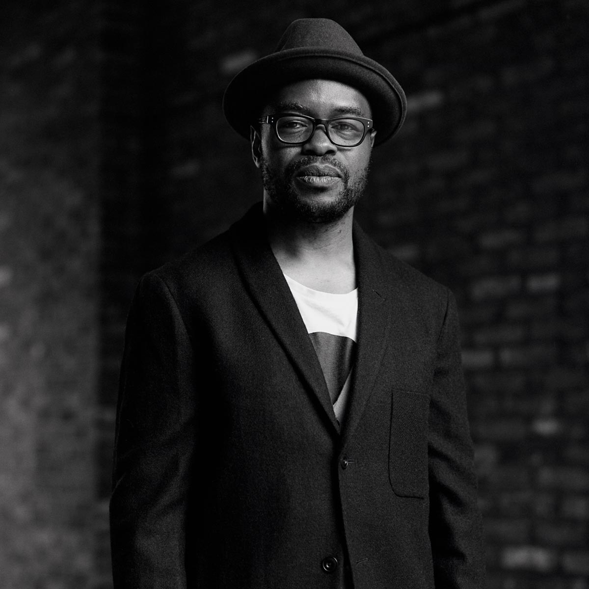
Hugh Miller, Creative Director, BOND Creative Agency.
Who is BOND Creative Agency?
BOND is an inter-disciplinary Brand Experience Design Agency. We are a collective of designers, producers, strategists, coders, technologists and writers who work collaboratively across studios.
BOND has offices in four different countries, what is the focus of your work?
Brand design, spatial design & digital interaction are our focus — sometimes fusing them all into one. Creativity adding value to business with our tailored solutions from our cross-studio teams. We have offices in Helsinki, London, Dubai, and Tallinn.
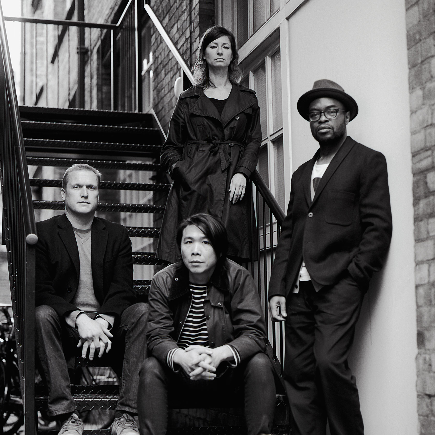
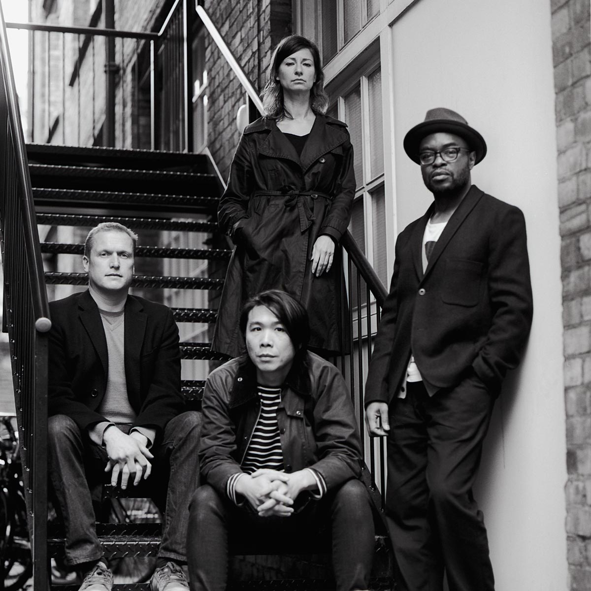
BOND Creative Agency team.
Can you quickly walk us through your career path? What lead you to co-found Bond London?
I’m a graduate of Kingston University Art and Design. I worked with Tony Brook and the team at SPIN — working on arts and cultural projects such as Christie’s Contemporary, Haunch of Venison Gallery identity, and the Whitechapel Gallery identity.
I joined the in-house design team at Nokia — working on retail, packaging and exhibition projects, and most notably the Nokia Pure typeface with Dalton Maag. We completed 19 scripts including Armenian, Ethiopic, Malayalam, Tamil, Kannada, and Telugu.
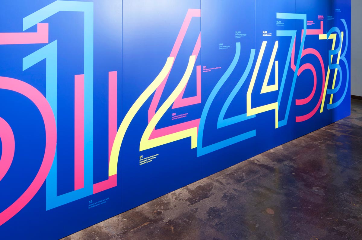
Nokia: People Made exhibition wall vinyl featuring Nokia Pure typeface.
I then worked in-house for the Microsoft Brand Design Team.
It was a conversation with Creative and Founder Jesper Bange at an AGI Open conference in London that sparked the idea of setting up a London studio. I had previously worked with Jesper at Nokia Design and we had kept a close dialogue over the years.
Bond London opened in 2015.
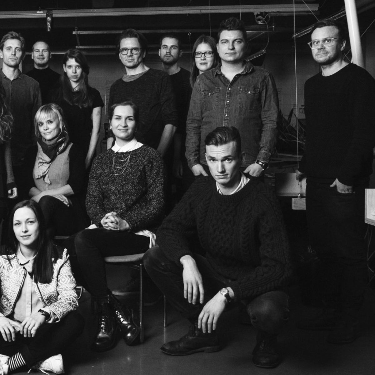
BOND London.
How has your global perspective influenced this year’s TDC65 competition campaign?
For a global competition, it only felt right to bring together an international cast of collaborators from around the world. It was exciting to engage with the different type foundries — new, established, and experimental — that challenge our idea of letterforms, language, and legibility. From the parametric designs of MuirMcNeil (UK) that breaks with the past to the ever-inventive collective of ABC Dinamo (Switzerland) and the way Daria Petrova’s (Russia) Zangezi font pushes traditions to their idiosyncratic limits.
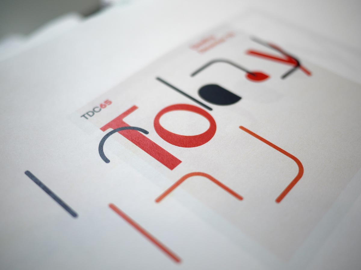
TDC65 Identity - Type study (print test).
Describe your process behind designing it?
The type specimen was kind of a starting point. It was an obvious point of reference for a competition such as TDC, but it was the close conversations and regular design discussions with this year’s Chair of Communication Design, Bobby C. Martin Jr., and Typeface Design Chair Nina Stössinger that took it beyond that — creating a progressive campaign that continuously explored and pushed the design language whilst retaining enough visual codes to identify the campaign as a whole.
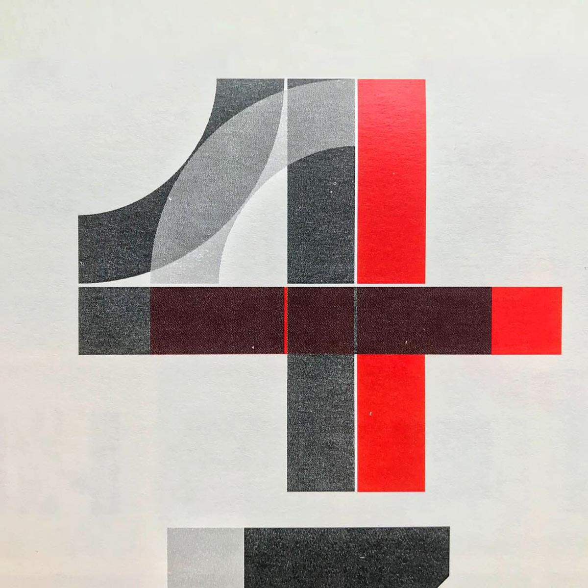
TDC65 Identity - Countdown numbers (print test).
Hugh, you have an impressive personal design archive. How has that design and typographic history impacted your design approach at BOND?
From Anni Albers to Piet Zwart, the archive serves as a great resource for projects and research material. You have a wealth of design history to draw influence from.
El Lissitzky and H. N. Werkman were early influences whilst studying design. Equally art and music inspire my work. The optical art of Bridget Riley, Dieter Roth, jazz and the Blue Note covers of Reid Miles still resonate. The poetic covers of the ECM label continue to surprise and inspire.
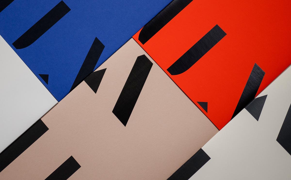
Heritage: A User’s Manual print collateral - Broadsheet covers.
Whilst the archive serves both historical and contemporary references that help give context and creative fuel, it’s important to bring your own expression and point of view on things.
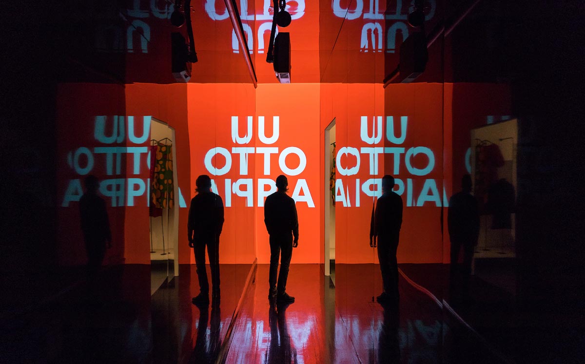
Design Museum Helsinki, Utopia Now exhibition - video projection.
What design principles do you work by? Live by?
Discuss, research, play, discuss, craft, play, discuss some more…
What do you want the world to know about you that they didn’t know before?
I much prefer constructive criticism to praise. Critical feedback gives you the focus to improve and evaluate, build and make better the next time.
It’s also worth mentioning we have some very talented typeface designers within our armament at BOND.
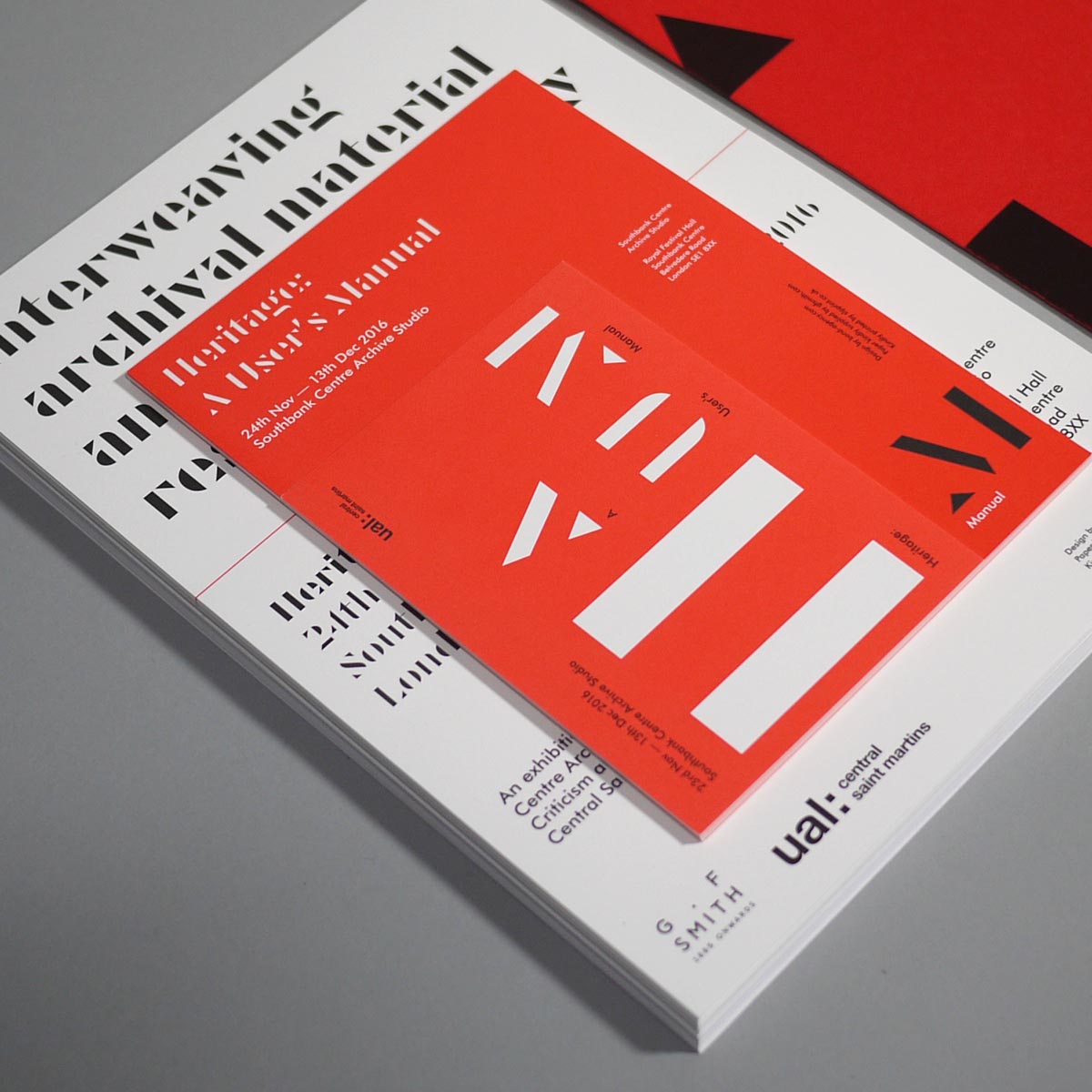
Heritage: A User’s Manual - print collateral.
What’s a day like at BOND? Are you on teleconferences all day with each of the offices? How do you integrate the different cultures into the design process?
Thank goodness, not all the time. However, we do work tightly across our studios and teams usually consist of people from different studios and skill sets. So, we use Slack and make calls back and forth, and sometimes this means even taking a flight.
The mix of cultures opens up interesting discussions that create those unexpected turns that bring projects to life.
What is your motto?
Build it and they will come!
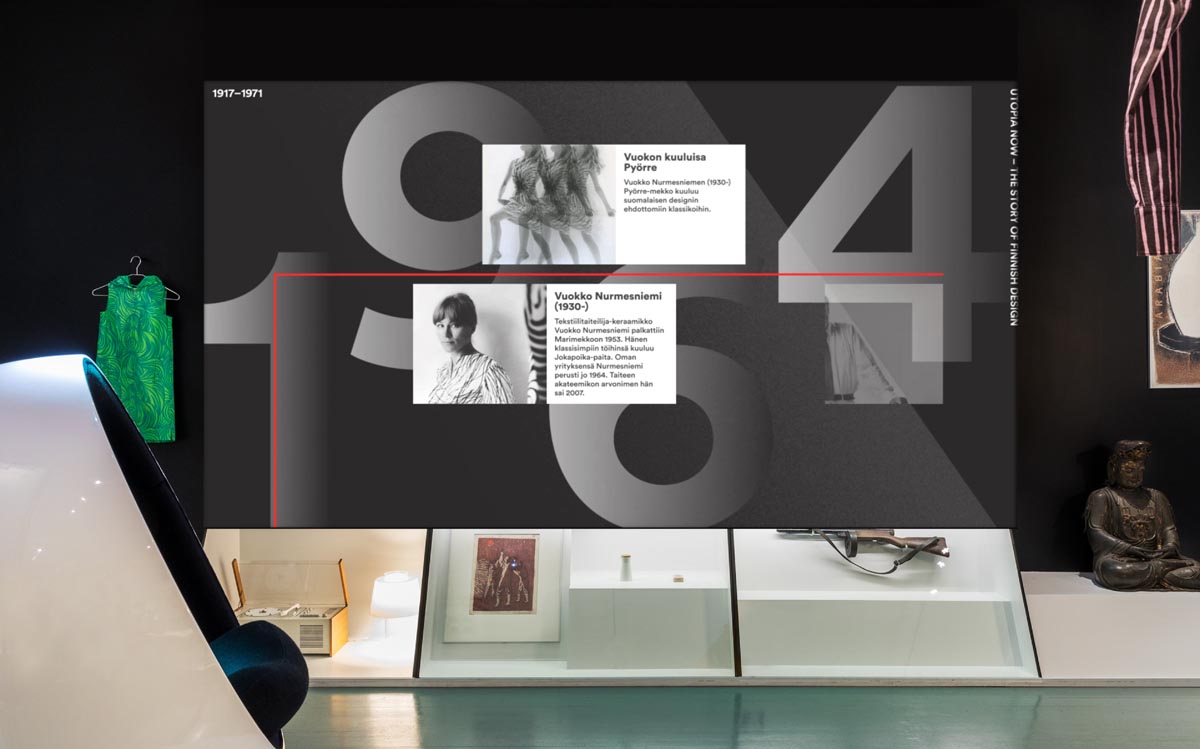
Design Museum Helsinki, Utopia Now exhibition - timeline video projection.
Do design competitions matter?
Yes. The best ones act as a benchmark of our industry and maintain high standards and integrity.
During our research, what became apparent was the number of design awards and competitions one could enter. There is a point of saturation. I guess to turn the question around is which of the many design competitions out there still matter?
But of course, if we win something, we’ll take it!
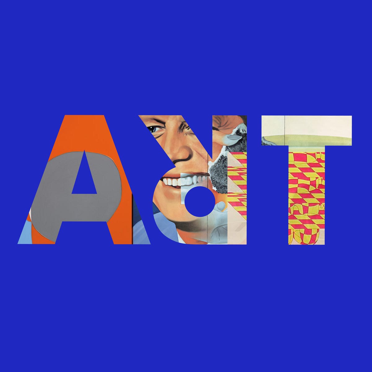
BOND's award-winning Art Rabbit Logo identity, featured in TDC63 The World’s Best Typography.