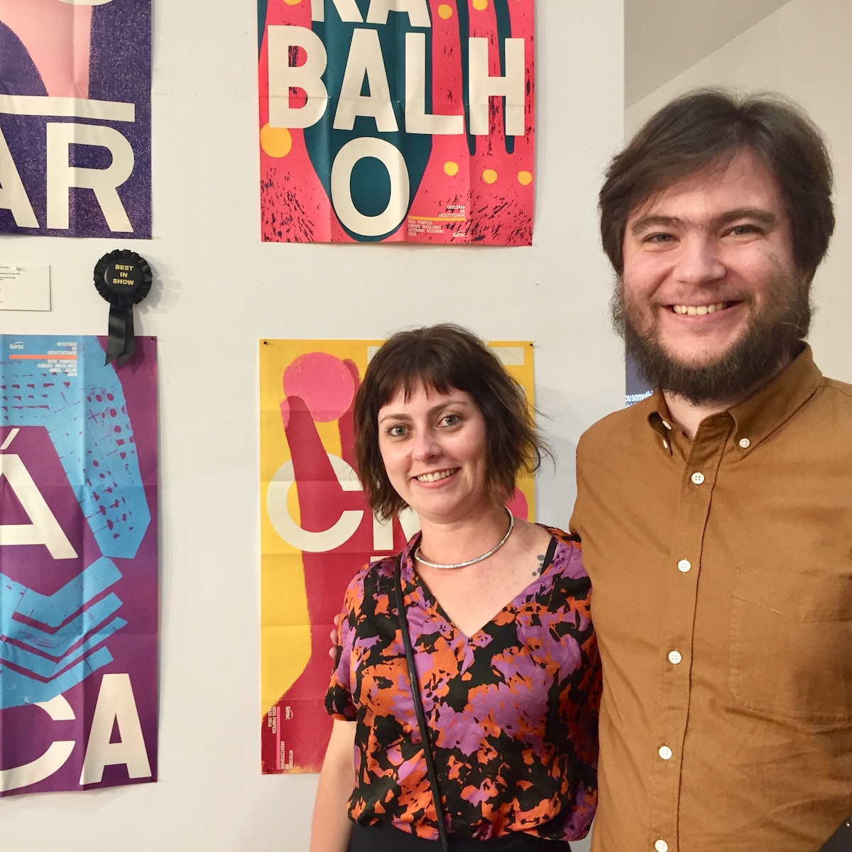
At the July 18 awards ceremony in New York, the Type Directors Club presented Bloco Gráfico of São Paulo, Brazil with the Best in Show award in the 65th Annual Communication Design competition.
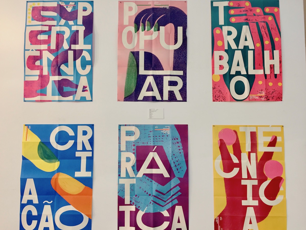
Bloco Gráfio created the Oficinas de criatividade Sesc Pompéia 2018 set of posters to promote a series of workshops held inside one of São Paul’s most celebrated cultural buildings. Here are the credits:
- Design: Gabriela Castro, Paulo André Chagas, and Gustavo Marchetti, São Paulo
- Illustration: Andres Sandoal
- Studio: Bloco Gráfico
- Client: Sesc São Paulo
- Principal Type: Cindie Mono
Bloco Grafico described the project as “a series of posters with the theme of creativity, that announces the workshops that take place in Sesc Pompeia’s oficinas (the iconic building designed by the Italian-Brazilian architect Lina Bo Bardi, in São Paulo, Brazil).
Designed by Bloco Gráfico with illustrations by the artist Andrés Sandoval, the posters show the hands interacting with the letters of the words that are the concept of the workshop of the month and, at the same time, express the main idea of the oficinas —manual work.”
The Type Directors Club annual competitions highlight the best of the best typographic work in both communication and typeface design from studios and individuals in the United States and internationally. The work by Bloco Gráfico was chosen by Paulina Reyes as her Judge’s Choice, and then selected by the entire seven-judge panel as the best work among 254 pieces that were chosen to be included in this year’s The World’s Best Typography exhibition.
When asked about what made this work stand out, Paulina Reyes said, “I knew this set of posters would be my ‘judge’s choice’ when I saw them across the room. Everything about this piece drew me in. The bold compositions show an effortless play between type and illustration, executed in a wonderful color palette that recalls the fearless color sensibility of Latin America. The type is raw and graphic. Its letterforms’ varied widths interact beautifully with the hand-crafted nature of the illustration. The scale is impactful, and the projection of the series is at once playful and sophisticated.
The posters are not only exquisite in their execution, printed on really nice paper with inks that do the color palette justice, they do an excellent job communicating the creative nature of the workshops they announce.”
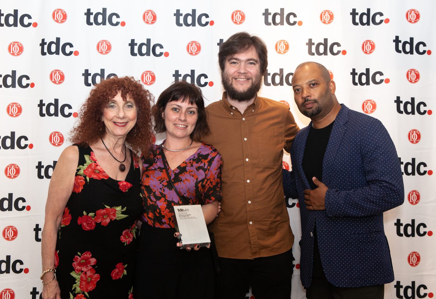
Designers Gabriela Castro and Paulo Andre Chargas came to New York to receive the award, which was presented by TDC executive director Carol Wahler and competition chair Bobby C. Martin, Jr. The award, taking the form of an oversized “sort” of metal type, was designed by past TDC president Graham Clifford.
The 254 competition winners from 33 countries, as well as the winners of the typeface competition, are on display at The Cooper Union’s Gallery 41 until August 9. Exhibitions of the winners will also travel to many cities around the world, and will be published in the upcoming TDC annual, The World’s Best Type and Typography. The annual and the entire TDC 65 competition campaign were designed by Bond Creative, a branding and design studio with offices in London, Helsinki, Dubai, and Tallinn.
We would like to thank our competition and exhibition sponsors — Monotype, The Cooper Union, Fordham University, and A2A Studio Solutions.
The World’s Best Typography exhibition will be on display at The Cooper Union at 41 Cooper Square in New York City through August 9.