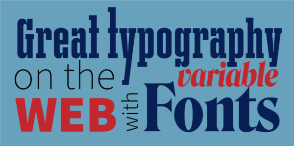
Join Jason Pamental for a one-day workshop “Great Typography on the Web with Variable Fonts — From paper to pixel, metal to malleable”
New developments in fonts and the web allow us to practice better typography on screens than ever before. In some ways, even better than we can in print. Get an in-depth introduction to responsive typography and the latest evolution of the OpenType specification: Variable Fonts. While traditional design applications are only just beginning to support them, web browsers have embraced them for a lot longer. We’ll explore just how much of your typographic expertise can be put to great use on the web, and look at what variable fonts can do, and how much they can improve both our designs and the user experience.
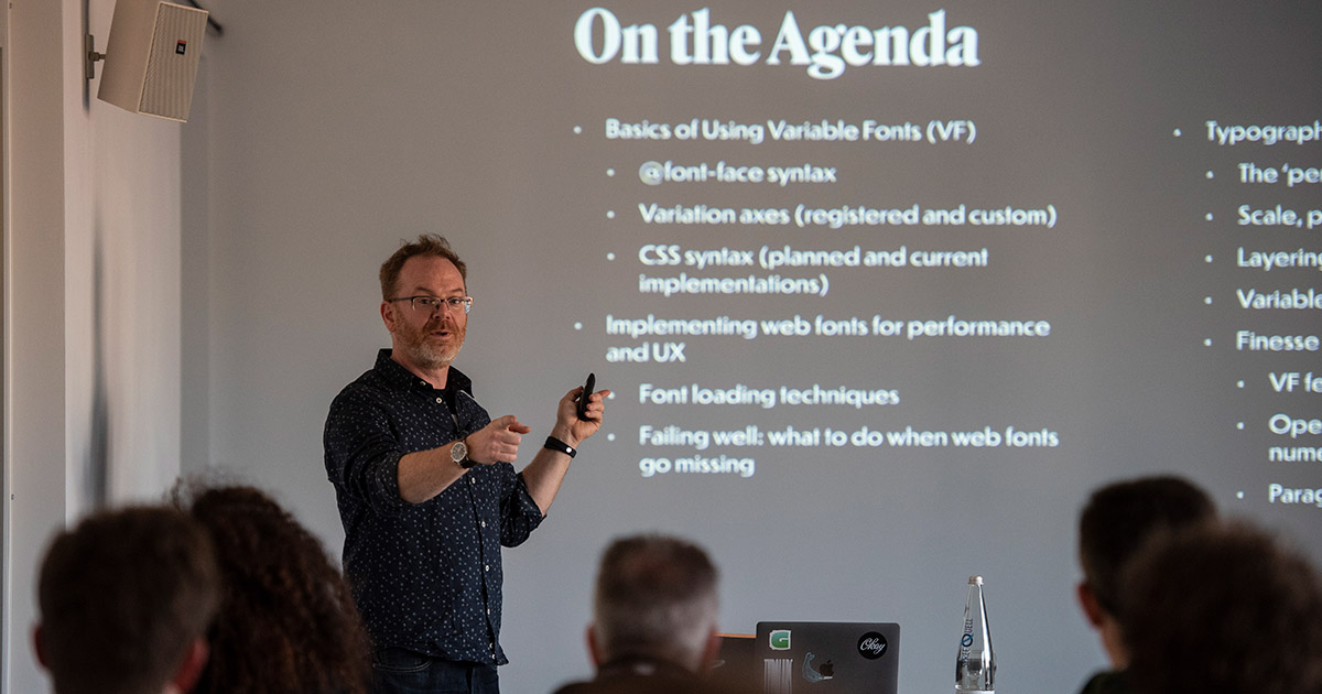
Starting with an introduction to the concepts of responsive typography, you’ll learn what techniques translate to the web, and what you have to anticipate will change. The real magic is finding the ways to bring sophistication to your typography while still embracing how that system can evolve and adapt as screen sizes change. Variable fonts take design even further, allowing access to the entire design of a typeface—width, weight, italics, and more—rather than having to limit ourselves to only three or four weights and styles on the web.
We’ll go much more in-depth into the new Variable Font format: looking at what axes of variation are typically made available, what’s possible, how it works to implement them, how to find them, and how to test them. From there, we’ll explore what this means for designing on the web, and look at some more editorial design ideas to push our sites a whole lot farther.
This is meant to be a hands-on workshop working through implementing various typographic techniques and exploring a variety of variable fonts to show what they can do. We’ll also discuss how our current definition of typography is challenged by the ability for type to change in response to the user: either through preference or environment.
We’ll be working with HTML and CSS, though attendees can certainly opt to watch and listen rather than work along as we go. It’s also perfectly fine to come and work collaboratively if some attendees are more comfortable with coding than others. Some experience working with HTML and CSS is preferable, but not required.
Requirements:
- You must bring your own laptop with web browser (a recent version of Firefox is well worth it: their developer tools are very helpful in exploring variable fonts)
- Code editor of some kind (if you want to work along with the examples we will discuss and create)
- Basic familiarity with HTML and CSS is helpful, but not required if you prefer to just watch and list.
Jason Pamental spends much of his time working with clients to establish their typographic systems and digital strategy, helping design and development teams works smarter and faster, and running workshops about all of the above. He is a seasoned design and user experience strategy leader with over 20 years’ experience on the web in both creative and technical roles, and an Invited Expert to the W3C Web Fonts Working Group. Clients range from type industry giants, Ivy League and High Tech, to the NFL and America’s Cup. He also researches and writes on typography for the web: he’s author of Responsive Typography from O’Reilly, articles for .Net Magazine, PRINT Magazine, HOW, Monotype.com, and frequent podcast guest. Author of online courses for Aquent’s Gymnasium platform and Frontend Masters. He’s an experienced speaker and workshop leader, having presented at over 50 national and international conferences. The real story: mainly he just follows Tristan and Tillie around Turner Reservoir, posting photos on Instagram.
This workshop is being held in association with Creative Tech Week and NYC x Design.