Didn’t get enough of Armin? No worries.
He answers your questions from his TDC Virtual Salon
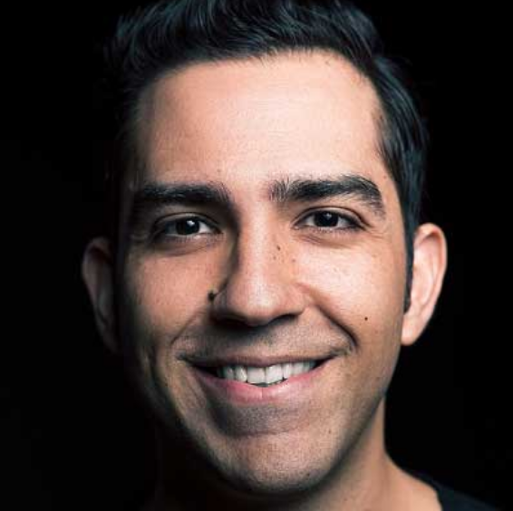
Thank you to everyone who joined us (and tried to!) on Thursday, May 22 for our virtual salon with Armin Vit of Brand New, where he took us through his logo design process in real time. We’re preparing the video of the webinar, distributing it to TDC members for 30 days, and will share it with everyone here on the website and on the TDC YouTube channel.
Armin took your questions (all 97 of them!) and we’re happy to share his answers here:
Thank you, TDC community and Armin!
Can you talk about providing clients with options or multiple concepts to choose from? Is this something you typically do or try to avoid?
I like to show options and let the client choose. I think there is no single right answer to a logo/identity project so the client should be able to choose a direction they enjoy and are comfortable with. I show between 3 and 5 options.
How do you decide on the typefaces that form a typography system and match (or not) the type in a logo?
I try to find typefaces that are useful and simple so that the client can get the most out of them. Something too weird or esoteric, I think they’ll get tired of it quickly. So I try to find logos that either complement or contrast the logo.
Armin, what made you become a graphic designer?
Path of least resistance! LOL. When I was in high school I was a terrible student and graphic design seemed like a degree that didn’t require lots of testing or memorizing things and I liked to draw heavy metal band logos on my notebooks (instead of taking notes). Third year of college is when I realized I REALLY enjoyed graphic design.
How final were these marks before you presented them to the client? How many/which ones did you end up showing them?
They are pretty close to final. I will usually do a round of revisions to clean up and tighten the selected direction. Sometimes the client doesn’t even ask for it but I know that any logo presented in the first round needs a lot of refinement.
How many days did this bpp design process take?
From initial client conversation to first round design presentation about 3 weeks. We spent a good 3 weeks developing two of the options in parallel because neither he nor us were sure which one would best. Then it was about another month to get the logo approved by the board of directors, about a week to prepare final files for them and then they were on their own.
Do you look at other logo designs for inspiration during the creative process?
Never, not because I’m all high and mighty but because I invariably end up copying something. I try to dig into my head for references to pull from and build new things. Every now and then, I’ll look at something like “Soviet logos” if I want to emulate a specific approach.
Do you come up with concepts first and play, or do you play and develop those concepts later? Seems like the latter but I’m curious.
Play first : ) but as I’m playing I’m always thinking if what I’m doing can be rationalized.
What details influence your decision to eliminate ideas?
It usually has to do with expandability… meaning, can I see a logo expand into both a visual language and into a useful system. If I feel something doesn’t have legs for the long run, I’ll abandon it. Also, if I can tell it will suck.
How do you push yourself to come up with more concepts? Do you ever feel stuck at 1 or 2 concepts?
I can usually power through 3 – 5 different solutions without a problem but I always feel like I have to have 7 to 10 to satisfy my curiosity and yeah, plenty of times I will feel like I have nothing else to do. A trick that often helps is to ask “What Would X Do?”… so “What would Michael Bierut do?” “What would Jessica Hische do?”, etc and sometimes that will trigger different directions.
Armin, have you ever submitted your own logo to Underconsideration??
Yes, it did not go well, LOL [see here] I still like our condensed logo a lot.
Love your work, thank you for sharing. How do you stay confident in your work and not worry about what others are creating?
I worry. A LOT. So, I think that because I worry so much, that makes me work harder, which gives me a confidence that I am doing something right somehow.
Curious about your hours estimate for a logo design? And roughly how much time do you spend in the concept stage?
Oh, I’m a wreck when it comes to estimating because I always spend more time than I first imagine spending. Working non-stop on the concept stage I will probably spend 8-full-working hours a day for maybe 7 to 10 days.
Do you present all options to the client or narrow it down to 3? The One Logo approach is gaining steam in the design space.
I present all good options. Sometimes it’s 3, sometimes it’s 5, sometimes it’s 7 — which is way too much and I don’t do that anymore. I’m not a believer in the one-solution approach but that’s me.
How do you manage the conversation around presenting several logo design concepts as well as a variety of color choices at the same time? How do you narrow it down with the client without having to iterate on lots of different ideas?
If color is completely up for grabs, from the beginning I will tell them that the colors chosen are interchangeable and if they see a color they like in one option we can easily apply it to another option. That’s why I always show the logo in black and white first so that they can see the idea first. I very rarely have super strong opinions about color, so I’m happy to go with whatever makes the client comfortable.
What program did you do the simple logo animation and how did you show it as animation in the InDesign presentation ?
I use Adobe Animate and I generate an MP4 or MOV file from there. The presentation itself is given in Keynote, so I embed the video there. Before getting into Keynote I do the presentation itself in InDesign and simply leave blank spaces for videos later.
What do you do if you end up hating or otherwise struggling with the option the client likes best? I think about the paycheck : )
Kidding aside, yeah, it happens so it’s really just about getting the job finished properly and quickly and just moving on. Not every project can be great.
How do you manage situations where clients like aspects of different options and then ask you to combine them for round 2?
If it makes sense, I have no problem combining elements of different ideas and I have been in 2 or 3 situations where that was the case where the client was right in bringing two ideas together. If I know the combination will not work I simply tell the client that it will be like trying to combine an Italian dish with a Thai dish and that those specific ingredients, while good on their own, were not meant to come together.
Has a client ever chosen your least favorite concept? How do you prevent that?
So far, never my least favorite. Most often is the second favorite. I think clients can tell when you are not excited about an option so if you can’t get them excited about something they won’t do it for it.
Do you typically show 6 options? Have always been told to only show 3-4, so as not to overwhelm the client. Is this an outdated rule?
See answers 1 and 16 above + no, overwhelming the client is a real thing. I have showed as many as 7 and the client had no idea how to move forward.
How much of your rationale do you share with your client? How do you support your decisions on symbols, colors, typefaces, etc.?
I share a lot, almost all of it. I want them to know that the decisions are not completely gratuitous and then I think that the more abstract thinking and way we talk about logos is beneficial for them to talk about their brand. I try to justify every decision with something regardless of whether the justification is overly simply or overly philosophical.
Will registrants receive a copy of the recording? Or is that only for TDC members?
You will receive a copy of the recording.
Having a simple animation in a branding project brings a change? if yes how? What all factors come to play?
It’s amazing what an animation can do (for the better) as it can bring to life an entire concept in 2 to 3 seconds.
Hi. Can you please talk about how you explained to BPP logo concept to the client?
That’s a lot to explain in this format, sorry. Will have to pass on this one.
Hi Armin, great presentation! How many logos thumbnails do you sketch on paper before you move to the computer?
It varies, sometimes 3, sometimes 20. There is no minimum I make myself do.
You use multiple files, each for a specific exploration—is there some limitation to using one file with multiple artboards, or is that just your preference?
Pure preference and probably comes from the fact that I started using Adobe Illustrator before multiple artboards were a feature so I have always used each file as single-use. Also, the less vectors and fonts you have in a file, the quicker it is to open them and go through them.
How do you get yourself out of getting overly attached to one idea? I find it can sometimes make me “blind” to other ideas.
I have to ask my partner to slap me out of it. It’s probably the hardest thing. I do get very attached to specific ideas. So, I don’t have good advice on how to not do it because I haven’t figured it out.
Do abstract logos make a difference?
Sure. You can build more meaning into them as well as allow the audience to interpret it.
Why Bloomington?
See here.
What techniques do you use to push your thoughts to try new solutions for the same thing over and over?
Oh, hard question. I really don’t know. Sorry!
It seems that these two projects each had a singular overarching hook (acronym, building). Do you get signoff on this direction ahead of time or do you just address it during the pitch?
I address it during the pitch because I usually don’t know what the possible solution is until I start coming up with ideas and after a while a better approach emerges, so neither the client nor I know what’s gonna happen until I start designing.
Where does your inspiration come from?
I really love graphic design so I look at a lot of it, which gives me a wide vocabulary to draw from. Also, sunsets.
How long does it take you to design the initial logo options?
Between 1 and 2 weeks.
How did you make the 3D version of logo in illustrator?
Effect > 3D > Extrude and Bevel
For the Mill, you stuck with the architecture throughout all exploration—was that initially from the client or did you just have the hunch that it would yield the best solution?
It’s such an iconic building and it had such specific architecture that I felt 1) we had to honor that and 2) it would be an easy association for the public to match the logo with the building.
Do you have an all-time favorite logo/ designer?
I think I’ll go with Lance Wyman. Beyond the 1968 Olympics logo he did some amazing stuff.
When you’re pitching these ideas are they pitched as finalized or do your clients choose a direction and you refine further from there?
Clients choose a direction and refine from there. We always assume there will be a second round where you can address concerns from the client and bring the logo further afield.
Do you have any techniques or ‘design principle checklist’ for motivating new directions in your exploration phase? Or is it a really free-flow approach like free association until something sticks?
Nope, no techniques… I just go. I think it’s almost like a muscle, the more you train it, the more it responds.
Do you present your favorite direction last? Possibly starting with second favorite? Or some other order?
Yup, favorite last, always. And I will usually show the “safest” direction first so that the client can ease in into the process of seeing and judging logos. Then in between those two I will include the others in a way that feels varied.
Is the custom font derived from an existing typeface?
Yes, DDC Hardware.
Thank you, Armin, for sharing your logo design process. Have you had time to explore with the Astute Graphics AI plug-ins yet? I feel their plug-in tools help increase creativity and productivity options during a designer’s initial ideation phases.
I have not. Sounds fun though.
How important of concept and storytelling of logo in present day?
VERY! Because anyone can make a logo that looks good, even robots, so it’s all about the story behind and around it that makes a difference.
How do you determine the right number of options to show when first presenting logo concepts?
It varies by client whether I think they can handle 3 or 5 or 7. No hard science though, I take it on a case by case basis.
Had Armin seen those crazy lockers before embarking on the sticker mockups, or was he only going with their request to show a sticker? Just because it ended up being a home run!
Ha! No, I had not seen them. They had them in a previous co-working space so they already had years worth of stickers on them.
How much tiny do you spend on a client? From first sketches to final Behance images?
It’s usually 6 months. We work with smaller clients so they move fairly fast. It can sometimes be 9 months to 12 months because it takes an additional 3 to 6 months to photograph the work, prepare images, and write text for the case study to get the Behance appreciations.
Sorry. Time.
No. YOU are time.
Did the clients from The Mill continued the project by themselves? Or you designed the brand identity too besides the logo?
We created some initial explorations and general approaches, provided some halfway comprehensive guidelines, and they did pretty much everything in-house with their marketing person.
How many hours/days do you give yourself to explore and design for 1st presentation?
2 weeks max to come up with the options and 1 week to put them together into a presentation.
My first question was re: The Mill identity…
Awesome!
When you’re facing 6 small variations of an idea (ie – the different triangle shapes in the BOND Mill logo), how do you determine which one works best when you’ve been staring at it for hours or days? How do you keep touch with reality?
In that case I think it comes down to the applications… and that’s why I always show some renders and mock-ups to see which one has more potential to work as a system.
Do you share your preference from the options? Or root for one option more than the other or showcase them at par with each other?
We usually do give the last option a little extra oomph but as we are presenting we don’t state it. If the client asks which one is our favorite and, in my experience, they all do, then we do share our preference.
How logo design evolve after covid era?
I don’t think logo design evolves, I think clients and designers evolve… the task is the same.
How do you know when to stop? Experimenting, doing more versions… I assume choosing the final one is more the client’s task?
When I feel satisfied with the exploration… meaning, do I have enough variety here? Do we address what the clients are asking for? If we have managed in the first few explorations then we’ll stop because, yeah, this process can go on forever.
During this pandemic, would you recommend doing the first client presentation through zoom or some other online platform? Or should it always be in person?
I think zoom is as good as it gets to doing it in person. The benefits of doing the presentation in person currently do not outweigh the risks of being in a meeting room for at least an hour while you talk loudly and expel particles. Also, at this point, I think Zoom is so much second nature to most people that’s a very accepted form of communication.
How long do you typically take for your exploration process?
2 to 3 weeks.
Do you give yourself time limits per sketch idea?
No, not really. I’ll dig at it until I get to something good. Sometimes I do have to force myself to stop on one specific idea so that I don’t get too obsessed with it.
What have you learned from writing/curating Brand New?
I think I answered this on the video.
For « The mill » project did you supervise all the steps with your client ? I mean : were you involved in all the things (tape / sign / wood things…) where the logo is marked ?
No… and it drove me crazy. They took the logo files and just went with it. As I mentioned, I’m a control freak, so not overseeing how the logo was applied kept me up at night. The rolls of tape I was able to do because the specs for it were so weird… it wasn’t just providing the logo to a vendor. A first set of t-shirts they printed, the logo was horizontally shrinked at some point in the process, so yeah, things like that happen. But other than that, they have done a wonderful job.
Do you work independently? If not, how many other people are you working with?
Our business is just me and my business partner and wife. She’s also a designer but specializes in the hand-assembly things we do for our conferences as well as our admin so she usually doesn’t have time to work on the identity projects. So, pretty much, I do it on my own but always with her input, which is critical because otherwise I get carried away.
Is it essential to have your own style in branding nowadays?
Nope. I think your style should adapt to what the client needs, not the other way around.
Any tips on keeping your problem solving process fresh?…Avoiding cyclical thinking everytime you approach a design?
I think it’s about being very self-critical and really questioning if you are just repeating yourself or doing something new that is appropriate for the client.
Does your blog make you a better designer or overly self-critical?
Both. I do think it has improved my abilities because I’m constantly analyzing what works and what doesn’t so by being OVERLY self-critical of my own work I think that by sheer brute force something decent eventually comes out.
What are your favorite resources for finding typefaces?
I love TypeWolf. He is able to point out some really cool things. And every now and then in the marketing emails of MyFonts or even Creative Market, I’ll see something that catches my eye.
Does deciding on a typeface depend on whether the client chooses to license it?
Sadly, yes. In my experience, clients’ sticker shock when they learn they have to pay hundreds of dollars for a “font”, is very real. Luckily, Google Fonts has some decent options, so I will often propose licensing one or two weights of a display typeface to serve as the brand typeface and then choose a text family from Google Fonts.
What are you charging lately?
Non-profits between $10,000 and $16,000; for-profits between $20,000 and $40,000. This includes logo exploration, basic guidelines, and some templates.
Do you research a client’s competitors when you start the project? And if so, how do you record and use that info?
Nothing too scientific or rigorous. I’ll look at their website and social media. A lot can be inferred from a superficial glance. Since our clients are smaller, a true competitive analysis at the Landor/Interbrand levels is not necessary.
When a brand has such a long history, how do you treat rebrands?
With a lot of care. this involves a much longer answer, sorry, and at question 74, I’m losing steam!
Process-wise, how do you schedule your time for logo projects like these and allow for enough exploration, before the first presentation?
Yeah, definitely. I will usually state in the proposal that we need 4 weeks — it’s usually 3 weeks but I want them to know that it won’t be immediate.
How long is a typical process of exploration for you, Armin?
2 to 3 weeks.
Can you elaborate on the conceptual process you follow while creating a brand identity?
Oy… I’m not sure I can. Not because it’s a secret but because I’m not sure how to verbalize it.
If you can’t present to the client in-person, do you send them a video/screenshare of you walking through it or do you just send the PDF?
Never a PDF on its own. It’s a recipe for disaster. You want to at least have them on the phone and walking them through it.
Do you define the communication parameters of the project by creating some sort of attributes and share those with the client? Or do the client pass these to you?
They’ll pass them on to us somewhat indirectly, it usually comes out from initial conversations.
The form (shape of the mill) of the selected logo has not been used in the signage, which happens to be one of the first touch-points for a user. What are your thoughts?
YES! Good question. Because the shape of the logo is the shape of the building so it would have looked very redundant. It was very much on purpose to not include the building shape in signage so that the building itself could be the logo.
Since you design your logos by yourself, how do you get perspective/critical distance?
At this point I think it comes down to experience. 10 years ago, I don’t think I could do it as well. Something I ask myself a lot as I’m designing is “if I put this up on Brand New, what would the comments be like?” That wakes me up right fast.
Hey there! I have a question: from where do you get clients??
These last few ones have been from good old-fashioned networking. When we moved to Bloomington I made a HUGE effort to meet other people who are not designers and that was very hard.
Has it ever happened that you’ve thought of an amazing idea and executed it pretty well and later learnt something like that already exists?
Yeah, it sucks.
Has it ever happened that the client did not like any of the options presented?
Yeah, it sucks. With one client I went through four rounds of completely different directions. In the end, I think it was my fault for not asking the right questions.
Do you think it’s a good idea to engage the client in the ideation and sketching phase before moving forward executing and crafting many options? did you try this before?
Some designers swear by this but I would never do it. This is ME-time. I really do think this is where the magic happens and, at least for me, it happens best in isolation.
How do you go about the charging process? Is it project-based or hourly? Does it vary if depending on how big / small the client is?
We do it project-based and it will depend on the financial capacity of the client. For the same amount of work we’ll do it just the same for $10K as $30K. We usually break down the total by phases so that the client at least sees some breakdown of how their money is being spent.
How to convince clients to invest in a custom font, when they’ve only commissioned a logo?
In this case it wasn’t too hard because the cost was minimal, only the fee for the OpenType features. In general, custom fonts come about when the cost of commissioning one is less than the cost of licensing it for a huge corporation. But in more normal circumstance it comes down to value: can you explain the real value of a custom font to the client or is it just a designer whim?
Do you have some algorithm in designing identities?
No?
From your point of view, does it need to be a good designer to be a good design critique?
I do think so because it’s about filling that bridge between theory and practice; if you are not a good designer I don’t think you would have the right understanding how design works to give useful critique.
How many hours would go into budgets like you mentioned?
No idea! We do not track hours and every project is different. In 20 years we have never outlined actual hours.
When does agreeing to a limited scope make it not worth doing a logo anymore—at what point do you pass on a project, or do you ever pass on a project?
Yeah, we’ll pass on projects where we don’t feel there is any satisfaction anymore. The ideal is to do logo and identity and then the implementation. I’m usually okay with dropping the implementation phase. I’m sometimes okay with dropping the identity design and just designing the logo, but that’s usually when projects start to get questionable — if they start haggling about how many explorations they want to see then that starts to be a red flag.
How long have you been designing on your own?
Since 2007.
When you are sure a certain option is *the one* but it’s not selected…. what do you do?
I cry a little inside but then move on. I never push any one solution on a client.
Armin, always a pleasure to see you speaking!
Thank you! So nice to end on an easy, non-question : )